Agreeable Gray vs Repose Gray: Which One to Choose?
When picking paint colors for your home, two Sherwin-Williams options often come up in discussions: Agreeable Gray and Repose Gray.
These colors have become go-to choices for many homeowners, and it’s easy to see why.
However, choosing between them can be tricky, as they share several key features while maintaining their distinct qualities.
This comparison will examine what makes these colors similar, how they differ, and when to use each.
Overview of Agreeable Gray and Repose Gray
Agreeable Gray by Sherwin-Williams
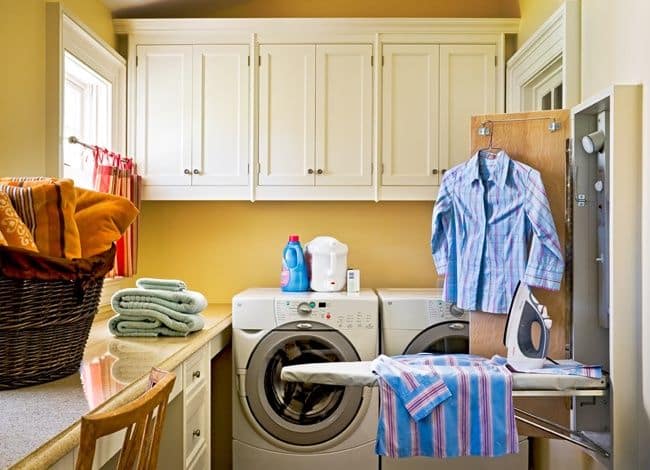
Agreeable Gray by Sherwin-Williams merges gray with hints of beige and brown, making it a versatile neutral shade.
With a Light Reflectance Value of 60, it sits in the mid-tone range, bright enough for daily living spaces yet deep enough to show its color well.
It’s especially well-matched with wooden elements.
Repose Gray by Sherwin-Williams
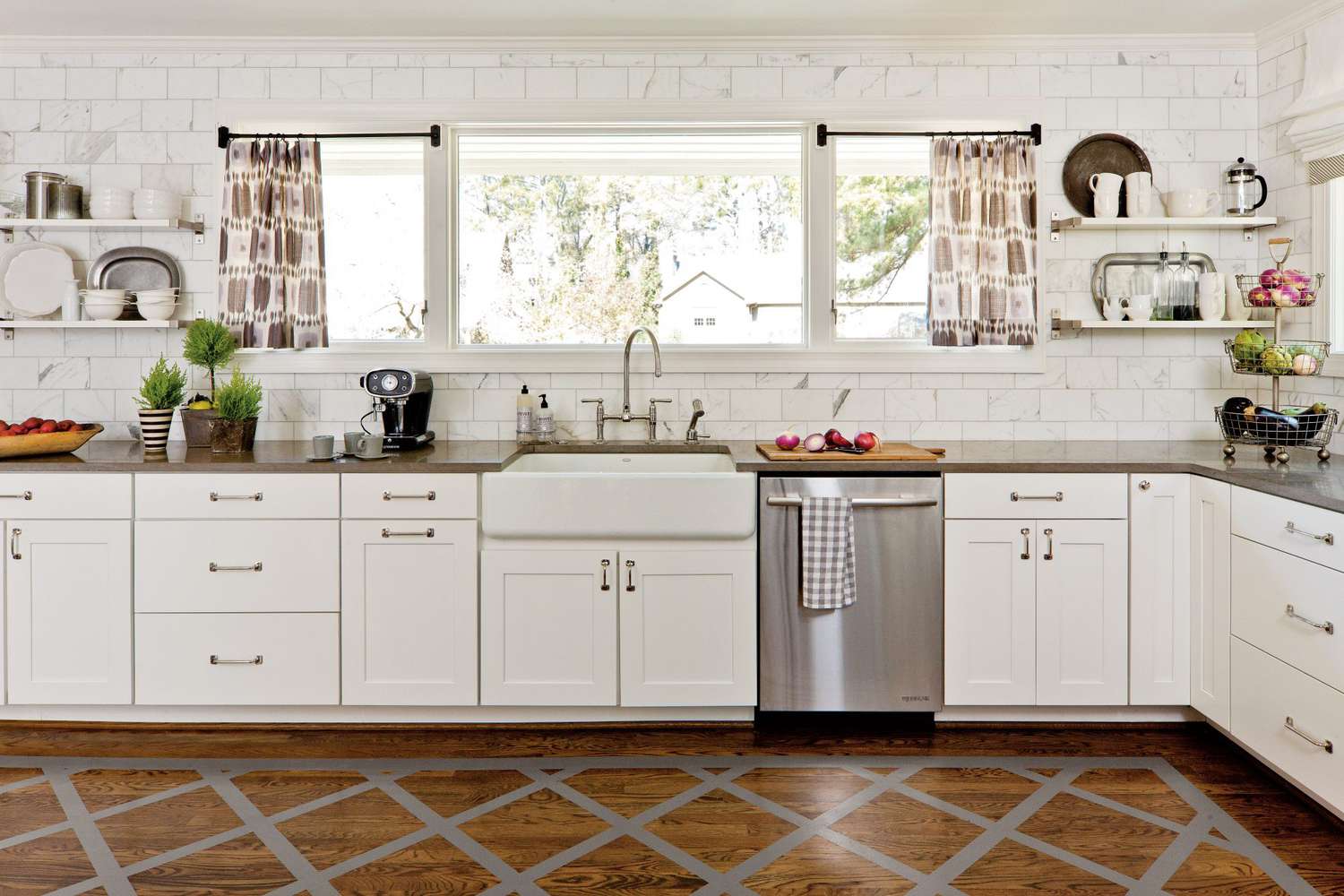
Repose Gray by Sherwin-Williams is a classic gray with subtle beige undertones.
A Light Reflectance Value of 58 provides a clean, mid-tone shade that works in most home spaces.
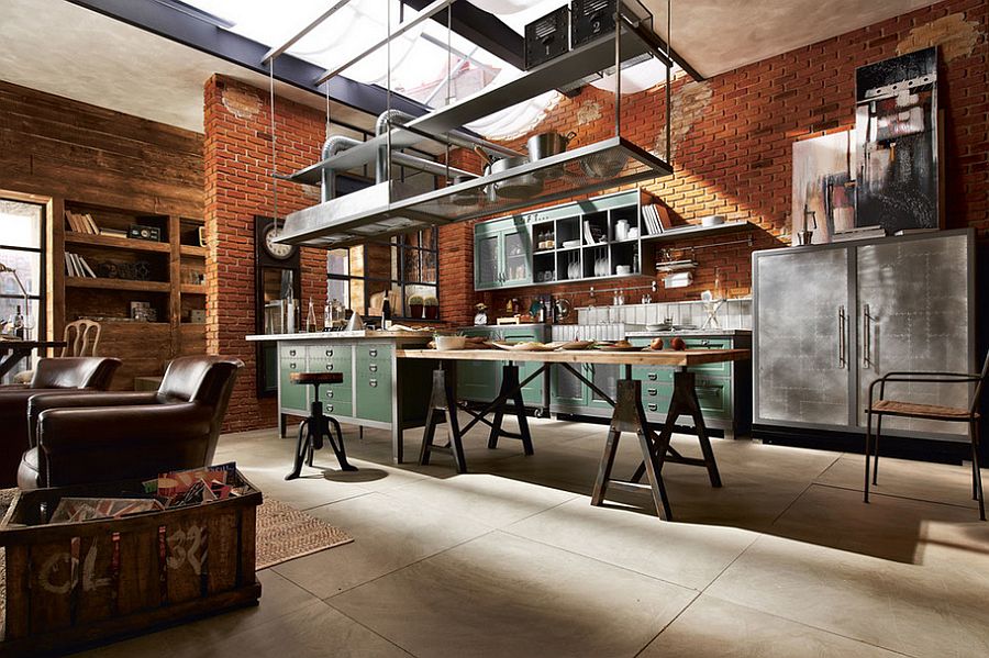
It performs particularly well in rooms with metallic accents and cooler color schemes.
Differences between Agreeable Gray and Repose Gray
| Aspect | Agreeable Gray | Repose Gray |
|---|---|---|
| Undertones | Slight taupe (gray + brown) undertone | A cooler gray with a hint of beige, slightly leaning towards a green undertone. |
| Impact of Undertones on Overall Look | It can bring out warm undertones in spaces with wood, brick, or natural elements. | It can bring out cooler tones with elements like cooler lighting or metallics. |
| It is best suited for spaces that need a warm, balanced feel. | It is best suited for spaces with a modern, minimalist feel or cooler tones. | |
| Slight Difference in LRV | LRV: 60 (Slightly lighter, more airy) | LRV: 58 (A tad darker but still within a light mid-tone range) |
| Best Uses | Great in spaces with warm undertones (wood, natural elements). | It is ideal for cooler tones and modern or minimalist designs. |
| Suitable for living rooms, kitchens, and cozy spaces. | Works well with cooler lighting and metallic elements. |
Similarities between Agreeable Gray and Repose Gray
| Aspect | Agreeable Gray | Repose Gray |
|---|---|---|
| Brand and Availability | Both colors by Sherwin-Williams | Both colors by Sherwin-Williams |
| Option to use other paint brands, but best results with Sherwin-Williams | Option to use other paint brands, but best results with Sherwin-Williams | |
| The Gray Family | Classified as gray | Classified as gray |
| Variations within the gray family: cool, warm, greeny, bluish, etc. | Variations within the gray family: cool, warm, greeny, bluish, etc. | |
| Light Reflectance Value (LRV) | LRV: 60 (Lighter mid-tone) | LRV: 58 (Lighter mid-tone) |
| Both colors provide a lighter, airy feel in rooms | Both colors provide a lighter, airy feel in rooms | |
| Ideal for bedrooms, living rooms, hallways, etc. | Ideal for bedrooms, living rooms, hallways, etc. | |
| Why People Choose These Colors | Balanced tones that aren’t too light or dark | Balanced tones that aren’t too light or dark |
| Versatile for minimalist, neutral, and modern designs | Versatile for minimalist, neutral, and modern designs |
How to choose the right one for your home
When deciding between Agreeable Gray and Repose Gray for your home, consider these key points:
Consider your space elements
- Agreeable Gray might be the better choice if your room has wooden furniture or brown tones, as its slight brown undertones complement these features.
- Repose Gray could be the more fitting option for spaces with metallic finishes or cooler color schemes.
Testing is essential
- Use large paint samples in your space to see how each color looks
- Check the colors at different times of day, as lighting changes can affect how they appear
- Place the samples near your furniture and decor to see which one fits better with your existing items
- Consider using test boards to compare both colors side by side in the same room
Testing Colors: The Mighty Boards Method
Using test boards gives you a better idea of how paint colors will look in your space. Mighty Boards are a specific tool that helps with this process:
What They Do
- Let you see large samples of each color
- Help compare colors side by side
- Allow you to move the samples around different areas
- Show how colors look in your actual lighting
Why Testing Matters
- The same color can look different throughout the day
- Room lighting affects how paint appears
- Natural and artificial light create different effects
- Your room’s layout and size influence color appearance
- Existing decor can change how colors look.
Examples of rooms designed in both colors
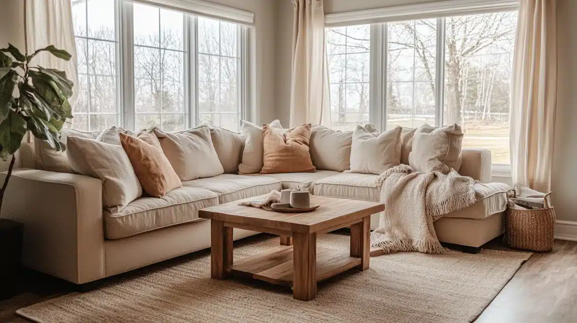
Agreeable Gray Living Room
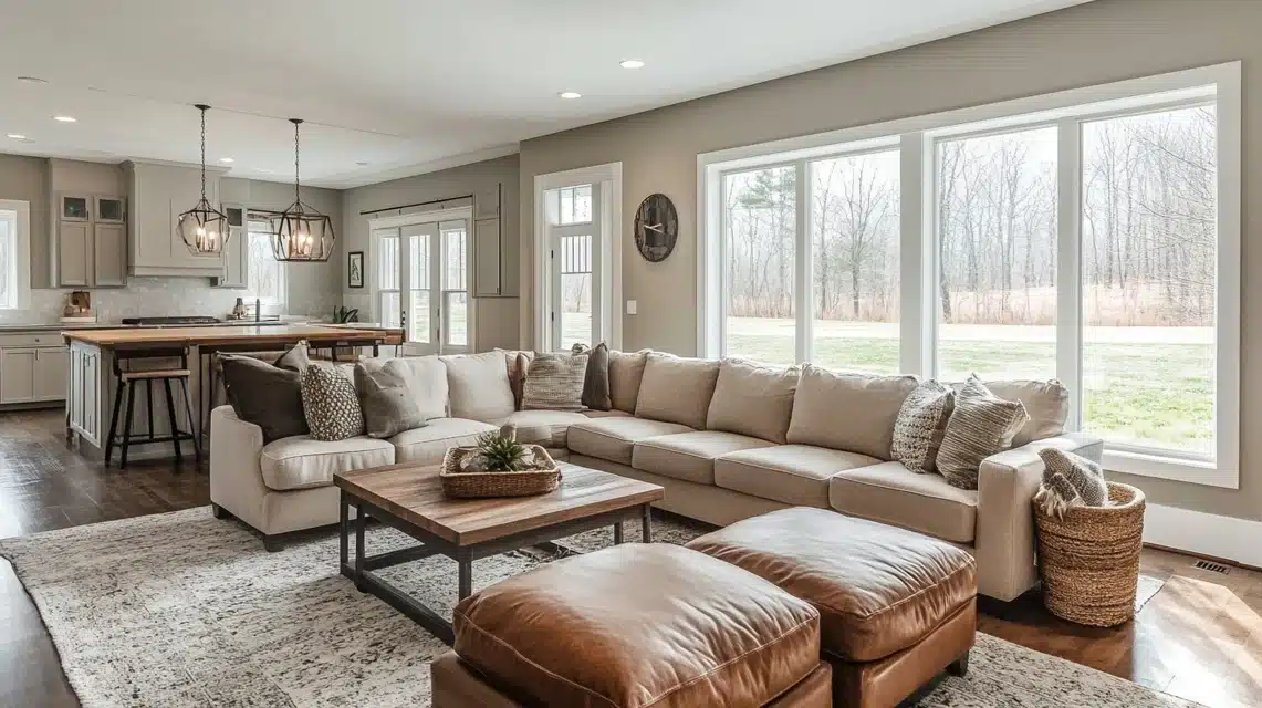
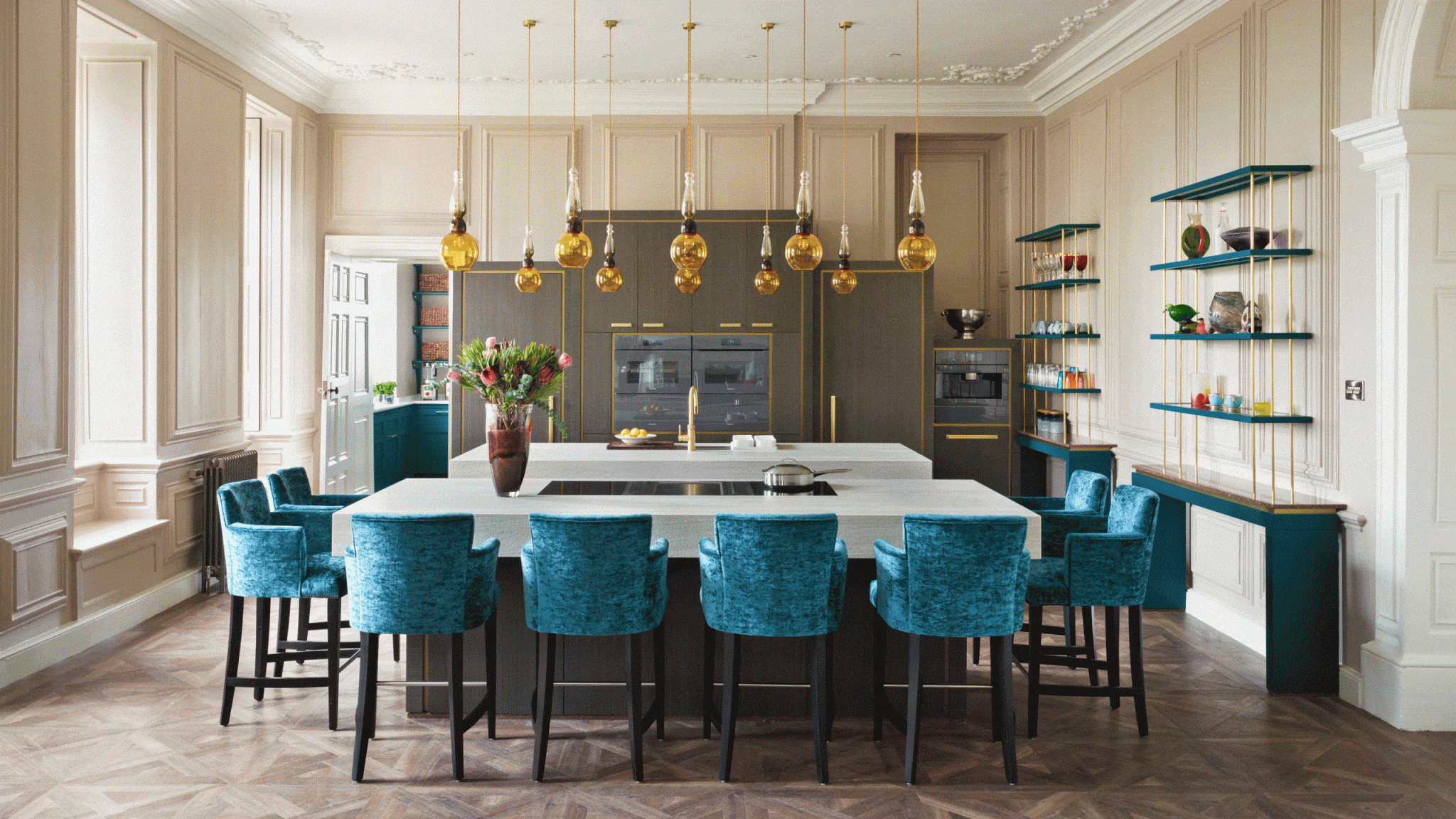
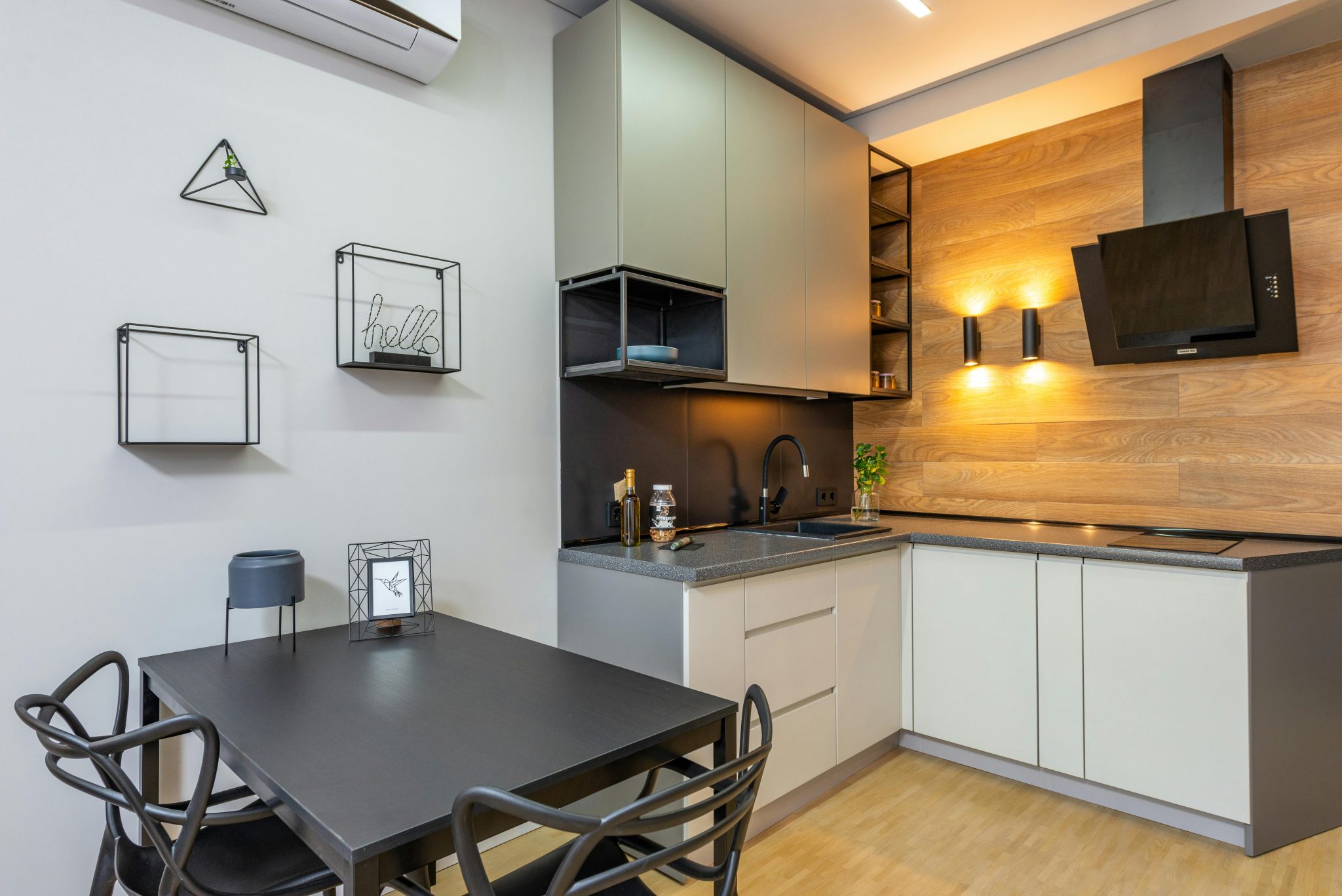
Repose Gray Living Room
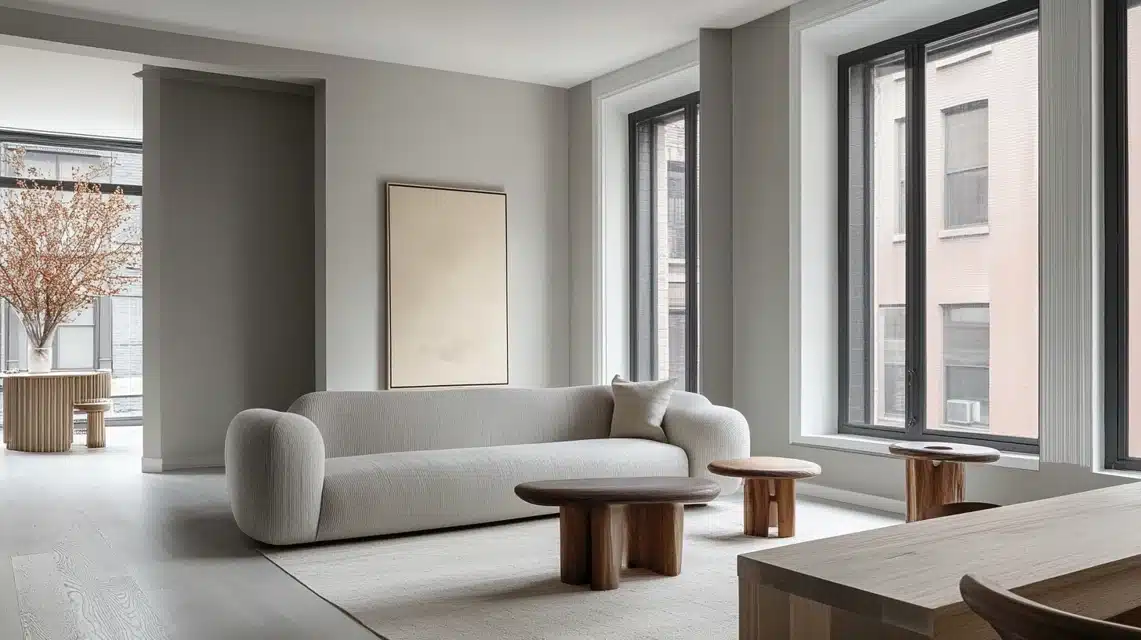
Comparing Agreeable Gray and Repose Gray with other popular gray paint colors
| Aspect | Agreeable Gray | Repose Gray | Revere Pewter | Mindful Gray | Worldly Gray |
|---|---|---|---|---|---|
| Undertones | Slight taupe (gray + brown) undertone | Cooler gray with a hint of beige, slight green undertone | Warm gray with a strong beige undertone | Slight warm gray with a touch of green | Warm gray with subtle beige undertones |
| Light Reflectance Value (LRV) | 60 (Lighter mid-tone) | 58 (Lighter mid-tone) | 55 (Medium light tone) | 48 (Medium light tone) | 57 (Medium light tone) |
| Best For | Warm spaces with wood, natural elements, and cozy rooms | Cooler spaces with modern, minimalist designs, metallics | Traditional and classic interiors, living rooms, and kitchens | Spaces needing a soft, warm backdrop work well in living rooms, bedrooms | Neutral spaces that work with both warm and cool tones |
| Overall Vibe | Balanced, soft, warm gray with a slight taupe undertone | Cool, contemporary, soft gray with a hint of green | Warm, classic, and neutral, slightly more beige than gray | Soft, warm gray with subtle green, more muted than others | Soft, warm, neutral gray with beige undertones |
| Suitability for Modern Designs | Yes, it works with contemporary styles, especially with warm elements | Yes, it fits well with modern, minimalist interiors | Less suitable for modern designs, more traditional | Yes, it pairs well with contemporary, subdued color schemes | Yes, it is versatile for modern and traditional designs |
| Best Room Uses | Living rooms, kitchens, bedrooms, hallways, cozy spaces | Living rooms, bathrooms, kitchens, entryways, bedrooms | Living rooms, kitchens, open-concept spaces, hallways | Living rooms, bedrooms, home offices, open spaces | Living rooms, kitchens, bedrooms, bathrooms |
Summing Up
When comparing Agreeable Gray and Repose Gray, remember that Sherwin-Williams colors offer excellent mid-tone options for your home.
Agreeable Gray, with its slightly warmer undertones, works well with wooden elements, while Repose Gray’s cleaner gray appearance fits nicely with cooler color schemes.
Both have similar light values, making them suitable for most rooms.
The best choice depends on your specific space. Take time to test both colors in your home, considering your lighting, furniture, and decor.
This careful approach will help you select the paint color that creates the perfect look for your space.

