6 Interior Design Principles Every Furniture Lover Should Know
Everyone is aware that furniture can make or break a room.
But do you know how to use furniture to its full potential?
There’s more to interior design than just putting together a bunch of stuff and hoping for the best.
You can use furniture in your home or office to create beautiful, practical spaces that are relaxing, functional, and unique.
And the key is understanding some basic interior design principles.
In this article, I’ll share some interior design principles that all furniture lovers should know. I’ll also give you some tips on practising them in your home or office.
So grab your favourite chair (or sofa) and transform your space with serious style.
6 Interior Design Principles Every Furniture Lover Should Know
1) Alignment
When arranging your furniture, align them to create balance and order. Alignment helps achieve a visually pleasing and cohesive look in your home.
Think of alignment as the glue that holds your furniture arrangement together. You create a sense of structure and organization by aligning pieces along a common axis.
It’s like conducting an orchestra – each piece has its place and contributes to the overall symphony of your room.
But feel free to play with alignment. Try mixing vertical and horizontal arrangements or using curved lines.
Playing with the alignment of your pieces adds visual interest and keeps things from looking too rigid or predictable.
2) Mass and Void Spaces
Mass occupies spaces, while void spaces are the empty areas surrounding the mass.
Balancing a room’s mass and void spaces creates a pleasing and functional furniture arrangement. You don’t want your area to feel overcrowded or empty like a ghost town.
Finding that sweet balance between solid pieces and open areas is critical.
Think of it as finding the perfect balance between cake and frosting – you want just the right amount.
You’ll achieve a light and inviting atmosphere by strategically creating a harmonious distribution of mass and void spaces.
3) Scale and Proportion
Make sure your furniture is proportionate to the size of the room and other elements within it. Scale and proportion play a significant role in achieving balance and harmony in interior design.
Use a furniture comparison website to compare furniture to other elements in the room to help you determine if it’s too large or too small.
Here are three reasons why paying attention to scale and proportion is crucial:
Avoid overpowering the space: Choosing furniture that is too large for a room can make it feel cramped and overwhelming, while furniture that is too small may get lost and appear insignificant.
Create visual cohesion: Having appropriately scaled furniture helps establish a sense of unity within the space. Each piece complements one another, creating a harmonious overall aesthetic.
Enhance functionality: Properly scaled furniture ensures that each piece serves its intended purpose effectively without hindering movement or obstructing access to other rooms.
4) Emphasis and Focal Point
Emphasis means to make something stand out because of its importance or prominence. You can achieve emphasis by placing a focal point.
Try using a statement piece of furniture to create a focal point in a room. It could be a single piece or an arrangement of furniture, but whatever you choose, it should stand out somehow.
Picture this: You walk into a living room, and a vibrant red sofa immediately demands attention like a diva on stage. That’s the power of emphasis and focal points.
Placing one bold furniture item can instantly elevate the overall design scheme and inject personality into your space. Think outside the box – a funky chair with intricate patterns or a unique coffee table made from reclaimed wood.
5) Unity and Harmony
Now that you’ve mastered the principle of emphasis and focal point in design. Let’s move on to another important principle: unity and harmony.
Unity and harmony go hand in hand when creating a visually pleasing space. Think of unity as the glue that holds everything together, while harmony is like a symphony where all the elements work together in perfect rhythm.
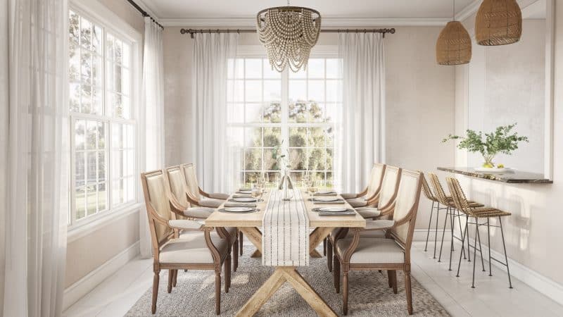
You’ll want to select furniture pieces with shared characteristics such as style, colour, or materials to achieve a unified look. Harmony comes into play by ensuring that these pieces complement each other rather than clash.
6) Contrast
Contrast is about creating visual interest and adding excitement to your space.
Here are three ways contrast can elevate your furniture design:
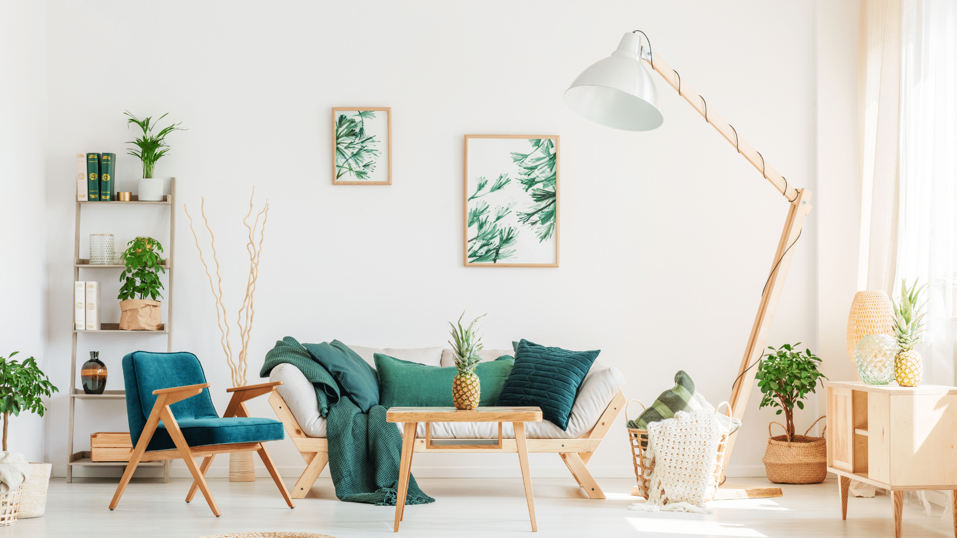
Colour: Pairing bold and vibrant colours with neutral tones can create a striking contrast that grabs attention and adds energy to the room.
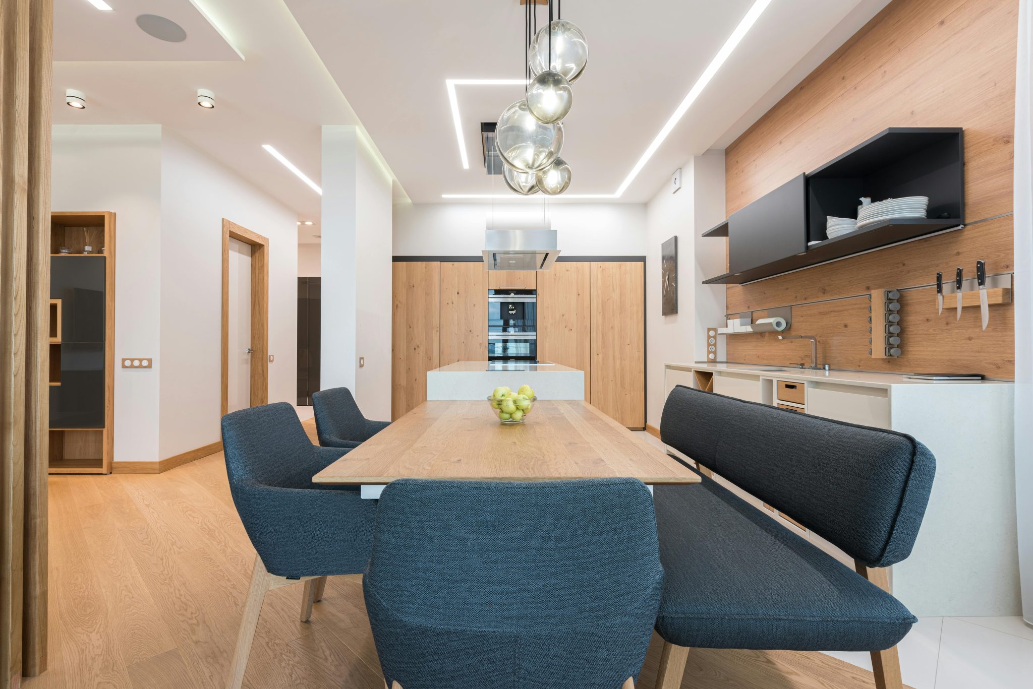
Texture: Combining smooth and sleek surfaces with rough or textured materials creates a tactile contrast that adds depth and dimension to your furniture.
Shape: Mixing different shapes, such as pairing angular pieces with curved ones, adds visual intrigue and keeps things interesting.
When you buy furniture online, pay attention to these contrasting elements for a dynamic and captivating interior design.
Frequently Asked Questions (FAQs)
What are common mistakes to avoid when considering scale and proportion in interior design?
- Choosing furniture inappropriate to the space: Be mindful of selecting furniture that is too large and too small for the room. Balance is key.
- Considering the relationship between furniture pieces: Consider how different furniture pieces relate to each other in size and shape to avoid creating an inharmonious look.
How can I create a cohesive and unified look in my space?
To achieve a cohesive and unified look in your space, follow these steps:
- Choose a complementary colour palette: Select colours that work well together to create a harmonious visual impact.
- Stick to a consistent style and theme: Determine the style and theme you want to convey and ensure your design choices align.
- Pay attention to scale and proportion: Ensure that the size of your furniture pieces is appropriate for the room, creating a balanced composition.
- Remember proper lighting: Properly lit spaces enhance your home’s ambience and appearance.
What are some examples of details that can elevate a room’s overall design?
If you want to take your room’s design to the next level, focus on incorporating these details:
- Unique lighting fixtures: Consider statement chandeliers or sleek wall sconces to add a touch of personality and style.
- Textural elements: Layer fabrics like velvet, silk, and faux fur to create visual interest and depth.
- Pops of colour: Add vibrant hues through artwork, throw pillows, or accent furniture pieces.
- Bring nature indoors: Remember to appreciate the power of plants to infuse life and freshness into any space.
Conclusion
When designing a room, remember this: furniture is just the beginning. It’s only one piece of the puzzle.
But what’s the most crucial part? It’s all about the flow and functionality of the space.
As you contemplate room design, consider the bigger picture and small details, focusing on everything from decor to lighting. Every detail matters.
These interior design principles can help you get started on the right track. And as you begin to apply them, remember that it’s okay to experiment and make changes along the way.
That’s part of what makes designing your home so much fun.

