Worldly Gray vs. Agreeable Gray: Which Paint is Perfect for Your Home?
Picking the right gray paint for your home can be a big choice. Two popular Sherwin-Williams colors – Worldly Gray and Agreeable Gray – often come up in home design talks. Both shades bring warmth to any room, but key differences matter for your space.
Want to know which gray will work best in your home? This guide looks at what makes these colors different, how light affects them, and which rooms they suit best. We’ll help you understand their base colors, how they look at various times of day, and what furniture colors match well with each shade.
Let’s look at these two paint options side by side to help you make the best choice for your home.
How do Undertones in Paints Affect the Look of The Wall?
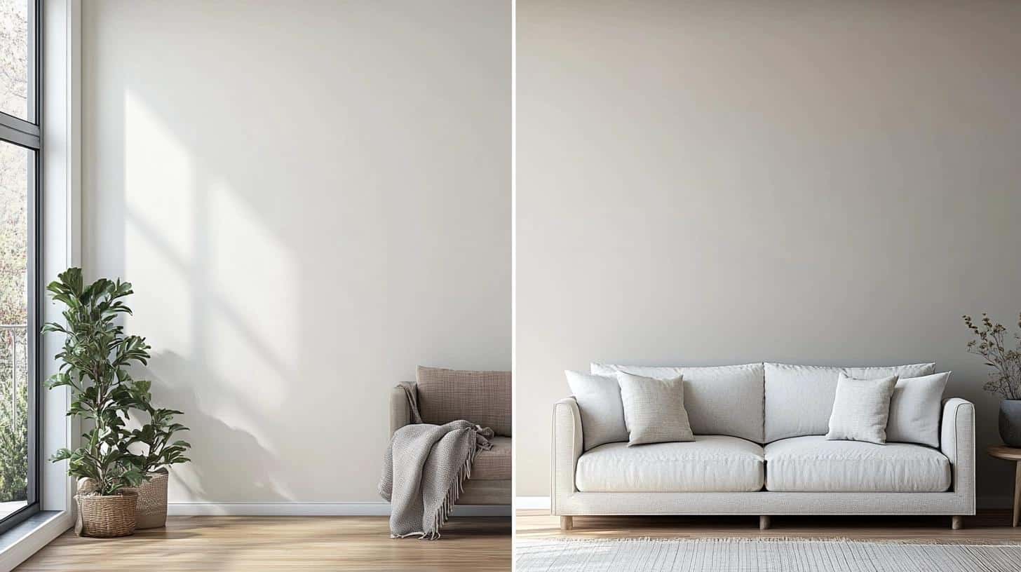
Undertones in paint can significantly influence the appearance of a wall, affecting how colors are perceived in different lighting conditions.
Understanding Paint Undertones
When you look at paint, you see two key parts: the main color and its hidden undertones. Think of the main color as what you notice first, like gray. Undertones are the subtle hints of other colors mixed in that you might not spot right away.
In paint terms, we group undertones into three types:
- Cool undertones have hints of blue, green, or purple
- Warm undertones show touches of red, yellow, or brown
- Neutral undertones stay balanced without leaning too warm or cool
Effects of Lighting on Undertones
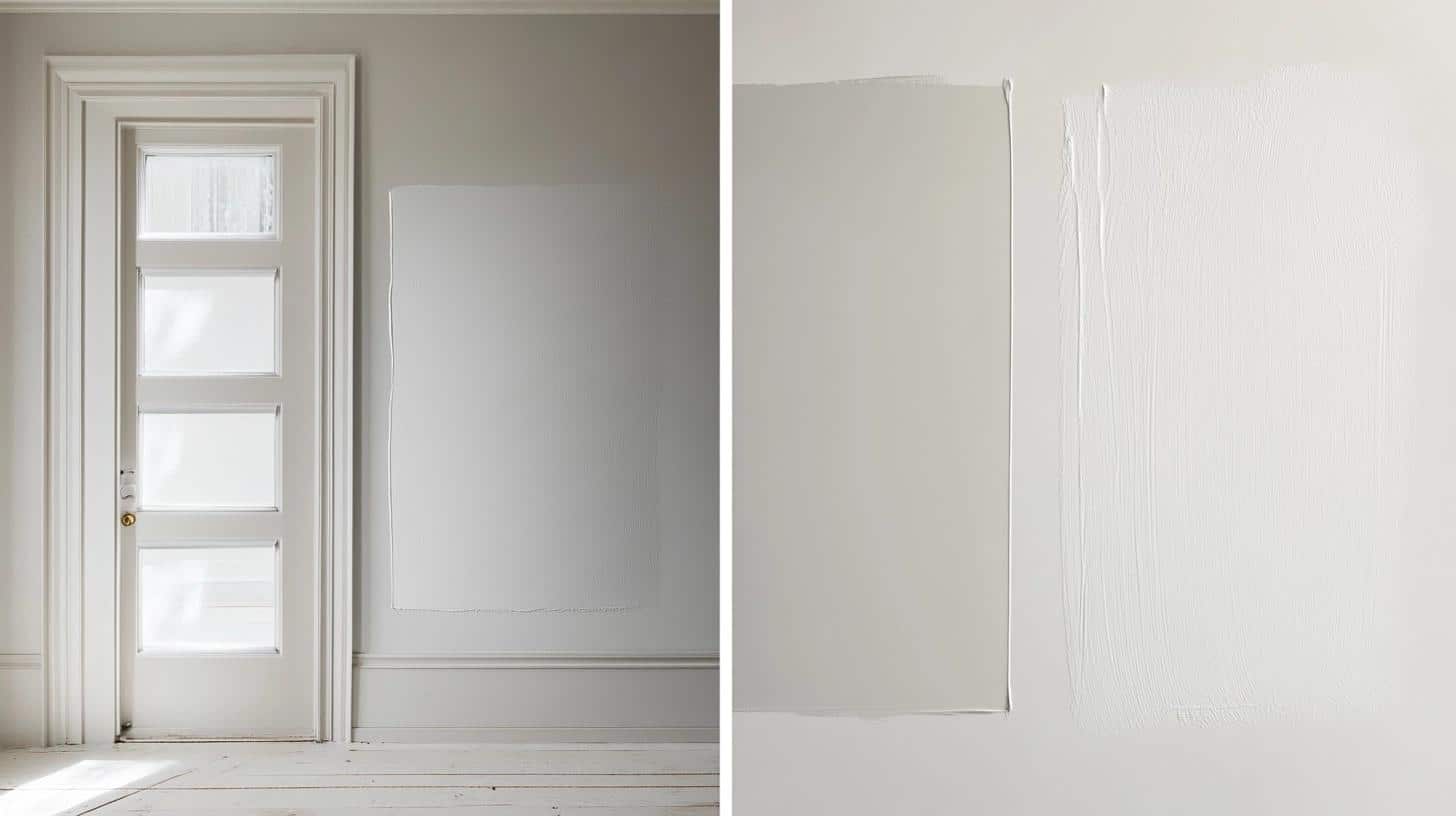
Light plays a big role in how paint looks on your walls. Morning sunlight might make your gray paint look different than evening lamp light does.
Testing tips for paint samples:
- Put samples on different walls in the same room
- Check the color at different times of day
- Look at the paint under both natural and artificial light
- Use large sample areas (at least 2 feet square)
Choosing the Right Undertones for Your Space
Room size and light matter when picking paint undertones:
- Small rooms often work well with cooler undertones to feel more open
- Larger spaces can handle warmer undertones without feeling closed in
- North-facing rooms might need warmer undertones to feel cozier
- South-facing rooms often look good with any undertone choice
Briefing the Two Colors: Undertones
Worldly Gray (SW 7043)
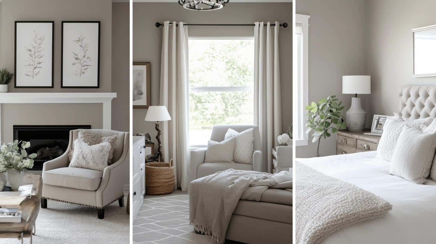
Worldly Gray (SW 7043) stands out as a mid-tone gray that brings softness to any room. It sits in the middle range of Sherwin-Williams’ gray paint options, with green-brown undertones that make it unique.
The color shifts throughout the day:
- Morning light brings out its green notes
- Midday sun shows its true gray base
- Evening light highlights its brown tints
Agreeable Gray (SW 7029)
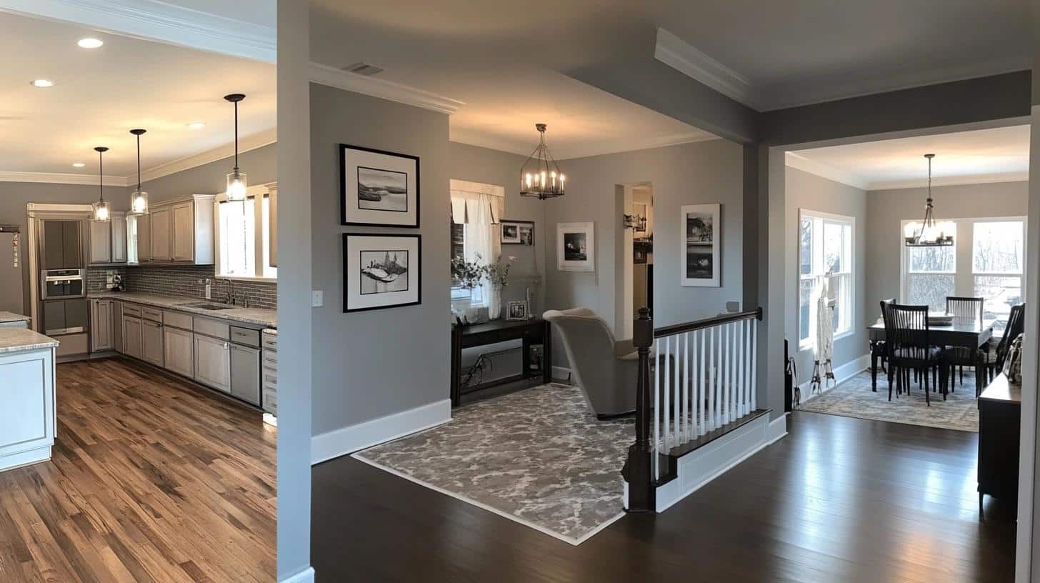
Agreeable Gray (SW 7029) stands as a light-to-medium gray that works well in many settings. This shade mixes gray with beige (often called “greige”), creating a balanced neutral that fits most spaces.
Its undertones show differently based on your view:
- Natural light reveals its warm beige notes
- Artificial light keeps it looking more gray
- Shadow areas stay neutral and balanced
Worldly Gray VS. Agreeable Gray
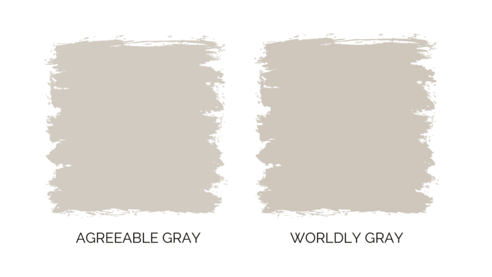
1. Aesthetic and Mood Influences
Worldly Gray brings steadiness to a room. It makes spaces feel grounded and natural, perfect when you want a structured but gentle feel. It works well in spaces where you need focus and calm.
Agreeable Gray adds warmth wherever it goes. It creates spaces that feel clean and fresh while staying cozy. This paint fits perfectly in homes that want to feel put-together without being stiff.
- Worldly Gray suits modern and farmhouse styles best
- Agreeable Gray fits both modern and classic home designs
2. Versatility and Coordination
Both colors work well with other shades. Worldly Gray pairs beautifully with pure white trims and looks strong next to dark wood furniture. Metal accents in black or oil-rubbed bronze stand out nicely against it.
Agreeable Gray matches with bright white trims and light wood furniture. It looks good with brushed metal fixtures and can handle both light and medium-toned accent pieces well.
- Worldly Gray works best with darker accents and furniture
- Agreeable Gray shines with lighter decor elements
3. Durability and Maintenance
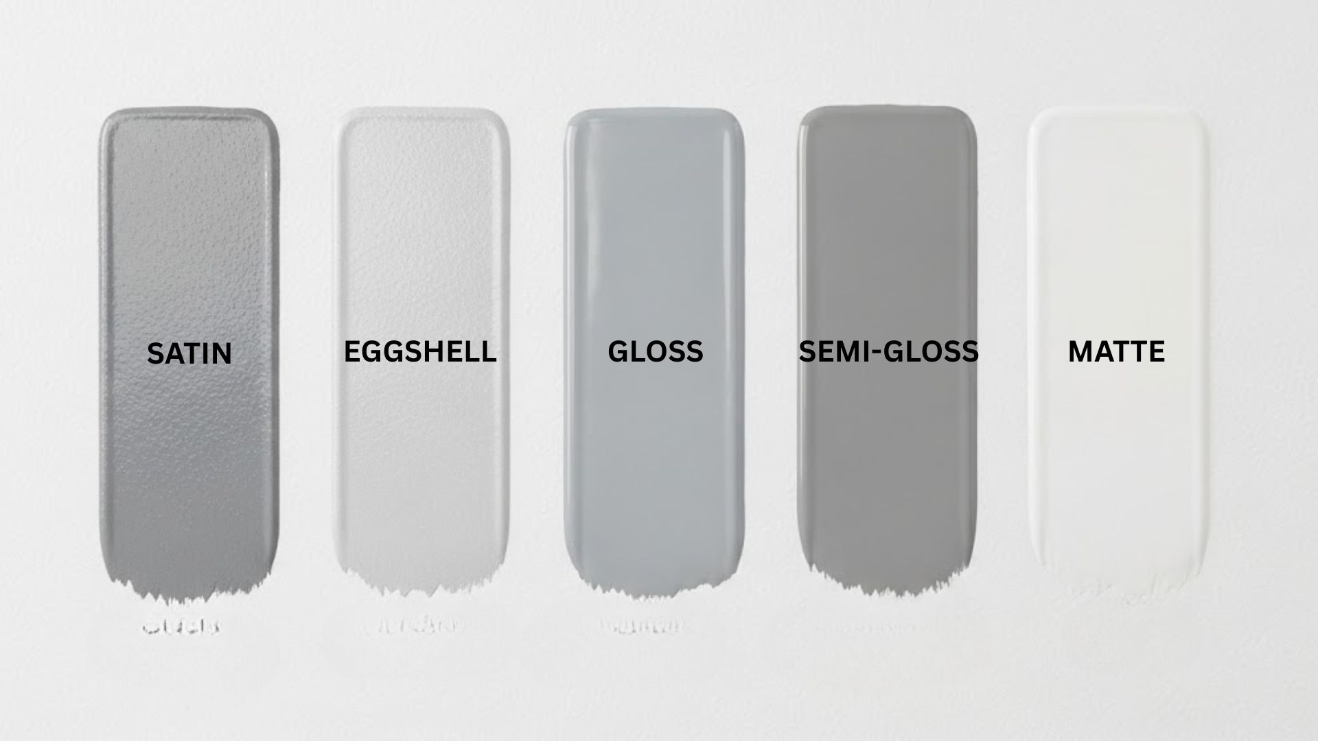
Both paints come in different finishes for different needs. Flat finish suits quiet spaces like studies. Eggshell works well in living areas. Satin holds up best in busy spots like kitchens.
Taking care of these paints is simple. Clean marks with a soft, damp cloth. Keep some paint stored away for quick fixes. For big repairs, use primer first to make sure the fix blends in well.
- Satin finish is best for high-traffic areas and rooms with moisture
- Store touch-up paint in a cool, dry place for best results
Which Room do They Suit Best in?
Worldly Gray (SW 7043)

| Room | Mood/Effect | Perfect Pairs |
|---|---|---|
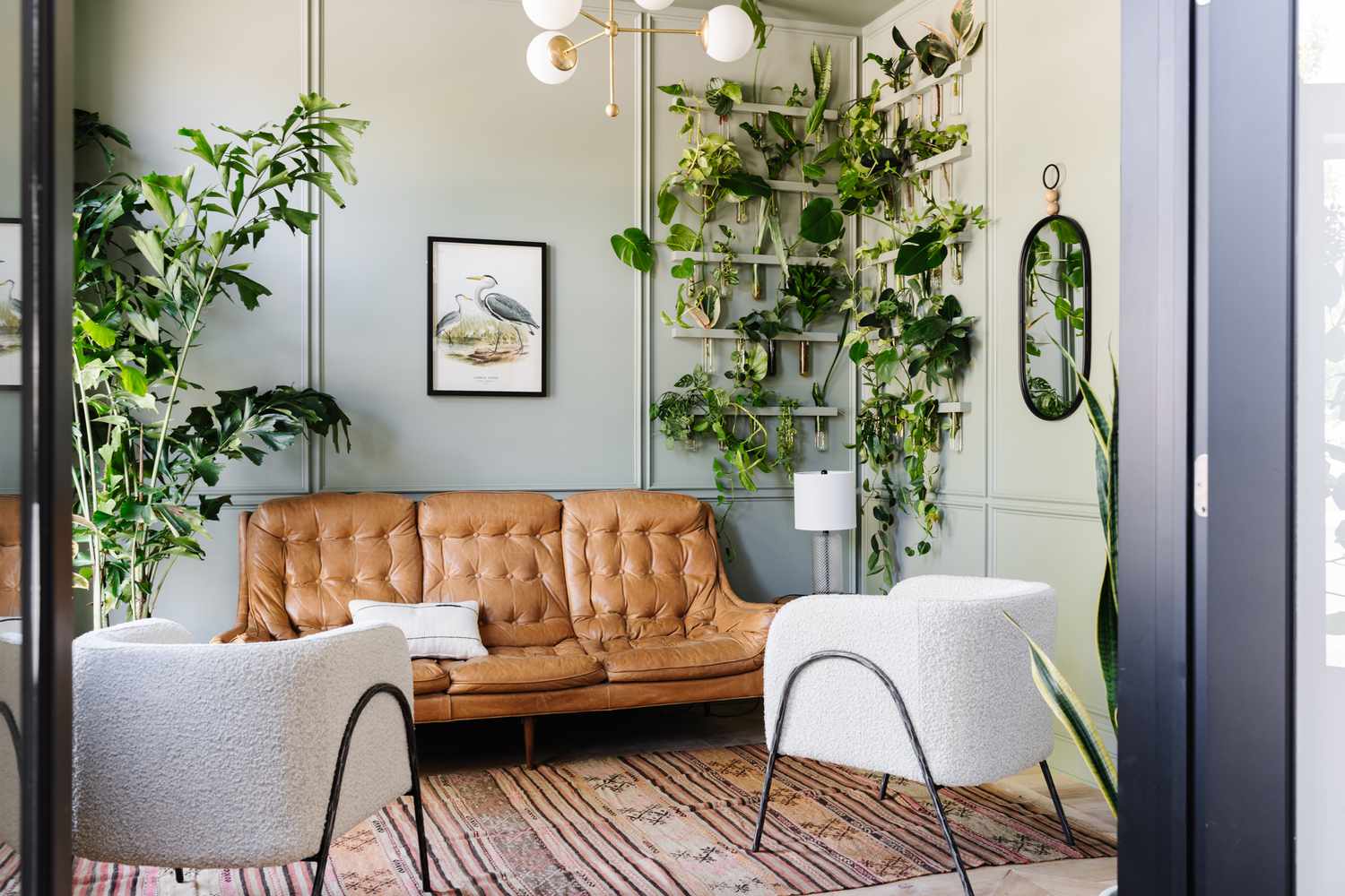
| Living Room | Creates a welcoming mood in main living spaces | Tan leather chairs, Cream-colored sofas, Deep brown tables, Textured throws, Natural fiber rugs |
| Bedroom | Sets the right mood for rest and sleep | White bedding sets, Blue or green accents, Light, flowing curtains, Natural wood furniture |
| Home Office | Helps maintain focus during work hours | Solid wood desks, Task lighting, Dark metal fixtures, Simple window treatments |
Agreeable Gray (SW 7029)

| Room | Mood/Effect | Perfect Matches |
|---|---|---|
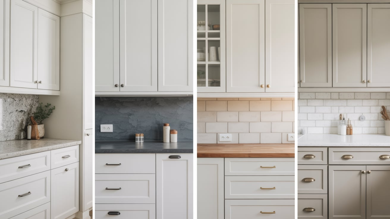
| Kitchen | Looks fresh and clean, hides minor marks well | White cabinets, Steel appliances, White subway tiles, Light stone counters, Chrome fixtures |
| Bathroom | Creates a spa-like atmosphere, maintains a clean, fresh look | White fixtures, White fluffy towels, Glass accessories, Chrome hardware, Simple mirrors |
| Dining Room | Provides an ideal backdrop for meals, makes the space feel sophisticated | Glass chandeliers, Metal light fixtures, White trim, Patterned curtains, Mixed metal accents |
Additional Design Ideas for Worldly Gray and Agreeable Gray Inside

Indoor Color Pairings
Worldly Gray : Trim and ceiling options bring out the best in Worldly Gray. Soft ivory trim makes each wall stand apart, while off-white ceilings help rooms feel taller. Natural wood trim adds extra warmth to the space.
When it comes to accent walls, Worldly Gray opens up many options. Navy blue creates a sense of depth that works well in living spaces. Deep green brings nature inside and keeps rooms feeling balanced. For a bolder look, charcoal gray makes a strong statement without fighting the main walls.
Agreeable Gray: Pure white trim gives Agreeable Gray a fresh, clean border. Bright white ceilings make spaces feel open and airy. Light wood trim adds a modern touch while keeping the room warm and inviting.
For accent walls, soft pink adds gentle warmth that works well in bedrooms or dining rooms. Rich brown brings coziness to living spaces, while slate blue helps create smooth flow between rooms.
Exterior Uses of The Colours
Worldly Gray: This color shines on modern farmhouse exteriors, bringing out their simple charm. It suits craftsman homes perfectly, highlighting their architectural details. On ranch-style houses, it creates a timeless look that works with any landscape.
The color pairs beautifully with white window frames and natural stone details. Dark metal light fixtures and hardware stand out nicely against these walls.
Agreeable Gray: On colonial style homes, this color creates a strong but gentle presence. It updates traditional buildings without losing their classic feel. Ranch houses get a fresh look with this color, especially with modern updates.
Black shutters create a sharp contrast against these walls. Red brick looks warm and inviting next to this shade. Front doors in bold colors like navy or forest green make a striking first impression.
Conclusion
Choosing between Worldly Gray and Agreeable Gray comes down to your space and needs. Worldly Gray brings earthy warmth that works well in living rooms, bedrooms, and home offices, making these spaces feel grounded and peaceful. Agreeable Gray offers clean, fresh appeal that fits perfectly in kitchens, bathrooms, and dining rooms.
Both colors change with light throughout the day, so testing samples in your space is key. Pay attention to how they look morning, noon, and night. Think about your room’s purpose – Worldly Gray might be better for focus areas, while Agreeable Gray suits busy family spaces.
In the end, both shades offer lasting style that works with many decor choices. Take time to test, watch how they change, and pick the one that feels right in your space.
FAQ (Frequently Asked Questions)
Are These Colors Suitable for Open Floor Plans?
Both colors work well in open spaces. They flow smoothly between rooms, keeping your home feeling connected. Their neutral base helps create smooth transitions from one area to another.
Can These Colors Make a Small Room Look Larger?
Yes. Both shades have light-to-medium tones that reflect light well. When paired with white trim and good lighting, they help small spaces feel more open and airy.
Is Agreeable Gray Outdated in Current Design Trends?
No. Agreeable Gray remains current because it mixes well with modern color trends. Its balanced tone works with today’s design choices while staying timeless in appeal.

