What Colors Go with Gray? Ideas for Every Room
Gray is one of the most popular colors in home design because it works well in almost any space. It acts as a neutral base, making it easy to pair with both soft and bold colors.
Whether you are decorating a living room, bedroom, or kitchen, choosing the right color of gray can change the overall look of your space.
From warm tones that add comfort to cool shades that create a calm feel, there are many options to try.
This guide offers simple, practical ideas to help you find the best color combinations for gray in every room.
Why Gray Works with So Many Colors?
Gray is a neutral shade that sits between black and white, making it easy to pair with almost any color. Its flexibility comes from a few simple reasons:
- Warm grays pair well with beige, yellow, and rust tones
- Cool grays match naturally with blue, green, and purple
- Works across both bold and soft color palettes
- Adapts to different lighting conditions without losing balance
This makes gray one of the most versatile base colors for any room.
Best Color Combinations That Go with Gray
These combinations help you plan your space with ease. Each option gives a different feel based on color balance and usage.
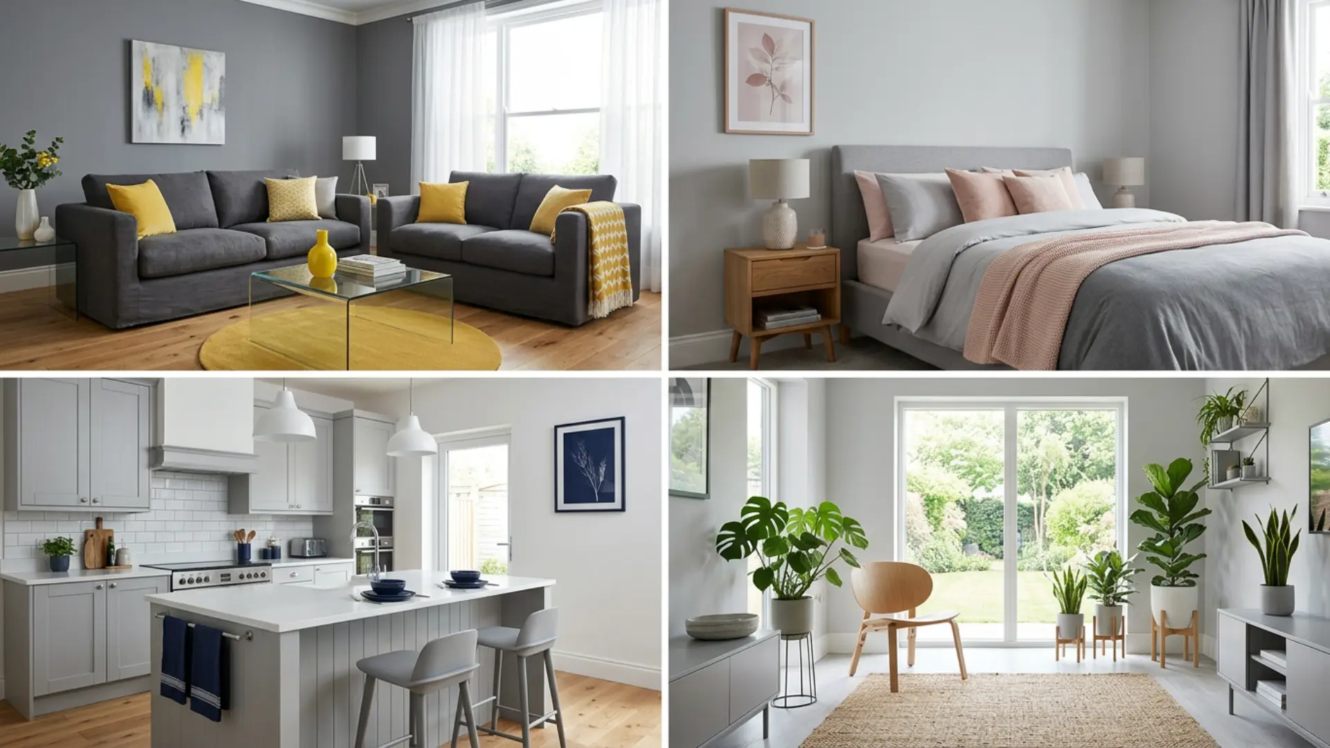
1. Gray and White
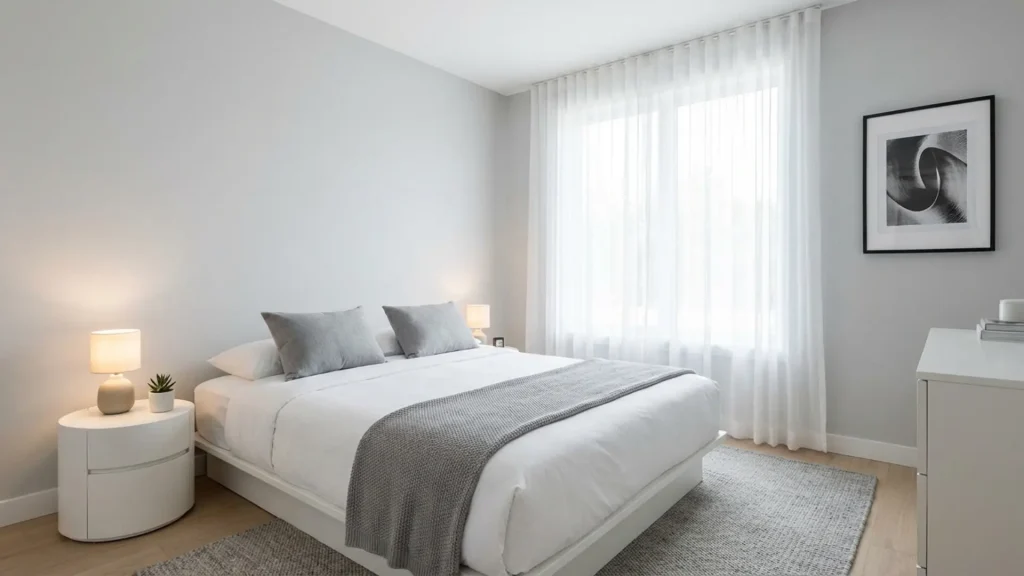
Gray and white create a clean and simple look. This combination works well in almost any room. This combination is also easy to update over time with small decor changes.
It works well with both modern and traditional styles without needing major adjustments. Adding textures like wood, fabric, or metal can help avoid a flat or plain look.
White helps brighten gray and makes the space feel open. It also keeps the overall look light and easy to manage.
Use white on walls and ceilings while adding gray through furniture or decor. This helps maintain balance without making the space feel plain.
Best for: Living rooms, kitchens, and small spaces
Recommended: SW- Pure White SW 7005, BM- Chantilly Lace OC-65
2. Gray and Yellow
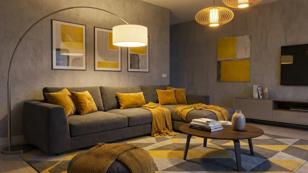
Lighter shades of yellow feel soft, while mustard tones give a deeper look. Keeping gray as the main color helps control the brightness of yellow.
This combination works well in spaces with limited natural light. It helps make the room feel more active without being overwhelming.
Use yellow in cushions, rugs, or artwork for a balanced look. Too much yellow can feel strong, so keep it in small areas.
Best for: Living rooms and workspaces
Recommended: SW – Butter Up SW 6681, BM – Hawthorne Yellow HC-4BS MQ4-11
3. Gray and Blue
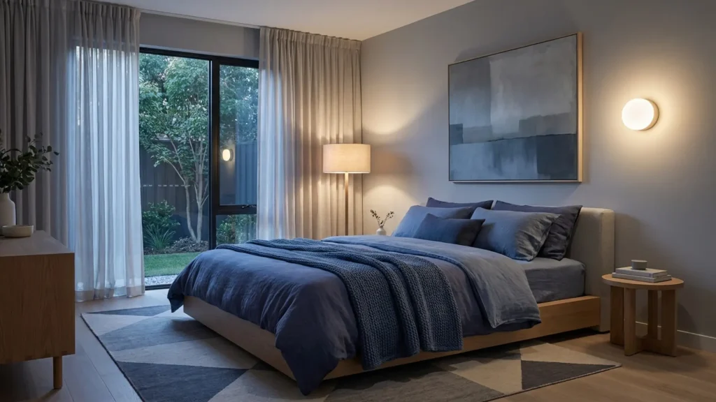
Gray and blue create a calm and steady setting. Light blue keeps the space fresh, while navy adds depth. This combination works well in both small and large spaces without feeling heavy.
Using different shades of blue can add depth without changing the overall tone. It also pairs well with white or wood elements for a more balanced setup.
This pairing is easy to use and feels balanced in most interiors. It does not feel too bold or too plain.
Best for: Bedrooms and offices
Recommended:SW- Azure Tide SW 9684, BM- Hale Navy HC-154
4. Gray and Green
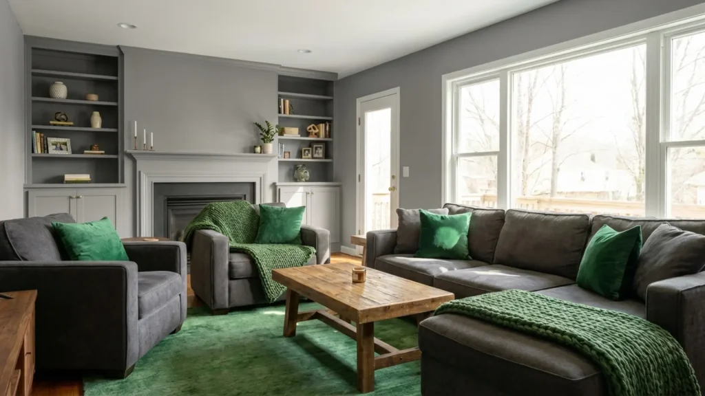
Gray and green create a natural, relaxed feel. Green softens gray and makes the space feel more comfortable. This combination works well in spaces where you want a calm and steady feel.
Natural materials like wood or stone can enhance the overall balance. Keeping green in small accents helps maintain a clean and simple look.
Light green feels fresh, while darker green adds depth. Indoor plants also fit well with this combination. Use green in decor, cushions, or wall accents. This helps create a calm and balanced space.
Best for: Living rooms and bedrooms
Recommended:BB – Nature S340-4, BM Essex Green HC-188
5. Gray and Blush Pink
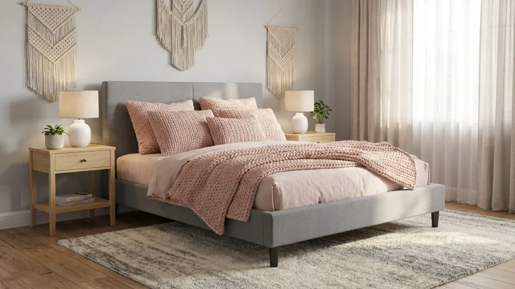
Gray and blush pink create a soft, calming look. Pink adds warmth without being too strong. This pairing is a good choice for spaces where you want to feel gentle and quiet.
This combination works well for a relaxed setting. It feels light and comfortable, with little contrast. Use blush pink in bedding, curtains, or decor items. Pair it with light or medium gray for the best result.
Best for: Bedrooms and cozy spaces
Recommended: BM- First Light 2102-70, SW- Romance SW 6323
6. Gray and Beige
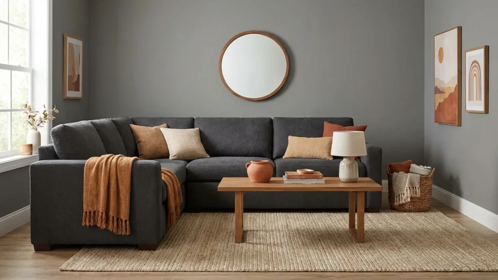
Beige adds warmth and softens the cool tone of gray. This combination is easy to maintain and does not go out of style quickly.
It works well with natural textures like wood, linen, or stone. Using different shades of beige and gray can help add subtle variation.
This mix is simple and works well for long-term use. It keeps the space looking clean without feeling cold. Use beige in rugs, walls, or furniture. Layering both shades helps maintain depth.
Best for: Living rooms and hallways
Recommended: BM – Edgecomb Gray HC-173, BA – Wisp PPU5-12
7. Gray and Black
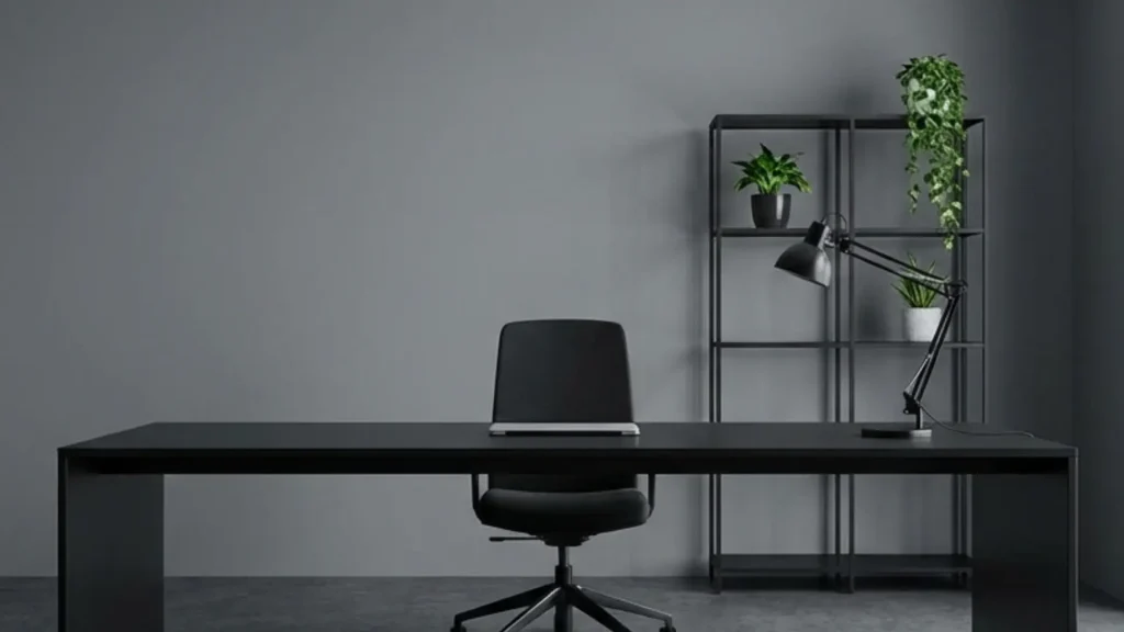
Gray and black create a strong and structured look. This combination adds contrast without using bright colors.
Clean lines and simple layouts help maintain a neat look. Adding a small amount of white can help balance the contrast.
Black works best in small details like frames, furniture, or fixtures. Too much black can make the space feel heavy. Use gray as the main base and add black for definition. This keeps the look sharp and balanced.
Best for: Modern interiors and workspaces
Recommended: SW- Tricorn Black SW 6258, BMBlack HC-190
8. Gray and Teal
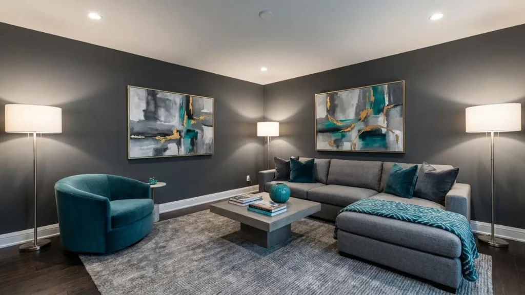
Gray and teal add color while keeping the space balanced. Teal sits between blue and green, making it easy to match. This combination adds depth without making the space too bold. It works well with both light and dark gray.
Use teal in cushions, accent chairs, or wall decor. This helps introduce color without overwhelming the space. This pairing works well when you want a bit of color without a strong contrast.
Different shades of teal can change the overall mood of the space. Keeping gray as the base helps maintain a clean and steady look.
Best for: Living rooms and accent areas
Recommended: BC – Current MQ6-35, BM – Teal Ocean 2049-30
9. Gray and Red (or Burgundy)
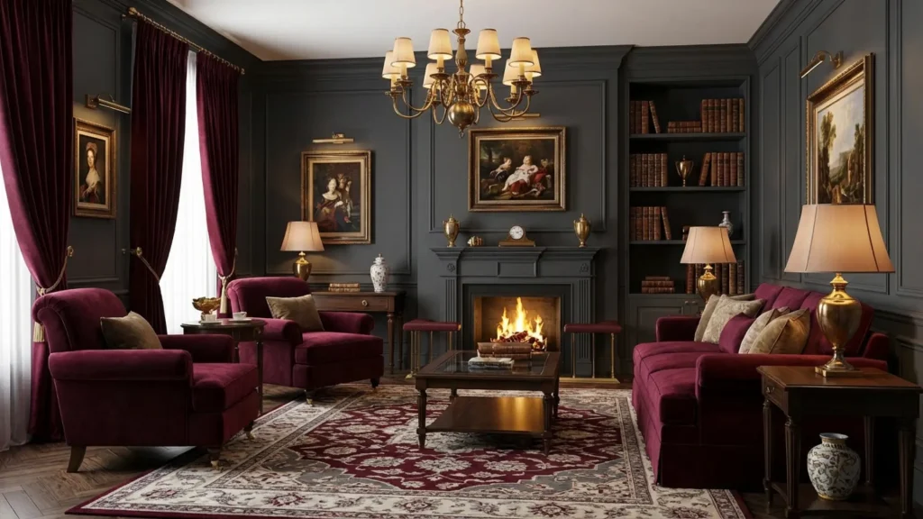
Gray and red create a bold contrast. Bright red feels strong, while burgundy gives a more balanced look. This combination adds focus and depth to a room.
This combination works well when you want to highlight a specific area. Darker red tones are easier to manage than bright shades.
Use red or burgundy in decor pieces, such as cushions or art. This keeps the space from feeling too intense. Keeping gray as the base helps control the overall intensity.
Best for: Accent walls or decor
Recommended: SW – Rookwood Red SW 2802, BM – Caliente AF-290Farrow & Ball Preference Red No.297
How to Choose the Right Color with Gray?
Choosing the right color depends on undertones, lighting, and how bold you want the space to look. A few simple checks can help you avoid mismatched combinations.
| Factor | What to Check | What to Do |
|---|---|---|
| Undertones | Warm gray or cool gray | Pair warm gray with beige, yellow, and rust. Pair cool gray with blue, green, and purple |
| Natural Light | Bright or low-light space | Use darker tones in bright rooms. Use lighter or warmer tones in low light |
| Color Testing | How colors appear in your room | Test samples on walls, fabrics, or decor before final use |
| Contrast Level | Soft or bold look | Use soft shades for calm spaces. Use bold colors for strong contrast |
| Usage Area | Walls, furniture, or decor | Start with small items like cushions or decor before large changes |
| Balance | Light vs dark mix | Combine both to avoid a flat or heavy look |
Common Mistakes to Avoid When Pairing Colors with Gray
Many people choose colors with gray without checking how they actually look in their space. Avoiding a few common mistakes can help you get better results.
- Ignoring undertones: Not all gray is the same. Warm and cool grays need different color matches.
- Using too many bold colors: Strong shades can make the space feel cluttered. Stick to one or two accents.
- Overusing dark tones: Too much dark gray and dark colors can make the space feel heavy. Balance with lighter shades.
- No contrast: Using only similar tones can make the space look flat. Add light or bold accents for balance.
Final Thoughts
Gray is one of the easiest colors to use because it pairs well with both soft and bold shades. The right combination depends on the mood you want and the lighting in your space.
Start with simple color mixes and add small accents like cushions or decor to test the look. This helps you make changes without committing too quickly.
Always test colors in your space, as lighting can change how they appear. With the right mix, gray can work in almost any room.
If you are planning a room update, start by trying one color combination from this list and see how it feels in your space. Small changes can make a big difference, so take your time and build a look that works for you.
Save this guide for later so you can refer back while planning your space. You can also share it with someone who is working on a similar setup.
Frequently Asked Questions
Does Gray Work Better in Light or Dark Rooms?
Gray works in both, but the shade matters. Light gray suits darker rooms, while darker gray works better in spaces with more natural light.
Can I Use Multiple Colors with Gray in One Room?
Yes, but it is best to limit it to two or three colors. Too many shades can make the space feel unbalanced, so keep one main color and use others as accents.
What Colors Don’t Match Gray?
Neon shades, bright orange, and overly warm tones rarely work well with gray. These colors create an unbalanced contrast. Avoiding such pairings helps keep your space looking clean and well-coordinated.


