The Power of Typography: How Text Transforms Poster Design Into Visual Communication
Typography has evolved from a mere supporting element to the commanding force behind today’s most impactful poster designs. In an era where visual communication must cut through endless digital noise, the strategic use of fonts, text arrangements, and typographic elements has become the secret weapon for creating memorable and effective posters.
The transformation is particularly evident in how designers now approach text as the primary visual element rather than an afterthought. Modern beautiful posters demonstrate this shift perfectly, showcasing how thoughtful typography can create stunning wall art that serves both aesthetic and communicative purposes. According to design trend reports, typography is now the primary design element in 60% of top-performing posters and branding campaigns, highlighting its critical role in contemporary visual design.
The Rise of Bold and Maximalist Typography
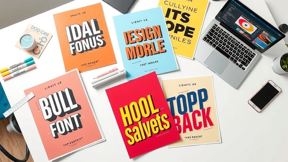
After years of minimalist design dominance, the pendulum has swung dramatically toward maximalism and bold typographic statements. Today’s poster designers are embracing vibrant colors, high-contrast fonts, and layered visual elements that demand attention and create lasting impressions. This shift represents more than just a stylistic preference; it reflects our collective desire for visual experiences that feel rich, engaging, and emotionally resonant.
The maximalist approach allows designers to pack multiple layers of meaning into a single poster, using typography to create hierarchy, emotion, and visual interest simultaneously. Bold fonts serve as both the message and the medium, transforming simple text into powerful visual statements that can anchor entire design compositions. This trend has proven particularly effective in commercial applications, where posters must compete for attention in crowded visual environments.
Contemporary designers are also experimenting with liquid retro typography, combining wavy, fluid shapes with nostalgic fonts to bring movement and playfulness to static designs. This technique creates a sense of dynamism that draws viewers in and encourages longer engagement with the poster’s message. The revival of vintage aesthetics combined with modern digital techniques has created a unique visual language that appeals to audiences seeking both familiarity and innovation.
Technology’s Revolutionary Impact on Typographic Design
Artificial intelligence and digital design tools have fundamentally transformed how typographic posters are conceived, created, and refined. The democratization of design through AI-powered platforms has opened professional-level typography to creators who previously lacked technical expertise or expensive software access. Over 40% of new designers are now using AI for typography in 2025, demonstrating how technology has lowered barriers to entry while simultaneously raising creative possibilities.
AI-driven typographic tools enable custom text art creation, intelligent font pairings, and automated layout suggestions that would have required years of design experience to master manually. These platforms can analyze successful typographic combinations, suggest improvements, and even generate entirely new font variations based on specific project requirements. The result is a new generation of typographic posters that blend human creativity with machine precision.
Digital tools have also enabled real-time experimentation with typography effects, color combinations, and layout variations. Designers can now iterate rapidly through dozens of typographic approaches, testing different emotional tones and visual impacts before settling on final designs. This technological evolution has led to more sophisticated and nuanced typographic poster designs that leverage both traditional design principles and cutting-edge digital capabilities.
The integration of machine learning algorithms has particularly enhanced font selection processes, with AI systems capable of analyzing brand requirements, target audience preferences, and contextual factors to recommend optimal typographic choices. This technological assistance has proven invaluable for both seasoned designers seeking fresh perspectives and newcomers learning the fundamentals of effective typographic communication.
The Psychology and Cultural Impact of Typographic Communication
Typography in poster design operates on multiple psychological levels, influencing how viewers perceive, process, and remember visual messages. Different font choices trigger distinct emotional responses: serif fonts often convey tradition and reliability, while sans-serif options suggest modernity and clarity. Script fonts can evoke elegance or casualness depending on their execution, and display fonts create personality and distinctiveness that helps posters stand out in crowded visual landscapes.
The cultural dimension of typographic poster design has become increasingly important as designers seek to create work that resonates with specific audiences and reflects contemporary values. Retro typography trends, for instance, tap into collective nostalgia while offering comfort and familiarity in uncertain times. These design choices aren’t merely aesthetic decisions; they’re strategic communications that help establish emotional connections between posters and their intended audiences.
Research indicates that posters with strong typographic elements are more likely to be remembered and shared, particularly when they employ bold, high-contrast fonts that create immediate visual impact. This finding has significant implications for both commercial and artistic poster applications, suggesting that typography serves as a crucial bridge between initial visual attraction and lasting message retention. The text art renaissance we’re witnessing today reflects this understanding, with designers increasingly treating typography as the star of their compositions rather than a supporting player.
Furthermore, cross-cultural studies have revealed that typographic preferences vary significantly across different demographic groups, with younger audiences gravitating toward experimental and unconventional font choices while older demographics often prefer traditional, readable typefaces. This insight has prompted designers to develop more targeted typographic strategies that account for audience-specific preferences while maintaining universal appeal. The psychological impact of typography extends beyond mere aesthetics, influencing purchasing decisions, brand perception, and even social sharing behaviors in measurable ways.


