
Sherwin Williams Origami White (SW 7636): Paint Review
Picking the right white paint seems easy until you realize how many options are out there. I’ve been through the same thing, holding up paint chips that all look nearly the same until they’re on the wall.
That’s why I put this guide together: to help you figure out if Sherwin-Williams Origami White (SW 7636) is the white you’ve been searching for.
I’ll show you how it behaves in real rooms, how the lighting and finish affect it, and what colors it works best with. You’ll also get a few lookalikes from other brands and smart shopping tips to help you decide confidently.
Getting to Know Origami White by Sherwin-Williams

Origami White (SW 7636) by Sherwin-Williams is a soft, creamy white that’s often described as a warm off-white. It’s part of the brand’s trusted neutral palette and works across a variety of spaces, from traditional to transitional and even light-modern rooms.
Basic Color Profile
HEX code: #E5E2DA
LRV (Light Reflectance Value): 76
Color family: Soft white with warm gray undertones
Origami White is part of Sherwin-Williams’ White Paint Colorscollection, a palette designed to feel clean, calming, and natural.
It’s a warm off-white that has enough softness to feel cozy but still reads like a true white in most spaces.
Undertones Explained
Origami White has warm gray and soft taupe undertones, which makes it more forgiving than cooler whites but less yellow than a true cream.
- In daylight, the warm gray softens the space without making it feel too creamy.
- Under warm bulbs, it leans a little more taupe but doesn’t go beige or dingy.
This balance of tone is what makes Origami White so easy to live with. It rarely looks stark or sterile.
Origami White in Real Spaces
Origami White doesn’t behave the same in every room. Here’s what to expect based on how and where you use it.
How It Looks in Different Rooms
Kitchens

Origami White makes kitchens feel fresh and timeless. It pairs beautifully with wood cabinets, brass hardware, and light countertops. Its warmth softens bright lighting without looking yellow.
Bathrooms

In bathrooms, it brings a clean and cozy look. Combine it with marble tile or brushed gold fixtures to keep it feeling upscale without being cold. It’s especially nice in small bathrooms where cool whites feel too harsh.
Living Rooms

Origami White adds softness and comfort to living rooms. It blends well with both warm and cool-toned furniture, creating a backdrop that feels neutral but not flat.
Bedrooms

In bedrooms, Origami White creates a soothing, light-filled atmosphere. It’s a great choice if you want a white that feels relaxed rather than stark. Works well with linen textures, warm woods, or soft-toned textiles.
This color really shines in homes where you want a natural, inviting feel without the crispness of pure white.
How Lighting Affects It
Lighting has a huge impact on how Origami White reads:
North-facing rooms: These bring out the cooler, gray side of Origami White. Expect a slightly muted look.
South-facing rooms: The bright natural light warms up Origami White just enough to make it feel creamy and cozy.
East-facing rooms: Morning light makes Origami White feel fresh and clean.
West-facing rooms: Evening light draws out the taupe side, making the color feel slightly deeper and richer.
Try samples on different walls and view them at different times of day before making your decision.
Origami White vs. Other Sherwin-Williams Neutrals
Sherwin-Williams offers a bunch of great off-whites. Here’s how Origami White stacks up against some popular choices:
Origami White vs. Alabaster
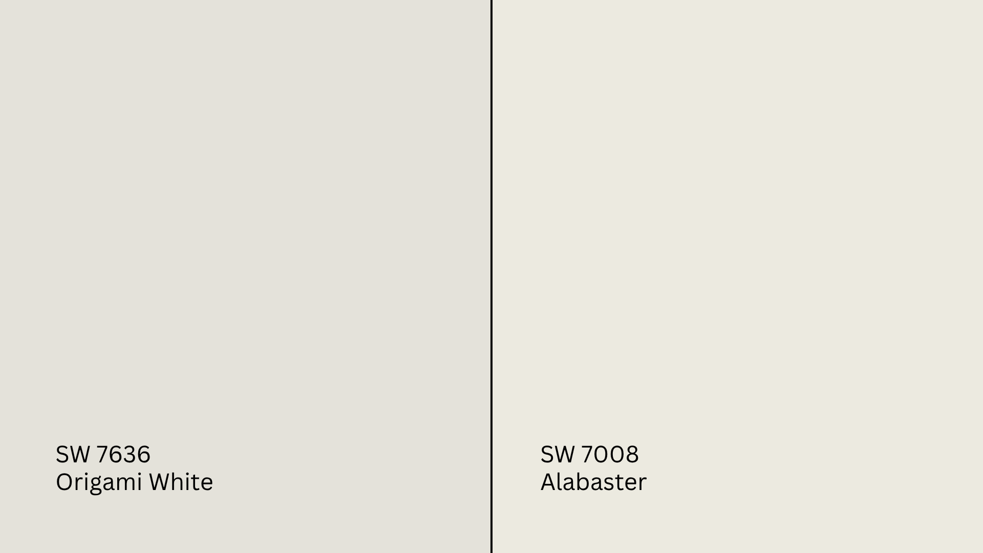
Alabaster (SW 7008, #EDEAE0) is slightly warmer and creamier than Origami White.
- Alabaster feels cozier in low light.
- Origami White is softer and more neutral, with gray in the base.
Go with Alabaster for a warmer, creamy look. Stick to Origami White for subtle warmth with a fresher finish.
Origami White vs. Greek Villa

Greek Villa (SW 7551, #F0ECE2) is another warm white with creamy undertones.
- Greek Villa leans more yellow in sunlight.
- Origami White stays more balanced and slightly more modern.
Greek Villa is better for traditional rooms; Origami White feels a bit more flexible.
Origami White vs. Snowbound
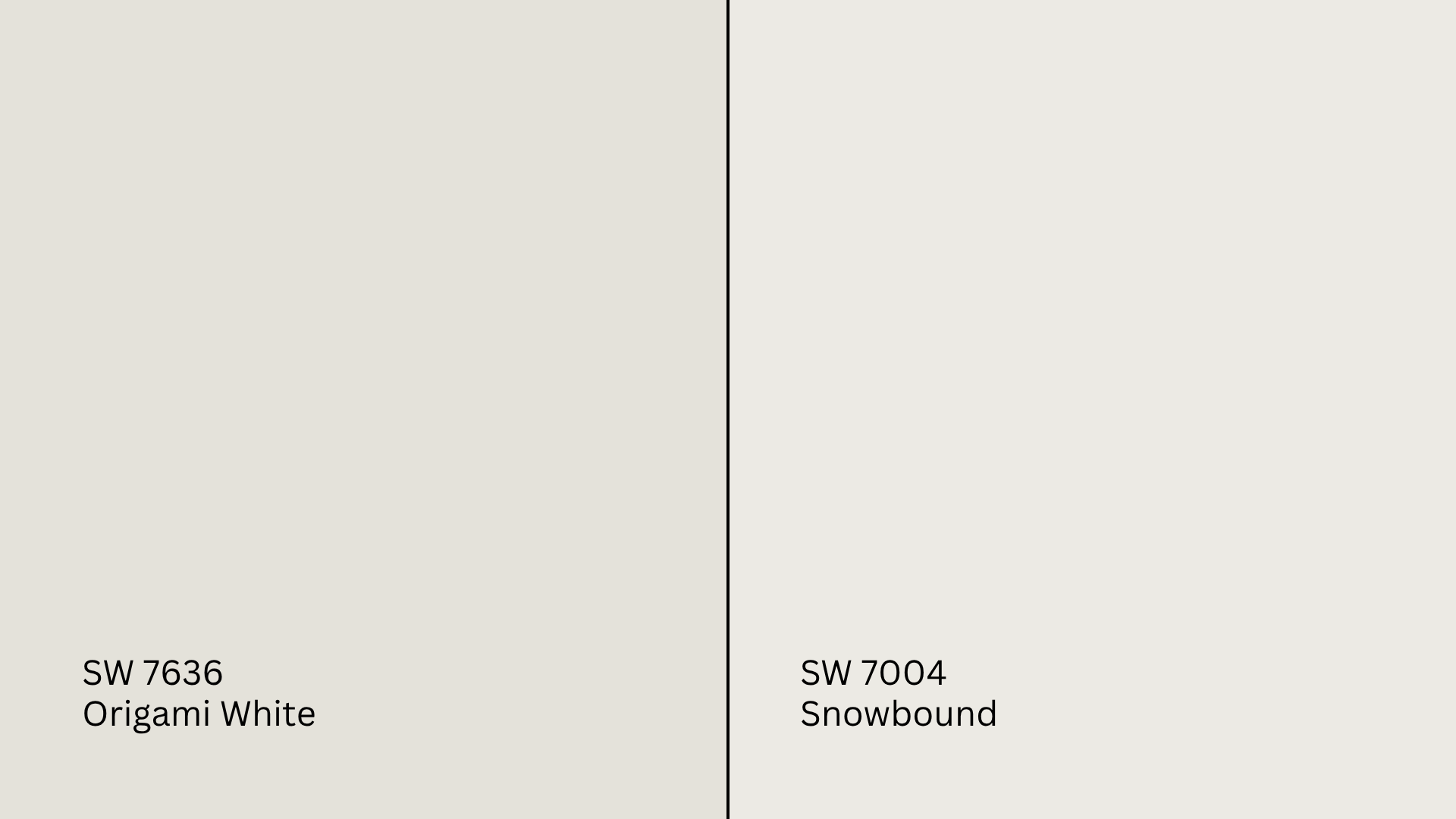
Snowbound (SW 7004, #EDEAE5) is cooler, with subtle pink or purple undertones.
- Snowbound is crisper and feels cooler in most lighting.
- Origami White is warmer and more grounded.
Choose Snowbound for contrast against warm finishes. Choose Origami White for a soft neutral base.
Origami White vs. White Duck
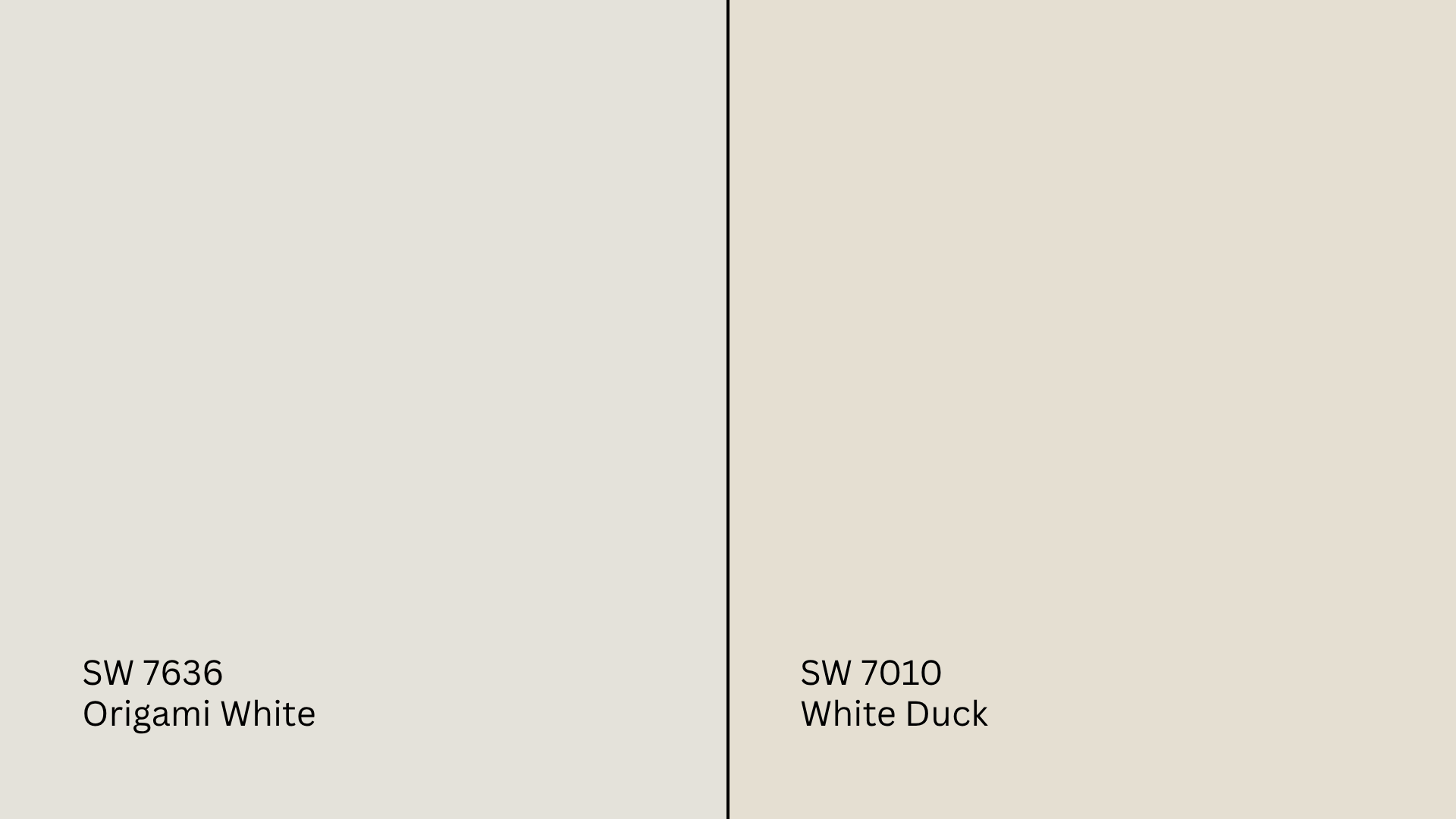
White Duck (SW 7010, #E5DFD2) is much warmer and leans greige.
- White Duck is almost beige in warm light.
- Origami White keeps more of a soft, off-white presence.
Use White Duck if you’re styling with deep woods or earthy tones. Origami White is more versatile.
Undertone and LRV Comparison Table
| Paint Color | Undertones | LRV | Warm or Cool |
|---|---|---|---|
| Origami White | Warm gray/taupe | 76 | Warm |
| Alabaster | Creamy beige | 82 | Warm |
| Greek Villa | Yellow-white | 84 | Warm |
| Snowbound | Cool pink-purple | 83 | Cool |
| White Duck | Beige-greige | 74 | Warm |
Best Color Pairings for Origami White
Origami White is easy to work with, but the right pairings make it even better. Here’s how to bring it all together.
Trim and Ceiling Suggestions
Pure White (SW 7005, #EDECE6): Clean and crisp, but not stark. Great for trim or ceiling.
Alabaster (SW 7008, #EDEAE0): Adds warmth to match Origami White’s cozy side.
Extra White (SW 7006, #EEEFEA): A high-brightness white for more contrast.
Keep ceiling finishes matte or flat to avoid shine.
Accent Wall and Furniture Colors
For a soft, serene look, pair Origami White with warm gray, blush, muted olive, or light clay. These work especially well in bedrooms and living areas.
For contrast, try navy, charcoal, espresso brown, or even black. These tones sharpen Origami White and give the space more edge.
Stick to neutral upholstery in beige, tan, or oatmeal for balance. Use color in throws, art, or accent chairs to bring it to life.
Hardware and Flooring Compatibility
Hardware like brushed nickel or champagne bronze blends nicely with Origami White’s warmth. Matte black can work too if you want contrast.
For flooring, white oak or natural maple keeps it light. Medium tones like chestnut or walnut bring warmth and depth. For tile, go with warm grays or creamy whites that echo the wall tone.
Paint Finish Recommendations
The finish you choose will change how Origami White looks and wears. Here’s what to expect:
Matte: Best for ceilings and bedrooms. Gives Origami White a soft, almost powdery feel.
Eggshell: Works in living rooms or dining rooms. Just enough shine to reflect light without glare.
Satin: Great for high-traffic spaces. This finish will brighten Origami White a little and make undertones more visible.
Still unsure? Test the same sample in two finishes under your room’s lighting for a side-by-side comparison.
Sampling and Buying Options
Before buying gallons, always test Origami White in your space. Lighting, nearby finishes, and wall texture can shift how it looks.
Where to Get Peel-and-Stick Samples
- Samplize sells real Sherwin-Williams paint swatches with a sticky backing. No mess, easy to move.
- Sherwin-Williams stores carry sample chips and small tester pots.
- Hardware stores may offer Origami White in custom sample sizes.
Place samples on multiple walls and check them during different times of the day to see the undertones clearly.
Where to Buy the Paint
- Sherwin-Williams.com: Online ordering, pickup, or delivery
- Sherwin-Williams stores: Stocked in all finishes
- Authorized dealers: Can mix or match on demand
- Big box stores: May not stock, but can custom order
Call ahead if you’re looking for same-day pickup or curbside options.
Paint Equivalents in Other Brands
Can’t get Sherwin-Williams nearby or want to match a different brand? Here are some similar shades.
Benjamin Moore: Try White Dove (OC-17, #F0EDE4) or Swiss Coffee (OC-45, #EDEAE0) for a soft white with gentle warmth.
Behr: Look at Almond Wisp (PPU5-12, #D6C9BA)or Spun Cotton (YL-W09, #F7F2E4) for creamy off-whites.
Valspar: Check out Du Jour (7002-6, #F4F2EB) or Cream in My Coffee (3005-10C, #E8DFCF) for warm white alternatives.
Always test them first. Even small changes in base formulas can make a big visual difference.
Conclusion
If you’ve made it this far, I’d say you’ve got a good feel for whether Sherwin-Williams’ Origami White fits your home.
You’ve seen how it plays out in real rooms, how lighting and finishes shift the tone, and which colors pair best.
I’ve learned that whether you shop in-store or online, being prepared makes all the difference. Just don’t skip testing it on your own walls; lighting can change things more than you’d think.
Still checking out your options? Read my other paint guides. You’ll be able to compare shades easily and find one that really works for your space. Take a look at the website before you decide.


