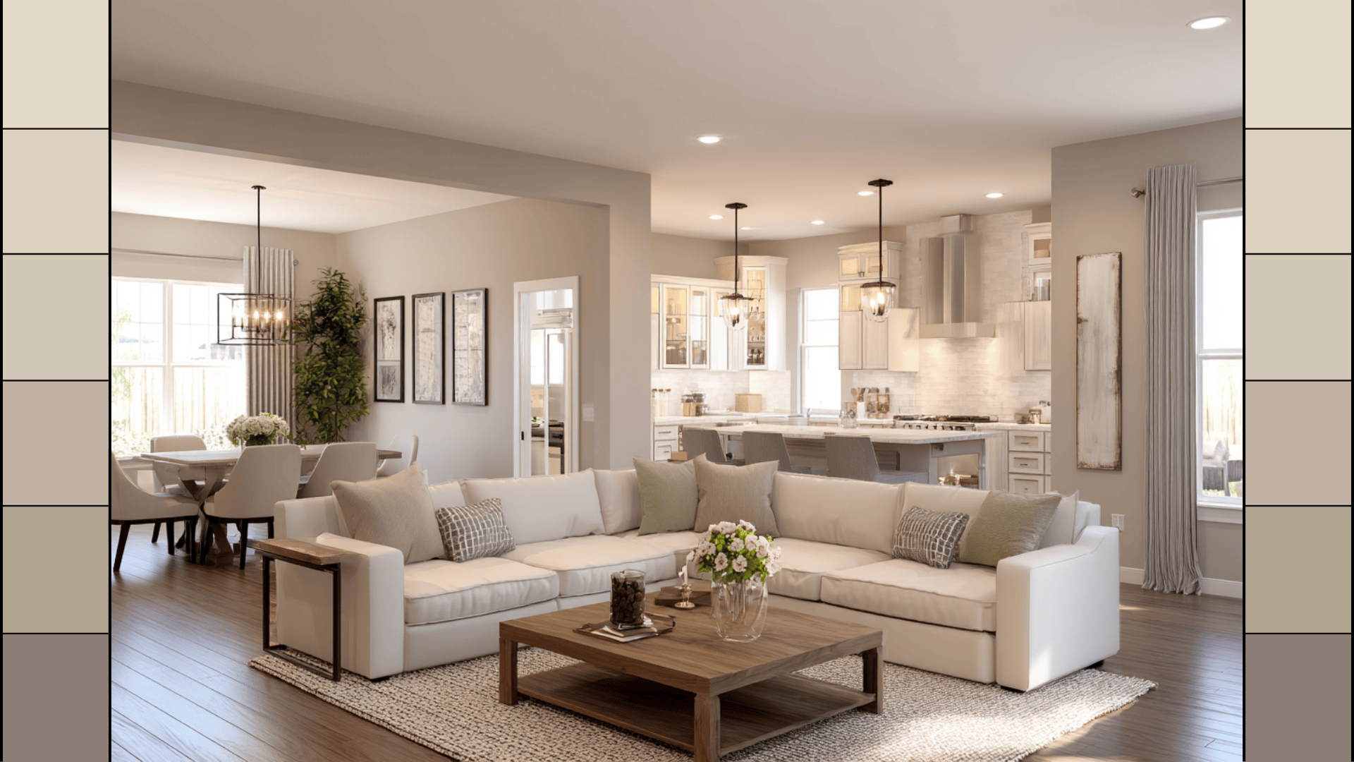
Sherwin Williams Accessible Beige Color Strip: Paint Review
Choosing the right neutral can be overwhelming, but Sherwin-Williams makes it easier with thoughtfully designed color strips. One of the most loved? The Accessible Beige Color Strip. It’s warm, natural, and flexible, without feeling too gray or too yellow.
If you’ve been eyeing Accessible Beige (SW 7036), this guide will walk you through its full color strip, so you can see what pairs with it, how each shade behaves, and where they work best.
You’ll also find sample tips, buying options, and easy combos to try in your own space. Let’s take a look.
What Is the Accessible Beige Color Strip?
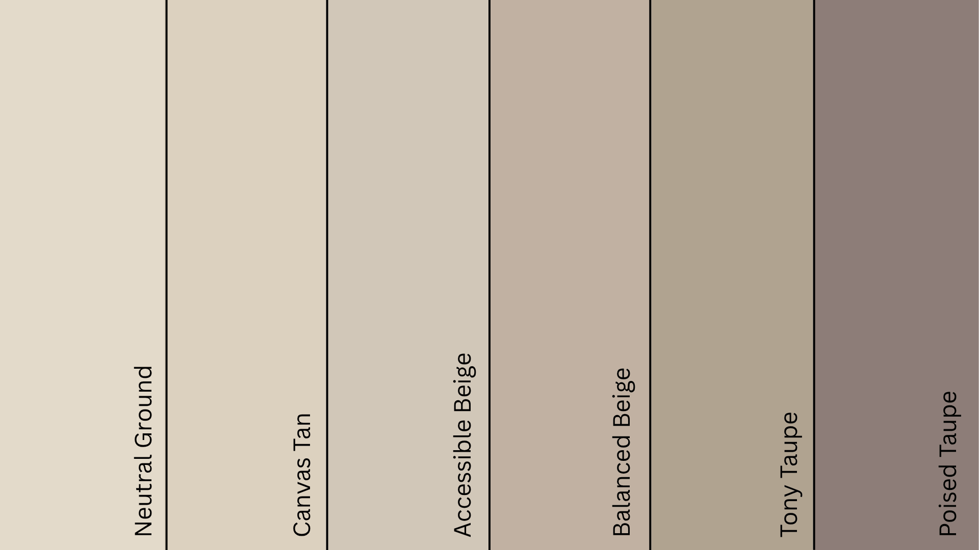
A Sherwin-Williams color strip is a coordinated set of paint shades that live in the same color family but vary in depth and saturation. The Accessible Beige color strip includes a smooth gradient of warm neutrals that range from soft and airy to rich and grounding.
Here’s what’s typically included in this strip:
| Paint Color | SW Code | HEX | LRV | Undertone |
|---|---|---|---|---|
| Neutral Ground | SW 7568 | #E2DACA | 70 | Warm cream-beige |
| Canvas Tan | SW 7531 | #DCD1BF | 64 | Soft warm tan |
| Accessible Beige | SW 7036 | #D1C7B8 | 58 | Beige-gray |
| Balanced Beige | SW 7037 | #C0B2A2 | 46 | Warm beige |
| Tony Taupe | SW 7038 | #B1A290 | 37 | Earthy taupe |
| Poised Taupe | SW 6039 | #8C7E78 | 27 | Muted purple-taupe |
Each shade in this strip coordinates naturally with the next. They’re easy to layer in the same space or use individually, depending on the look you want.
Getting to Know Accessible Beige (SW 7036) by Sherwin-Williams
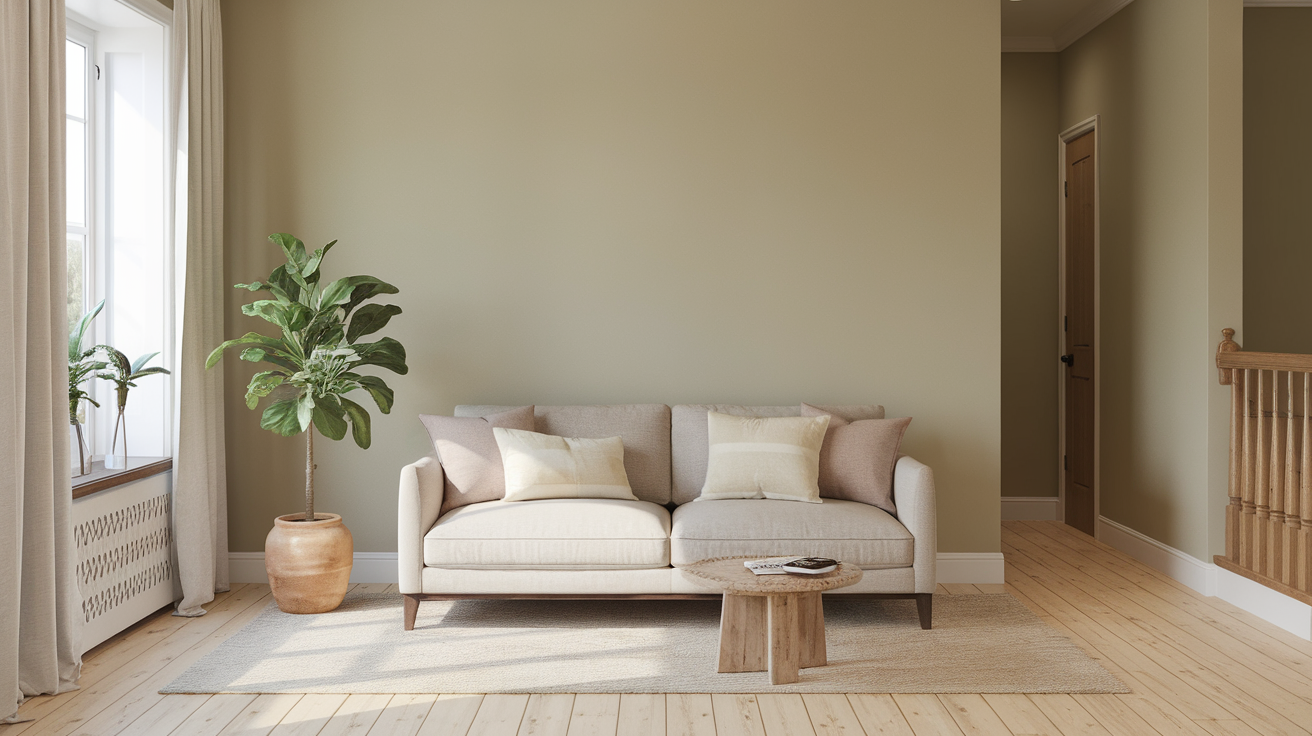
Accessible Beige is the heart of this strip, a warm, greige-inspired neutral that never feels too cold or too yellow. Its 58 LRV makes it light enough to feel open but grounded enough to add warmth and body to any room.
In daylight, Accessible Beige feels airy and balanced. In low light, its soft warmth becomes more noticeable, making the room feel cozy.
Accessible Beige works just as well on walls as it does on cabinets, exteriors, or even ceilings when paired with contrasting trim.
Where to Use the Accessible Beige Color Strip
This palette is ideal for homes that lean warm, relaxed, and classic. Each color on the strip serves a purpose, from softening bright rooms to grounding cozy corners. Here’s how to use each one effectively:
Neutral Ground (SW 7568)
Best for: Ceilings, trims, low-contrast walls
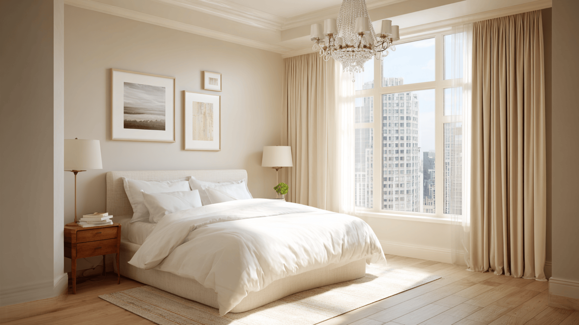
This soft cream-beige is a great alternative to white. It works well on ceilings, trims, or even entire walls in sunlit spaces where stark white might feel too bright. Also nice in bedrooms or guest rooms for a calm, natural backdrop.
Canvas Tan (SW 7531)
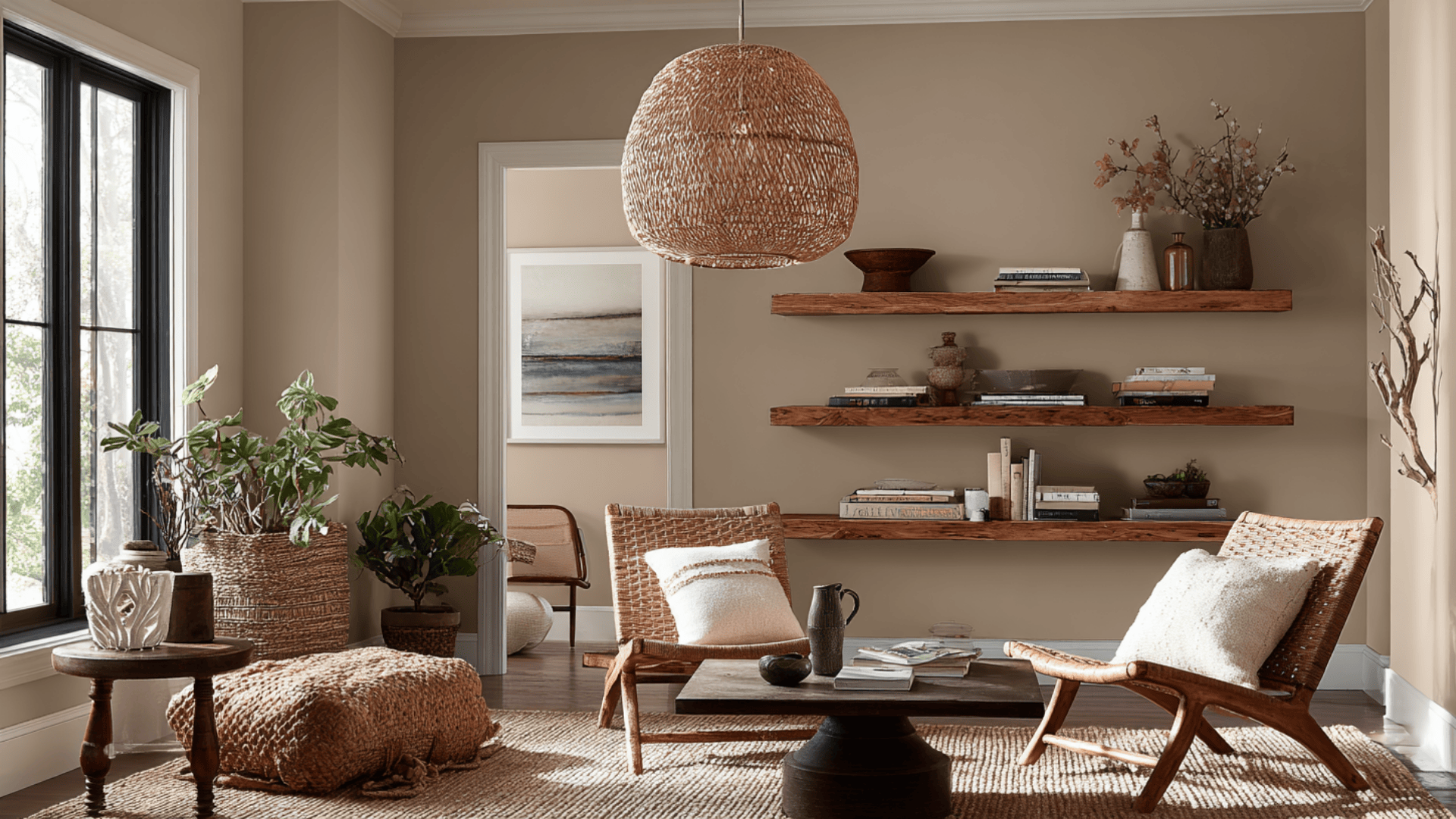
Best for: Living rooms, kitchens, or transitional spaces
A warm tan that’s subtle but not boring. It looks beautiful in the main living areas, especially when paired with natural woods and warm metals. Use it to connect adjoining rooms or anchor an open-concept space.
Accessible Beige (SW 7036)
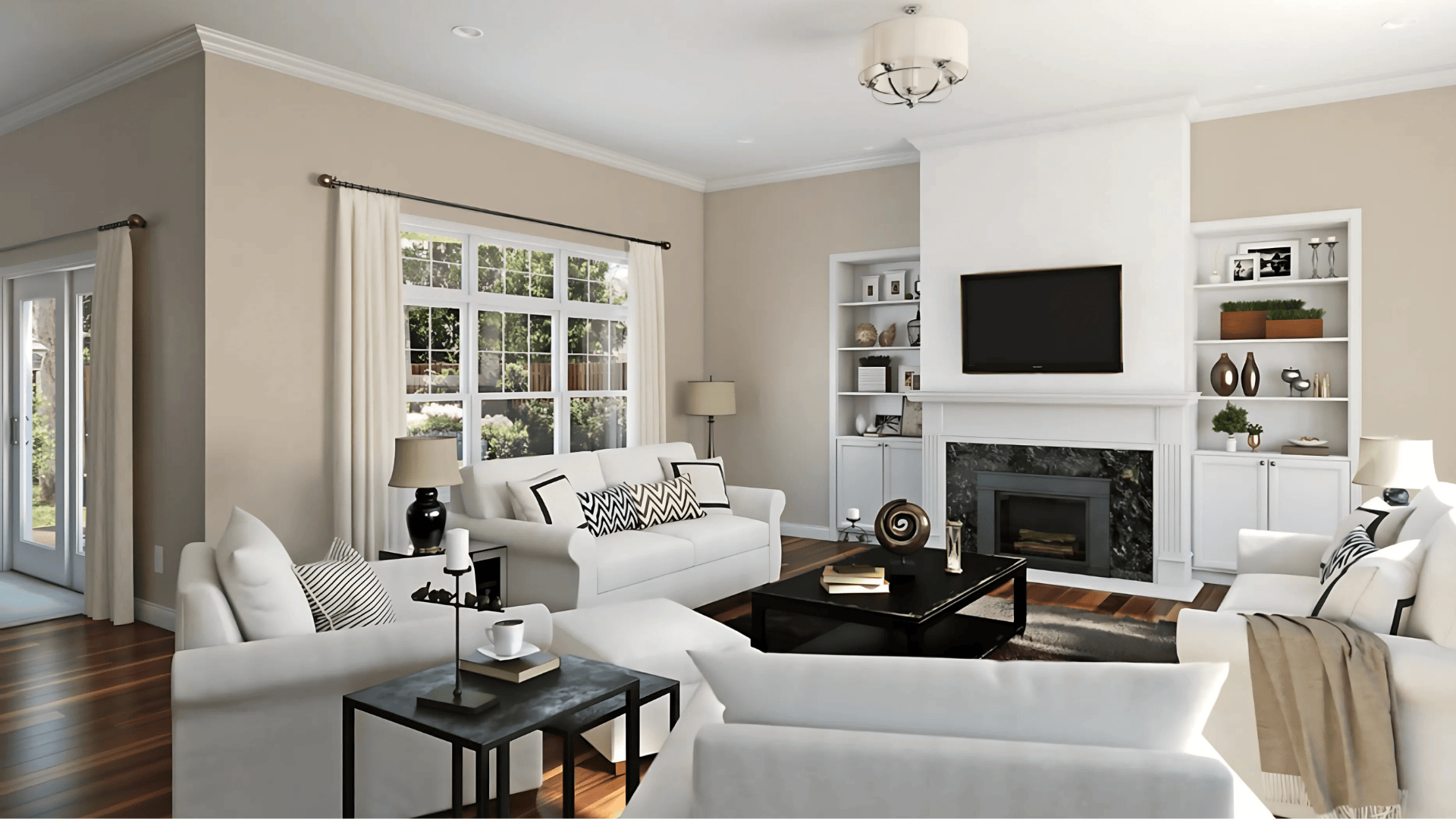
Best for: Bedrooms, living rooms, and open-plan layouts
This is the hero shade of the strip: balanced, versatile, and neutral enough for any space. It’s especially effective in areas with mixed lighting or where you want the color to “stay put” throughout the day.
Balanced Beige (SW 7037)
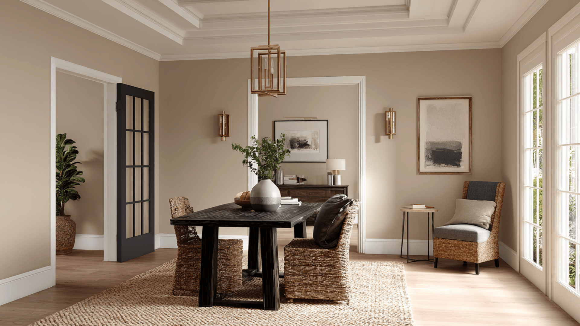
Best for: Dining rooms, offices, and feature walls
Slightly deeper than Accessible Beige, this shade adds visual depth without overpowering a room. It’s perfect for adding warmth to formal spaces or creating a cozy, inviting backdrop in bedrooms or dens.
Tony Taupe (SW 7038)
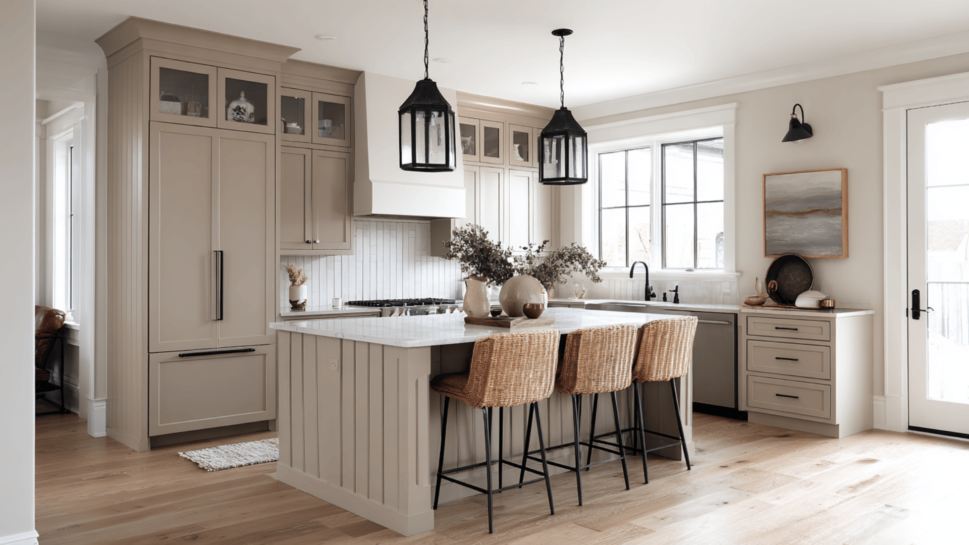
Best for: Built-ins, cabinetry, wainscoting, or small rooms
This earthy taupe brings mood and richness. Use it on lower walls, kitchen islands, or office cabinetry to ground the space. It also pairs well with lighter tones from the strip for contrast.
Poised Taupe (SW 6039)
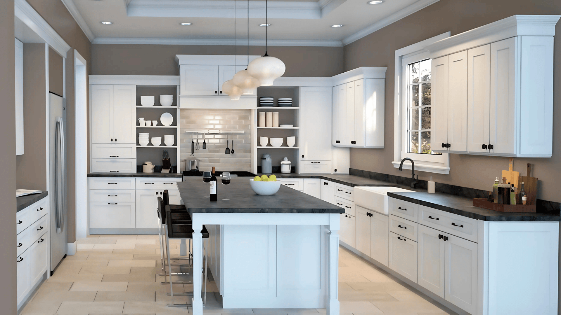
Best for: Accent walls, exteriors, and bold trim
The deepest shade in the strip, Poised Taupe, offers a moody, sophisticated touch. Use it as an accent color indoors or as a bold trim or door color outside. It pairs beautifully with off-whites and warm neutrals.
Best Pairings and Trim Suggestions
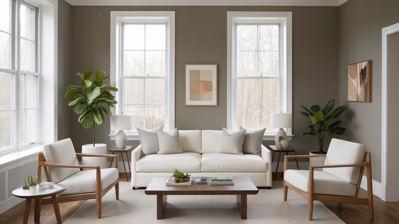
This color strip pairs well with both warm and cool tones, depending on the overall feel you want in your space. It’s versatile enough to lean cozy or modern, just by changing your accents.
Whites and Trim Options
Alabaster (SW 7008): A warm and soft white that adds comfort without looking yellow. Perfect for trim, especially with Accessible Beige and Canvas Tan.
Pure White (SW 7005): A clean, neutral white that offers subtle contrast. Great if you want a crisp look with any shade on the strip.
Shoji White (SW 7042): A warm off-white that mixes softly with the lighter tones in the strip. Ideal for a tone-on-tone look with a cozy, natural vibe.
Accent Colors
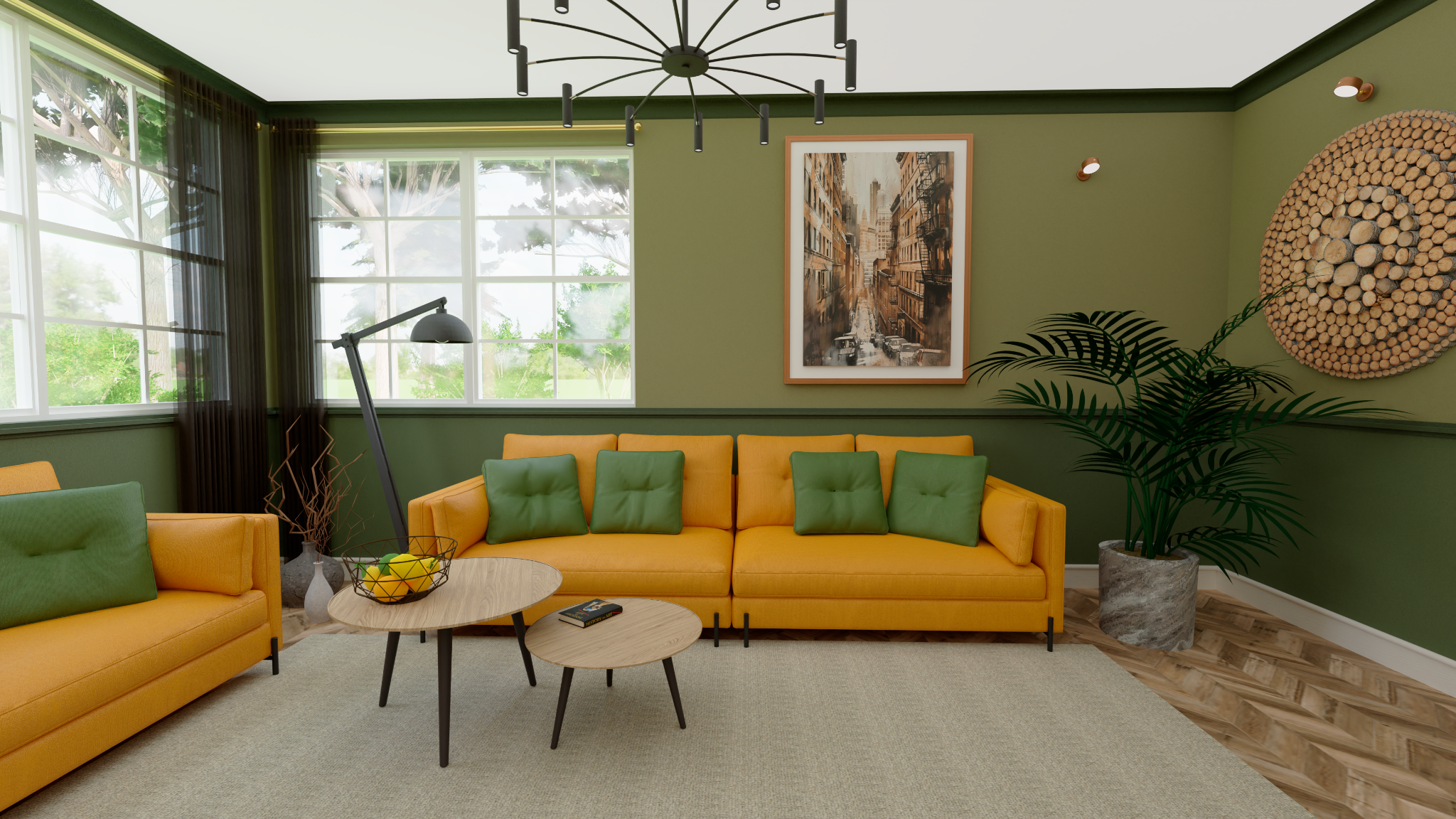
Warm accents like terracotta, bronze, olive green, and dusty rose bring out the earthy warmth in colors like Balanced Beige and Tony Taupe.
Cool accents such as slate blue, navy, charcoal, or matte black add contrast and give the palette a more modern, grounded look.
Wood Tones
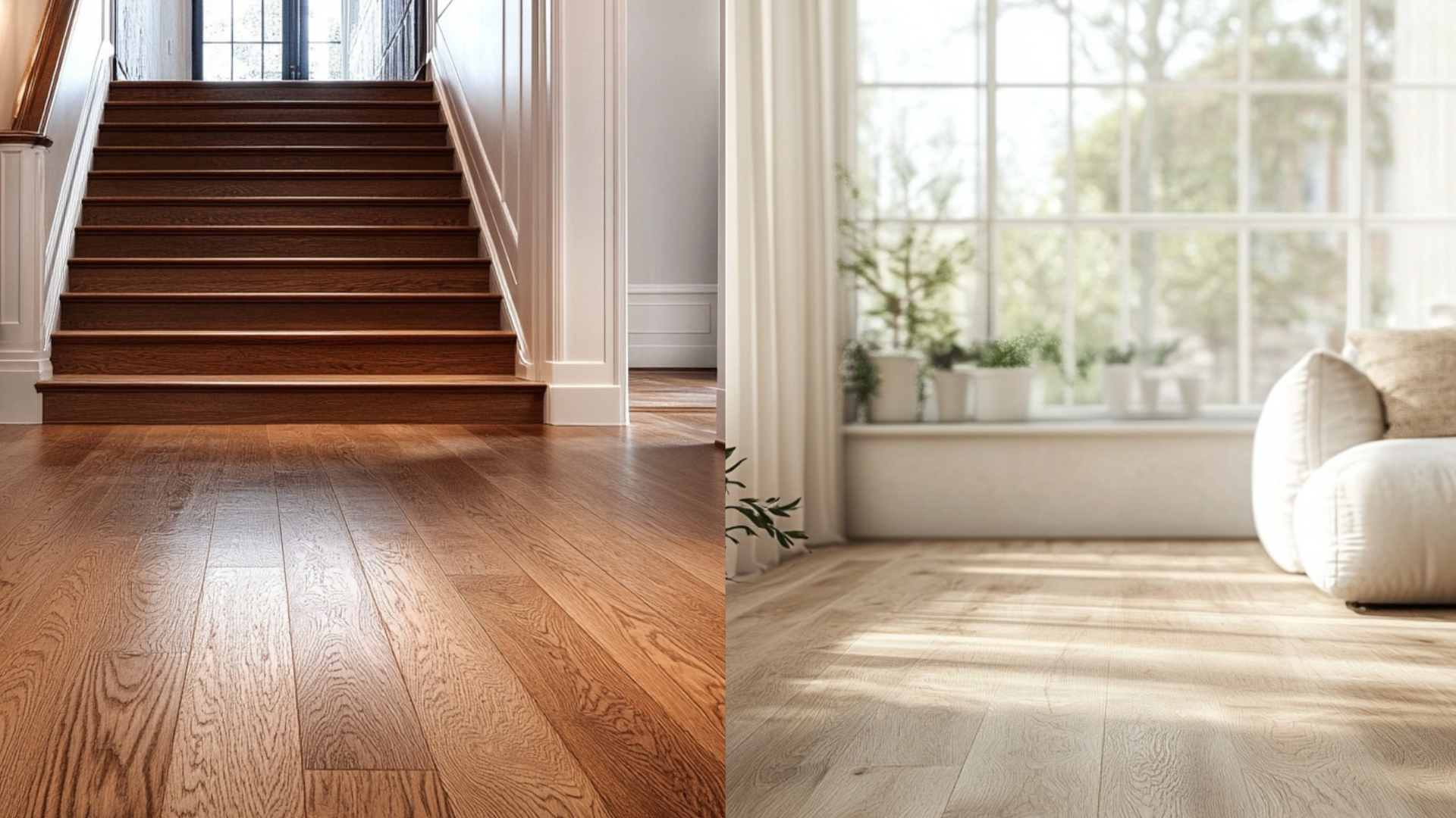
This strip works beautifully with natural wood. Lighter finishes like oak keep things airy, while walnut, chestnut, or driftwood add depth and richness without overpowering the walls.
Paint Finish Recommendations
The finish you pick will affect how these colors show up in your space.
Matte: Great for bedrooms and ceilings. Tones look softer and more powdery.
Eggshell: Works for living rooms, hallways, or offices. Soft glow without being too reflective.
Satin: Ideal for bathrooms, kitchens, and high-traffic zones. More washable and makes undertones slightly clearer.
Semi-gloss or gloss: Reserve for trim, doors, or cabinetry where you want definition and contrast.
Try the same color in two finishes if you’re undecided; how it reflects light will shift the entire mood.
Sampling and Buying Tips
Always sample before you commit; these warm tones can shift depending on lighting, furniture, and floor color.
Where to Get Peel-and-Stick Samples
- Samplize: Real Sherwin-Williams paint, removable and mess-free
- Sherwin-Williams stores: Offer paint chips and sample pots
- Online ordering: Sherwin-Williams.com offers delivery or pickup options
Place samples on different walls and observe them in natural and artificial light, especially near windows, trim, and large furniture pieces.
Buying Tips
- Sherwin-Williams.com and local stores carry all six colors in every finish.
- Custom mixing is available if you’re matching older paint jobs.
- Ask about discounts or sales, they often run 30–40% off promos on weekends.
Paint Equivalents in Other Brands
Looking to match these Sherwin-Williams colors in other brands? Here are the closest lookalikes:
| Sherwin-Williams Color | Benjamin Moore Equivalent | Behr Equivalent |
|---|---|---|
| Neutral Ground (SW 7568) | Sonnet (AF-55) | Silky White (PPU7-12) |
| Canvas Tan (SW 7531) | Cedar Key (OC-16) | Sandstone Cliff (750C-3) |
| Accessible Beige (SW 7036) | Edgecomb Gray (HC-173) | Wheat Bread (720C-3) |
| Balanced Beige (SW 7037) | Pashmina (AF-100) | Perfect Taupe (PPU18-13) |
| Tony Taupe (SW 7038) | Indian River (985) | Studio Taupe (UL140-7) |
| Poised Taupe (SW 6039) | Smoked Oyster (2109-40) | Suede Gray (PPU18-17) |
These are close visual matches, but always test samples first. Undertones and finishes can shift slightly between brands, especially under different lighting conditions.
Conclusion
If you’re leaning toward warm neutrals, the Accessible Beige Color Strip is a dependable, classic choice. You’ve now seen how each color behaves, what they pair with, and how they can be used throughout your home.
No matter if you’re redecorating a single room or planning an open-concept makeover, this palette gives you the flexibility to keep things cozy, layered, and cohesive.
Still unsure which shade to pick? Start with Accessible Beige, it’s the sweet spot of the strip. Then test the lighter or deeper tones to find your perfect match.
I’ve posted more color guides on the website if you’re looking for more options. Don’t forget to check them out.

