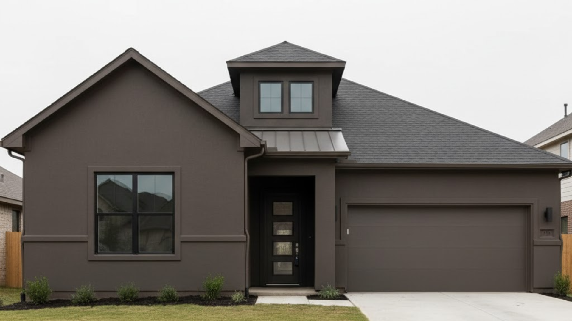
Sea Serpent vs Naval: Real-World Color Comparison
Want to find out how two similar navy blues can change the feel of a room? I want to share how each shade shapes your space differently in real life.
Some blues bring calm, while others add bold energy. Picking between these popular colors may seem tricky, but it all depends on what mood you want in your home.
Observing how they look in natural light and different rooms can help you see their true character. This real-world look will drive you closer to selecting a shade that suits your style perfectly and feels just right.
Sea Serpent vs Naval: The Difference
Sea Serpent and Naval are both dark blue paint colors that people love for calming, moody spaces with a coastal hint. The main difference between them is in how each color feels and the mood it brings to a room.
Sea Serpent paint by Sherwin-Williams gives off a quieter, more relaxed look, while Naval feels strong and dramatic. Each shade sets a slightly different scene; one is more easygoing and serene, the other bold and confident.
Both are great for making a space feel cozy, but the vibe is never exactly the same. Picking one comes down to what type of feeling is best for the room’s atmosphere and style preference.
Hale Navy is a great dupe that matches both Sherwin-Williams Sea Serpent and Naval closely. It blends the muted green undertones of Sea Serpent with the bold, classic richness of Naval in one versatile navy shade.
Shade Profile: Identifying Undertone Differences
Both colors bring depth and character, but their subtle differences can change the whole mood of a space. Let’s break down the undertones side by side:
Sherwin-Williams Sea Serpent (SW 7615)

Sherwin-Williams Sea Serpent is a moody, deep navy blue paint with unique undertones. This color features muted blue mixed with hints of gray and a soft green cast.
The green influence adds depth and keeps the blue from feeling cold or too sharp. Looking at Sea Serpent, rooms feel calm yet dramatic, with a subtle coastal vibe that is never too bold.
In bright light, the green and blue tones become more obvious, but in dim light, it looks darker and richer. The hint of gray in Sea Serpent helps soften the color and makes it easier to use anywhere.
Sherwin-Williams Naval (SW 6244)

Sherwin-Williams Naval is a true deep navy blue with classic undertones. This shade is bold and rich, with no distracting green or gray hints. It offers a pure, strong blue that brings a graceful look to any room.
Naval has crisp, dark tones that create serious impact and classic style, whether used on walls, furniture, or trim. It is loved for a “true navy” look, with no surprises in different lighting.
Naval’s depth makes a room feel cozy or dramatic, but always chic. Because it stays so pure, it matches almost any decorating style with ease.
Room by Room Comparison: Sea Serpent vs. Naval
I think both Sea Serpent and Naval bring a lovely mood and style to any room. If you want to know how they work in specific rooms, here’s a little look:
Kitchen
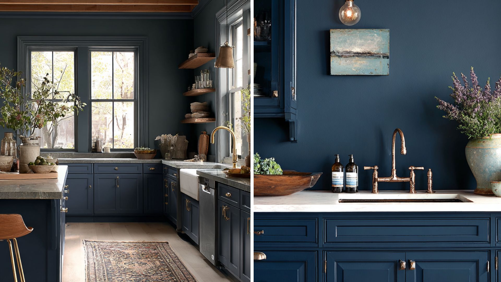
Sea Serpent: This color looks beautiful in kitchens as it brings calming energy with its muted navy tone mixed with a little green. It pairs well with white cabinets or light countertops; the gray-green base keeps things soft and cozy without feeling too dark or cold.
Naval: This is a true navy blue because it makes kitchens feel dramatic and crisp with classic depth and richness that stands out on cabinets. It looks best with lighter accents because its bold, pure blue brings a smart, sharp style while staying classy.
Bedroom
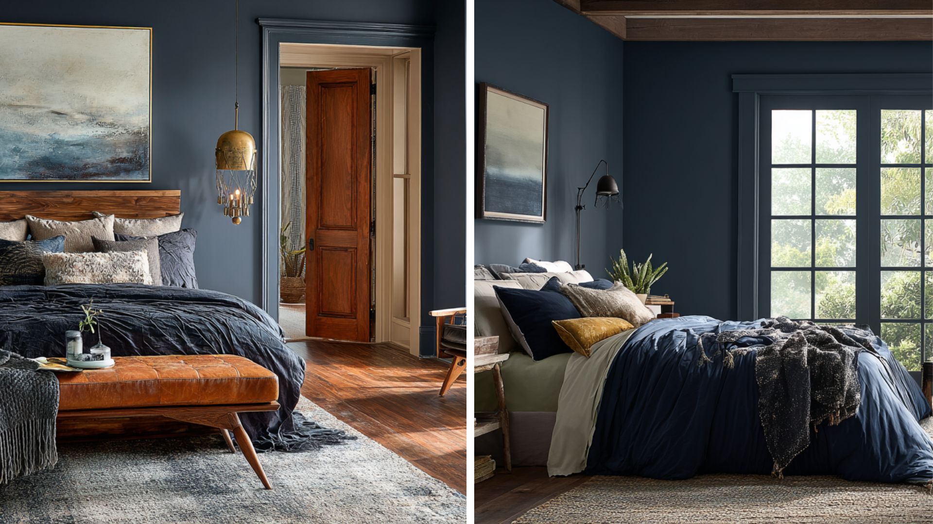
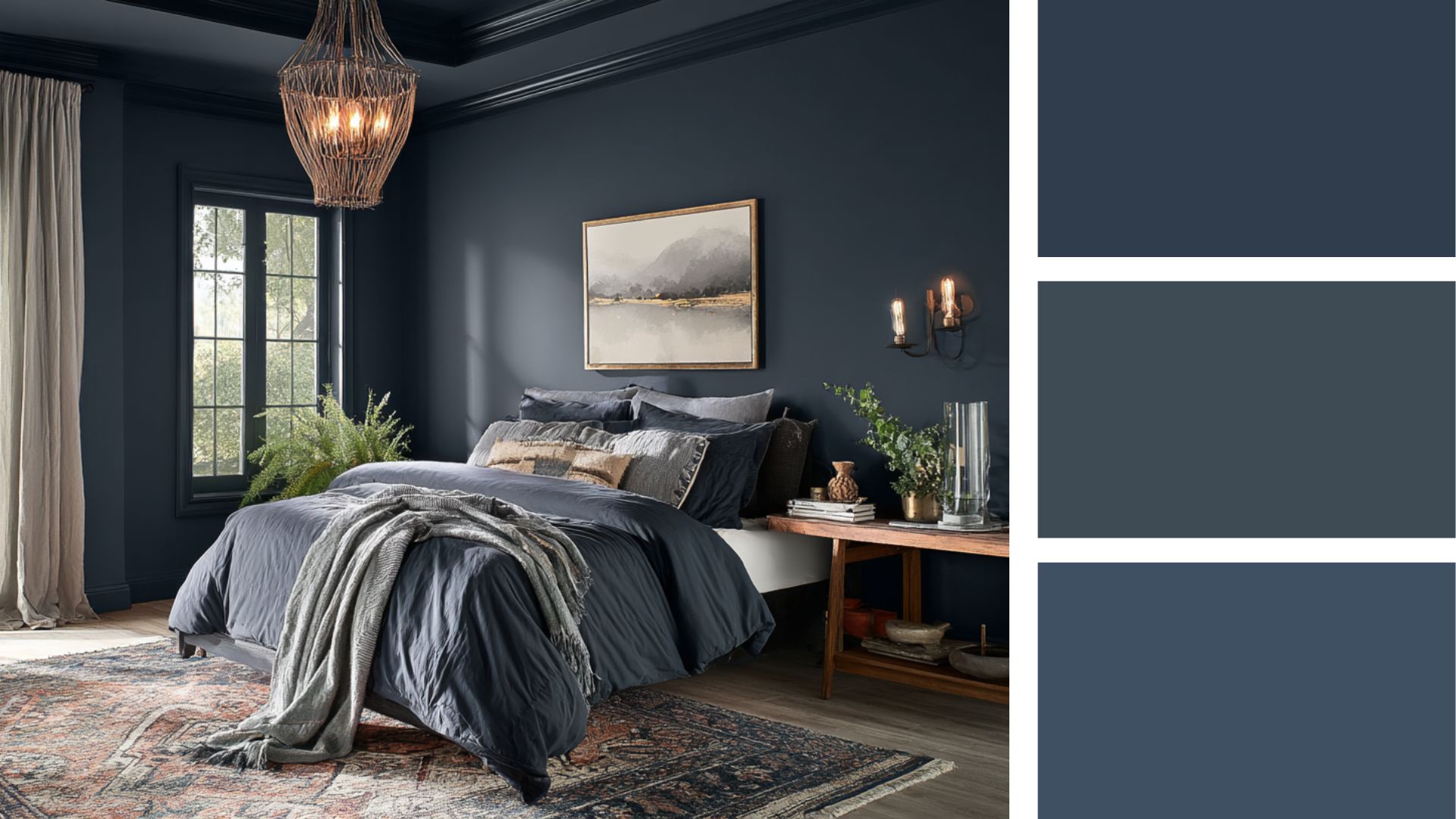
Sea Serpent: Bedrooms with Sea Serpent feel restful. This gentle mix of navy, gray, and green tones creates a calm retreat. It softens the space while adding a cozy mood. This works well on all walls or as an accent for a modern, relaxing bedroom.
Naval: This classic navy adds depth, confidence, and style without overpowering the bedroom. It creates a dramatic yet welcoming space. The rich blue makes the bedroom feel like a designer hotel while keeping comfort.
Coordinating Colors for Each Shade
Choosing the right coordinating colors can make Sea Serpent and Naval look even better. These colors work together nicely to balance the mood and style. Here are some great picks for each shade:
Sea Serpent
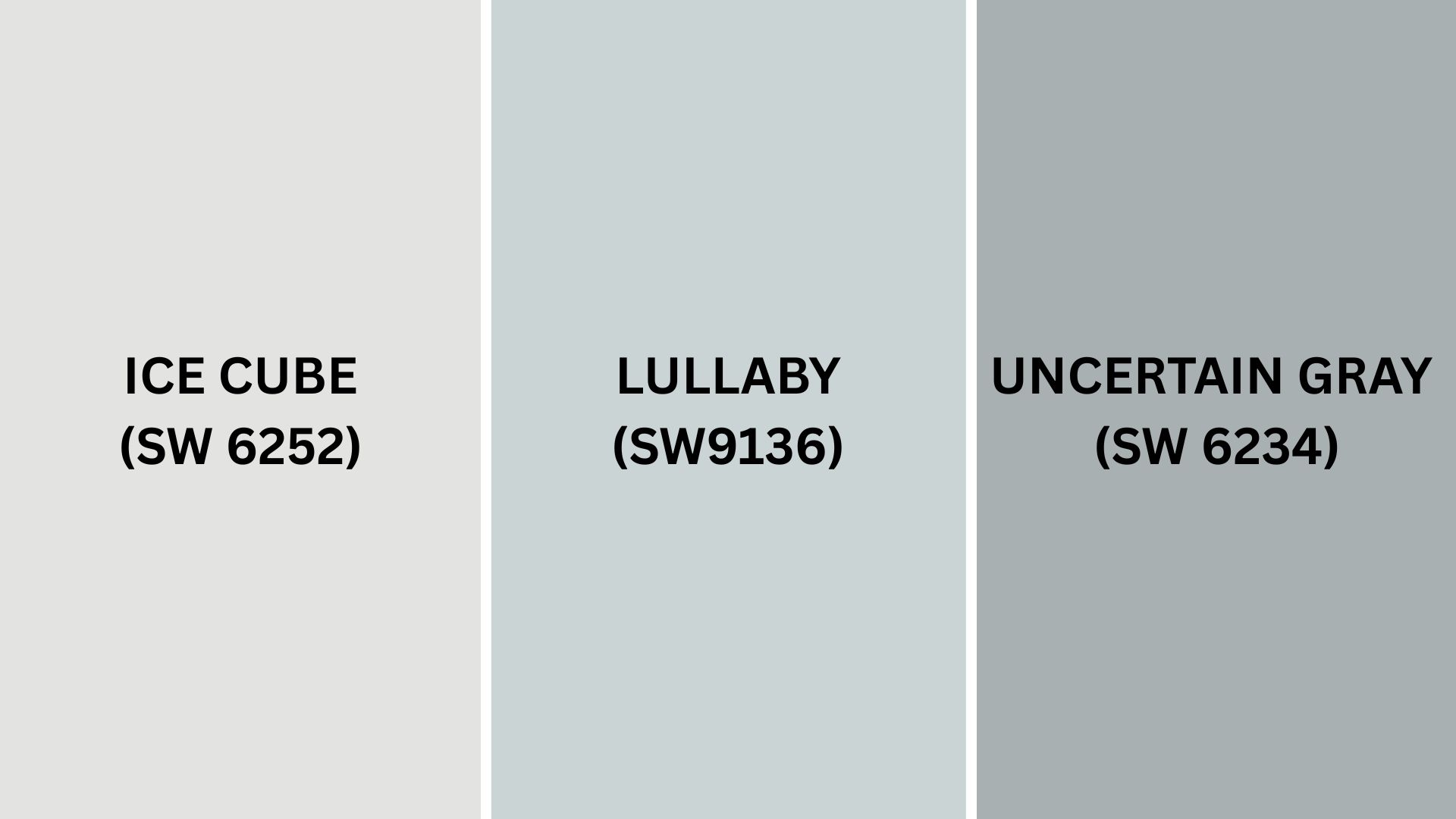
Here are some colors that go well with Sea Serpent:
- Ice Cube (SW 6252): This is a light gray that cools and brightens Sea Serpent’s deep richness.
- Lullaby (SW 9136): A soft creamy white that adds warmth to balance Sea Serpent’s green-blue tone.
- Uncertain Gray (SW 6234): A medium gray that blends with Sea Serpent’s muted depth for a calm feel.
These colors create a gentle and balanced look when paired with Sea Serpent.
Naval
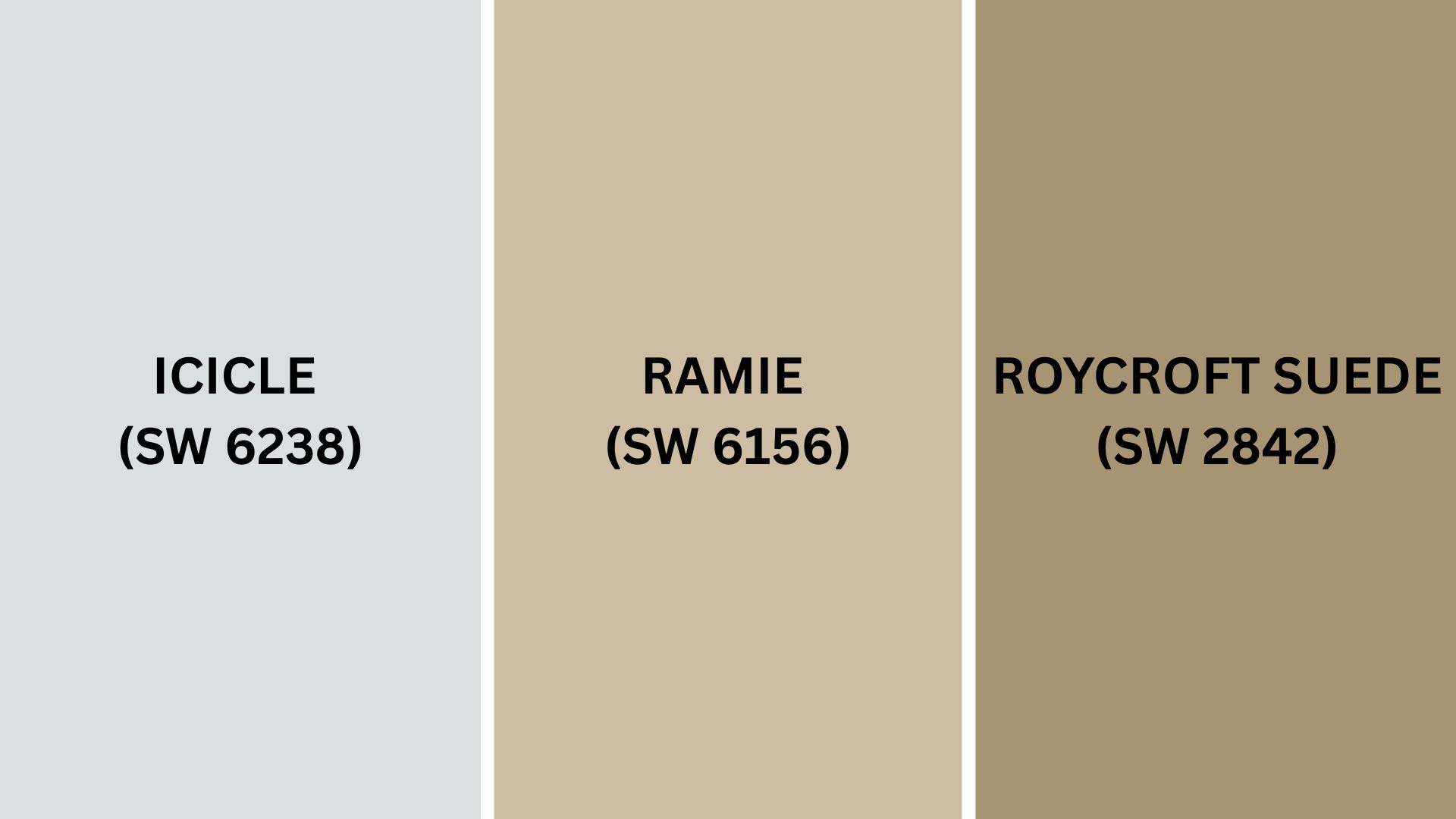
For Naval, these colors make beautiful pairs:
- Icicle (SW 6238): A clean, crisp white that highlights Naval’s deep navy color.
- Ramie (SW 6156): A creamy beige that softens Naval’s boldness with warmth and balance.
- Roycroft Suede (SW 2842): A rich taupe that adds earthiness to the strong navy shade.
These choices bring out Naval’s classic richness without losing warmth or softness.
Final Words
After understanding how these two navy blues work in real rooms, you can see they each create their own vibe.
The choice you make will shape how your space feels and looks daily. Both shades offer beauty and appeal, whether you want calm comfort or bold style.
I’m excited to hear what you’d choose or how you’d use these colors in your home.
So, why not share your thoughts or experiences? Your comment below could help others in making their color choices.


