Reviewing Sherwin Williams Cashmere Interior Latex Paints
Sherwin-Williams Cashmere has become popular with homeowners for good reasons. This paint creates a smooth finish that makes walls look professional with less effort.
The paint feels soft to the touch when dry. Many people notice this difference right away when they visit rooms painted with Cashmere.
Cashmere covers walls better than regular paint. Most projects only need two coats instead of three.
The paint levels itself as it dries, which helps hide small brush marks and mistakes around trim.
Testing has shown that Cashmere stands out from other brands due to its buttery smooth finish. The paint may cost more than basic options, but the results make it worthwhile.
We will cover everything needed to use Cashmere paint successfully. Learn about prep work and finishing techniques to get the best results for any painting project.
About Sherwin-Williams Cashmere
Sherwin-Williams Cashmere is a type of paint specifically designed for use on walls inside your home.
It is very smooth and easy to use, making walls look soft and nice. It comes in many colors so that you can pick your favorite shade.
Cashmere paint can be shiny or flat, depending on what you want. It covers well and hides little marks on the wall. This paint dries evenly, so you don’t see brush or roller lines.
It is also easy to clean if your walls get dirty. People like it because it makes rooms feel cozy and fresh.
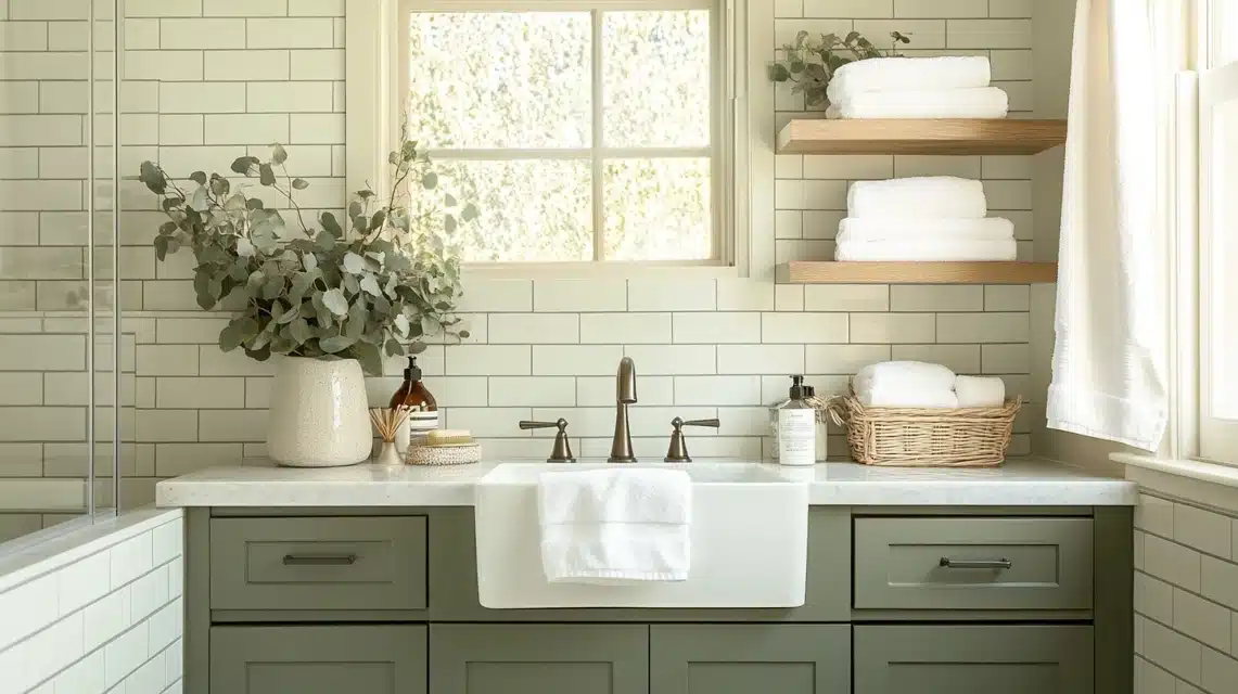
Cashmere paint is good for bedrooms, living rooms, and other indoor spaces where you want a calm, pretty look. It is safe and not too strongly smelly, making it suitable for homes as well.
Using Sherwin-Williams Cashmere in Different Rooms
Sherwin-Williams Cashmere offers a smooth, stylish finish that works beautifully in many spaces.
Here’s how it can enhance different rooms in your home.
1. Cashmere in Living Rooms

I painted my living room in Cashmere Agreeable Gray last month, and the results exceeded my expectations. The paint’s rich texture made my walls look smooth even though they had some minor flaws.
I found that morning light brings out subtle warmth in the color, while evening light creates a soft, welcoming feel.
2. Applying Cashmere in Bedrooms

The bedroom was my next project, and I went with Cashmere Sea Salt. I was worried about brush marks showing up in the morning light that streamed through my windows, but the paint self-leveled beautifully.
I noticed that one coat wasn’t quite enough near my windows, so I applied two full coats for perfect coverage.
The flat finish absorbs light instead of reflecting it, which I found makes my room feel bigger and more peaceful.
3. Using Cashmere in Kitchens & Busy Areas

My kitchen makeover taught me a lot about Cashmere’s durability. I chose Pearl Finish because I cook daily and need to wipe down walls often. After three months of regular cleaning, the walls still look fresh.
Something important I learned in areas near the stove, I had to clean the walls thoroughly with TSP before painting any missed grease spots showed through.
The paint covered my old, darker color in just two coats, which saved me time and money.
Tip: I found that Cashmere dries faster than other paints I’ve used, so I had to work in smaller sections to keep a wet edge.
Pairing Sherwin-Williams Cashmere with Other Colors
Sherwin-Williams Cashmere pairs well with a wide range of shades. Here are some color combinations that bring out its soft, timeless look.
1. Best Accent Colors for a Complete Look

After painting my main walls with Cashmere Pure White, I spent weeks testing different accent colors.
My favorite combination turned out to be Naval Blue on my dining room accent wall; it creates a good contrast without feeling jarring.
Through trial and error, I found that the Repose Gray trim creates a subtle, clean separation between different paint colors.
If you want a dark accent wall, Naval Blue is best; for light accent walls, Repose Gray is best.
2. Pairing Cashmere with Bold and Subtle Tones

I took a risk in my home office by pairing the Cashmere Alabaster wall. The paint’s soft finish helped balance the bold color perfectly.
For my guest bathroom, I went lighter, matching Cashmere Snowbound with small touches of Dried Thyme in the vanity area.
The key lesson I learned? Bold colors need breathing room. I make sure to leave plenty of neutral space between stronger colors.
3. Adding Texture and Warmth to Cashmere with Wood and Fabrics

Cashmere paint works great with different textures and materials. Oak furniture looks richer against Cashmere White Duck walls.
Linen curtains in warm beige blend perfectly with the paint’s soft finish.
Greek Villa walls paired with chunky knit throws create cozy reading spaces. The mix of textures makes rooms feel more inviting and comfortable.
Color choices depend on the flooring and lighting in each room.
Extra White looks different next to walnut floors compared to maple flooring. Warm LED lights help cooler Cashmere shades stay crisp without looking cold.
Mixing finishes adds depth to rooms. Matte Cashmere pairs well with glossy furniture pieces because the contrast creates visual interest.
Tip: Keep paint samples on small poster boards and move them around at different times of the day.
Benefits of Choosing Sherwin-Williams Cashmere Paint

Sherwin-Williams Cashmere offers more than just good coverage; it brings a smooth, rich finish and lasting durability that stands out in any room.
- Creates a soft, smooth finish that hides brush marks and flaws, even in direct sunlight or high-traffic areas like hallways and entryways.
- Makes older walls look fresh and updated without extra sanding or prep work, saving time and effort during painting projects.
- Pearl finish resists stains and is easy to clean, making it perfect for kitchens, bathrooms, and other areas with frequent messes.
- Stands up well to daily wear from kids, pets, and general household activity, maintaining its look for months without fading or chalking.
- Enhances natural and artificial lighting, giving walls a soft glow that makes rooms feel cozy and polished throughout the day.
- Looks photo-ready even in casual lighting; perfect for video calls, online listings, or rooms where a polished look matters.
- Feels soft to the touch, adding a subtle luxury to everyday spaces while still being tough enough for real-life messes.
- Offers long-term value by reducing the need for frequent touch-ups or repaints thanks to its strong coverage and lasting durability.
For those seeking beauty, durability, and easy upkeep, Sherwin-Williams Cashmere delivers a finish that feels high-end without the hassle.
Sherwin-Williams Cashmere in Various Design Styles

Sherwin-Williams Cashmere’s smooth finish and soft look make it a great match for a variety of design styles, from classic to modern.
| Design Style | Cashmere Color(s) Used | Key Features and Visual Effects |
|---|---|---|
| Classic & Traditional | Creamy White, Accessible Beige | Highlights crown molding and antiques; soft sheen pairs well with brass and vintage wood tones. |
| Modern & Contemporary | Pure White, Tricorn Black | Looks clean and bold; smooth finish softens sharp lines and adds subtle depth with lighting. |
| Coastal & Farmhouse | Sea Salt, Alabaster, Pure White | Feels light and airy; complements shiplap, wood, and iron without overpowering textures. |
| Versatile Appeal | Varies by room and materials | Adapts to many styles; looks sleek with modern pieces and soft with natural or rustic elements. |
No matter your style, Sherwin-Williams Cashmere offers a finish that quietly supports your design without taking the attention away from the space itself.
How to Sample & Test Sherwin-Williams Cashmere in Your Home?

Sampling Sherwin-Williams Cashmere at home is the best way to see how its color and finish look in your lighting and space.
1. Ordering Sherwin-Williams Paint Samples for Accurate Testing
After making a few color mistakes in my past painting projects, I learned the right way to test Cashmere paint.
I started by getting large color swatches from my local Sherwin-Williams store.
Instead of just picking from the color wall, I asked for actual paint samples in Cashmere’s formula.
This cost me about $10 per sample but saved me from buying gallons of the wrong color.
The store mixed small amounts of three different shades I was considering – this was key because colors look different in Cashmere’s unique finish compared to other paint lines.
2. Viewing Cashmere in Different Lighting for the Perfect Look
When I tested Cashmere Agreeable Gray in my living room, I made notes about how it looked at different times. This really helped me avoid surprises.
I put samples on each wall and checked them at sunrise, midday, and sunset. The north-facing wall looked cooler, while the south-facing wall had a warmer tone.
What really helped was taking photos with my phone at different times – this showed me things my eyes missed.
I even tested how the paint looked with my lamps on at night, which ended up being super important since that’s when I spend most time in the room.
3. Testing Swatches to Visualize Cashmere’s Effect on Your Home
My best testing tip came from hard experience: I painted 2-foot squares on large white poster boards. This let me move the samples around my rooms easily.
I placed them next to my furniture, curtains, and trim to see how everything would work together. The poster board method also helped me test different finishes; I tried matte and pearl finishes side by side.
I lived with these samples for a full week before deciding. One thing that really helped was putting samples next to my baseboards and crown molding, since I noticed Cashmere’s finish can look different next to other painted surfaces.
Also, I tested my samples against my flooring – the color I loved on the wall looked completely different when I placed it near my hardwood!
I kept my samples even after painting; they’ve been super helpful for touch-ups and for testing other colors when I moved on to other rooms.
Looking back, the time I spent testing saved me from making expensive mistakes.
Tip: I found that painting two coats on my test squares made a huge difference. The first coat didn’t show the true color or finish, but the second coat gave me a real preview of how my walls would look.
Maintenance Tips for Sherwin-Williams Cashmere Paint
Keeping Cashmere paint looking fresh requires basic care and quick action when spots appear.
- Clean spills right away with a soft microfiber cloth and plain water for best results
- Use warm water and mild dish soap for tougher marks like crayon or fingerprints
- Keep small containers of leftover paint labeled with the color name and room for easy touch-ups.
- Clean areas completely and let them dry before applying touch-up paint for better blending.
- Test cleaning methods in hidden spots behind doors or furniture before using them on visible walls
- Dust walls lightly each week and inspect for touch-ups every few months
Small maintenance tasks done regularly keep walls looking like new for years.
Conclusion
Sherwin-Williams Cashmere paint delivers professional results for homeowners seeking smooth, clean-looking walls.
While the paint costs more than basic options, the quality becomes clear in both appearance and durability.
Cashmere performs well in various rooms throughout the home. The paint applies smoothly, hides minor wall imperfections, and maintains its fresh appearance even with regular cleaning.
Many homeowners report receiving compliments on their walls months after painting.
Success with Cashmere requires proper preparation and color testing in the actual space. Different lighting and flooring can affect how colors appear, making testing essential for choosing the right shade.
For those wanting paint that creates a finished, clean look without excessive shine, Cashmere offers excellent value.
The smooth finish and lasting quality make it a reliable choice for home renovation projects.
Frequently Asked Questions (FAQs)
What Makes Cashmere Different from Other Sherwin-Williams Paints?
Its self-leveling quality creates a smooth, soft finish that hides brush marks and leaves walls looking clean and professionally painted.
Can I Use Cashmere Paint in a Bathroom?
Yes, just choose a pearl finish for better moisture protection and keep the bathroom well-ventilated to help the paint last longer.
How Many Coats of Cashmere Paint Will I Need?
Two coats are best for even coverage, but in lighter areas, one thick coat may be enough for smooth, lasting color.
Is Cashmere Paint Worth the Higher Price?
It covers well, lasts longer, and requires fewer touch-ups, which makes it a smart choice compared to lower-priced paint options.