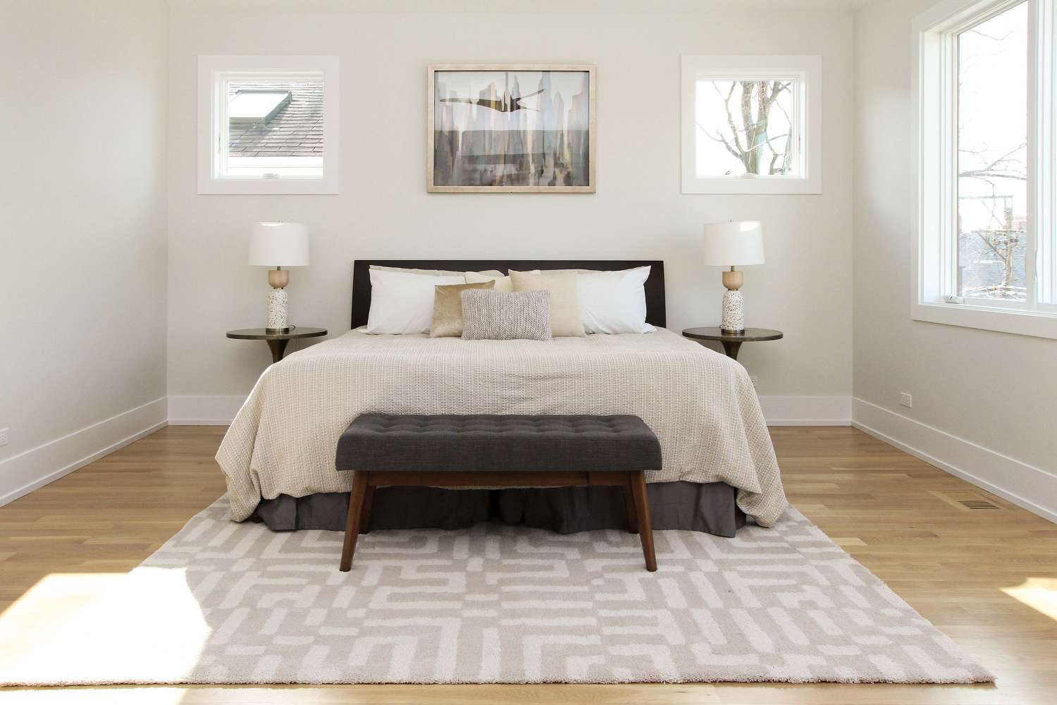
Reviewing Sherwin Williams Alabaster White: An Honest Take
Sherwin Williams Alabaster (SW 7008) is a fan favorite.
Its delicate warmth and versatility have made it a top choice for homeowners, designers, and architects.
Whether revamping your interiors or refreshing your exteriors, Alabaster offers a timeless charm that works across various styles.
In this guide, we’ll explore what makes Alabaster so special, covering everything from its undertones and lighting effects to real-world applications.
By the end, you’ll know if this classic off-white fits your next project perfectly.
Understanding Sherwin Williams Alabaster
1. What Is Alabaster SW 7008?
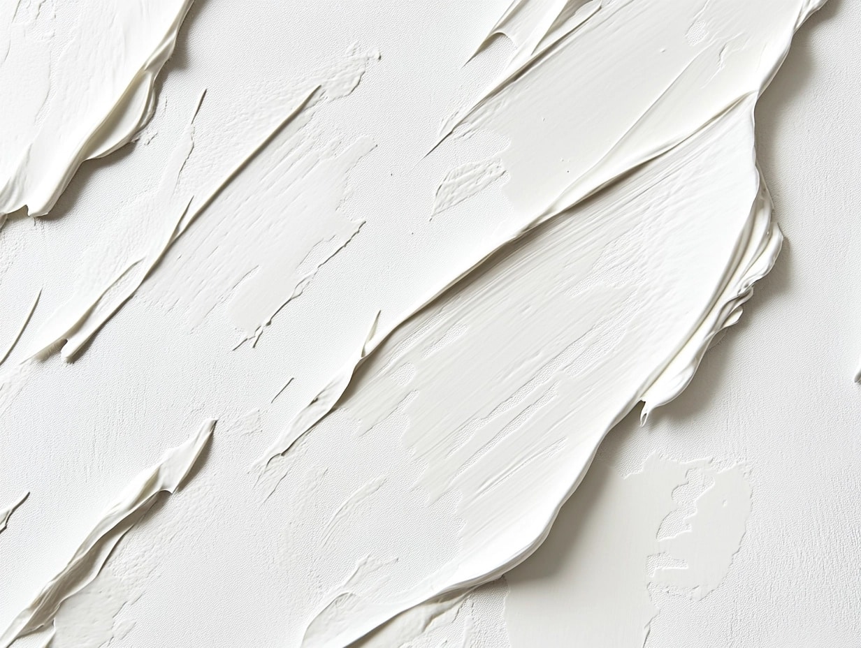
Sherwin Williams Alabaster is a warm off-white paint that perfectly balances brightness and subtle warmth.
While it can appear like a true white in certain lighting, it carries soft hints of beige and yellow undertones that give it a creamy quality.
- Why It Works: Alabaster’s subtle warmth makes it versatile, seamlessly blending with various color palettes and styles.
- Perfect For: Minimalist spaces, traditional homes, and modern interiors seeking a touch of softness without appearing stark.
2. Light Reflectance Value (LRV) and Its Importance
Alabaster has an LRV of 82, meaning it reflects 82% of light that hits its surface.
This makes it a bright color, capable of opening up spaces and creating an airy feel.
- What LRV Means: LRV determines how light or dark a color will appear. Colors with high LRV like Alabaster are perfect for making rooms feel more spacious.
- Impact on Space: In well-lit rooms, Alabaster enhances brightness. In dimmer areas, it retains warmth, ensuring the room doesn’t feel cold.
3. Undertones of Alabaster
Alabaster is not just white—it has depth and complexity.
Its creamy undertones, with soft hints of beige and yellow, make it warm without being overpowering.
- Why Undertones Matter: The undertones affect how Alabaster interacts with other colors in the space.
- In Practice: Pair it with neutral or earthy tones to emphasize its warmth, or cool tones like light grays to balance its creamy nature.
Warm vs. Cool Whites: Where Alabaster Fits
Warm whites like Alabaster bring coziness and softness to a space, while cool whites like Sherwin Williams Pure White offer crispness and modernity.
- Alabaster’s Fit: It sits firmly in the warm white category, making it an excellent choice for homes looking to exude comfort and inviting energy.
- Visual Contrast: Alabaster’s warmth prevents it from looking sterile, especially in north-facing rooms that lack natural light.
Tips for Choosing Between Warm and Cool Whites
- Consider Lighting: Warm whites suit areas with less natural light or spaces where you want to create a cozy feel.
- Room Function: Warm whites are best in bedrooms and living rooms, while cooler whites work well in kitchens and bathrooms.
How Lighting Affects Alabaster
1. Natural Light Considerations
Alabaster’s appearance changes depending on the room’s orientation:
- North-Facing Rooms: The cool light will neutralize some of Alabaster’s warmth, making it appear softer and more neutral.
- South-Facing Rooms: Warm sunlight enhances Alabaster’s creamy tones, creating a cozy, inviting atmosphere.
- East/West-Facing Rooms: Expect subtle shifts in undertones throughout the day, offering a dynamic yet harmonious look.
2. Artificial Lighting Effects
Artificial lighting can also influence Alabaster’s appearance:
- LED Bulbs: Use warm white LEDs to maintain Alabaster’s warmth.
- Incandescent Bulbs: Amplify Alabaster’s creamy undertones, adding depth and richness.
- Daylight Bulbs: They can make Alabaster lean slightly cooler, especially in spaces without much natural light.
Comparing Alabaster to Other Popular Whites
1. Alabaster vs. Pure White
Pure White by Sherwin Williams is crisper and cooler than Alabaster.
- Key Differences: Pure White has a cleaner look, making it ideal for contemporary spaces, while Alabaster’s warmth is better suited for traditional or transitional designs.
- Best Uses: Use Pure White for modern cabinetry or trims, and Alabaster for walls to create a balanced contrast.
2. Alabaster vs. White Dove
White Dove by Benjamin Moore is another popular warm white but is slightly more muted compared to Alabaster.
- Key Differences: White Dove leans more beige, while Alabaster has a touch more brightness and creaminess.
- Best Uses: White Dove works well in vintage-inspired interiors, while Alabaster feels fresher and more modern.
3. Comparison Chart
| Paint Color | LRV | Undertones | Best For |
|---|---|---|---|
| Alabaster | 82 | Creamy beige, soft yellow | Walls, trim, exteriors |
| Pure White | 84 | Neutral cool white | Trim cabinets, modern interiors |
| White Dove | 85 | Beige undertones | Classic and vintage-inspired spaces |
Using Alabaster in Interior Spaces
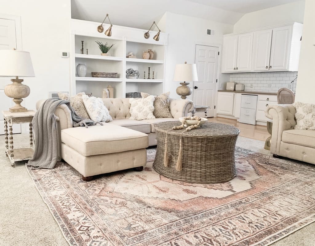
1. Living Rooms
Alabaster creates a warm and welcoming ambiance in living rooms.
It works beautifully with wooden accents, soft textiles, and earthy decor.
- Decor Tips: Pair it with natural materials like rattan or oak. Add pops of color through cushions or artwork.
- Lighting Note: Ensure warm-toned lighting to bring out Alabaster’s cozy undertones.
2. Kitchens
Alabaster pairs seamlessly with a range of cabinetry and countertop materials.
- Why It Works: Its creamy warmth prevents the kitchen from feeling cold or sterile.
- Pairing Ideas: Use with marble or quartz countertops and matte black fixtures for a chic, modern look.
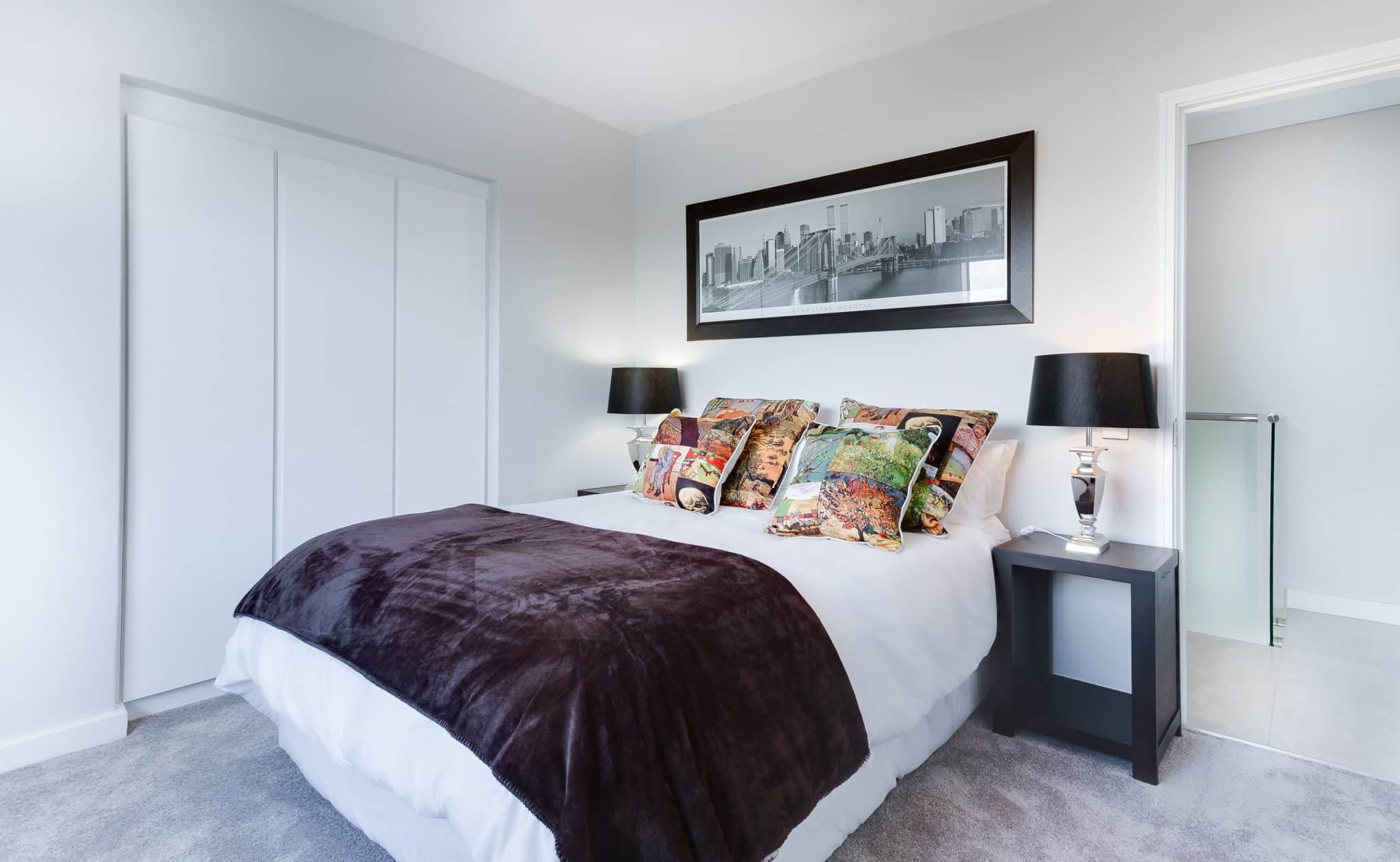
3. Bedrooms
Alabaster fosters comfort in bedrooms, making it a perfect wall color.
- Coordinating Textiles: Opt for neutral bedding in beige or gray tones to complement Alabaster.
- Accent Walls: Pair with darker hues like SW Thunder Gray for a striking yet cozy effect.
4. Bathrooms
Alabaster brings a clean yet warm vibe to bathrooms. It pairs wonderfully with tile or stone.
- Pro Tip: Use it on walls alongside bold patterned floor tiles for a contemporary twist.
- Lighting Consideration: Ensure sufficient lighting to prevent shadows from dulling the color.
Trim and Accent Colors That Pair with Alabaster
1. Best Trim Colors
Alabaster works exceptionally well as a wall and trim color, but choosing the right trim shade can elevate its impact.
- SW Extra White: A crisp, clean white subtly contrasts Alabaster walls without overpowering them.
- SW Pure White: Slightly warmer than Extra White, it creates a harmonious look that feels cohesive and soft.
- SW Urbane Bronze: A darker, earthy tone that provides bold contrast, perfect for modern or industrial-style spaces.
Design Tip: I often recommend using the same color (Alabaster) for both walls and trim but with different finishes—flat for walls and semi-gloss for trim.
This trick highlights architectural details while maintaining a seamless aesthetic.
2. Complementary Accent Colors
Choosing the right accent colors can make your Alabaster walls truly shine.
- City Loft (SW 7631): A light greige that blends beautifully with Alabaster for understated elegance.
- Thunder Gray (SW 7645): A deep taupe that adds depth and drama to living or dining spaces.
- Broccoflower (SW 9037): A vibrant yellow-green that creates a striking, cheerful contrast.
Styling Idea: For a balanced look, stick to a 60-30-10 rule: 60% Alabaster walls, 30% a complementary accent, and 10% bold decor pieces or furnishings.
This ratio ensures visual interest without overwhelming the space.
Styling Tips and Expert Advice
Alabaster is a paint color that thrives on thoughtful styling.
Its neutral yet warm undertones make it adaptable, but to truly maximize its potential, consider these tips:
- Layer Textures: Pair Alabaster walls with linen, wool, or natural fibers to add depth. For instance, a woven rug or a chunky knit throw can warm up the space visually.
- Play with Finishes: Matte Alabaster walls create a soft, elegant look, while satin or eggshell finishes enhance their reflective qualities, adding brightness.
- Incorporate Metallics: Gold or brass accents, like light fixtures or hardware, beautifully complement Alabaster’s warmth, while chrome or nickel adds a contemporary edge.
Pro Insight: I once worked on a project where Alabaster walls were paired with dark walnut furniture and gold light fixtures.
The result was a room that felt timeless and welcoming, proving that this color effortlessly adapts to various decor styles.
Designer Testimonials: Alabaster White
- Martha K., Interior Designer: “Alabaster is my go-to when I want a versatile white. It has just enough warmth to feel inviting but doesn’t lean too yellow, making it perfect for modern and traditional spaces alike.”
- Paul R., Home Stager: “I recommend Alabaster to clients selling their homes. Its neutrality appeals to buyers, and it looks fantastic in photos.”
Common Misconceptions About Alabaster
1. “Does Alabaster Look Yellow?”
This is a common concern, especially among those wary of warm whites. While Alabaster has creamy undertones, it doesn’t veer into overt yellow territory.
- When it might appear yellow: Rooms with intense warm lighting or south-facing windows can amplify its warm undertones.
- How to avoid it: Balance the warmth by incorporating cooler elements, like gray furnishings or blue accents.
2. “Is Alabaster Too Bright or Too Dull?”
Alabaster balances bright and soft, but lighting and context matter.
- When it feels too bright: In spaces with high natural light, Alabaster can appear washed out. Layer it with darker trim or furnishings to add contrast.
- When it feels dull: Artificial lighting with cool tones may make it seem flat. Opt for warm or neutral bulbs to bring out its creamy richness.
Quick Tip: Test Alabaster in various lighting conditions before committing. Sample boards are your best friend!
Practical Tips for Choosing and Using Alabaster
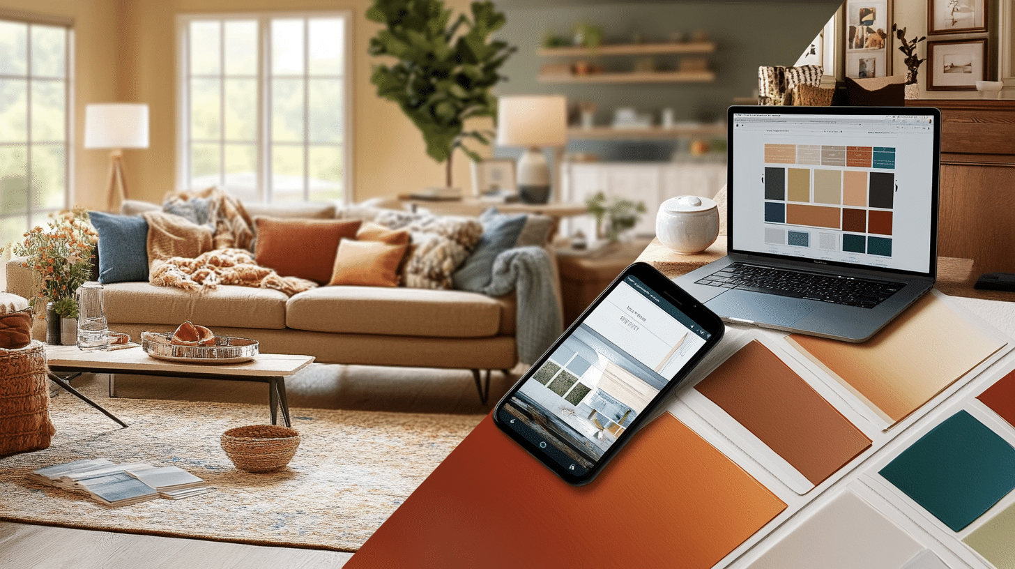
- Sample Before You Commit: Paint a few large swatches on your walls and observe them at different times of the day.
- Match with Fixed Elements: Consider your flooring, cabinetry, and countertops to ensure Alabaster complements them.
- Mind the Finish: For walls, choose matte or eggshell for a soft look. Use semi-gloss for trims to make details pop.
- Layer with Art and Decor: Alabaster provides a neutral backdrop for colorful artwork or textured decor, allowing your personality to shine through.
- Hire Professionals for Exteriors: While Alabaster is easy to apply indoors, achieving even coverage on exterior surfaces may require professional expertise.
Conclusion
Sherwin Williams Alabaster (SW 7008) is more than just a paint color; it’s a timeless choice that adapts to various styles, lighting conditions, and design preferences.
Whether you’re looking to brighten a small room, add sophistication to your kitchen, or create a welcoming exterior, Alabaster delivers unmatched versatility.
Its warm, creamy undertones provide a soft backdrop for bold accents or minimalist designs, making it a favorite among homeowners and designers alike.
If you’re considering Alabaster for your next project, you’re on the path to achieving a space that feels balanced, bright, and inviting.
Frequently Asked Questions
Can Alabaster Work in Small Spaces?
Absolutely! Its high LRV helps small rooms feel larger and more open. Pair it with minimalist decor to maximize its effect.
What Colors Pair Best with Alabaster in Kitchens?
For a harmonious kitchen, combine Alabaster with gray or beige countertops and light wood or navy cabinets for contrast.
Does Alabaster Work Well in Open-Concept Homes?
Yes! Its neutrality and warmth allow it to blend seamlessly with adjoining spaces, creating a cohesive look throughout the home.

