
Repose Gray Coordinating Colors & Room Pairing Guide
Choosing a gray paint seems easy, until you realize how many versions of “light gray” exist. I’ve been there too, trying to figure out which one won’t feel too cool, too beige, or just kind of flat once it’s on the wall.
That’s exactly why I put this guide together: to help you decide if Sherwin-Williams Repose Gray is the right shade for your home.
I’ll walk you through how it looks in real spaces, how it compares to other popular grays, and what Repose Gray coordinating colors work best. You’ll also get tips on testing, picking a finish, and how it shifts in different lighting. Let’s figure this out together
Getting to Know Repose Gray by Sherwin-Williams

Repose Gray (SW 7015) by Sherwin-Williams is a versatile, soft gray paint color that blends warm and cool tones. It’s part of the brand’s neutral collection and works beautifully in both modern and traditional spaces.
Basic Color Profile
HEX code: #CCC9C0
LRV (Light Reflectance Value): 58
Color family: Warm gray with balanced undertones
Repose Gray offers a cozy and calming feel. It’s light enough to keep your room feeling open but grounded enough to bring warmth to the space.
Undertones Explained
Repose Gray has subtle purple and taupe undertones that shift depending on lighting conditions. These undertones are gentle, noticeable in some settings but never overpowering.
- In natural light, especially in south-facing rooms, the warmth softens and the taupe becomes more visible.
- In low or artificial light, the gray can take on a cooler, almost silvery appearance.
This flexibility makes Repose Gray a safe and popular choice. Still, you should always sample it on your wall before committing to a whole room.
How Lighting Affects It
Lighting plays a huge role in how Repose Gray shows up. The same paint can shift depending on direction, time of day, and what else is in the room.
North-facing rooms: These get cooler light, so Repose Gray might lean more gray-blue and feel a little moodier.
South-facing rooms: These bring in steady, warm light, which can soften Repose Gray and give it a lighter, creamier feel.
East-facing rooms: Morning light makes it feel crisp and airy. As the day goes on, it might start to feel a touch cooler.
West-facing rooms: Late afternoon light can bring out faint purple or taupe undertones, depending on what’s around it.
Light changes all day long, so it’s smart to test Repose Gray on different walls and check it in morning, afternoon, and evening light. That way, you’ll know exactly what to expect.
Top Coordinating Colors for Repose Gray
Repose Gray pairs well with a wide range of colors. Let’s look at the best options that help it stand out or blend in, depending on the style you’re going for.
White Trims

Repose Gray works beautifully with soft whites that don’t feel too bright. Eider White (SW 7014) is a favourite because it has a light gray base that keeps everything balanced.
Pure White (SW 7005) is another solid pick, clean and crisp without feeling harsh. If you want a slightly warmer trim, Alabaster (SW 7008) is a great option.
Warm Neutrals

Warm neutrals are a natural match for Repose Gray. Accessible Beige (SW 7036) brings a soft tan feel that warms up the space without clashing. It’s a good choice for living rooms or hallways.
Kilim Beige (SW 6106) adds a touch more richness, making it perfect if you want something cozy. Both mix smoothly with the soft base of Repose Gray while keeping the room inviting.
Cool Accents

If you like a bit of cool contrast, go for colors like Naval (SW 6244) or Storm Cloud (SW 6249). Naval adds a strong navy tone that pops against the soft gray. It works well on cabinets or accent walls.
Storm Cloud is a moody blue-gray that keeps things calm but adds depth. Dovetail (SW 7018) is another cool shade that’s a bit deeper and leans more into a slate look.
Earthy Tones

Earthy shades make Repose Gray feel grounded. Dried Thyme (SW 6186), a dusty green, adds a soft natural touch that works well in bedrooms or offices. Urbane Bronze (SW 7048), a deep brown-gray, brings weight and strength to any space.
Bold Contrast Colors

For a sharp contrast, go bold with dark shades like Caviar (SW 6990) or Tricorn Black (SW 6258). Caviar is a deep black with warmth, which gives Repose Gray something to play off without feeling too harsh.
Tricorn Black is richer and cooler, great for doors, frames, or furniture. These colors add drama and help Repose Gray pop in any setting.
Coordinating Color Palettes by Room Type
Repose Gray is a go-to color that fits in every part of the house. But the way you use it can change depending on the room. Here are some simple and smart color combinations based on where you plan to use them:
Living Room

In the living room, Repose Gray looks great with soft neutrals like cream, greige, and cozy whites. These colors keep the space feeling warm and open. You can add white trim and light wood tones to create a calm and welcoming setting for daily life or guests.
Bedroom

For a restful bedroom, pair Repose Gray with calm greens or dusty blues. These shades help build a peaceful feel without making the space feel flat. You can also add linen bedding, soft textures, or muted decor for a cozy and relaxed look.
Kitchen

Repose Gray works well on walls or cabinets in the kitchen. Pair it with crisp whites for a clean look or navy for a bold contrast. Greige tones also work for cabinets or backsplashes. These combinations keep the kitchen bright and still give it depth and interest.
Bathroom

In a bathroom, Repose Gray brings a fresh and soft touch. Light blue accents or off-white trim make the space feel clean without being too cold. Simple tiles, white counters, and silver fixtures complete the look and keep things feeling balanced.
Exterior Use

For the outside of your home, Repose Gray pairs well with strong trims that can stand up to sunlight. Try it with warm whites like Alabaster or a deep shade like Tricorn Black for doors and shutters.
How to Pair Furniture and Decor With Repose Gray
Now that you’ve seen how Repose Gray fits into different rooms, let’s talk about the furniture, finishes, and textures that bring it all together. Here’s how to style it with confidence:
Wood Tones
Stick with light to medium woods like oak, maple, or walnut. These tones highlight the warmth in Repose Gray without clashing. Avoid red or yellow-based woods, which can bring out unwanted undertones.
Furniture
Neutral-colored furniture—think beige, greige, cream, or light brown upholstery—blends seamlessly with Repose Gray. This combo keeps the space grounded and soft. Clean-lined modern pieces and classic shapes both work well.
Metal Finishes
Repose Gray pairs beautifully with brushed brass, matte black, and soft silver. These finishes add contrast without overpowering the walls. If your room already feels warm, skip high-shine chrome; it can feel too sharp.
Textiles and Rugs
Layer with natural fabrics like linen, cotton, or boucle in muted tones. Rugs made from jute, wool, or sisal bring texture and depth while keeping the color scheme calm and cohesive.
Repose Gray vs. Other Sherwin-Williams Grays
Repose Gray sits in the middle of many popular grays, which can make it tough to choose the right one. Here’s how it compares to other well-known shades that often get picked alongside it:
Repose Gray vs. Agreeable Gray

Agreeable Gray (SW 7029) is warmer than Repose Gray and leans more toward beige. It has a softer look in most lighting and feels slightly more traditional.
Repose Gray, on the other hand, sits closer to true gray with a balanced mix of warm and cool tones. If you’re choosing between the two, think about how much warmth you want in your space.
Repose Gray vs. Light French Gray
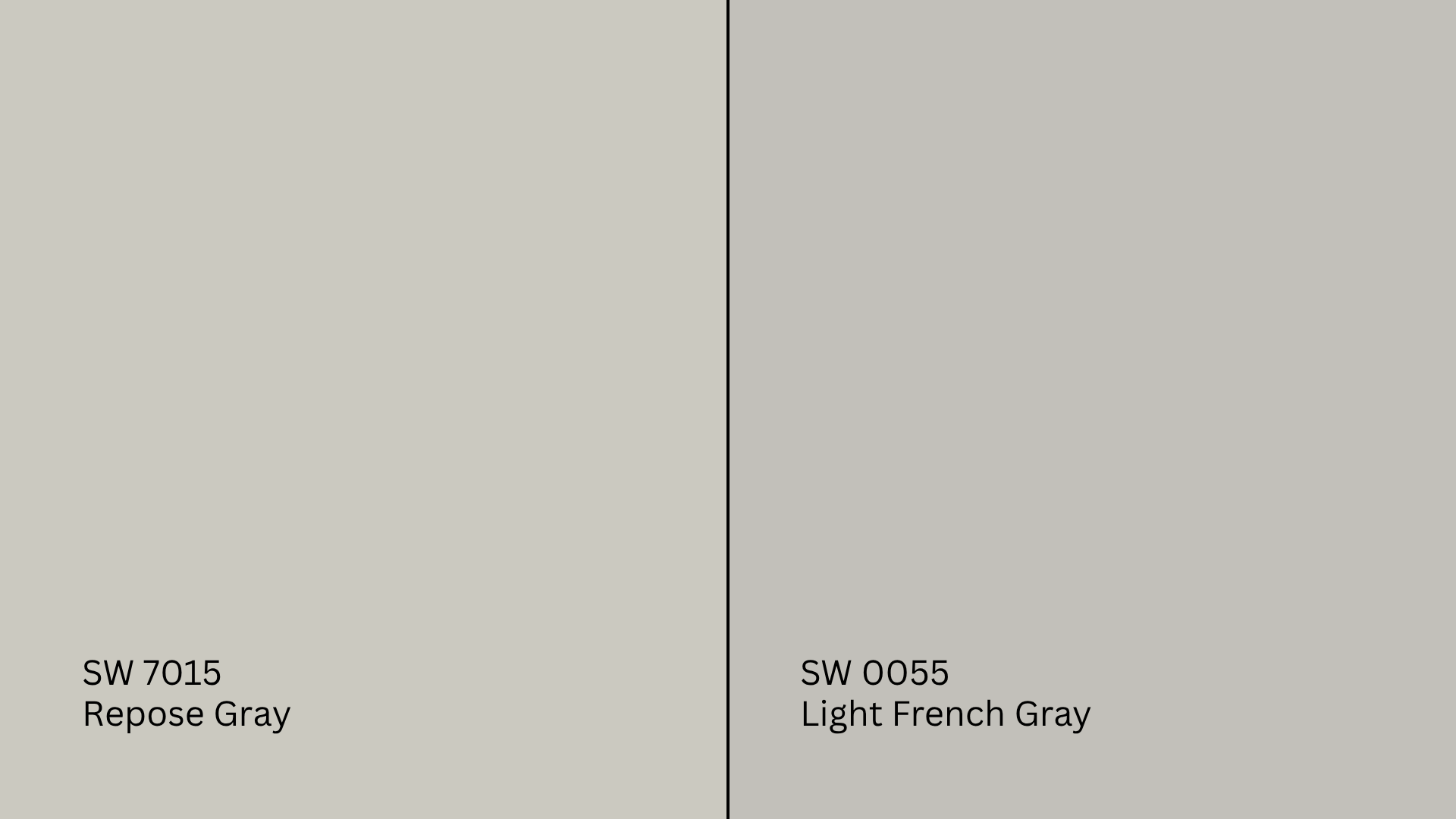
Light French Gray (SW 0055) is cooler and crisper than Repose Gray. It has subtle blue undertones that show more clearly, especially in bright natural light.
Repose Gray feels more muted and less sharp, which can make it easier to work with in both warm and cool settings. Light French Gray is better if you want a clean, modern feel.
Repose Gray vs. Mindful Gray

Mindful Gray (SW 7016) is a bit deeper and richer than Repose Gray. It carries stronger warm undertones, which give it more presence on walls.
If you want a slightly darker look without going too bold, Mindful Gray could be the right pick. Repose Gray offers a lighter, more gentle feel while still giving the room a grounded base.
Common Mistakes to Avoid
Getting the best results with Repose Gray means knowing what works and what to look out for. Here are a few simple things to avoid:
- Clashing undertones: Strong red or yellow flooring can shift how Repose Gray appears on your walls.
- Too-cool whites: Bright, icy trim can make Repose Gray feel sharper than you’d like. Stick with soft whites.
- Bold furniture choices: Loud or mismatched decor can take away from the calm, balanced feel this color brings.
- Skipping a sample: Lighting and nearby finishes change everything. Always test the color before you commit.
These quick checks can save you from surprises once the paint’s up. Live with a swatch for a few days, and you’ll thank yourself later.
Conclusion
Repose Gray became one of my go-to paint choices because it works almost anywhere, once you understand how to use it. Now that you’ve seen why it stands out and how it shifts with light and nearby colors, you’re in a better spot to try it in your own space.
I always remind people to test it first and pay attention to lighting and fixed features. When you pair it with the right Repose Gray coordinating colors, from soft whites to deep darks, you can create a space that feels complete.
If this helped you feel more confident, take a look at my other paint guides and room-by-room color tips on the website to keep your project moving forward.


