Paint Baseboards Same Color as Walls: Tips for a Cohesive Look
Are you thinking about painting your baseboards the same color as your walls? Many people ask if this look will bring a modern touch or simply make the space feel plain.
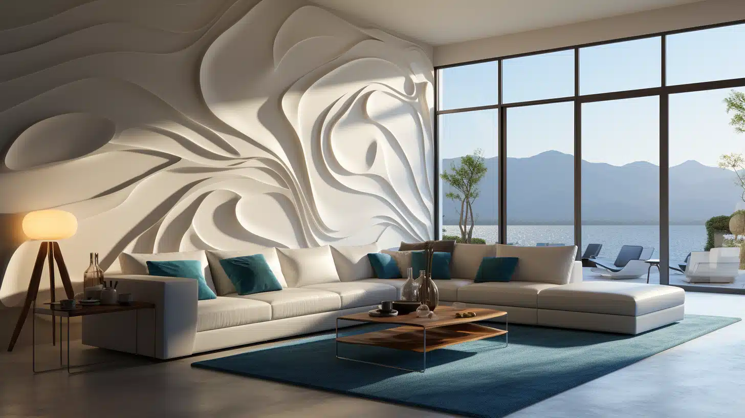
But the truth is, when done right, it can actually help your room feel larger, more peaceful, and well put together.
This guide will take you through everything you need to know, from the pros and cons to the best ways to make this design choice work for you.
If you’re refreshing one room or tackling your entire home, this blog will help you make an informed decision that suits your space perfectly. Let’s get in!
Why Match Baseboard and Wall Color
Choosing to match your baseboard and wall color might seem like a small decision, but it can dramatically change how a room feels.
Many homeowners are embracing this design approach for good reasons.
Style Benefits
The trend of painting baseboards the same color as walls is gaining popularity for several key advantages:
- Seamless Look: When baseboards and walls share the same color, the room flows without visual interruption.
This creates a clean, consistent appearance that feels intentionally designed rather than pieced together.
The eye moves smoothly across the space without getting caught on contrasting trim lines. - Modern Design: This monochromatic approach aligns perfectly with contemporary design principles that favor simplicity and clean lines.
It creates a cleaner, updated look that works especially well in newer homes or recently renovated spaces where you want to showcase a fresh look. - Better Furniture Focus: With walls and trim blending together, your furniture, art, and decorative elements naturally become the stars of the room.
This background uniformity allows statement pieces to stand out more prominently without competing with architectural elements for attention.
Visual Illusions
Beyond pure looks, matching your trim and wall color can actually change how you perceive a space:
- Increases Room Height: When baseboards blend with walls, the vertical lines of the room appear to extend without interruption.
This creates an optical illusion that makes ceilings feel higher and rooms more spacious. The continuous color draws the eye upward instead of stopping at a contrasting trim line. - Reduces Visual Clutter: Every color change in a room requires your brain to process a new visual element.
By eliminating the contrast between walls and trim, you instantly reduce the visual noise in a space.
This is particularly valuable in busy rooms with lots of furniture, patterns, or architectural details that might otherwise overwhelm the eye.
Things to Consider Before Painting Baseboard
Before you commit to matching your baseboards and walls, take time to assess a few important factors that will influence the success of this look in your specific space.
1. Room Size and Natural Light
Matching your baseboards to the wall color can make a big difference in smaller rooms. When there’s no visual break between the wall and trim, the space feels less cut off and more open.
It’s a useful way to help compact rooms feel wider or taller. If your ceilings are low, painting everything the same color helps pull the eye upward, making the room feel taller than it really is.
In brighter rooms, natural light creates soft shadows on matching trim, which still highlights the details without harsh lines.
In darker spaces, you might want to switch up the paint finish, like matte on the walls and satin on the trim, to keep that subtle definition.
2. Paint Style
Your overall design style plays a big role in choosing trim color. If your home leans modern or minimalist, painting baseboards the same color as the walls can help keep things smooth and simple.
This look works well when you want quiet lines and less visual contrast.
On the other hand, if your space has more traditional features, white or light trim against a darker wall helps show off the room’s structure and fine details.
For a mix of both styles, you might use contrast in shared spaces like the living room, and go tone-on-tone in bedrooms for a softer feel.
3. Flooring Type
The look of matching trim depends a lot on the flooring. Here’s how it plays out with different types:
| Flooring Type | Effect of Matching Trim and Wall Color |
|---|---|
| Dark Wood Floors | Natural contrast with walls means trim doesn’t need to stand out separately. |
| Light Wood Floors | It can blend in too much with walls and trim, making the space feel flat. |
| Tile or Stone | Matching trim and walls lets floor patterns or textures take focus. |
| Carpeted Floors | Helps create a smooth shift from wall to floor, especially with neutral carpet tones. |
This comparison can help you choose the right trim look for each room based on the floor you have.
4. Paint Finish (Sheen)
Even when using the same color, varying the sheen creates subtle definition and practical benefits.
While walls typically look best in flat, matte, or eggshell finishes, baseboards benefit from more durable satin or semi-gloss sheens.
This difference in light reflection creates definition without using different colors.
| Finish Type | Best For |
|---|---|
| Flat/Matte | Walls, ceilings, and low-traffic areas |
| Eggshell | Living room, bedroom, and dining room walls |
| Satin | Family rooms, hallways, and children’s rooms |
| Semi-gloss | Trim, doors, and high-traffic areas |
| High-gloss | Accent trim, furniture |
For the most successful same-color look, consider using flat or eggshell on walls with satin or semi-gloss on trim.
This combination creates subtle definition through light reflection while ensuring your baseboards have the durability needed for high-traffic areas.
Design Tips for Matching Walls and Baseboards
Painting your baseboards the same color as your walls can look simple, but it still takes thoughtful planning to get it right.
Use Different Sheens for Depth

Even with one color, sheen creates contrast. Try matte or eggshell on the walls and semi-gloss on the baseboards.
This keeps the look unified but still gives the trim some definition. It also makes baseboards more durable and easier to clean, especially in high-traffic areas.
Stick to the Same Undertone Family

Matching colors isn’t just about the name on the paint can. Warm and cool undertones affect how the room feels.
If your wall paint has a warm undertone, your baseboards should, too. Keeping undertones aligned helps everything blend smoothly and prevents clashing.
Consider Room Function and Traffic

Think about how each room is used before choosing your paint finish. Semi-gloss or satin works better in areas where scuffs and marks are common.
In quieter rooms, like bedrooms, you can get away with a softer finish. Picking the right sheen based on use keeps your space both stylish and practical.
White on White

Using white walls with matching white baseboards creates a crisp, airy feel that suits nearly any home.
This approach is especially popular in modern and Scandinavian designs. The clean look makes a space feel open and bright while letting your furniture and decor take the spotlight.
Jewel Tone Applications

Deep colors like navy, emerald, or charcoal can look eye-catching when carried from wall to baseboard. This creates a bold, dramatic effect that feels intentional and high-end.
Just be sure to choose a higher sheen for the trim to avoid making the room feel too dark or flat.
Neutral Palettes with Matching Trim

Greys, taupes, and beiges are perfect for this style if you want a calm, grounded look. These shades work well in bedrooms, living rooms, or offices where you want warmth without strong contrast.
Matching trim makes the whole space feel smooth and softly styled without any jarring edges.
Paint Selection and Application for Baseboard and Walls
When choosing a color for your matching walls and baseboards, not all shades perform equally well. Professional designers and color experts have identified certain colors that work exceptionally well for this monochromatic approach.
These recommended hues have been tested in real spaces and deliver reliable results across different room sizes and lighting conditions.
Sherwin-Williams Selection

Sherwin-Williams offers several standout colors that designers frequently select for matching wall and trim applications:
Alabaster (SW 7008): A soft, warm white that feels welcoming without turning yellow. Alabaster is subtle enough for both modern and traditional homes. It works especially well in bright rooms where cooler whites might feel too harsh.
Repose Gray (SW 7015): A flexible light gray with balanced undertones. Repose Gray shifts gently in different lighting and offers contrast when paired with various sheens. It’s a great pick for bedrooms, offices, or spaces with mixed design elements.
Urbane Bronze (SW 7048): A rich, earthy color that makes a bold statement when used on both walls and trim. Urbane Bronze works best in cozy, enclosed rooms like a den or study where you want a deeper, grounded feel.
Naval (SW 6244): A deep navy that adds strong visual interest without making a space feel tight. Naval is perfect for dramatic looks in rooms with plenty of natural light and works well when carried across both walls and trim.
Benjamin Moore Selections

Benjamin Moore offers equally impressive options that experts frequently recommend:
Simply White (OC-117):Simply White is a crisp, clean white with just enough warmth to avoid looking clinical. It works especially well in minimalist or Scandinavian-inspired spaces where you want everything to feel light and airy.
Classic Gray (OC-23):Classic Gray is a soft, warm gray that reads neutral and calm. It adds gentle contrast when combined with different sheens and performs well under all types of lighting. Classic Gray is a solid choice for bedrooms, hallways, or living areas.
Hale Navy (HC-154):Hale Navy is a deep navy with a strong, grounding presence. It looks great on both trim and walls, offering rich depth without making a room feel too dark. Hale Navy is ideal for entryways, libraries, or accent spaces.
Revere Pewter (HC-172):Revere Pewter is a timeless greige that blends warm and cool tones. It’s a go-to shade that suits nearly any space, big or small, bright or dim. When Revere Pewter is used on both walls and baseboards with a sheen difference, it creates a calm, unified look.
Tips for a Professional Finish
A smooth, clean paint job starts with proper prep and the right tools. Rushing or skipping steps can lead to uneven lines or peeling.
- Prep surfaces: Clean, sand, and prime before you paint. This helps the finish last longer.
- Go slightly lighter than you might initially choose: Colors often appear more intense when applied to all surfaces in a room.
- Use tape: Painter’s tape gives you sharp, clean lines and protects edges.
- Choose the right tools: Use an angled brush for trim and a roller for walls to get even coverage.
- Apply two thin coats: It’s better than one thick coat. This helps avoid drips and creates a more even, long-lasting finish.
- Look at the color at different times of day: A shade that works beautifully in morning light might feel too dark or too warm in evening hours.
- Consider the adjoining rooms: For a cohesive feel, choose colors that transition well into neighboring spaces.
Conclusion
You’ve now got a clear sense of how painting baseboards the same color as walls can shape a room.
From picking the right sheen and tone to understanding how flooring and light affect the look, you’ve seen how this small choice can change how a space feels.
It’s not just about paint, it’s about comfort, flow, and how your home fits your needs. Now you’re better prepared to decide if matching baseboards and walls is right for you.
If you want calm or contrast, this approach can help. Still figuring things out? Take a look at my other blogs for tips, paint ideas, and more ways to make rooms feel just the way you like.