5 Most Popular Sherwin-Williams Colors Right Now for Homes
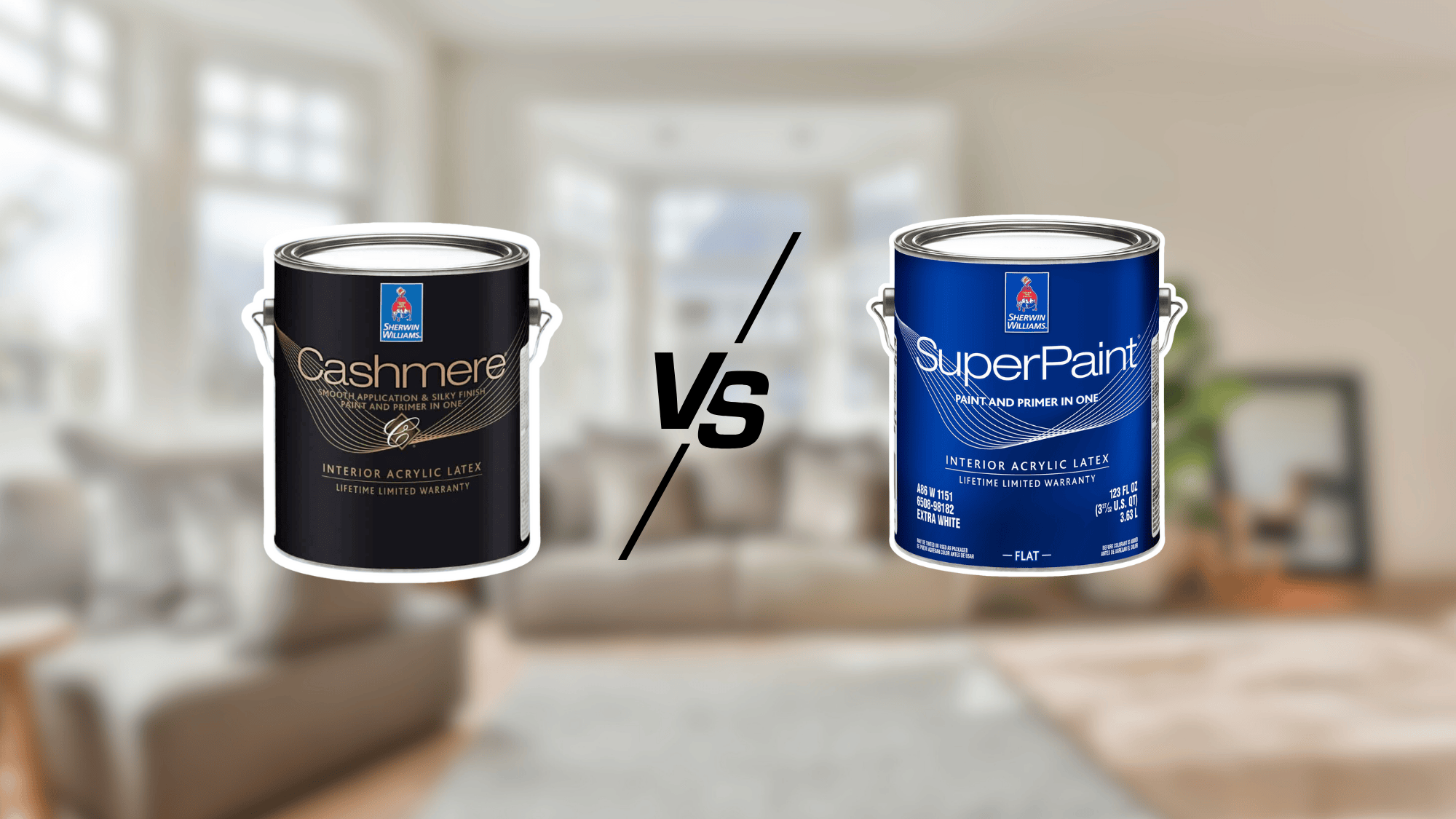
Choosing the right color has always felt like the toughest part of a home makeover for me. Paint lines like Sherwin-Williams Cashmere or Emerald matter for finish and durability, but it’s the shade itself that really sets the mood.
A soft neutral can make a room feel larger and brighter, while a bold accent instantly changes its energy.
When I tested different shades, I noticed how much the finish changed their personality. Cashmere gave colors a velvety softness, while Emerald made them appear bolder and more defined.
With that in mind, here are the Sherwin-Williams shades that homeowners, myself included, keep turning to again and again.
Why Color Choice Matters
Color does far more than simply cover a wall; it defines the atmosphere of a space. The right shade can make a small room feel open and airy, or make a large area into something cozy and intimate.
Sherwin-Williams’ most popular colors remain favorites because they are versatile, timeless, and easy to blend with a wide range of design styles, from modern to traditional.
Lighting also plays a huge role. Natural daylight can make a shade appear warmer or cooler, while artificial lighting can alter its appearance, making it look either bolder or softer.
Even the finish you select, whether matte, satin, or pearl, can alter the personality of the color. Trusted favorites remain in demand because homeowners know these shades consistently perform well in every environment.
Top Sherwin-Williams Colors
These five shades stand out as homeowner favorites, offering versatility, style, and timeless appeal across a wide range of spaces.
1. Agreeable Gray
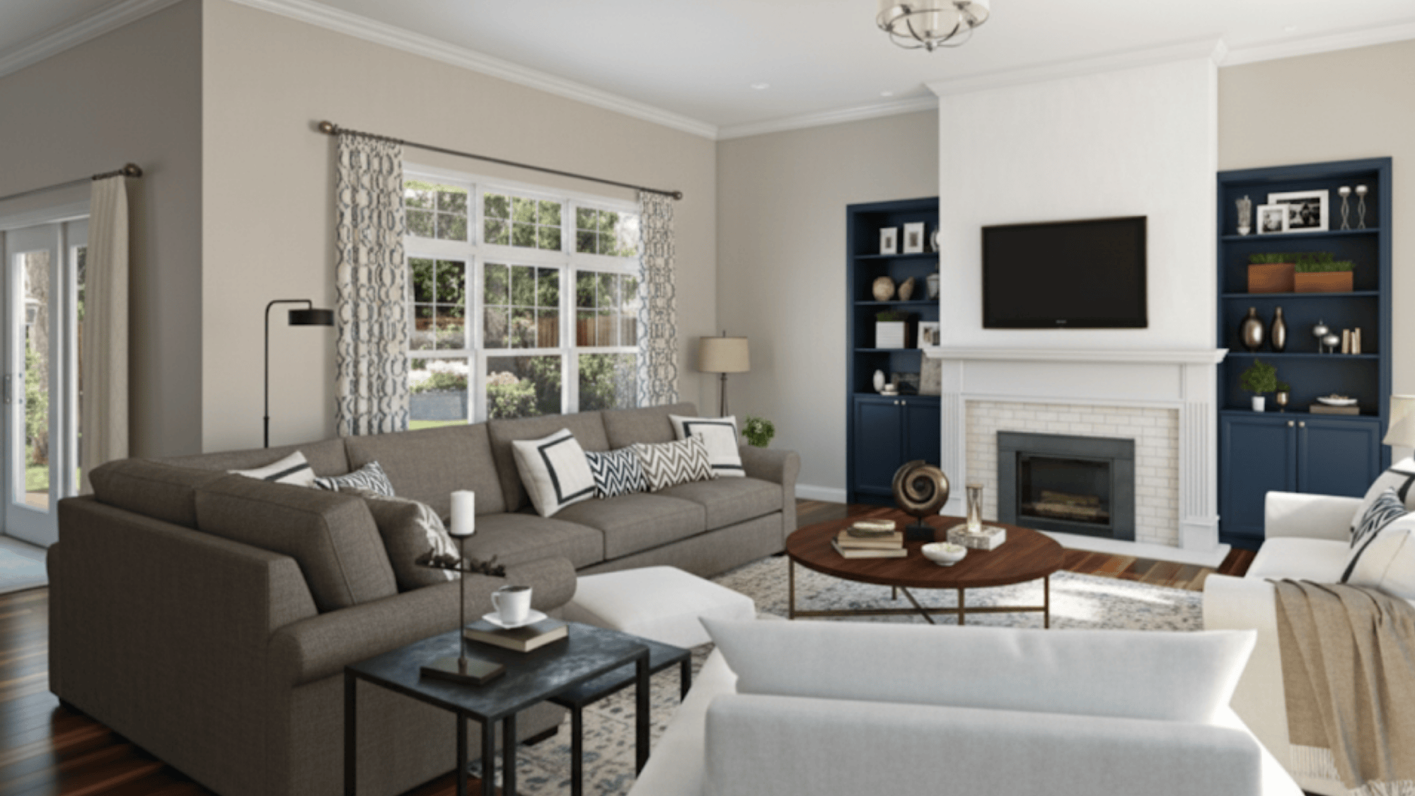
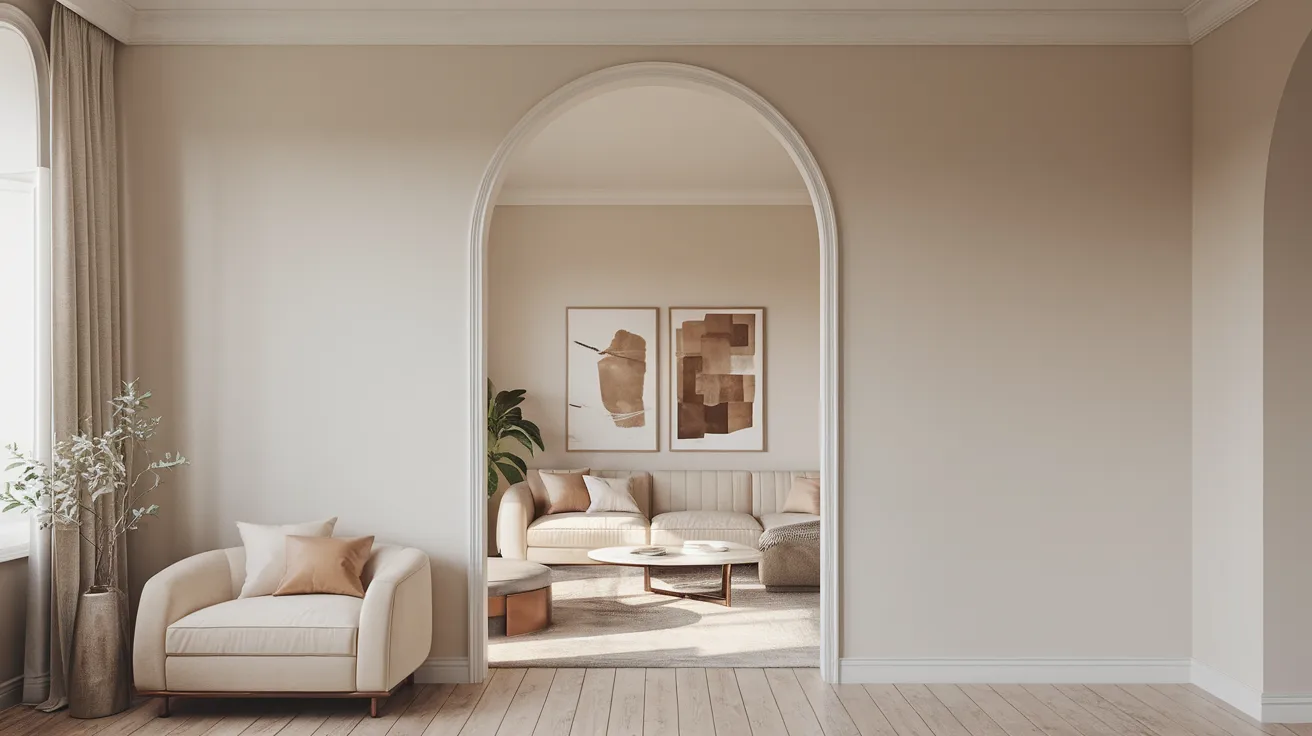
Often called the ultimate “greige,” Agreeable Gray blends gray and beige in a balanced way that works across almost any design style.
It has just enough warmth to avoid feeling cold but is still light enough to keep rooms open and airy. Homeowners love it for living rooms, kitchens, and open-concept spaces because it easily adapts to different décor styles.
2. Alabaster
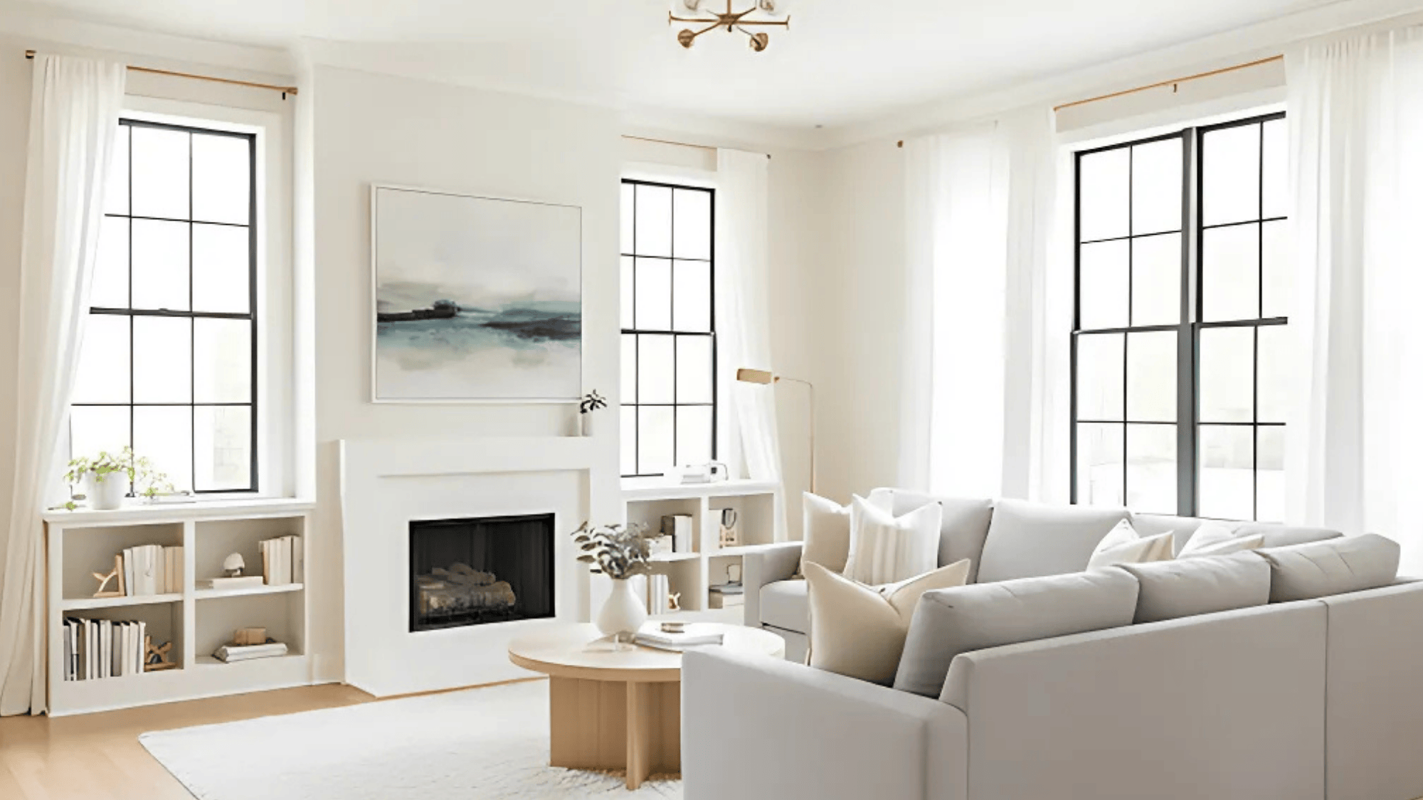
Alabaster is one of Sherwin-Williams’ most loved whites because it strikes the perfect balance between brightness and warmth. It feels clean without being harsh, which makes it ideal for bedrooms, living rooms, and entryways.
The shade reflects light beautifully and pairs well with natural wood, stone accents, or darker trims for a subtle contrast.
3. Sea Salt
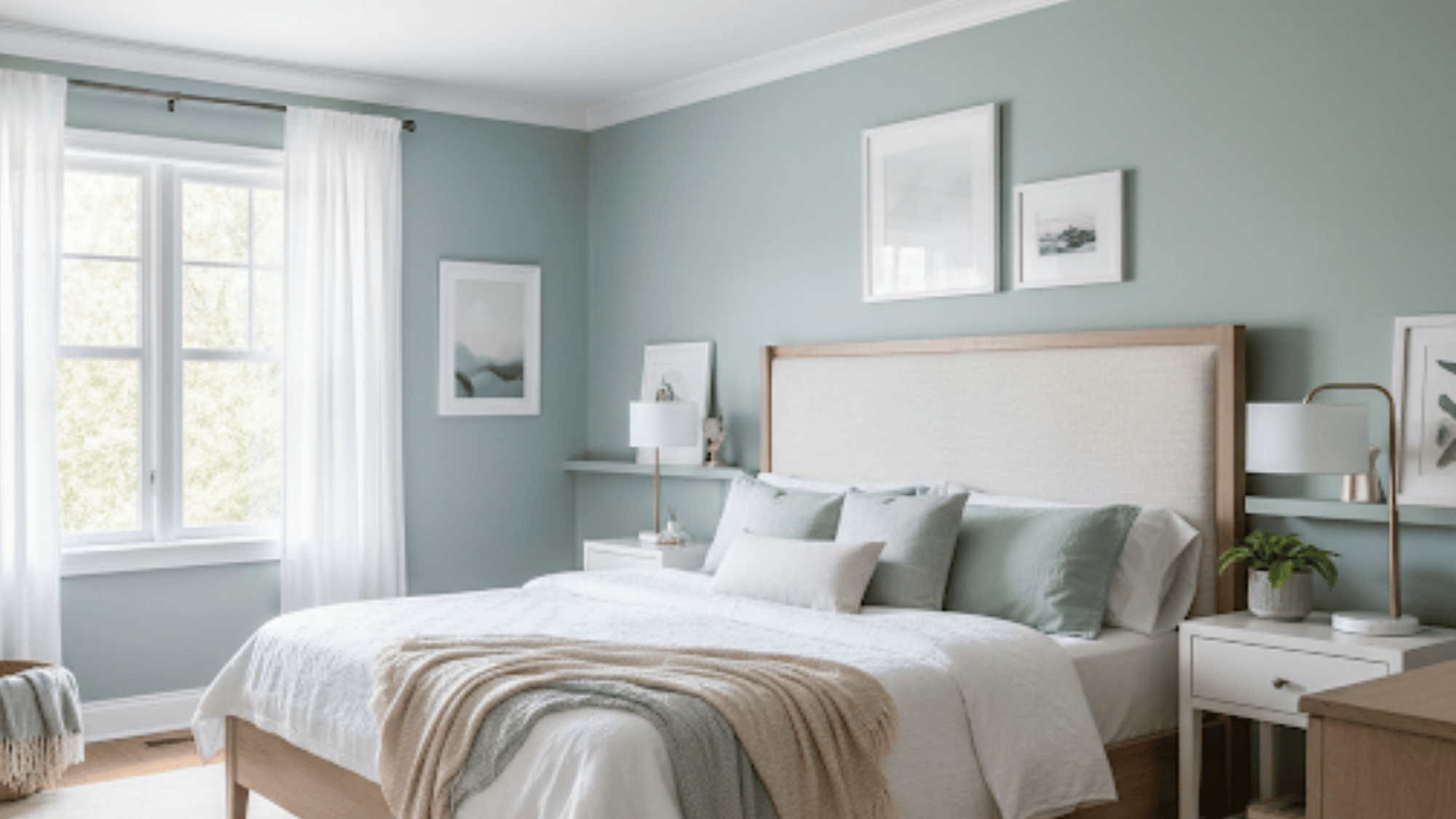
Sea Salt is a calming, spa-like color that mixes soft green with gray undertones. Depending on lighting, it shifts between cool and warm, making it a versatile choice for bedrooms, bathrooms, or even laundry rooms.
Its airy quality brings a sense of relaxation, which is why it’s often used in coastal or farmhouse-inspired interiors.
4. Naval
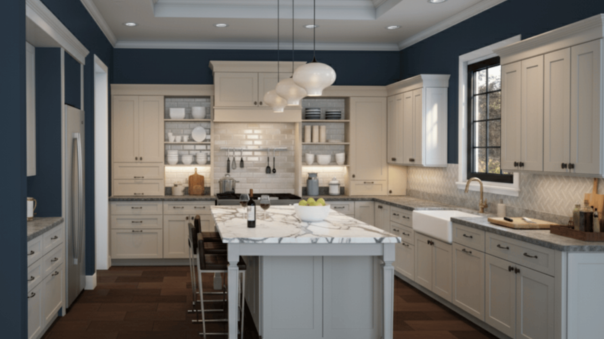
Naval is a bold navy blue that creates instant drama. It works well as an accent wall in living rooms or dining rooms and also looks striking in offices or libraries where a darker tone sets a more focused mood.
Pairing Naval with crisp whites, brass hardware, or warm wood accents adds richness and depth to any space.
5. Pure White
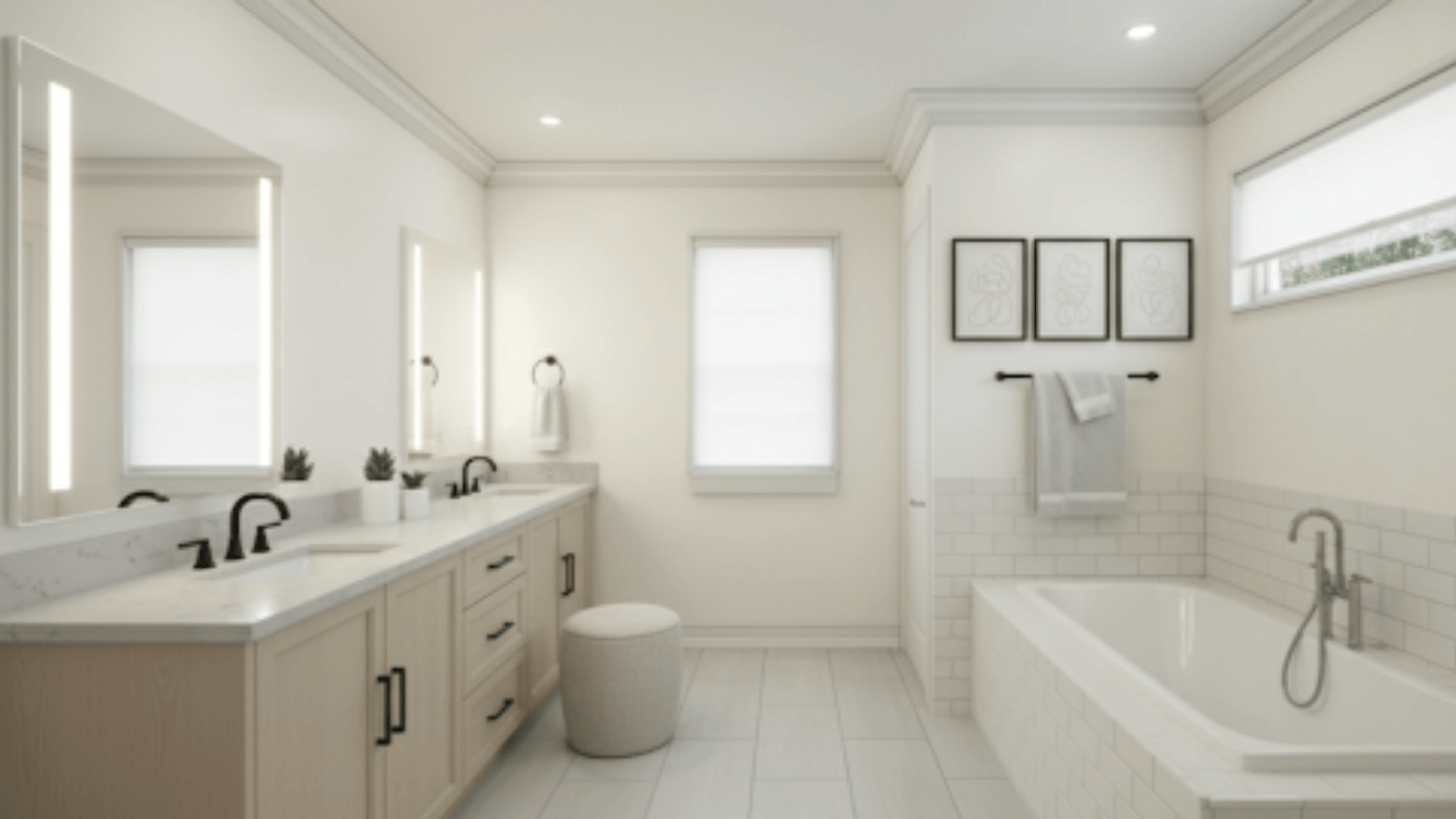
Pure White is a crisp, versatile shade that remains one of Sherwin-Williams’ most popular choices. It has just enough warmth to keep it from feeling sterile, making it suitable for both modern and traditional homes.
Pure White works well for walls, trims, and ceilings, serving as a perfect backdrop for bold accent colors or natural textures.
Beyond the Top 5: Other Trending Choices
While the top five dominate, several other Sherwin-Williams shades are quickly climbing in popularity:
- Repose Gray: Cooler in tone than many grays, this shade works beautifully in contemporary homes where clean lines and modern décor dominate.
- Greek Villa: Renowned for its creamy warmth, Greek Villa creates a welcoming ambiance that blends with farmhouse and coastal-inspired interiors.
- Tricorn Black: Bold and dramatic, Tricorn Black is often chosen for doors, trims, or statement accent walls that need strong definition.
- Snowbound: With its crisp brightness and just a hint of warmth, Snowbound is perfect for creating a fresh, clean backdrop without feeling sterile.
- Dried Thyme: Earthy and rich, Dried Thyme introduces character and depth to spaces, adding a natural, calming vibe that feels both modern and timeless.
These trending shades are especially appealing in busy spaces like kitchens and bathrooms. When choosing a paint line, discussions of Cashmere vs. Emerald often arise because each paint line performs differently.
Tips for Choosing and Testing Colors
Popular doesn’t always mean perfect for your home. The same shade can look very different depending on light, décor, and finish. To make the best decision:
- Paint large swatches or use peel-and-stick samples.
- Test the color on different walls to see it in both shadow and sunlight.
- Check the shade during the day and at night with your lamps on.
- Remember that Cashmere softens tones, while Emerald makes them bolder.
Conclusion
After working with these colors in different spaces, I’ve come to appreciate why they stay so popular.
Agreeable Gray, Alabaster, and even bold shades like Naval don’t just follow trends; they hold up year after year because they fit so many styles and moods.
For me, the biggest lesson has been that it’s not only about finding a color I like on the sample card, it’s about seeing how it lives on my walls, in my lighting, and with my furniture.
That’s where the right pairing of shade and paint line, whether it’s Cashmere for a softer touch or Emerald for more durability, makes all the difference.

