Hayley Servatius’ 5 Palette Picks for Perfect Home Harmony
You don’t have to be an ’80s lady to sing along with the Cyndi Lauper classic “True Colors.”
And you don’t have to be a seasoned interior designer like Hayley Servatius to select the ultimate hues for your abode — especially when Servatius is more than happy to share some helpful hints.
Color is the silent mood-setter, the unsung hero shaping the energy of a room. When one is stepping into a space, color whispers its greeting before any words are exchanged. It creates that elusive feeling of home, a place where harmony, balance, and personality collide.
And when it comes to curating these environments, few do it better than Hayley Servatius. Her knack for crafting cohesive, livable spaces starts with one essential ingredient: the perfect palette. If there’s one thing Servatius will tell you, it’s this: “Color is a mood driver for your home.”
And she’s right.
Visualize how a moody, dark bedroom surrounds you with warmth, while a bright, white kitchen invites creativity and movement.
So, how does one get it right every time?
Enter Hayley Servatius’s foolproof method — her five palette picks that deliver perfect home harmony every single time.
1. The Grounding Colors — Your Foundation for Serenity
First things first: Every palette needs its roots.
In Servatius’ design philosophy, these grounding colors are the foundation of the home’s aesthetic. They’re the backdrop, the sturdy undercurrent that ties everything together.
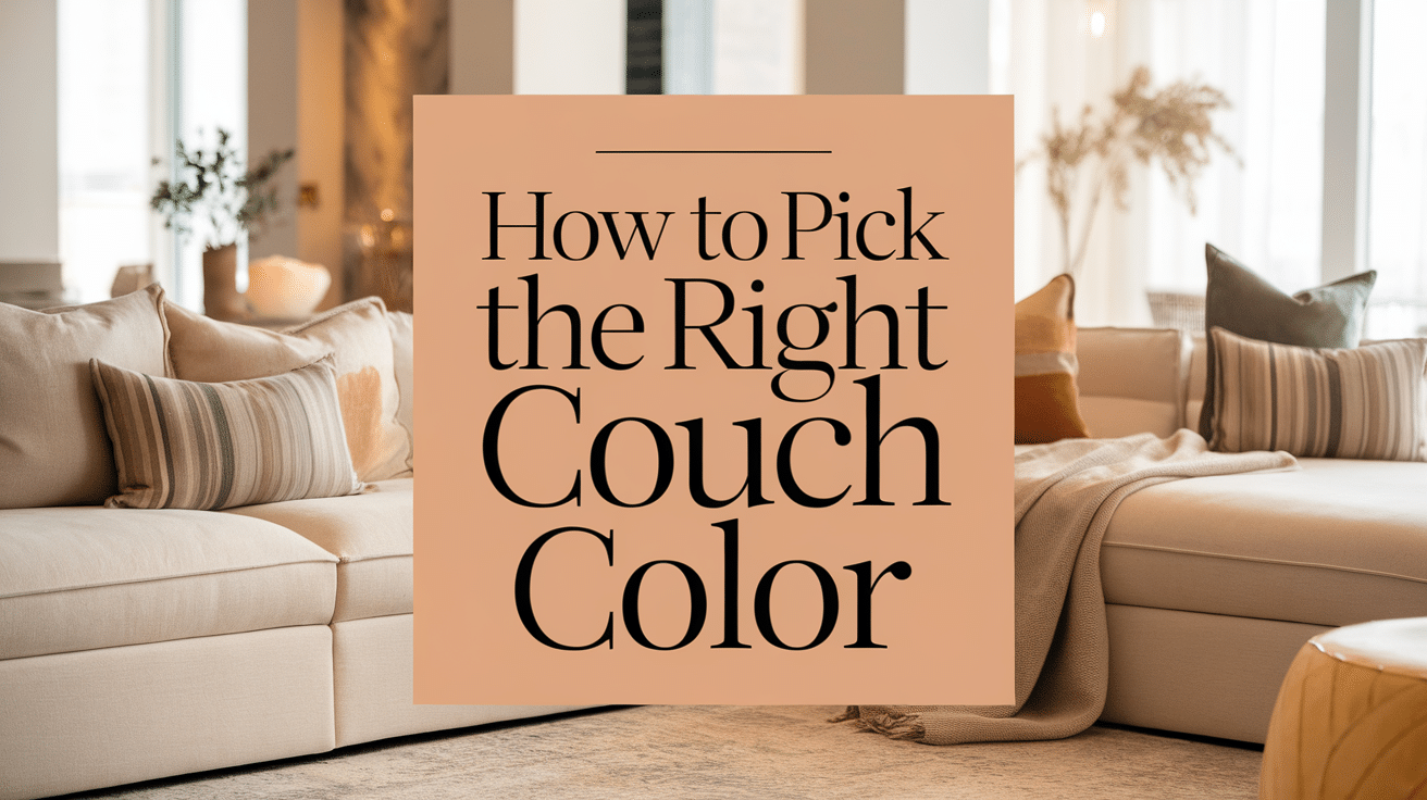
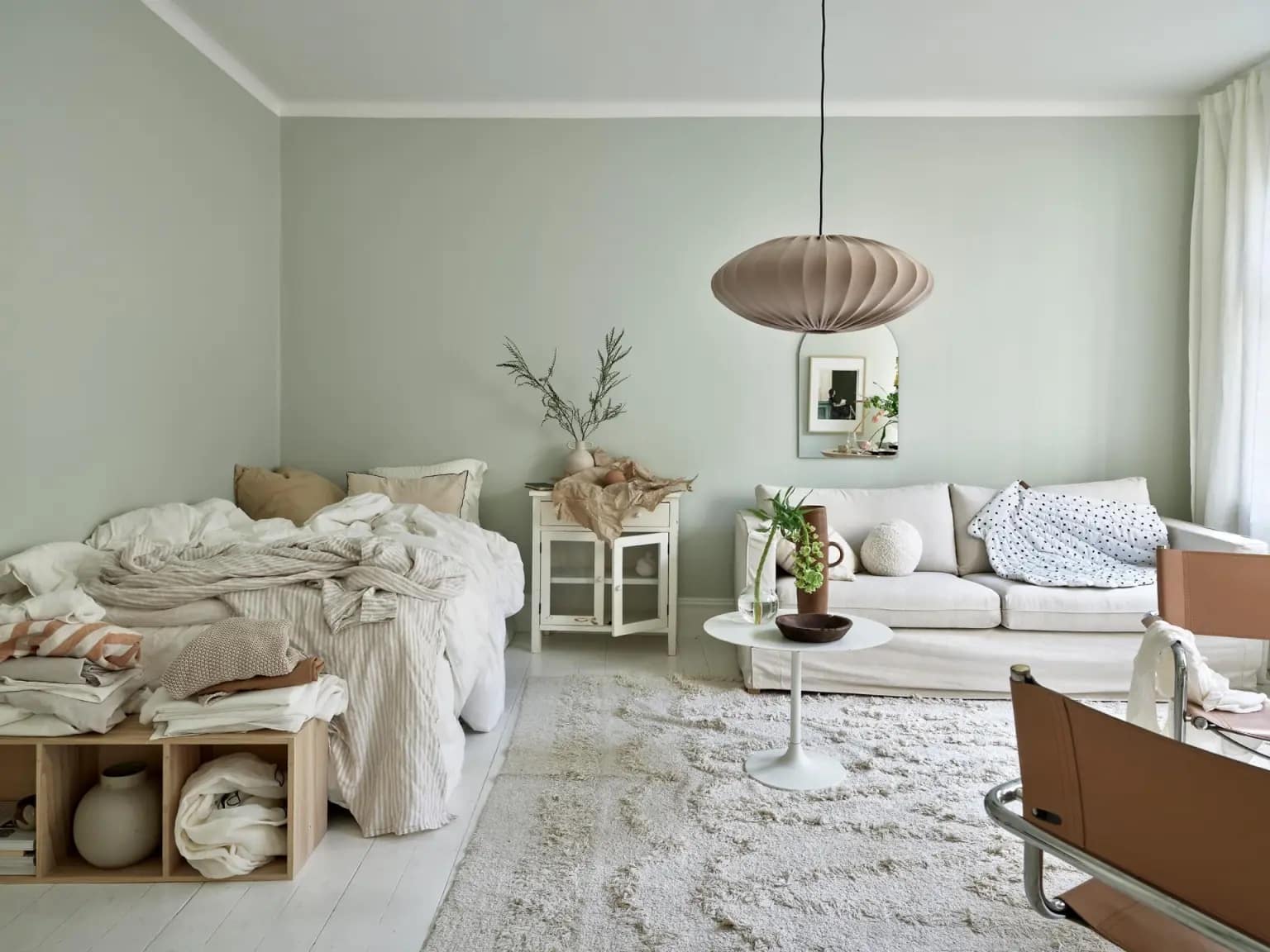
Imagine walking into a living room bathed in soft greige or a muted taupe that makes you want to sink into the couch. This isn’t your average white-wall moment. These grounding colors provide a sense of security and calm, giving the eye a place to rest while allowing other elements in the room to shine.
Servatius’ take? Always start with three to five base colors and use them consistently across your home. These hues create the cohesive flow needed for a serene space.
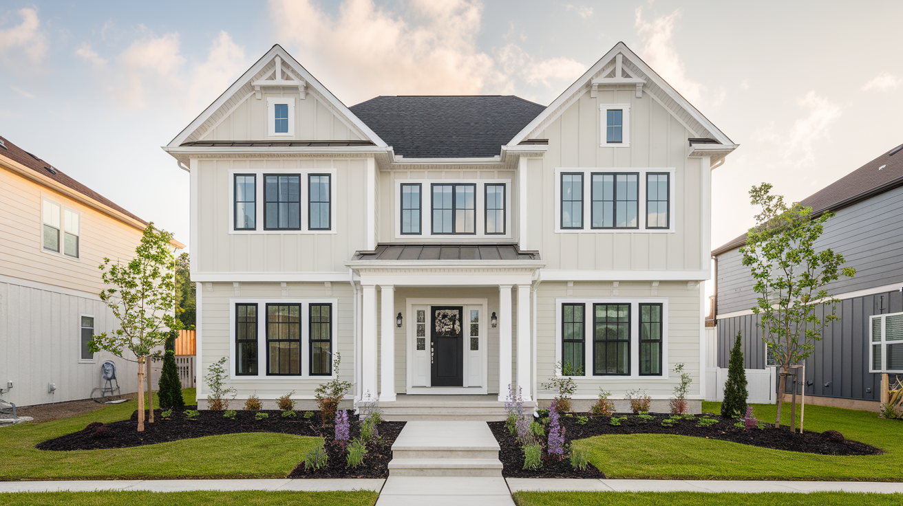
And don’t think grounding colors are limited to beige and gray. For homes with less sunlight, Hayley suggests incorporating soft whites or lighter tones — anything that helps maximize the light and injects that much-needed brightness.
Why fight with natural light when you can make it an ally?
2. Accent Colors — Layers of Depth and Personality
Once that foundation is set, it’s time to add a little more depth.
Accent colors are where the fun begins, where personal style starts to creep in. Hayley Servatius recommends layering three to four complementary hues into your home’s color scheme, seamlessly carrying them from room to room.
Think of them as the threads that weave the story of your home, connecting spaces while adding richness and texture.
Consider the kitchen. Your grounding color might be a creamy white, but an accent like a soft sage on the cabinetry or a warm terra-cotta backsplash will bring the space to life.
These shades should enhance the room without overwhelming it, adding a level of intrigue that subtly shifts depending on how the light hits.
In living spaces, accent colors often make their way onto textiles, rugs, or feature walls. They’re the middle players, neither shouting for attention nor fading into the background.
It’s this balance that keeps a home from feeling one-note, offering layers of visual interest that encourage both lingering and exploring.
3. Pops of Pigment — Unleashing Energy in Small Doses
This is the moment where things really get exciting: pops of color.
If the grounding hues are the quiet foundation and the accents are the rich narrative, pops of color are the exclamation points. Hayley Servatius suggests limiting these pops to just one or two colors, used sparingly yet strategically, to deliver maximum impact.
Imagine a sleek black living room with gray velvet sofas, then — bam — a pair of bold mustard-yellow cushions or an electric-blue vase on the coffee table. Suddenly, the space sings.
These pops aren’t there to take over, but rather to surprise and delight. They’re small but mighty and shine best in accessories like throw pillows, artwork, or even a standout piece of furniture.
Pops of color bring magic through their adaptability. Swap them out seasonally or when the mood strikes, and watch how easily the entire room shifts without needing a complete overhaul. That’s the power of the pop — a tiny change, a huge payoff.
4. Harmonizing With Nature — Bringing the Outdoors In
Homes that feel harmonious often echo the natural world outside their doors.
Servatius’ design approach draws inspiration from the outdoors, weaving in organic hues that ground a space in its surroundings.
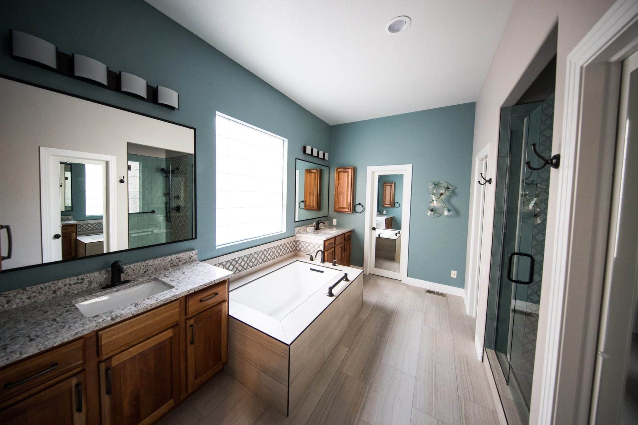
Soft greens, sandy beiges, ocean blues — nature’s palette offers endless opportunities to create a home that feels both fresh and timeless.
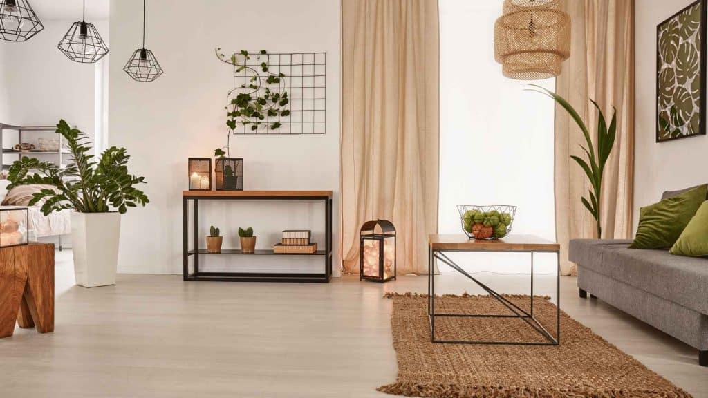
A few leafy greens in the living room, perhaps a mossy-toned throw in the bedroom, or a rich clay tile in the bathroom — these little touches connect your space to the world beyond, creating that effortless harmony every home craves.
5. Playing with Contrast — Bold and Subtle in Tandem
For Hayley Servatius, experimenting with contrast is crucial.
“I love to play with color, layer color, and add unexpected pops,” she says, and it’s this whimsical approach that keeps a home feeling dynamic rather than flat.
A deep navy accent wall can make crisp white trim feel even brighter. A sleek, modern space feels richer when paired with earthy, textural elements like wood or woven fabrics. This juxtaposition creates tension, but the good kind — the kind that makes you want to look just a little longer.
Servatius’ designs are the epitome of this balance. She often pairs soft, serene palettes with a touch of boldness, like a charcoal-black accent chair against a neutral-toned room, or a vibrant piece of art in a muted space.
It’s this delicate dance between contrasting elements that gives a home its heartbeat — something dynamic, something alive.
Crafting Your Own Perfect Palette
Hayley Servatius’ approach offers a clear road map that starts with grounding colors, layers in accents, adds pops of energy, harmonizes with nature, and embraces contrast.
Start with a color palette that inspires you and watch how it transforms your space from four walls to a living, breathing sanctuary.


