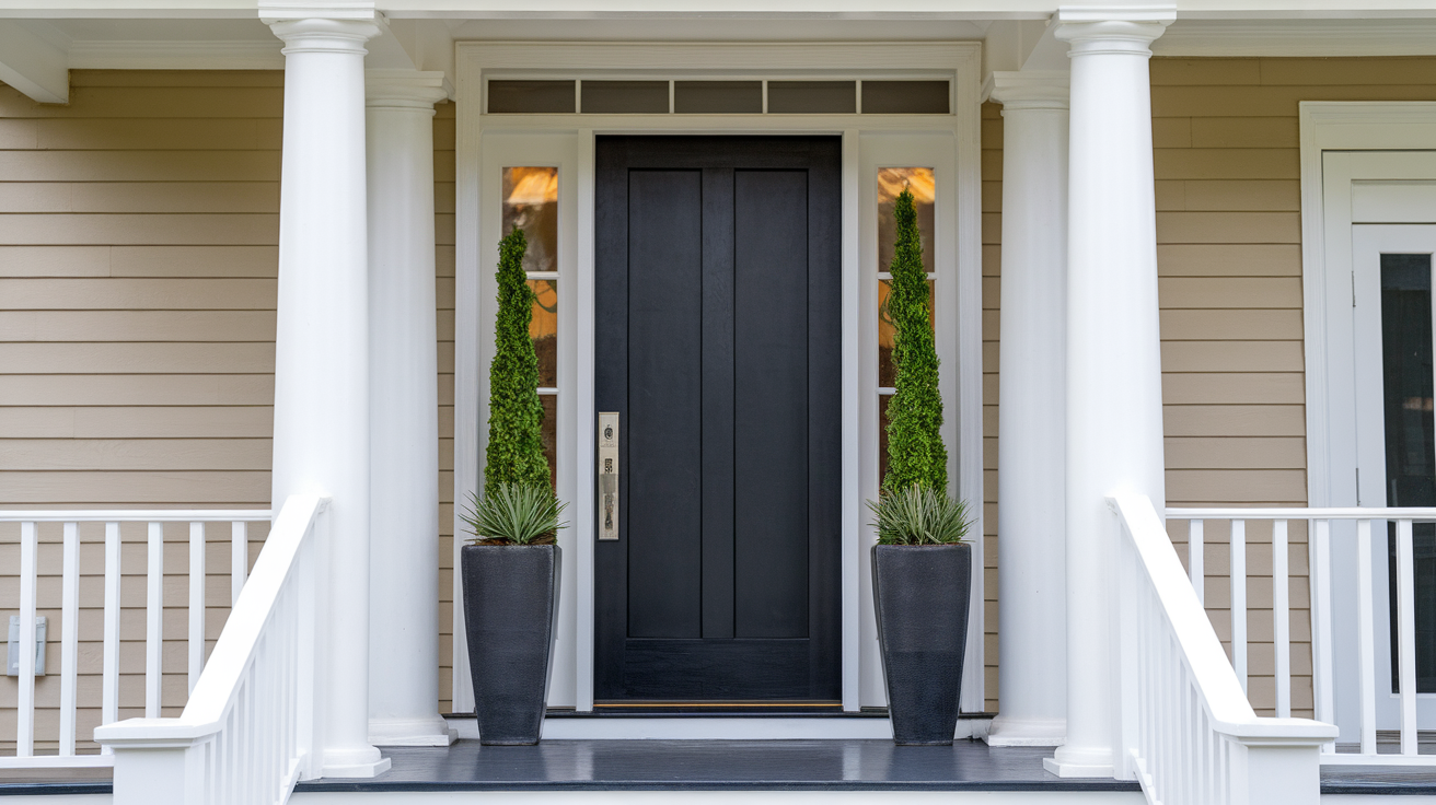
Dorian Gray by Sherwin Williams: Paint Review
Choosing a gray paint sounds easy until you’re standing in front of samples that all blur together. I’ve been there, wondering if one shade will feel too cold, too dark, or just off once it’s on the wall.
That’s why I created this guide: to help you determine if Sherwin-Williams Dorian Gray (SW 7017) is the right shade of gray for your space.
I’ll show you how it appears in real homes, how lighting affects it, how it compares to other popular grays, and what colors, textures, and finishes complement it well. Let’s get started and take out the guesswork.
Dorian Gray (SW 7017) by Sherwin-Williams

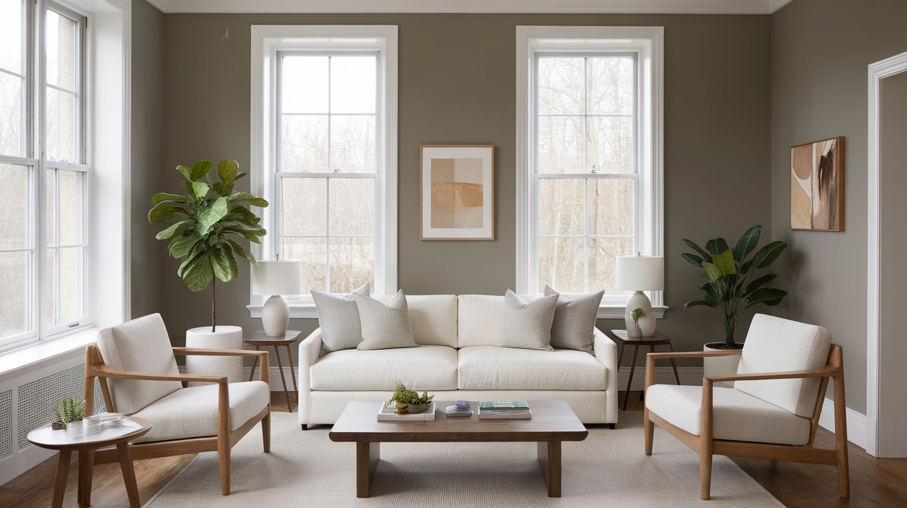
Dorian Gray (SW 7017) by Sherwin-Williams is a medium-depth neutral that’s often described as a warm, balanced gray.
This color fits into a wide variety of design styles, from modern to more traditional spaces, and offers enough color to add character without overwhelming a room.
Basic Color Profile
HEX code: #ACA79E
LRV (Light Reflectance Value): 39
Color family: Warm gray
Dorian Gray is part of the Sherwin-Williams Living Well Collection: Renew and is often used by designers looking for something just a little deeper than a light greige.
With its medium depth and warm base, it sits comfortably in the “not too light, not too dark” zone. A great middle ground if you’re working with contrasting trim or richer decor.
Undertones Explained
Dorian Gray is a warm gray with taupe and slight purple undertones. While those hints of color aren’t always obvious, they do shift with the lighting.
- In natural daylight, the color feels soft and neutral, with a slight greige warmth.
- Under warm bulbs, you might catch subtle taupe or violet shadows, especially in the corners or evening hours.
These undertones make Dorian Gray both versatile and a little moody. It can be cozy or refined, depending on how you style the room.
Where to Use Dorian Gray in Your Home
Dorian Gray works in more places than you might think. It’s versatile enough for entire walls, accent features, or even built-ins. Let’s look at where it shines.
Interior Rooms

You can use Dorian Gray in just about any room. It looks great in living rooms, especially when paired with wood furniture or neutral fabrics.
In bedrooms, it brings a sense of calm without being too dark or heavy. It also holds its own in home offices, offering a focused and quiet background.
Kitchens and Bathrooms
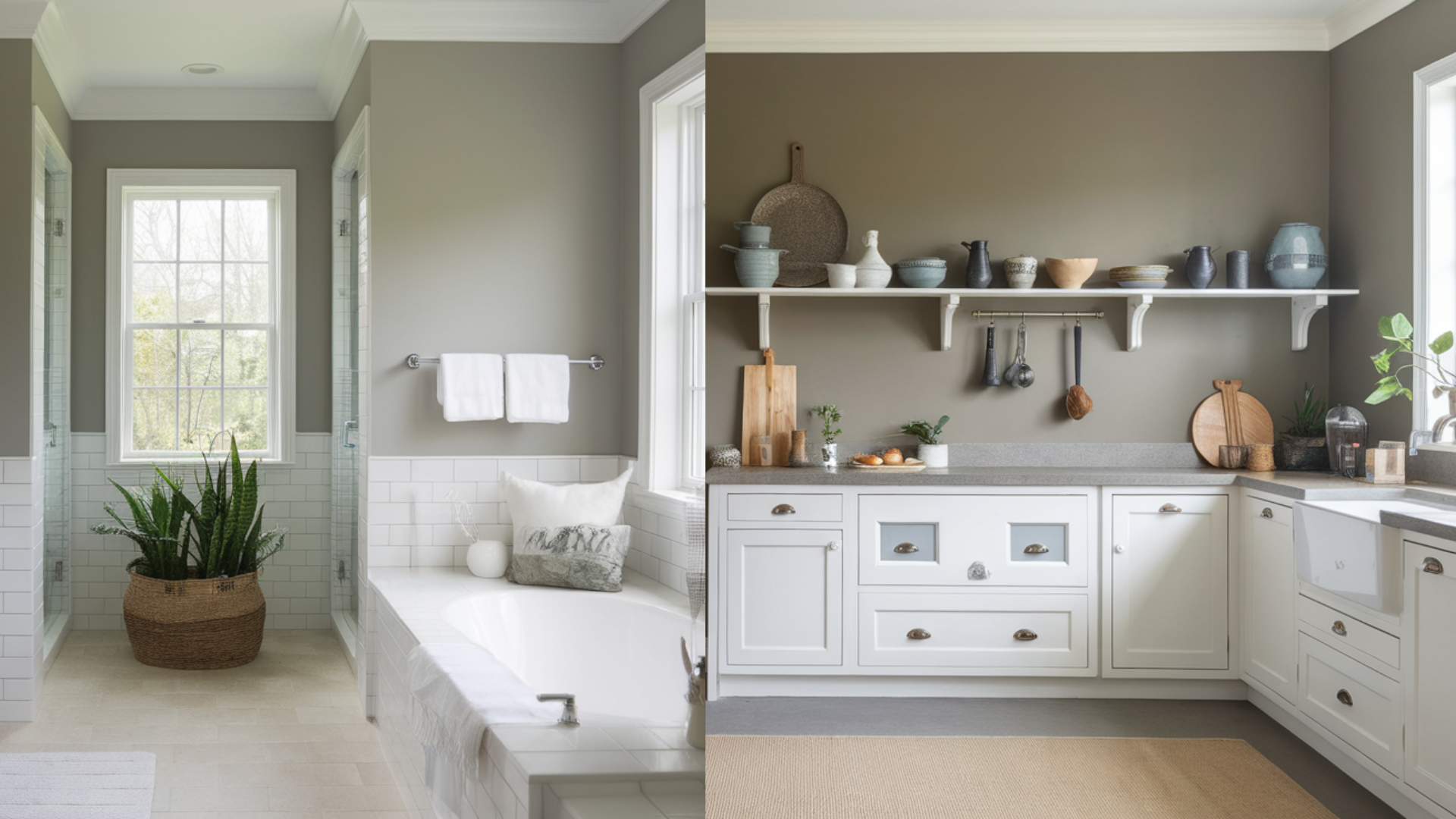
Dorian Gray shines on cabinets. If you pair it with white counters or even marble finishes, the warmth in the paint keeps things balanced.
It also hides minor scuffs or fingerprints better than lighter shades, which is a plus in busy spaces like kitchens and baths.
Exterior Applications

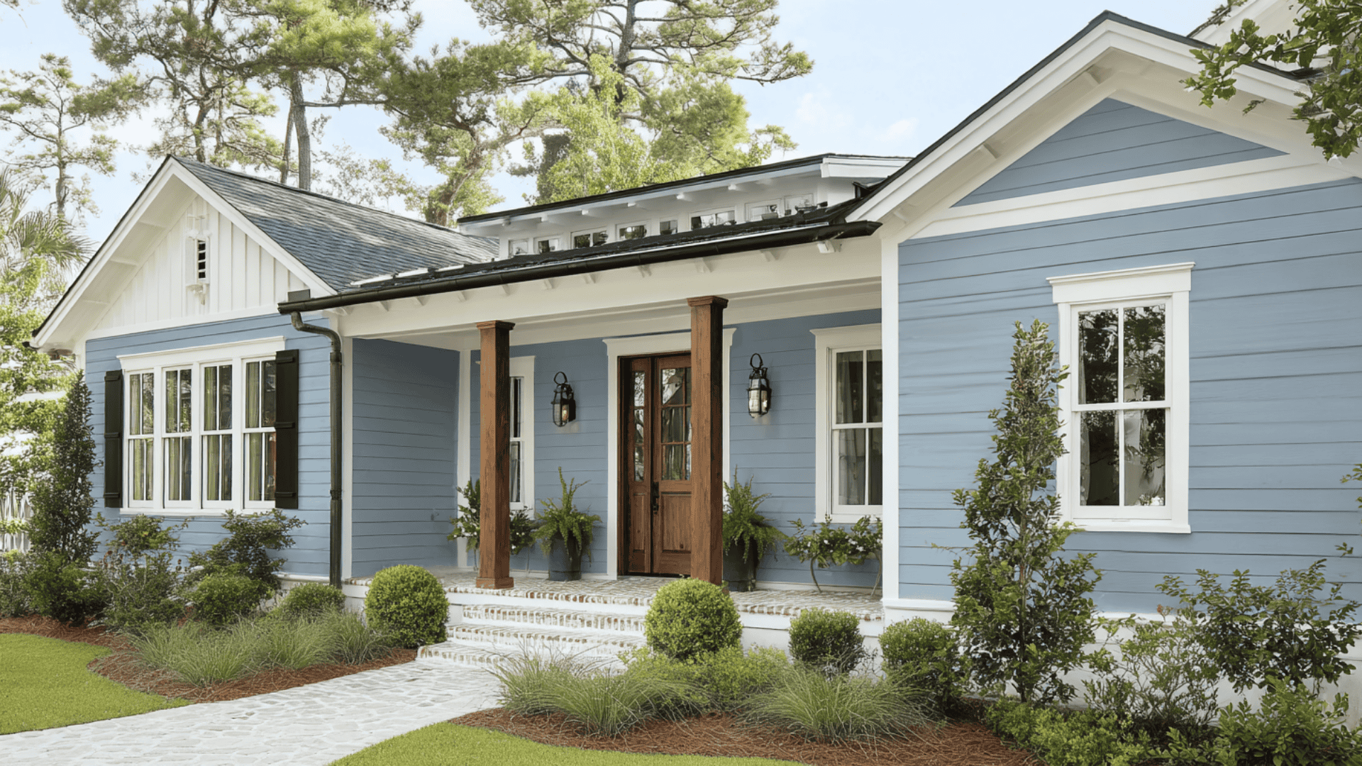
Dorian Gray is tough enough for outdoor use. It doesn’t fade quickly and handles direct sunlight well. On exteriors, it gives homes a grounded look, especially when paired with a crisp trim color like Pure White.
How Lighting Affects It
Dorian Gray’s undertones and depth make it highly responsive to lighting changes.
- North-facing rooms: Light is cooler, which may bring out more of the purple-gray base.
- South-facing rooms: Natural light makes it feel warmer and softer, even slightly greige.
- East-facing rooms: Morning light can make it appear cooler early, then warm up by midday.
- West-facing rooms: Warm evening light deepens the taupe, adding cozy depth.
This color can shift throughout the day, so be sure to sample it on multiple walls to see what you’re working with
Dorian Gray vs. Other Sherwin-Williams Grays
There are many grays in the Sherwin-Williams collection, and each one tells a slightly different story. Here’s how Dorian Gray compares to some other popular choices:
Dorian Gray vs. Mindful Gray
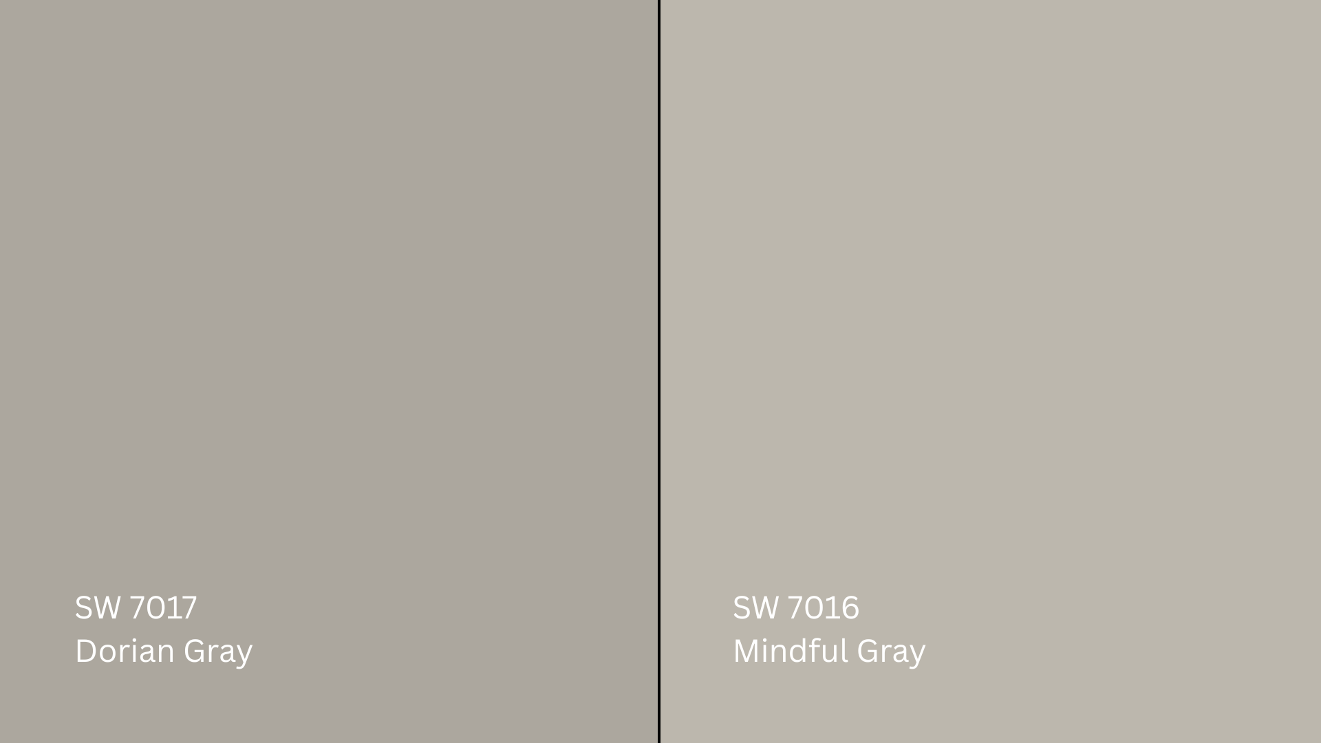
Mindful Gray (SW 7016, #BCB7AD)is a lighter gray with a slight hint of green. It looks soft and neutral in most rooms. Dorian Gray, on the other hand, is a little darker and has a warmer, slightly taupe base.
If you’re looking for a gray that feels lighter and more calming, Mindful Gray is a great choice. But if you’re going for something a little deeper and richer, Dorian Gray will work better.
Dorian Gray vs. Repose Gray
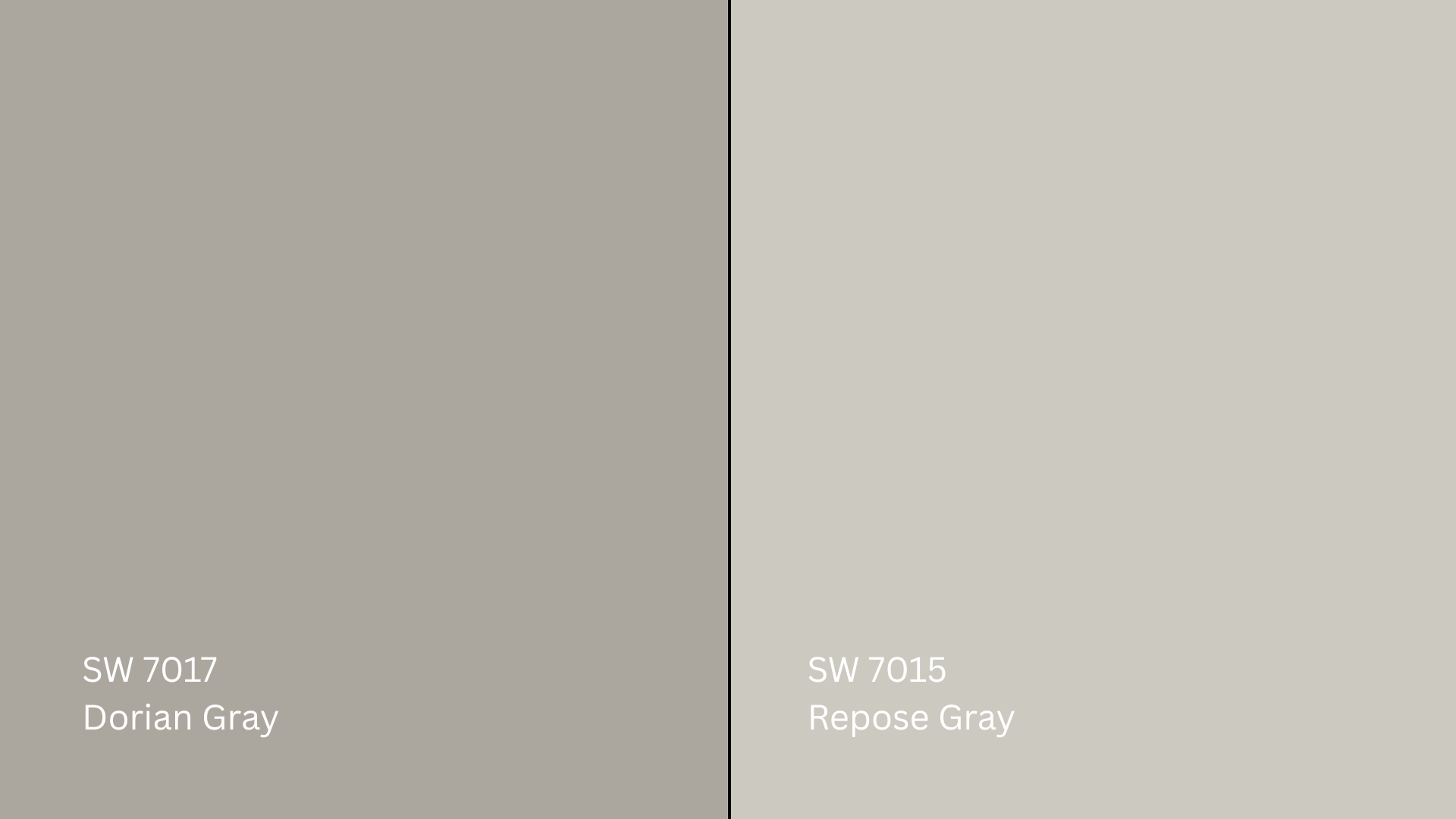
Repose Gray (SW 7015, #CCC9C0) is also lighter than Dorian Gray. It has a cool side, with small touches of purple and blue. That makes it feel more crisp. Dorian Gray leans warmer and doesn’t shift as much with different lighting.
If you want a cool-toned gray that blends easily with most colors, Repose Gray is a smart pick. If you prefer a warmer and more grounded feel, Dorian Gray might be a better fit.
Dorian Gray vs. Gauntlet Gray
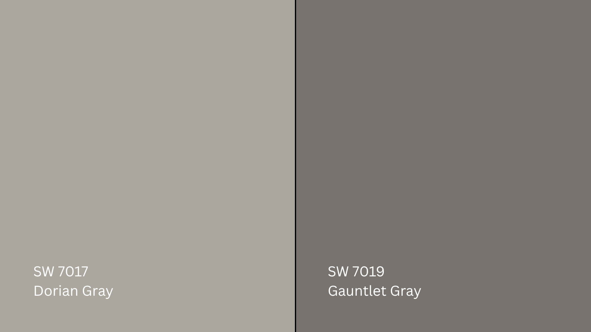
Gauntlet Gray (SW 7019, #78736E)is much darker and bolder than Dorian Gray. It brings a strong and moody vibe to a room. Dorian Gray, in contrast, is more balanced and doesn’t feel as heavy.
If you’re looking for a deep, dramatic gray, Gauntlet Gray might be what you need. But if you want a color that still adds weight without going too dark, Dorian Gray will be the better choice.
LRV and Undertone Comparison Table
| Color | LRV | Undertone | Best For |
|---|---|---|---|
| Dorian Gray | 39 | Warm brown | Cabinets, exteriors, bedrooms |
| Mindful Gray | 48 | Warm green gray | Living rooms, kitchens, and open floor plans |
| Repose Gray | 58 | Cool violet-blue | Gallery walls, hallways, bedrooms |
| Gauntlet Gray | 17 | Warm charcoal-brown | Accent walls, fireplaces, and bold contrast walls |
Best Coordinating Colors for Dorian Gray
Wall & Trim Pairings
To get a clean contrast, pair Dorian Gray with:
- Pure White (SW 7005, #EDECE6): Crisp and clean, perfect for trim
- Alabaster (SW 7008, #EDEAE0): Soft and creamy
- Greek Villa (SW 7551, #F0ECE2): Slightly warmer white with great balance
Accent Colors
If you’re adding accents, Dorian Gray works well with:
- Urbane Bronze(SW 7048, #54504A): A deep, grounding tone
- Naval(SW 6244, #2F3D4C): A rich navy blue for bold contrast
- Warm taupes and muted greens: These bring in a cozy, natural feel
Paint Finish Recommendations
The finish you pick can make Dorian Gray look softer or more dramatic.
Matte: Great for bedrooms or ceilings. Keeps the gray velvety and understated.
Eggshell: Best for living rooms and dining areas. Adds a soft glow without harsh reflections.
Satin: Ideal for kitchens, bathrooms, and hallways. Reflects more light and shows depth.
If you’re torn between two finishes, try both in sample swatches and check them in natural and artificial light.
Sampling and Buying Options
Before committing to a gallon, it’s always a good idea to sample Dorian Gray in your home’s lighting.
Where to Get Peel-and-Stick Samples
- Samplize: Offers real Sherwin-Williams paint samples with adhesive backs.
- Sherwin-Williams stores: Carry paint chips and small sample pots.
- Online: Sherwin-Williams.com lets you order paint, chips, or test kits directly.
Stick samples on walls in different rooms and check them throughout the day to see how Dorian Gray behaves.
Where to Buy the Paint
- Sherwin-Williams stores: Offers all finishes in stock
- Sherwin-Williams.com: Easy online ordering and store pickup
- Authorized dealers and hardware stores: May stock or custom mix
Many stores also offer curbside pickup or local delivery, so check ahead for options.
Paint Equivalents in Other Brands
If you’re not going with Sherwin-Williams, there are a few paints from other popular brands that come close to Dorian Gray.
Benjamin Moore:
Revere Pewter (HC-172, #CBC6B8): A warm gray with soft undertones, similar in mood and depth to Dorian Gray.
Pashmina (AF-100, #BBB2A1): Slightly deeper with more taupe, but still in the same cozy gray family.
Behr:
Mined Coal (PPU18-18, #6C6B65): A soft, earthy gray that leans slightly warm, giving off a similar feel.
Perfect Taupe (PPU18-13, #B6ACA0): A balanced warm gray with a grounded look, close to Dorian Gray in tone.
Just like with any gray, test these side by side with Dorian Gray. Lighting, surface texture, and paint brand can all affect how the final color appears.
Conclusion
Dorian Gray by Sherwin-Williams has become one of my favorite warm grays. It’s balanced, easy to work with, and looks great in all kinds of spaces.
If you’ve ever felt stuck picking the right gray, this guide should help you figure out if it fits your lighting and style. You’ve seen how it looks in real rooms, how it compares to other grays, and what colors pair well with it.
Just remember to test a sample first; lighting can shift the look more than you might expect.
Looking for more help choosing colors that actually work? Take a look at our other paint guides and design tips to keep your next project simple and stress-free.

