Coastal Curb Appeal: 15 Ways to Make a Beach House Look Custom on a Budget
Drive through almost any shoreline neighborhood and the houses start to blur together. Same siding, same builder-grade fixtures, same shade of pale gray that looked safe on a sample chip. The bones are often good. What’s missing is the layer of decisions that separates a house someone built from a house someone cared about — and that layer, contrary to what most renovation budgets assume, is not expensive. It’s specific. A custom look comes from a handful of small choices made with intention, repeated consistently across the front of the house, rather than one dramatic project that eats the entire budget. The list below works from the top of the house down, because that’s the order in which problems compound.
Color Choices That Do the Heavy Lifting
Paint is the cheapest way to change a house and the easiest to get wrong. Coastal light is harsh, reflective, and constantly moving, which means colors behave differently here than they do on an inland street.
1. Test the Body Color in Direct Afternoon Sun
Sample boards, not sample squares. Paint two square feet of poster board, prop it against the siding, and look at it at three different hours. Colors that read as soft indoors often go chalky or greenish under bright reflected light off sand and water.
2. Give the Trim Its Own Color
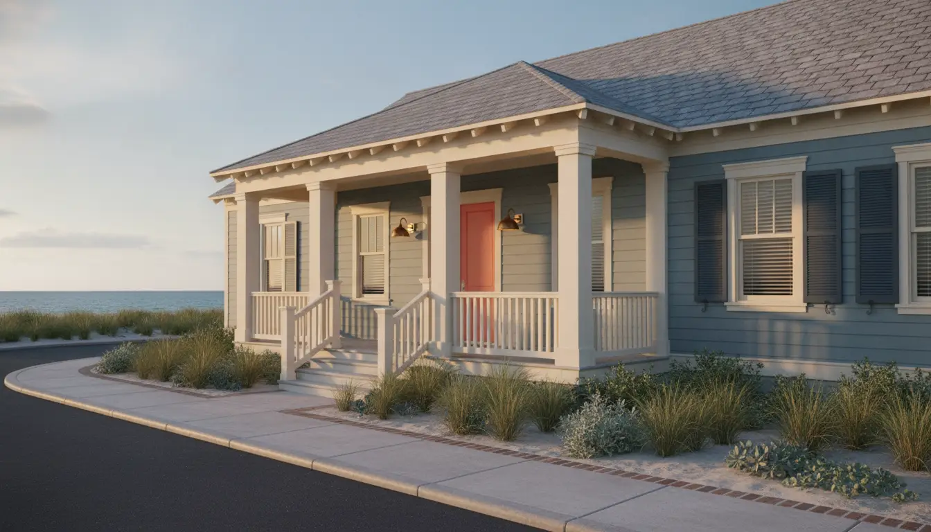
White-on-white trim disappears. Shifting the trim two or three steps warmer or cooler than the body creates a visible outline around windows and corners, which reads as deliberate rather than default.
3. Treat the Front Door as the Accent
One saturated color on the door, echoed nowhere else, gives the eye a place to land. If the house was built before 1978, scrape carefully and check the EPA’s guidance on lead-safe work practices before sanding anything.
The Roof Sets the Tone for Everything Below
Paint only holds up if what’s above it is sound, and no exterior refresh survives water getting in behind it. The roof is also the single largest visible surface on most houses, which makes it a design element whether or not anyone treats it as one.
4. Choose the Roof as a Color Decision, Not Just a Repair
Shingle color determines what siding and trim colors are even available to you. A cool gray roof kills a warm sand-colored body; a brown-toned roof fights blue. Homeowners on the South Carolina coast tend to learn this the hard way, replacing siding to match a roof they picked in a hurry — which is why it’s worth asking a Myrtle Beach roofer for physical shingle samples to hold against the house before signing anything, rather than choosing from a brochure in an office. Salt air and wind uplift also narrow the field of products that make sense near the water, and a contractor who works that coastline daily will steer you away from the ones that don’t last.
5. Match the Metal to the Plan
Gutters, drip edge, flashing, and vents should share a finish. Mixed white gutters, mill-finish flashing, and a dark roof make a new roof look patched together. Specifying one color across all of it costs almost nothing at the time of install and is expensive to fix later.
Small Architectural Details, Large Visual Payoff
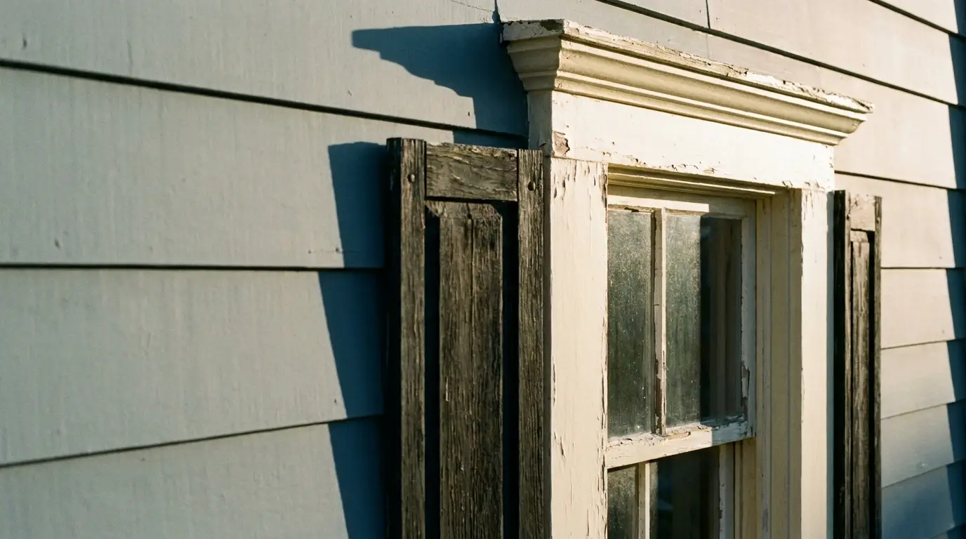
With the top of the house resolved, the next gains come from adding depth. Builder-grade exteriors are flat. Custom exteriors have shadow lines, and shadow is mostly a function of how thick things are.
6. Thicken the Window Trim
Wrapping existing casing in wider stock — moving from three inches to five, say — changes the proportion of every opening on the front of the house. It’s a weekend of work and a few hundred dollars in material.
7. Size Shutters as If They’d Close
Shutters that are visibly too narrow announce themselves as decoration. Each shutter should be half the width of the window it flanks. If that’s not possible, skip shutters entirely and put the money into trim.
8. Build out the Porch Posts
Skinny 4×4 columns can be wrapped in painted boards to read as substantial square columns. The structural post stays; the appearance changes completely.
9. Add One Gable Detail
A single bracket, a bit of shiplap in the gable end, or a small vent with real trim around it gives the front elevation a focal point above the door.
Hardware, Lighting, and the Things People Touch
Details at eye level get looked at closely, so they carry more weight per dollar than anything else on the house.
10. Replace Fixtures as a Set
One new porch light next to two old ones looks worse than three old ones. Buy the entry light, the garage lights, and any post light together. Warm-toned, shielded fixtures aimed downward light the house better and spill less into the sky — the DarkSky guidance on outdoor lighting is a useful reference for picking them.
11. Make the Address Readable From the Street
Numbers should be at least five inches tall, mounted on a backing board or directly on a well-lit surface. This is a twenty-dollar upgrade that people notice immediately.
12. Upgrade the Door Hardware
A solid handle set with a real weight to it changes the impression of the entire entry. Match the finish to the light fixtures and keep it consistent.
Ground-Level Work That Frames the House
Everything above only reads well if the base of the house looks intentional. The ground plane is where most exteriors quietly fall apart.
13. Define the Walkway Edge
A cut border of brick, steel edging, or even a clean spade-cut line between path and planting bed makes an ordinary concrete walk look installed rather than poured.
14. Plant for the Conditions, Not the Catalog
Salt spray, sandy soil, and wind narrow the list considerably. Check what actually survives locally against the USDA Plant Hardiness Zone Map and lean on massed plantings of a few reliable species instead of one of everything.
15. Hide the Utility Clutter
Hose bibs, meters, condenser units, and trash storage sit at exactly the height the eye scans. A simple slatted screen painted to match the trim removes visual noise for the price of a few boards.
Pulling It Together
None of these moves is dramatic on its own. That’s the point. A house looks custom when its choices agree with each other — when the trim relates to the roof, the lighting relates to the hardware, and the plantings relate to the walkway rather than each one having been decided in isolation on a different weekend. Budget constraints aren’t really the obstacle most homeowners think they are. Working in a sensible order matters more than spending more, since decisions made at the top of the house set the limits for everything underneath, and reversing that order is what turns a modest refresh into an expensive one. Start with what protects the house, resolve color and proportion next, then finish with the details people see up close. Do that consistently and the result reads as designed, which is the whole objective.