
How to Choose Best White Paint for Interior Walls
Searching for the best white paint for interior walls feels overwhelming when you face hundreds of shades at the paint store.
Here’s the secret designers know: the perfect white depends on your room’s light, size, and style.
Some whites are warm and cozy, others are crisp and modern. The right choice enhances your space, but the wrong one leads to disappointment and repainting.
Is White Paint Trending?
White paint is making a big comeback, but with a twist. Today’s popular whites are warmer and softer than the cool, bright whites of the past.
White walls make rooms look bigger and brighter while working with any decorating style. They’re like a blank canvas that shows off your furniture, art, and special details.
Best of all, white never goes out of style. You can easily update your space by just changing pillows or decorations.
Understanding White Paint: The Basics
Choosing white paint isn’t as simple as it sounds. To pick the perfect shade, you need to understand three key factors that make each white unique.
1. Undertones Explained
White paint has subtle color hints known as undertones. The main ones are yellow, blue, pink, and green, which influence whether whites appear warm or cool.
Gray undertones give white a balanced look, making it versatile for almost any space.
2. Light and White Paint
Natural light completely changes how white paint looks on your walls. North-facing rooms get cool, bluish light and need warm whites to feel cozy. South-facing rooms receive warm, golden light and can handle cooler whites.
East- and west-facing rooms change throughout the day, so consider when you use the room most.
3. LRV (Light Reflectance Value)
LRV measures how much light a paint color reflects on a scale from 0 to 100. Higher LRV numbers mean brighter walls that bounce more light around your room.
Most white paints have an LRV between 80 and 95, with higher numbers creating the brightest, most open feeling.
The Top Designer-Approved White Paints for Interior Walls
These twelve white paints are favorites among professional designers for good reason. Each one brings something special to your walls.
1. Benjamin Moore White Dove (OC-17)

This soft, warm white with gray undertones is popular among interior designers. It works well on walls, trim, and ceilings without feeling too stark. With an LRV of 83.16, it creates a cozy, welcoming atmosphere.
Best Used In: Living rooms and bedrooms
Pairs Well With: Navy blues and warm woods
Avoid If: You prefer cool-toned whites
2. Sherwin-Williams Alabaster (SW 7008)

A warm, creamy white that feels soft and inviting without looking yellow. It’s slightly warmer than White Dove and creates a subtle glow in any room. With an LRV of 82, it reflects plenty of light while maintaining warmth.
Best Used In: Entire homes and open spaces
Pairs Well With: Greige and natural textures
Avoid If: Your room lacks natural light
3. Benjamin Moore Simply White (OC-117)

A clean, crisp white with warm yellow undertones that never feels cold. It’s brighter than White Dove and works especially well in modern spaces. Its LRV of 91.7 makes rooms feel open and airy.
Best Used In: Kitchens and modern interiors
Pairs Well With: Bold colors and patterns
Avoid If: You want a softer look
4. Sherwin-Williams Pure White (SW 7005)
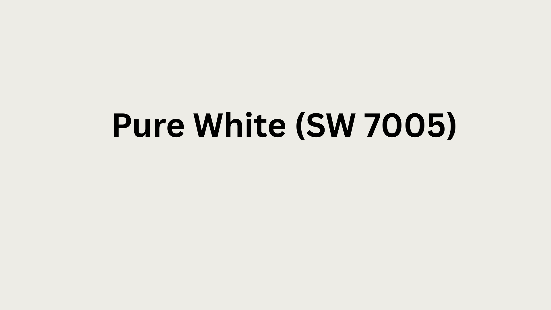
A warm white with subtle peachy-yellow undertones that adds gentle warmth. It’s slightly creamier than Simply White and feels more traditional. With an LRV of 84, it brightens without being too bright.
Best Used In: Traditional homes and hallways
Pairs Well With: Warm grays and earth tones
Avoid If: Rooms have yellow lighting
5. Benjamin Moore Chantilly Lace (OC-65)

A bright, clean white with barely-there warm undertones that feels fresh. It’s one of the truest whites without going stark or cold. Its high LRV of 92.2 maximizes light reflection beautifully.
Best Used In: Trim and contemporary spaces
Pairs Well With: Any color or style
Avoid If: You prefer cozy warmth
6. Farrow and Ball All White (No. 2005)

A warm, architect-favorite white with subtle depth and character. It has a chalky, refined finish that looks expensive and refined. The LRV of 84 provides brightness with understated elegance.
Best Used In: High-end homes and studies
Pairs Well With: Rich jewel tones
Avoid If: You’re on a tight budget
7. Benjamin Moore Cloud White (OC-130)

A soft, warm white with slight gray-beige undertones that feels gentle. It’s warmer and creamier than White Dove in most lighting. With an LRV of 85.73, it creates comfortable, livable spaces.
Best Used In: Bedrooms and cozy spaces
Pairs Well With: Warm neutrals and pastels
Avoid If: You want bright crispness
8. Sherwin-Williams Greek Villa (SW 7551)

A soft, warm white with subtle beige undertones that feels welcoming. It’s slightly creamier than Alabaster and works beautifully in traditional homes. With an LRV of 81, it provides gentle brightness without harshness.
Best Used In: Family rooms and dining areas
Pairs Well With: Warm browns and taupes
Avoid If: Rooms get cool northern light
9. Benjamin Moore Decorator’s White (CC-20)

A clean, crisp white with cool undertones that feels fresh and modern. It’s brighter than most warm whites and reflects maximum light. Its LRV of 83.87 makes small spaces feel larger.
Best Used In: Bathrooms and small rooms
Pairs Well With: Cool grays and blues
Avoid If: You prefer cozy warmth
10. Sherwin-Williams Extra White (SW 7006)
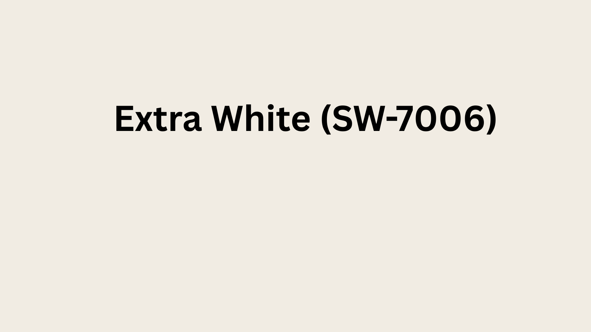
A bright, cool white with blue undertones that feels ultra-clean and contemporary. It’s one of the brightest whites available for maximum light reflection. With an LRV of 86, it creates the most open feeling.
Best Used In: Modern homes and ceilings
Pairs Well With: Black and white schemes
Avoid If: Room lacks sufficient lighting
11. Benjamin Moore Swiss Coffee (OC-45)

A warm, creamy white with yellow undertones that feels comforting. It’s richer than White Dove and deeper. Its LRV of 83.93 provides warmth while maintaining brightness.
Best Used In: Traditional spaces and exteriors
Pairs Well With: Warm wood and brick
Avoid If: You want contemporary crispness
12. Farrow & Ball Pointing (No. 2003)
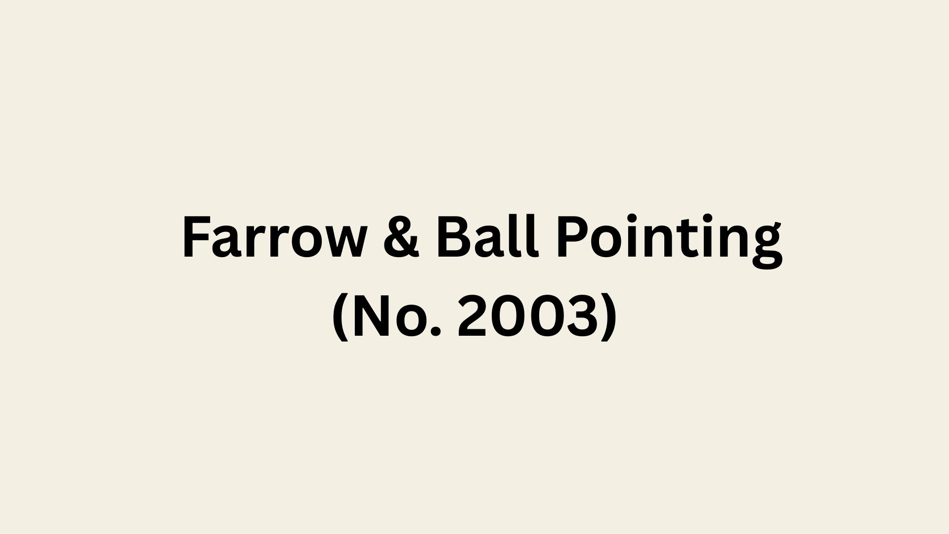
A warm, off-white with subtle stone-like undertones that adds character. It’s less bright than most whites but incredibly sophisticated. With an LRV of 82, it creates elegant, timeless spaces.
Best Used In: Period homes and libraries
Pairs Well With: Deep greens and blues
Avoid If: You need maximum brightness
How to Choose the Perfect White Paint
Finding the right white paint takes more than picking a pretty color card at the store. Follow these five simple steps to choose a white that looks perfect in your specific space.
- Assess Your Space: Check which direction your windows face, look at your existing floors and cabinets, think about room size, and consider how you use the space daily
- Narrow Down Undertones: Match your white’s undertone to existing finishes, choose warm whites for cozy traditional spaces, pick cool whites for modern crisp looks, or use gray-undertone whites when unsure
- Order Samples: Buy large peel-and-stick samples or paint poster boards, apply them to at least two different walls, live with samples for three to five days, and compare them side-by-side
- Test at Different Times: Check samples in bright morning light, observe afternoon sun changes, turn on artificial lights at night, and take photos at different times to compare shifts
- Paint Corners: Apply sample paint into corners where walls meet, see how light hits from multiple angles, reveal undertones better than flat sections, and understand exactly how shadows affect color
Common White Paint Mistakes to Avoid
Even experienced decorators make mistakes when choosing white paint. Avoid these five common errors to ensure your white walls look their absolute best.
- Choosing Too Cool for Dark Rooms: Cool whites make dark rooms feel cold and institutional instead of bright and welcoming, especially in north-facing spaces that already get blue-toned light throughout the day.
- Not Testing Samples Properly: Tiny paint chips don’t show real results, so buy large samples, paint poster boards, and observe them for several days in different lighting conditions before deciding.
- Ignoring Undertones with Existing Finishes: White paint undertones must match your floors, cabinets, and countertops or everything clashes, like pink-toned whites fighting against honey oak or yellow whites clashing with gray tile.
- Painting Everything the Same White: Walls, trim, and ceilings look better in slightly different whites, with a brighter white on trim creating contrast and depth, making architectural details pop throughout your space.
- Wrong Sheen Selection: Flat paint shows every fingerprint, while satin resists stains; choose eggshell for living areas, satin for kitchens and bathrooms, and semi-gloss for high-traffic trim and doors.
Choosing the Right Sheen for Your Space
Paint sheen affects durability, washability, and how much light a room reflects. Use this guide to choose the right finish for each surface.
| SHEEN TYPE | BEST FOR | WHY IT WORKS |
|---|---|---|
| Flat / Matte | Ceilings, low traffic areas | Hides imperfections, soft non-reflective look |
| Eggshell | Living rooms, bedrooms | Slight sheen, easy to clean, balanced finish |
| Satin | Kitchens, bathrooms, hallways | More durable, moisture-resistant, wipes clean |
| Semi Gloss | Trim, doors, cabinets | Tough finish, resists scuffs, crisp definition |
| High Gloss | Accent areas, dramatic details | Maximum shine, bold effect, highlights surfaces |
Wrapping It Up
Finding the best white paint for interior walls isn’t about following trends; it’s about discovering which white makes your specific space shine.
The perfect shade depends on your room’s natural light, finishes, and overall style, so test samples and watch how they shift throughout the day.
Your ideal white will reveal itself when you see it in your own lighting. Ready to change your walls? Grab those samples and begin your white paint venture today.


