
Benjamin Moore’s Tarrytown Green (HC-134) Review
Selecting colours can feel overwhelming with thousands of options available. That’s where Tarrytown Green HC-134 comes in, a classic Benjamin Moore shade that strikes the perfect balance between bold and subtle.
In this guide, we’ll show you what makes this shade special, how it looks in different lighting, and which colours pair well with it.
By the end, you’ll understand why designers often recommend this shade for anyone seeking a green that feels both fresh and classic.
Ready to see if this colour might be right for your next project?
The Basics of Tarrytown Green
Tarrytown Green Colour HC-134 is a rich, mid-tone green with subtle blue undertones. Its LRV is 9.71.
This paint colour sits on the cooler end of the green spectrum. It resembles a deep pine green that’s been slightly muted, making it more versatile than brighter greens while still maintaining enough depth to make a statement.
This historic Benjamin Moore shade strikes a thoughtful balance between being too dark and too light, allowing it to work well as both an accent colour and a main wall colour depending on your design goals.
Tarrytown Green in Different Spaces
This versatile green shade works wonderfully in various spaces throughout the home. Here’s where Tarrytown Green truly shines.
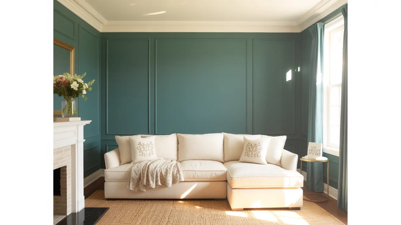
Living Room
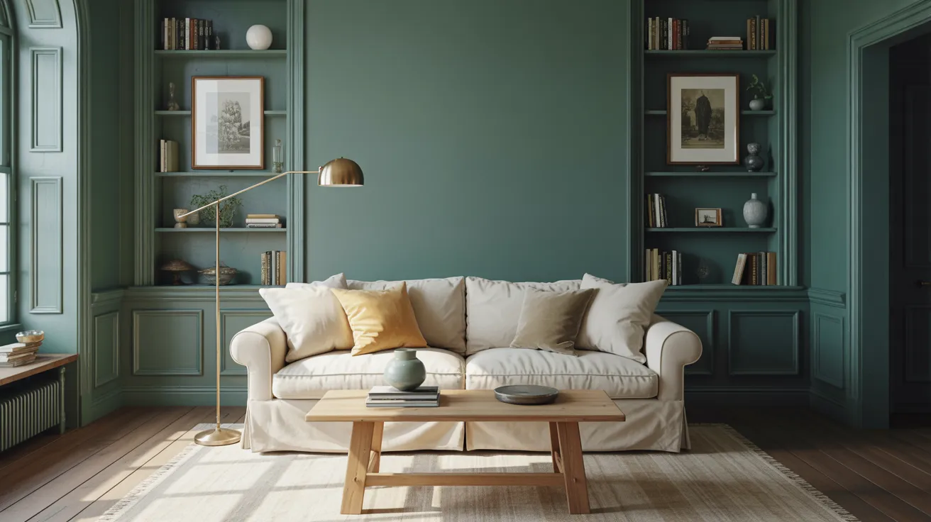
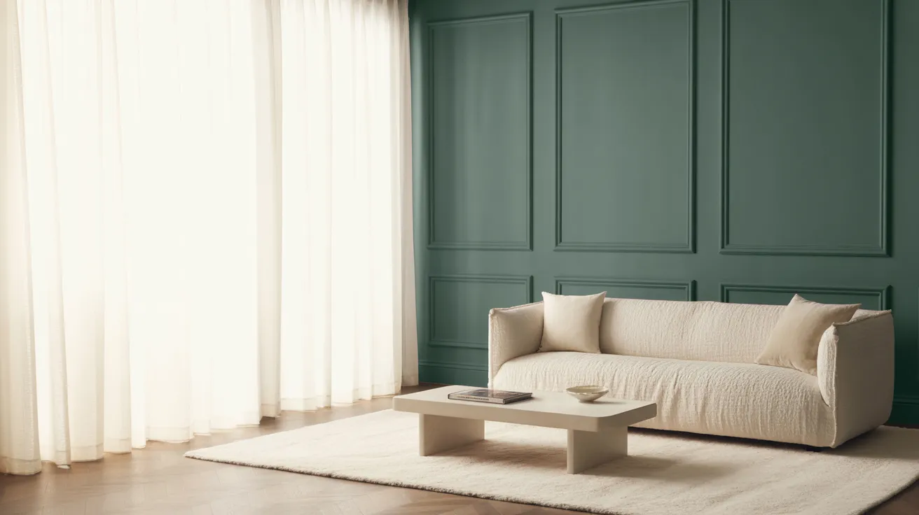
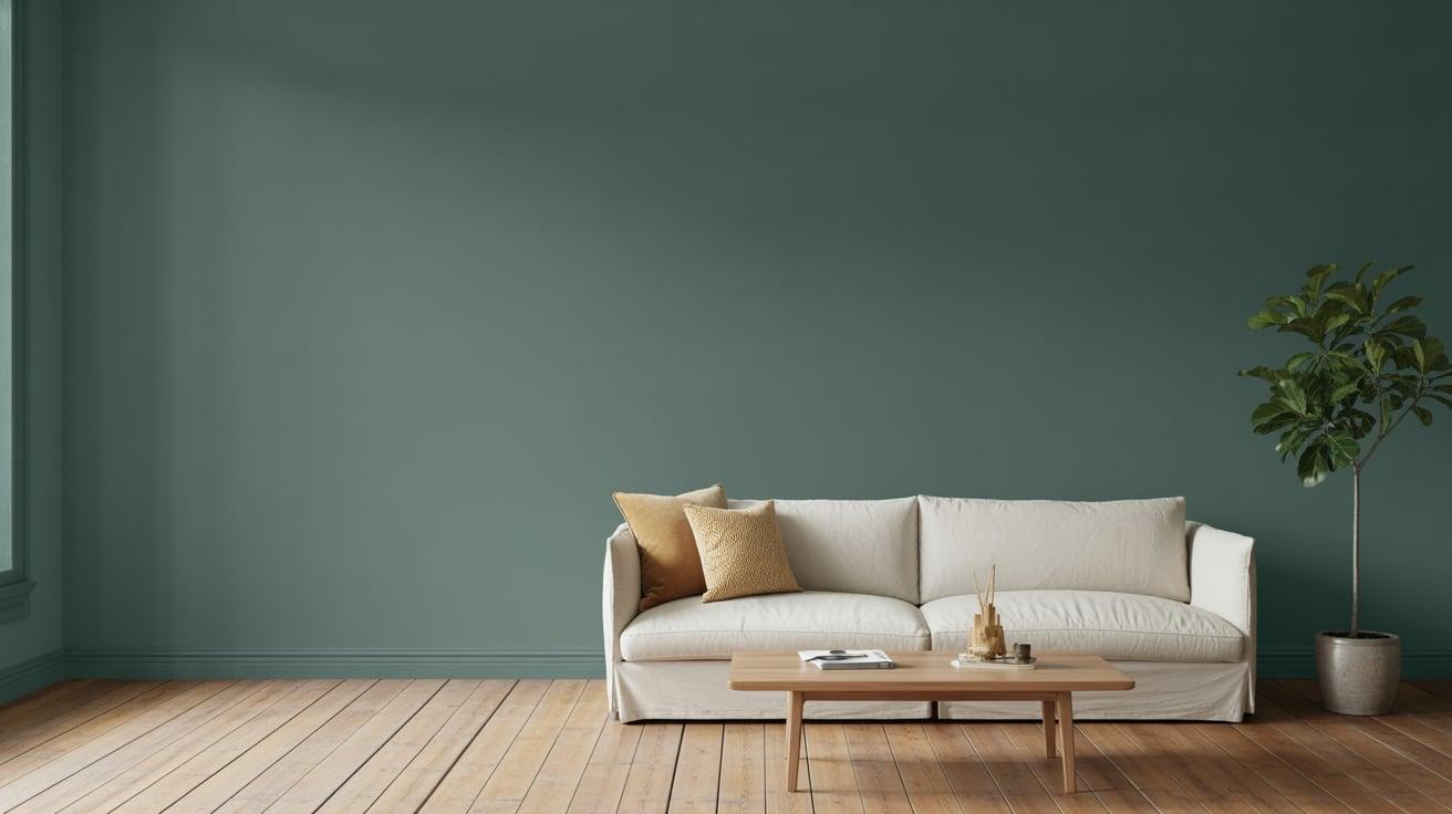
In living rooms, Tarrytown Green creates a warm, inviting atmosphere that feels both classic and fresh. Paint all four walls for a cozy, library-like feel that makes furniture and art stand out beautifully.
The colour forms an ideal backdrop for cream upholstery, natural wood tones, and brass accents.
For a more subtle approach, use it on built-in shelving or as an accent wall behind a fireplace to add depth without overwhelming the space.
Kitchen Cabinets
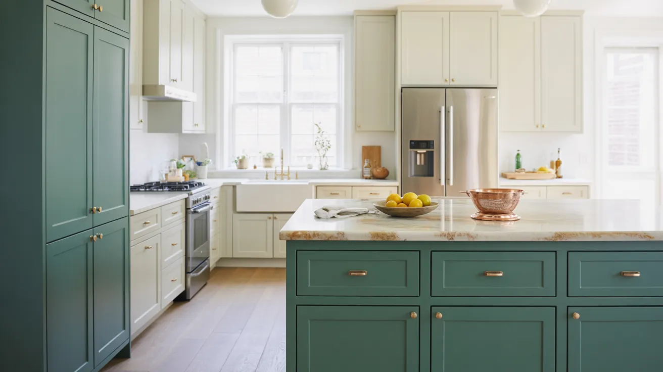
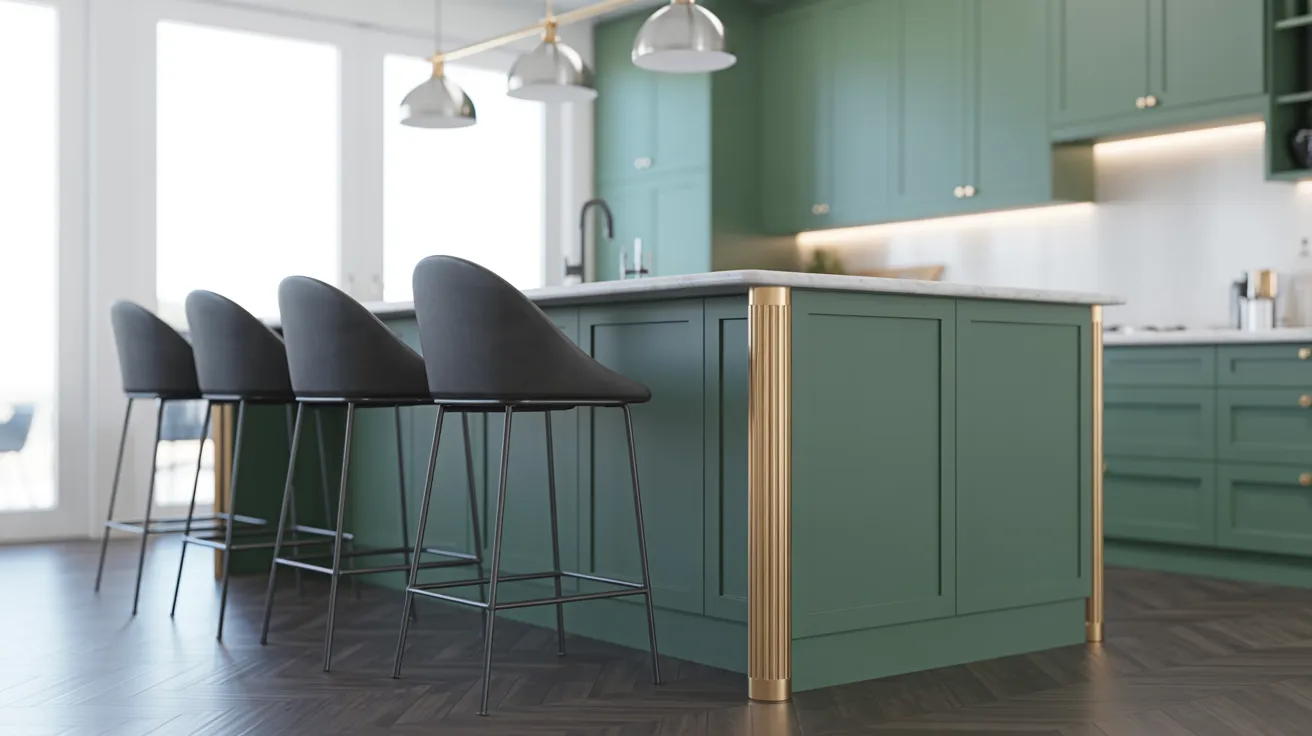
Kitchen cabinets painted in Tarrytown Green offer a welcome break from white and grey without going too bold.
This shade pairs beautifully with marble or quartz countertops, especially those with warm undertones. The colour holds its own against stainless steel appliances while creating visual interest.
Lower cabinets in Tarrytown Green with upper cabinets in a light neutral create a balanced, current look that won’t feel dated in a few years.
Bathroom Walls or Vanity
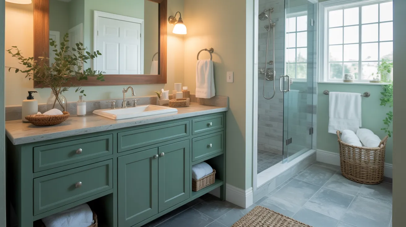
Bathrooms gain a spa-like quality with Tarrytown Green on the walls, particularly when paired with white fixtures and natural materials like wood or stone.
The colour works especially well in bathrooms with limited natural light, as it creates depth without making the space feel smaller.
For a more subtle approach, paint just the vanity while keeping the walls light, creating a focal point that anchors the room.
Bedroom Accent Walls
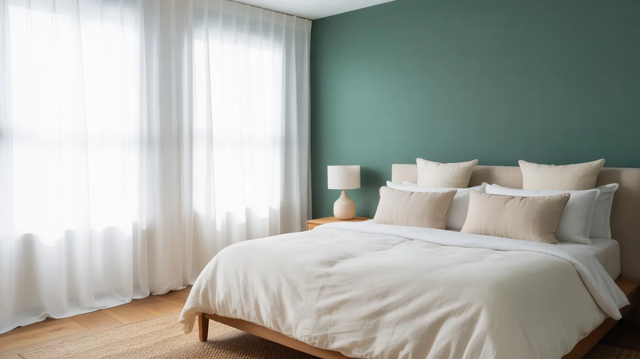
As a bedroom accent wall, Tarrytown Green creates a calming focal point behind the bed. The colour’s slightly muted quality makes it perfect for sleep spaces, as it feels both cozy and restful.
Pair with soft whites, natural linens, and minimal patterns for a tranquil retreat. The cool undertones work well with both crisp whites and warmer neutrals in bedding and window treatments.
Exterior Siding or Front Door
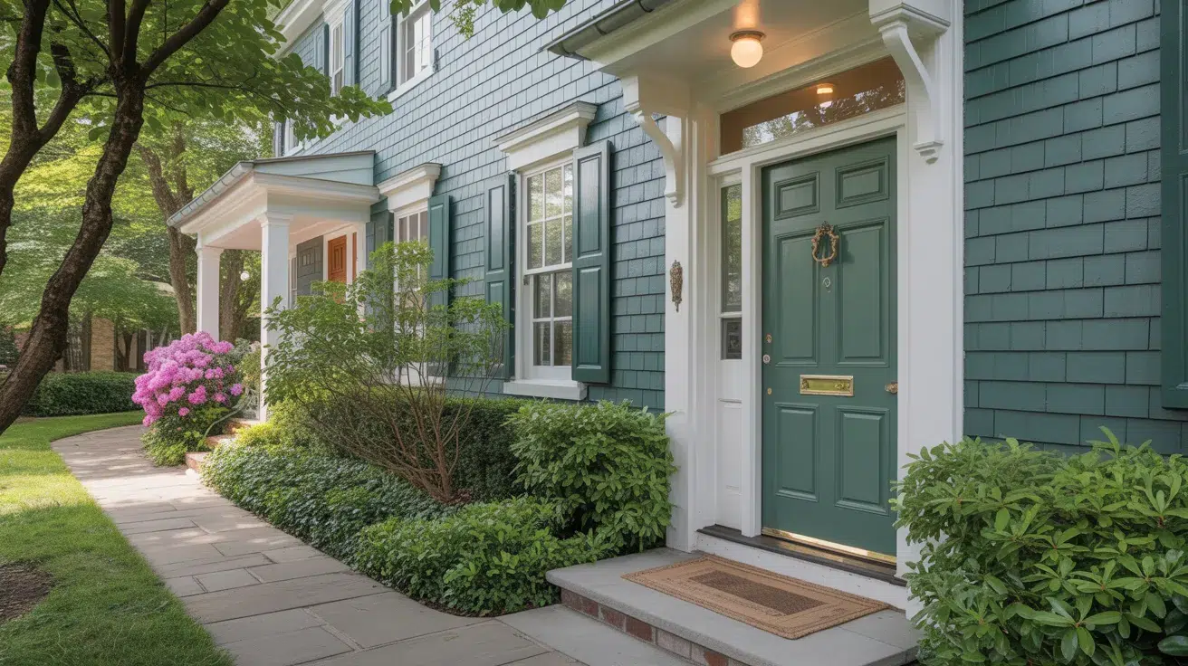
On home exteriors, Tarrytown Green makes a subtle statement that connects with landscape elements while maintaining curb appeal.
As siding, it pairs beautifully with white trim and natural stone. As a front door colour, it offers a welcome alternative to black or navy while still feeling classic and refined.
The shade looks particularly striking against brick or light-coloured homes, creating a welcoming entrance with character.
Furniture Pairing Ideas
Finding the right complementary decor can help Tarrytown Green truly shine in your space. These pairings highlight the colour’s natural beauty while creating balanced, cohesive rooms.
Neutrals That Work Well
Tarrytown Green pairs beautifully with soft whites, creating a clean contrast without harshness.
For a warmer look, consider Swiss Coffee or Ivory White to soften the overall effect. For depth, try darker neutrals like Chelsea Grey or Kendall Charcoal as accents.
Wood Tones and Finishes
Medium oak and walnut provide a balanced contrast that feels both classic and fresh.
Lighter woods like maple or ash create a more modern contrast that brightens the space. Even pine, with its yellow undertones, can work nicely, especially when the wood has aged to a honey tone.
Metallic Accents
Brass and gold tones warm up this cool green, which feels both traditional and fresh.
Matte black hardware and fixtures offer crisp contrast for a more modern approach. For a subtle look, brushed nickel or chrome provides quiet contrast without competing with the colour.
Mixed metals also work wonderfully; try brass light fixtures with black cabinet hardware for a curated feel.
White Trims to Consider
Simply White offers a clean, bright contrast that makes the green appear more vibrant.
Cloud White provides a softer edge with its slight warmth. For historical accuracy, try White Dove or China White, both with subtle creamy undertones that pair naturally with traditional colours.
Ceiling whites like Decorator’s White or White Diamond work well overhead when walls are painted this green shade.
Tarrytown Green vs. Similar Colours
While Tarrytown Green has its own distinct personality, it’s helpful to see how it compares to other popular green options.
Hunter Green

Hunter Green is notably darker and has more blue undertones than Tarrytown Green. It creates a more dramatic, formal atmosphere with its deeper saturation and rich forest-like quality.
Where Tarrytown Green maintains a certain lightness even in its depth, Hunter Green absorbs more light and can make spaces feel more intimate and cozy.
Tarrytown Green is the better option when you need versatility across different lighting conditions or want a green that won’t dominate the space.
Essex Green

Essex Green shares many qualities with Tarrytown Green but leans slightly more toward the olive end of the spectrum with its subtle yellow undertones.
This gives Essex Green a warmer overall appearance compared to the cooler Tarrytown Green. Essex Green feels more connected to earth tones and pairs especially well with terra cotta, brown, and gold accents.
Opt for Tarrytown Green when you need a colour that will play nicely with both warm and cool accents.
Essex Green is particularly striking in dining rooms and studies, while Tarrytown Green offers more flexibility across the entire home.
Salamander Green

Salamander is the boldest of these green options, with a deeper intensity and slightly more black in its formulation than Tarrytown Green.
Choose Salamander for accent walls, front doors, or spaces where you want a dramatic impact. Select Tarrytown Green when you want the room to feel balanced.
Salamander pairs beautifully with gold and brass but can be overwhelming in smaller spaces, while Tarrytown Green remains approachable across various room sizes and styles.
Tips for Painting with Tarrytown Green
Getting the best results with Tarrytown Green requires attention to a few key details. These practical tips will help ensure your painting project turns out beautifully.
- For living areas and bedrooms, use eggshell finish for a subtle sheen that hides minor wall imperfections while maintaining the true colour.
- In kitchens and bathrooms, opt for a pearl or satin finish to provide moisture resistance without excessive shine, which might alter how the green appears.
- Tarrytown Green appears darker in north-facing rooms and spaces with limited natural light; consider this when planning your colour scheme.
- Always use a tinted primer (light to medium grey) under Tarrytown Green to achieve full coverage with fewer coats and true colour representation.
- Apply at least two coats, waiting 4-6 hours between applications, for consistent colour depth and to avoid patchy or uneven results.
Conclusion
Tarrytown Green stands out as a truly special shade that bridges the gap between bold colour and practical livability.
The way Tarrytown Green interacts with your lighting and furnishings might surprise you.
Its balanced intensity and cool undertones make it a smart choice for anyone wanting to move beyond neutrals without going too extreme.
If you love colours that change subtly throughout the day and create different moods with the light, Tarrytown Green deserves your attention.
Before committing, always test a sample on your walls to see how it looks in your specific space. Ready to know more options? Check out our other colour guides to find your perfect shade.


