
Benjamin Moore Salamander 2050-10: Bold Green for Homes
Seeking a paint color that feels bold without being overbearing? You’re not alone.
Choosing the right dark green can be tricky, it needs balance, depth, and just enough personality. That’s where Benjamin Moore Salamander comes in.
In this blog, I’ll walk you through what makes Salamander 2050-10 unique, how it looks in different rooms and lighting, how to pair it with other colors, and where to buy or sample it with confidence.
Ready to find out if this deep green is the right fit for your space? Let’s take a closer look together.
Let’s Talk About Benjamin Moore’s Salamander

If you’re thinking about using a bold color in your space, I’ve got one worth considering. I’ve seen how Salamander 2050-10 changes rooms, and you might find it’s the right shade for you.
A Chameleon Green Shade
Salamander 2050-10 is a deep mix of green, black, and blue that shifts in color with the light. It’s rich, moody, and full of depth. With a low Light Reflectance Value (LRV) of around 5, it absorbs more light than it reflects.
That means it can feel cozy and dramatic at the same time. In daylight, you’ll see more of the green. Under softer lighting, the black and blue tones stand out more clearly.
If you want a color that doesn’t stay the same from morning to night, this one delivers.
Where It Comes From
This unique shade is part of Benjamin Moore’s Color Preview Collection. That’s a lineup known for its bold, saturated tones, which bring strong character to a space.
Salamander fits right in; it’s not your average green. It was designed for individuals who prefer a dramatic touch without being overly flashy.
The Color Preview group focuses on statement-making choices, and Salamander delivers that impact while staying grounded and versatile. It’s a thoughtful blend of style and strength for anyone seeking to transform a room’s atmosphere.
Using Benjamin Moore’s Salamander Throughout Your Home
I’ve seen Salamander 2050-10 work in all kinds of spaces, and you can use it in your home too. If you’re aiming for cozy, bold, or even dramatic, this color has serious range.
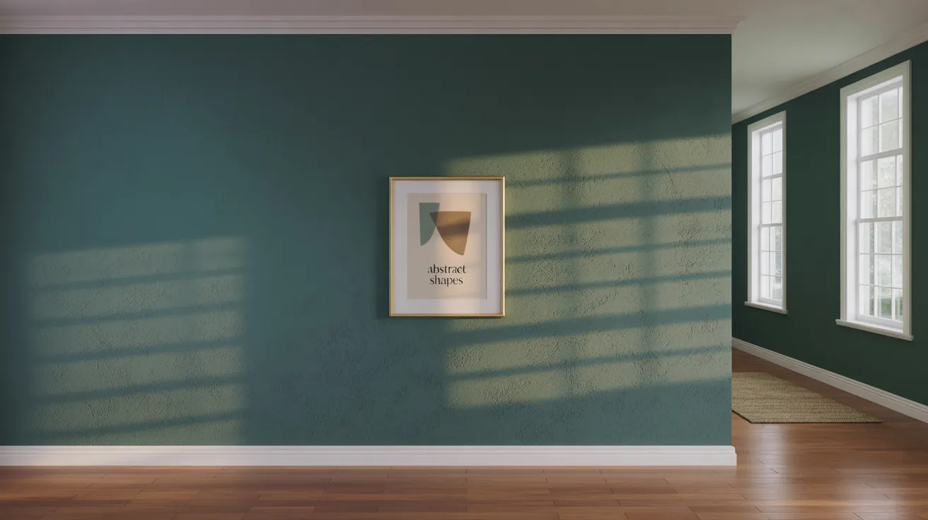
Living Room

If you want your living room to feel cozy and grounded, Salamander sets the tone. It wraps the space in a deep green that’s both calm and bold. Use it to add character without being too loud.
Pair it with warm lighting, soft textures, and wood accents to maintain a balanced look. You can opt for a modern or classic style; it adapts well to either. If you’re after a space that feels inviting but still makes a statement, this shade works like a beauty.
Kitchen Cabinets
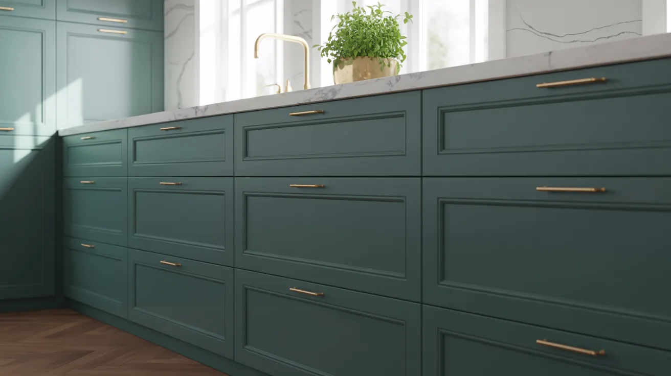
Salamanders are making their way into kitchens for a reasonthey stand out. You have seen it on cabinets, and the effect is instantly rich and stylish.
It adds weight and depth, especially when paired with brushed brass or matte black hardware. You don’t need a huge kitchen for it to work either.
Use it on a lower cabinet run or an island for a subtle touch of drama. This shade is trending because it feels fresh and bold at the same time.
Bathroom Walls
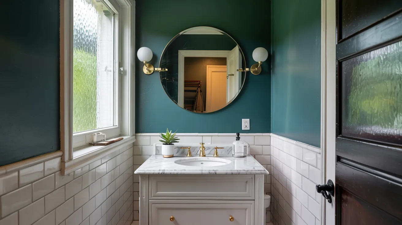
If you’re looking to change up your bathroom, Salamander works surprisingly well here, too. You have seen it paired with crisp white tiles and warm gold fixtures for a balanced, modern look.
It brings in a deep, grounded tone that softens the brightness of the white without overwhelming the space. You get that moody vibe without losing clarity.
For a small space, it adds personality without feeling closed in, make sure you have good lighting.
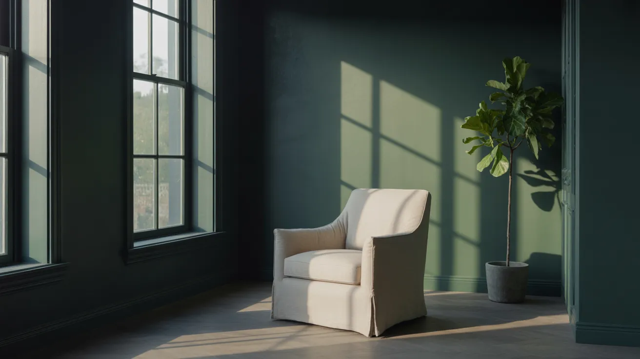
Bedroom Ambience
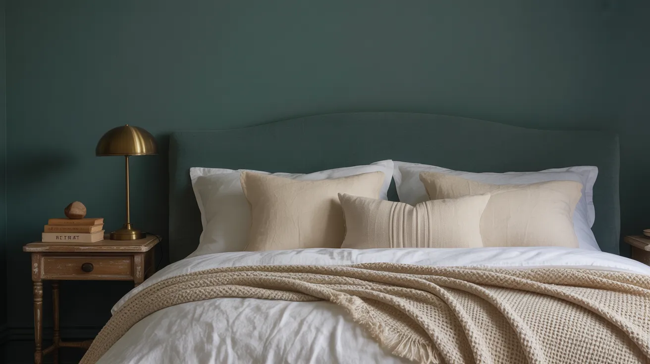
Your bedroom should feel calm and restful, and this deep green helps with that. Use Salamander in bedrooms where the goal is to create a cozy retreat.
It works great on accent walls or even the whole room if you like darker spaces. Add soft bedding in neutral or natural textures to lighten the space.
You’ll notice how the color shifts slightly throughout the day, providing your room with just the right amount of mood without being too intense. It’s peaceful but not plain.
Exteriors and Front Doors
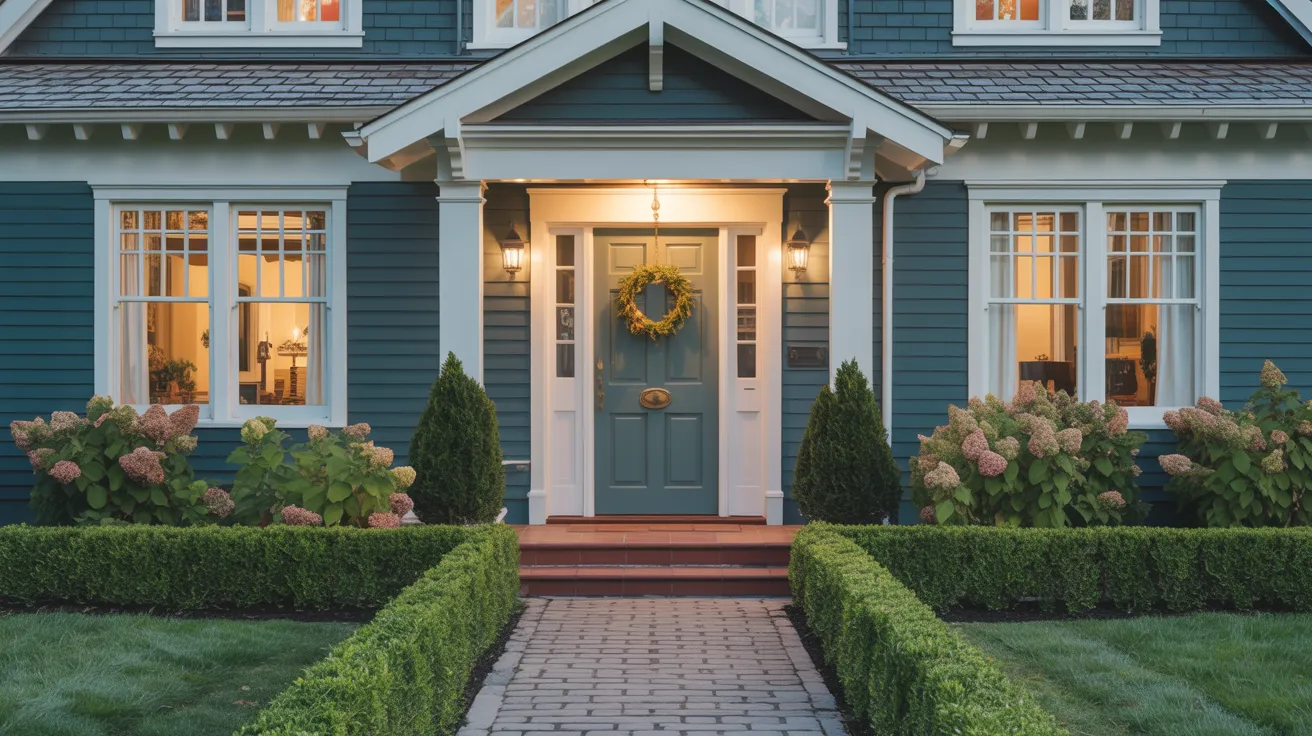
If you want to add curb appeal without going for a typical color, Salamander is a strong choice. Use it on front doors and siding, and it holds up beautifully.
It pairs well with both light and dark trim, making a home look grounded and intentional. This color works well in all seasons and doesn’t fade into the background.
Its low LRV gives it a solid presence outdoors, and you can count on it for both style and durability.
Smart Color Pairings and Finishes for Salamander
When I first tried pairing Salamander with other colors and finishes, I realized how flexible it really is. You can easily build a room around it with just a few smart choices.
Best Neutrals to Match

These soft neutrals help balance the richness of Salamander without clashing or competing.
| Neutral Color | Undertone | LRV | Why It Works with Salamander |
|---|---|---|---|
| White Dove (OC-17) | Warm white | 85.38 | Adds light and softness to offset the dark green |
| Sebring White (OC-137) | Creamy beige | 80.9 | Warms the space and creates a classic combo |
| Silver Marlin (2139-50) | Cool gray-blue | 57.85 | Echoes the blue tones in Salamander subtly |
| Edgecomb Gray (HC-173) | Greige | 63.88 | Blends warmth and neutrality for a calm pairing |
Try any of these for walls, trim, or fabrics; they let Salamander take center stage without overwhelming the space.
Bold Accents
To bring out the depth in Salamander, add rich, bold accents. Brass lighting, deep walnut furniture, or a splash of teal in artwork or throw pillows can all enhance the tone beautifully.
These accents work because they contrast just enough to stand out, but still support the richness of the main color.
You might also consider jewel-toned decor or natural textures, such as leather, to complete the look. With the right bold elements, Salamander doesn’t just blend in; it sets the mood.
Complementary Finishes
Choosing the right finish is just as important as the color itself. You will find that Salamander looks especially good in matte or eggshell finishes.
Matte keeps the mood soft and moody, while eggshell adds a bit of polish without shine. If you’re using it in a high-traffic area, eggshell might be a better pick for durability.
On furniture or cabinetry, a satin finish can give it just enough sheen to feel finished but not flashy. Keep the texture subtle so the color stays the focus.
How Salamander Looks in Different Lighting
When I first used Salamander, I noticed how much lighting affected its personality. You’ll see this color shift across the day, from soft and green to rich and moody as the light changes.
Morning Light
In morning light, Salamander appears noticeably greener. The softer, indirect sunlight improves the natural green hue while toning down the black and blue base.
This creates a fresher, calmer feel suitable for relaxed environments. The color feels lighter and more balanced during these hours, especially in rooms with east-facing windows.
Morning light provides the most clarity, allowing the paint’s complex base to shine with a gentle and welcoming tone.
Afternoon Sunlight
Bright afternoon sunlight deepens the color and emphasizes its boldness. Blue and black undertones come forward strongly, giving Salamander a more dramatic and grounded look.
The richer daylight brings out the depth and complexity of the paint, especially in west-facing rooms. This is when the shade feels most intense and saturated.
It serves well as a focal point or feature color during peak daylight hours when visual strength is desired.
Ambient or Artificial Light
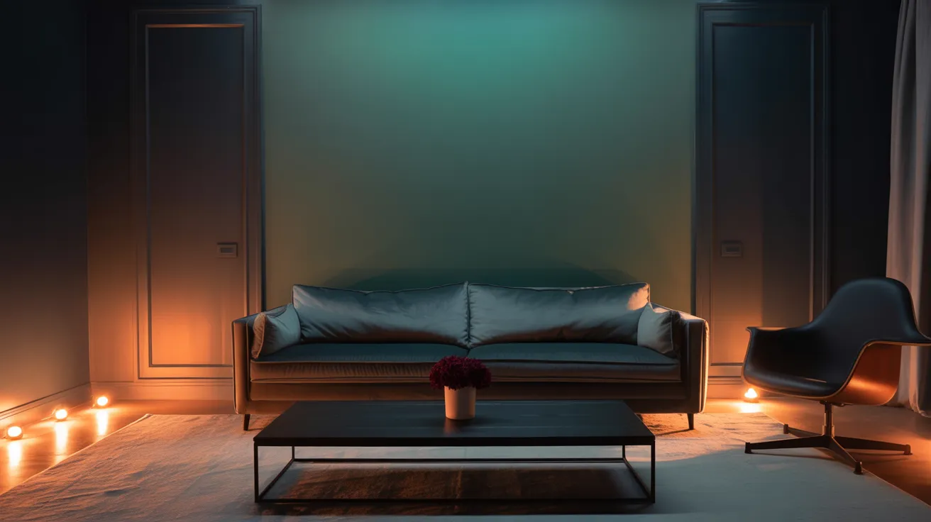
Under ambient or artificial lighting, the Salamander becomes darker and more shadowed. Black elements dominate the tone, while green recedes into the background.
Warm bulbs give it a cozier appearance, while cool lighting creates a sharper and more formal mood.
The lower reflectance value becomes more noticeable, making the shade feel deeper and more enveloping. This effect works well in evening settings or rooms with limited natural light exposure.
Simple Steps to Try and Choose the Color in the Right Way
Sampling the color first, picking the right finish, and knowing where to get it can make all the difference. When you and I take these simple steps, a great color becomes the right one.
Peel-and-Stick Testing
Samplize offers an easy way to try Salamander without the mess of paint cans and brushes. Their peel-and-stick samples use real paint, so the color shown is accurate and reliable.
These sheets can be moved from wall to wall, making it easier to see how Salamander looks in different lighting throughout the day.
It’s a low-commitment, no-fuss option that helps avoid costly mistakes and build confidence before committing to a full gallon.
Available Finishes
Salamander 2050-10 is available in several finishes to suit various surfaces and design goals. Matte offers a soft, velvety appearance that helps minimize wall imperfections.
Eggshell adds a subtle sheen while maintaining a smooth appearance, making it ideal for most living spaces. Satin offers greater durability and is well-suited for cabinets or furniture.
For wood applications, the Woodluxe stain line offers solid, semi-solid, and ultra-flat options, enabling the shade to complement both interior and exterior projects.
Where to Buy
Salamander can be purchased directly from Benjamin Moore’s website or through trusted paint suppliers. JC Licht offers both in-store and online options with expert guidance.
Material Bank serves design professionals looking for fast, sample-based service. For those wanting to see the color before purchasing, Benjamin Moore’s official site also provides digital previews and local store locators.
Availability includes both paint and wood stain lines, ensuring flexible solutions for any design or renovation plan.
Comparing Salamander to Other Popular Greens
Salamander stands out, but it helps to see how it compares to similar shades. Here’s a quick breakdown to guide your decision.
|
Paint Color |
Tone |
LRV |
Best For |
|
Deep green with black/blue |
5.72 |
Bold interiors, moody cabinets, and exteriors |
|
|
Dark forest green |
4.56 |
Traditional trim, exteriors, heritage style |
|
|
Green with a gray undertone |
5.66 |
Subtle accents, libraries, and formal rooms |
|
|
Very dark green-black |
3.07 |
Dramatic features, modern homes |
Each shade offers a different mood and depth, so the best choice depends on the style and lighting of your space.
How to Know if Salamander Belongs in Your Space
Not every color works in every space. I’ve learned that choosing a Salamander depends on room size, lighting, and the kind of mood you want to create.
When It Works Best
This color is a strong choice for bold, high-style interiors. It suits feature walls, cozy bedrooms, or moody dining rooms.
With enough natural light or paired with lighter elements, it creates depth and atmosphere without feeling overwhelming.
Salamander adds richness and contrast to well-balanced spaces, especially where design elements support a darker palette. Ideal for areas where drama and warmth are welcome.
When to Avoid It
Salamander may feel too heavy in rooms with little or no natural light. In compact spaces, the dark tone can shrink the feel of the room and make it seem closed in.
It’s also best avoided in areas already filled with dark furnishings or finishes unless carefully balanced. Choosing a lighter shade or using Salamander as an accent may be a better option in those cases.
Tips for Painting with Salamander
Dark shades, such as Salamander, require a little extra care during application. These quick tips can help ensure smooth, lasting results.
- Use a high-quality primer to prevent uneven absorption and boost color richness.
- Apply at least two coats for full coverage, especially over light or bare surfaces.
- Choose a matte or eggshell finish to control sheen and reduce glare.
- Use painter’s tape and angled brushes to create clean lines along the trim and corners.
- Allow full drying time between coats to avoid streaking or patchiness.
- Sample in multiple lighting conditions before committing to a full wall or room.
Conclusion
Now you’ve seen what Benjamin Moore Salamander looks like, it’s moody, flexible, and packed with personality. If you’re using it on cabinets, walls, or front doors, the right prep and pairing can bring out its best.
I hope this guide helped you feel more confident about trying a bold shade in your own space. A dark green like this doesn’t just fill a wall, it changes the feel of a room.
Want more color ideas or home tips? Check out the rest of the blog and find your next favorite project.


