Aesthetic White (SW 7035) by Sherwin Williams: Paint Review
Picking a white paint sounds easy until you realize how many “off-whites” lean too yellow, too gray, or just a bit too stark. I’ve been there, staring at swatches that all look the same, until they’re on the wall.
That’s why I put this guide together: to help you decide if Sherwin-Williams Aesthetic White is the right warm white for your space.
You’ll see how it behaves in real homes, how it compares to other whites, and what colors and finishes pair best with it. I’ll also walk you through lighting effects, sampling tips, and similar shades from other brands. Let’s break it down together.
Getting to Know Sherwin-Williams Aesthetic White

Aesthetic White (SW 7035) is a soft, warm off-white that belongs to Sherwin-Williams’ White Paint Colorscollection. It’s not a bright, crisp white. Instead, it offers a creamy, grounded feel that works in almost any room.
Basic Color Profile
HEX code: #E3DDD3
LRV (Light Reflectance Value): 73
Color family: Warm white / light greige
Aesthetic White is technically an off-white, but it has just enough warmth to keep it from feeling cold. It’s great if you want something brighter than beige but softer than stark white.
Undertones Explained
Aesthetic White has subtle greige (gray-beige) undertones with a slight taupe influence.
- In natural light, it reads creamy but never yellow.
- In artificial or low light, the gray side comes forward, making it feel calm and muted.
Because the undertones shift depending on light, you’ll want to sample it in your own home before painting a full room.
Aesthetic White in Real Spaces
This shade adapts beautifully to all kinds of settings, but how it shows up will vary based on light and other colors nearby. Here’s what you can expect in different rooms.
How It Looks in Different Rooms
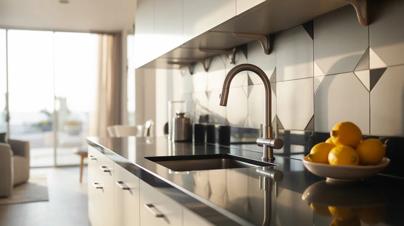
Kitchens

Aesthetic White offers a warm, subtle backdrop for white or wood cabinets. It pairs especially well with brushed brass, light woods, and soft quartz or marble countertops. It gives just enough color to feel inviting, without pulling attention away from the cabinetry.
Bathrooms

This shade helps bathrooms feel light and clean without looking sterile. It works great with white tile, warm grays, and organic textures like rattan or light wood. In smaller bathrooms, it reflects enough light to keep things feeling open.
Living Rooms

In living rooms, Aesthetic White sets a soft, cozy tone. It blends easily with both modern and traditional furniture, and offers flexibility if you like to change decor with the seasons. It doesn’t clash with wood tones or bold accents.
Bedrooms

Want a peaceful, neutral bedroom? Aesthetic White is a great pick. It balances cool lighting in north-facing rooms and keeps south-facing rooms from feeling overly warm. Layer it with beige, greige, white, or soft muted tones.
How Lighting Affects It
With an LRV of 73, Aesthetic White reflects a good amount of light, but its undertones still shift based on direction.
North-facing rooms: Light feels cool and indirect, so Aesthetic White shows its gray base and feels soft, muted, and calm.
South-facing rooms: Bright natural light warms it up, bringing out creamy undertones for a soft, sunny, welcoming feel all day.
East-facing rooms: Morning light makes it appear warm and glowing; later, it shifts to cooler and more neutral as daylight fades.
West-facing rooms: Starts neutral in the morning, then warms up in the evening with golden light, revealing subtle taupe undertones.
Because of its subtle undertones, Aesthetic White never feels too creamy or too gray, but test it on multiple walls first to be sure.
Aesthetic White vs. Other Sherwin-Williams Whites
There’s no shortage of warm whites and light greiges in the Sherwin-Williams catalog. Here’s how Aesthetic White compares to other popular choices:
Aesthetic White vs. Alabaster

Alabaster (SW 7008, #EDEAE0) is a creamy white with yellow undertones.
- Alabaster is warmer and brighter.
- Aesthetic White is more muted and grounded.
If you want a soft, almost creamy white, go with Alabaster. For something quieter and more balanced, Aesthetic White is better.
Aesthetic White vs. Shoji White
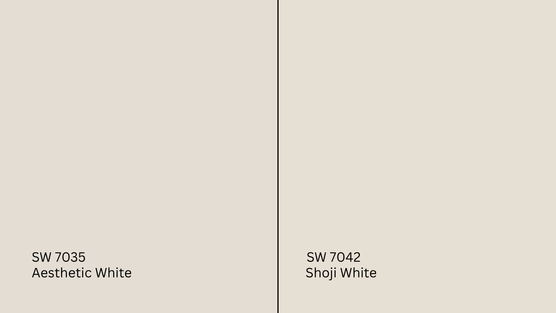
Shoji White (SW 7042, #E6DFD3) is a warm off-white with strong beige tones.
- Shoji White is slightly warmer and leans more into tan.
- Aesthetic White stays closer to greige.
Shoji White works better in rustic or traditional rooms. Aesthetic White fits better in transitional or modern settings.
Aesthetic White vs. Greek Villa
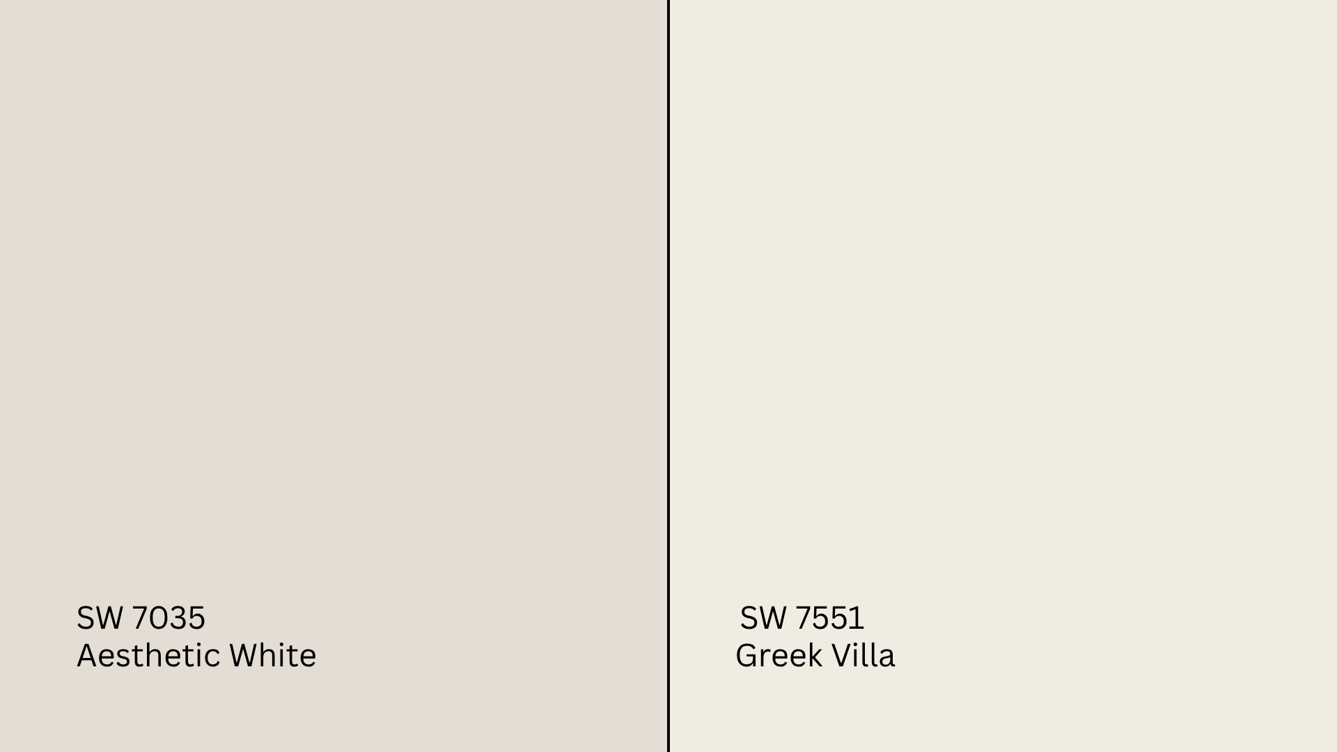
Greek Villa (SW 7551, #F0ECE2) is a clean, bright white with a soft, warm glow.
- Greek Villa is lighter and more classic.
- Aesthetic White feels dustier and more muted.
Choose Greek Villa if you want a clean backdrop. Choose Aesthetic White for a more layered, toned-down palette.
Aesthetic White vs. Agreeable Gray
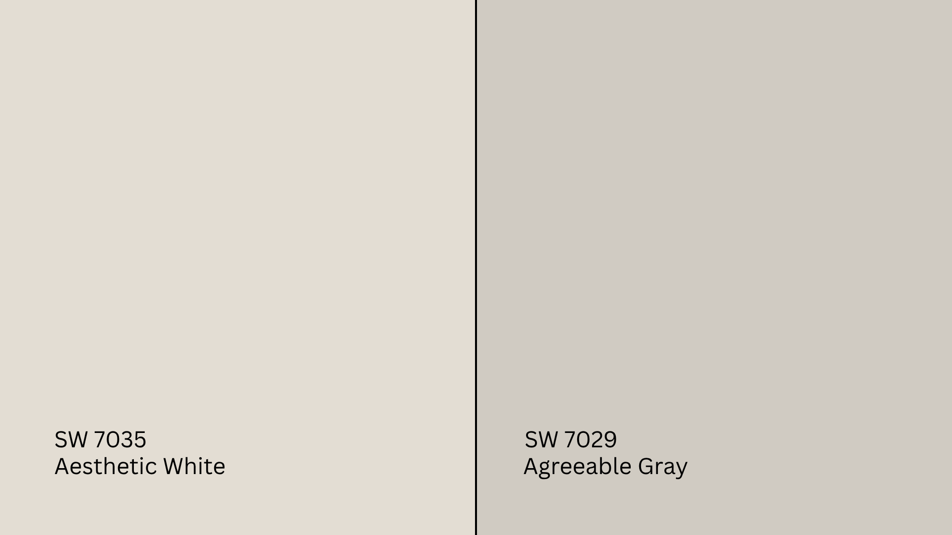
Agreeable Gray (SW 7029, #D1CBC1) is a bestselling greige with stronger gray tones.
- Agreeable Gray is darker and more gray.
- Aesthetic White is lighter and warmer.
If you’re choosing between the two, base it on how much contrast you want. Aesthetic White is closer to off-white; Agreeable Gray is a true greige.
Undertone and LRV Comparison Table
| Paint Color | Undertones | LRV | Warm or Cool |
|---|---|---|---|
| Aesthetic White | Greige, taupe | 73 | Warm |
| Alabaster | Creamy white | 82 | Warm |
| Shoji White | Beige-white | 74 | Warm |
| Greek Villa | Clean warm white | 84 | Warm |
| Agreeable Gray | Greige | 60 | Warm |
Every one of these shades is a fan favorite, but they all shift in real light. Sampling is a must.
Best Color Pairings for Aesthetic White
The key to making Aesthetic White feel polished is pairing it with the right supporting tones and finishes.
Trim and Ceiling Suggestions
- Extra White (SW 7006, #EEEFEA): Clean, bright contrast that keeps the palette crisp.
- Alabaster (SW 7008, #EDEAE0): Creates a soft, warm-white-on-white look.
- Pure White (SW 7005, #EDECE6): Balanced and neutral for subtle contrast.
Stick to flat for ceilings and semi-gloss for trim to create dimension without glare.
Accent Wall and Furniture Colors
To keep the look soft and layered: Try pale olive, soft taupe, warm gray, or muted clay.
For more contrast: Use charcoal, black, navy, or deep forest green.
Aesthetic White works especially well with natural textures like linen, cane, rattan, and warm wood furniture. It can feel either coastal or contemporary depending on how you style it.
Hardware and Flooring Compatibility
This shade pairs easily with a variety of hardware finishes. Brushed nickel or brass works well if you want a warm, refined look, especially in kitchens and bathrooms.
For a bit of contrast, matte black is a great choice. It adds a modern edge that works in both sleek and farmhouse-style spaces.
If you’re going for a softer or vintage vibe, aged bronze is a good way to warm things up while keeping the overall palette cohesive.
When it comes to flooring, Light oak or whitewashed wood helps keep things bright and airy.
If you want something more grounded, try warm mid-tones like hickory or maple. They complement the greige undertones nicely.
For tile, a beige or greige stone is an easy fit, especially in kitchens or bathrooms where you want a natural, clean base.
Paint Finish Recommendations
The finish you pick will influence how warm or cool Aesthetic White appears.
Matte: Diffuses light gently, softening undertones, best for ceilings, bedrooms, and calm, low-traffic spaces that don’t need scrubbing.
Eggshell: Offers a light sheen that enhances warmth slightly. Ideal for living rooms, hallways, and areas needing a touch of durability.
Satin: Reflects more light and intensifies warmth, great for kitchens, bathrooms, and high-traffic spots where easy cleaning matters
Because Aesthetic White has subtle undertones, sheen can shift it warmer or cooler. Test your samples with your lighting before making a choice.
Sampling and Buying Options
Where to Get Peel-and-Stick Samples
- Samplize: Offers real paint with an adhesive backing. Easy to move and compare.
- Sherwin-Williams stores: Carry paint cards and tester pots.
- Local hardware retailers: May carry Sherwin-Williams samples or color match for you.
Check samples morning, afternoon, and evening in multiple parts of the room to watch how the undertones react.
Where to Buy the Paint
- Sherwin-Williams.com: Purchase online for pickup or delivery.
- Sherwin-Williams retail stores: Carry a full range of finishes and color tools.
- Big box stores: Some can custom-match or order Sherwin-Williams paint.
Pro tip: Watch for 35–40% off sales at Sherwin-Williams. They happen several times a year.
Paint Equivalents in Other Brands
If you’re looking for a similar color in another paint line, here are close matches:
Benjamin Moore: Try Ballet White (OC-9) or Classic Gray (OC-23)
Behr: Check out Cameo White (MQ3-32) or Wheat Bread (720C-3)
Valspar: Look at Cream in My Coffee (3003-10C) or Gravity (4005-1B)
These are close, but always sample side-by-side to catch any differences in undertones.
Conclusion
If you want an off-white that’s soft, warm, and adaptable, Sherwin-Williams Aesthetic White could be the perfect pick.
You’ve seen how it works in real rooms, what undertones to expect, and which colors and finishes bring it to life.
Before painting, test it on your own walls. It’s the best way to see how it plays with your light and furnishings.
Still browsing options? I’ve got guides on other Sherwin-Williams favorites, too. Check them out on the website for more comparisons, tips, and sample strategies.