How to Choose Fonts for Home Decor Blogs, Moodboards, and Lifestyle Brands
Home decor content depends on atmosphere, but it also depends on clear information. A reader may be comparing paint colors, saving a shelf-styling idea, reading a DIY guide, browsing a furniture roundup, or checking a printable checklist before starting a weekend project. The typography behind that content shapes how easy the idea is to understand and how trustworthy the advice feels.
For interiors blogs, home decor creators, stylists, small shops, renovation guides, and lifestyle brands, fonts are part of the design experience. A type system can make a moodboard feel cohesive, a room guide easier to follow, and a product recommendation more credible. A weak type choice can make even beautiful photography feel less polished.
Use this guide to choose fonts for home decor articles, digital moodboards, printable guides, social templates, product pages, and lifestyle brand materials without losing warmth, readability, or licensing confidence.
Define the Room Mood Before Choosing a Font
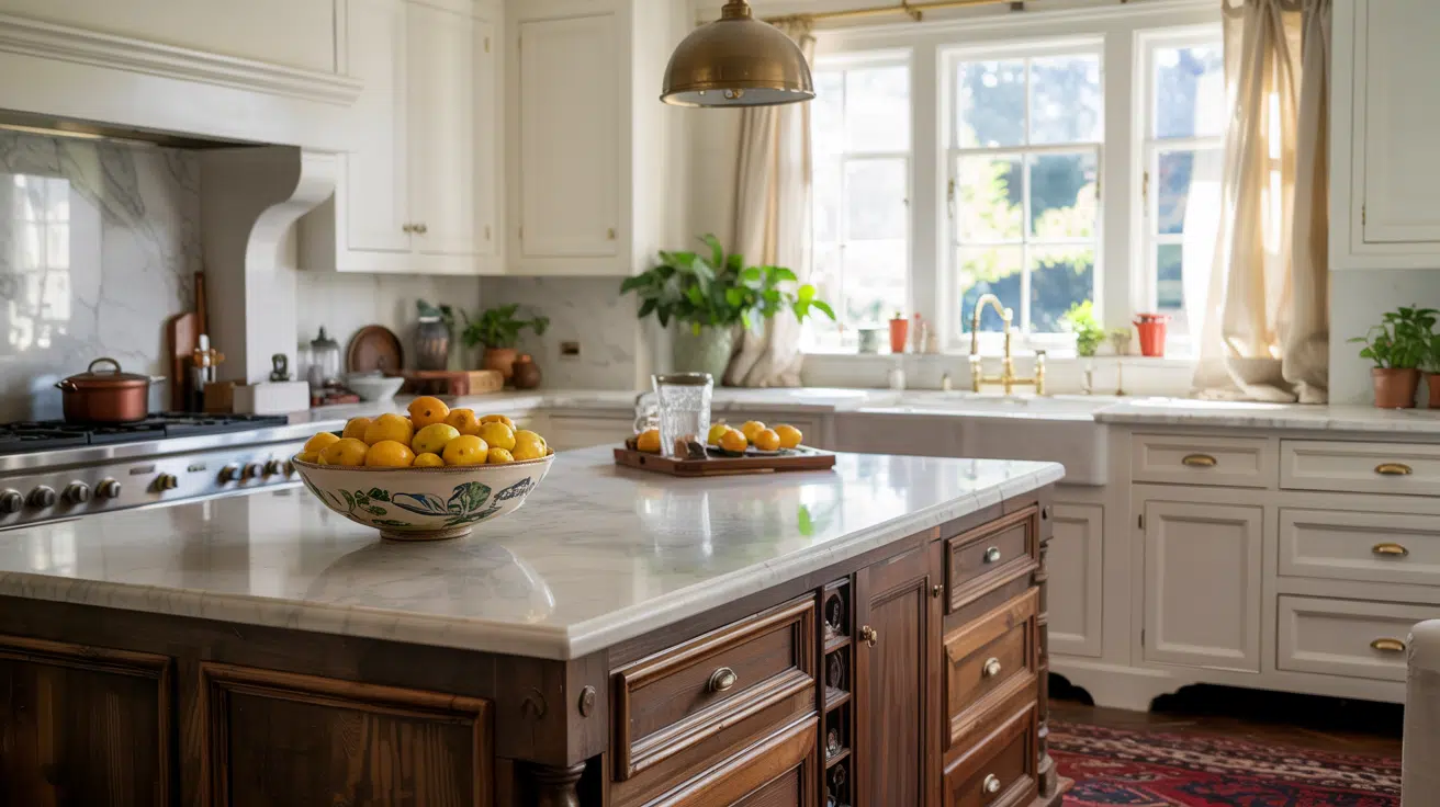
A font should support the feeling of the space, not compete with it. Before choosing a typeface, define the mood in practical words: calm, rustic, coastal, minimal, eclectic, playful, elegant, vintage, organic, or modern. These words help you avoid choosing a font only because it looks fashionable in one layout.
For example, a Scandinavian living room guide may need quiet typography with generous spacing. A colorful maximalist DIY project can handle a more expressive display style. A home maintenance checklist needs clarity first. The strongest home design content usually combines visual mood with practical structure.
| Home style | Useful font direction | What to avoid |
| Minimal interiors | Clean sans serif or restrained serif with open spacing | Overly decorative type that fights the simplicity of the room |
| Rustic or handmade decor | Warm serif or soft rounded sans with tactile accents | Heavy distressed fonts that make instructions hard to read |
| Modern luxury | Elegant display type supported by plain text | Very thin fonts that disappear on mobile or pale backgrounds |
| Colorful eclectic spaces | Playful headline style plus readable body font | Using a novelty font for every label and caption |
| Wellness or spa-like home | Soft, calm text with generous line spacing | Compressed type or dense paragraphs that feel stressful |
Match Fonts to Home Decor Content Types
A home decor site rarely publishes one kind of page. It may include room tours, DIY tutorials, shopping guides, recipes, lifestyle essays, renovation advice, and downloadable checklists. Each format asks the reader to do something different. Typography should make that action easier.
| Content type | Reader task | Typography priority |
| Room tour | Move between photos, captions, and design notes | Readable captions and clear section headings |
| DIY tutorial | Follow steps without missing tools or measurements | Numbered sections, strong numerals, and simple body text |
| Product roundup | Compare prices, sizes, materials, and uses | Tables, visible labels, and consistent product names |
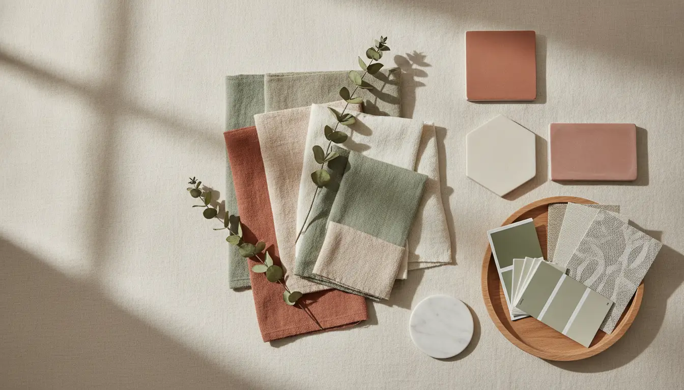
| Moodboard | Understand color, texture, and style direction | Expressive headings with restrained labels |
| Recipe or entertaining post | Read quantities, timing, and steps quickly | Clear numerals and list formatting |
| Printable guide | Save or print instructions for later | Legible text, spacing, and licensing clarity |
This is why real content testing matters. Do not test a font only on a polished hero image. Test it with long product names, small captions, paint color labels, dimensions, prices, measurements, and mobile layouts.
Separate Decorative Style From Readable Text
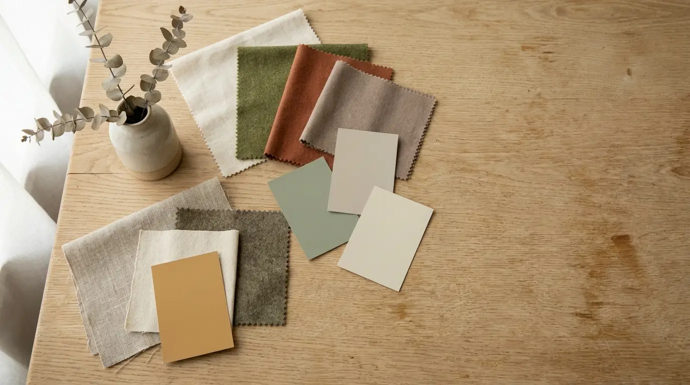
Home decor typography often leans into personality: handwritten labels, elegant serifs, editorial display fonts, retro letterforms, or soft lifestyle scripts. These styles can work beautifully in a heading or quote graphic. They become a problem when they carry practical information such as measurements, prices, addresses, or instructions.
| Type role | Best use | What to avoid |
| Display type | Room titles, moodboard headers, seasonal campaigns | Long paragraphs, shopping details, or DIY steps |
| Text type | Articles, captions, guides, product notes | A style so plain that the brand feels generic |
| UI type | Menus, search, filters, buttons, newsletter forms | Decorative shapes that slow users down |
| Numeric style | Prices, dates, room dimensions, quantities | Ambiguous 1, I, 0, O, or 5 |
| Accent style | Labels, tags, pull quotes, small decorative moments | Using it everywhere until the page feels cluttered |
Think of decorative type as the atmosphere layer and readable type as the service layer. A reader should enjoy the visual tone, but they should not struggle to find the shelf size, fabric name, paint code, or step order.
Compare Free, Commercial, Variable, and Custom Fonts
Free fonts can be useful for early moodboards, personal experiments, or one-off social posts. Once a creator or home brand becomes commercial, the requirements change. The font may appear on a website, media kit, product label, printable planner, paid newsletter, ebook, course, or social campaign.
| Font option | Best for | Main advantage | Main risk |
| Free fonts | Early concepts, personal posts, moodboards | Fast access and low cost | Overuse or unclear commercial rights |
| Open-source fonts | Accessible websites and simple projects | Easy distribution | Still requires license review |
| Commercial fonts | Professional blogs, shops, newsletters, printables, campaigns | Quality, family depth, clearer licensing | Requires budget and tracking |
| Variable fonts | Responsive websites and flexible editorial systems | Adjustable weights or widths | Needs careful implementation |
| Custom fonts | Established lifestyle brands, home platforms, apps, and product lines | Distinctive voice and long-term consistency | Higher cost and longer timeline |
Interior stylists, designers, and lifestyle teams comparing professional font families, variable fonts, or custom typography options can review foundries such as TypeType when they need type systems that can be tested across websites, printables, newsletters, packaging, social templates, and brand materials.
Learn From Real Custom Font Cases
Custom font projects from larger brands may seem far from home decor blogging, but the lessons transfer well. A home or lifestyle brand also has many touchpoints: articles, newsletters, product pages, downloadable guides, packaging, social graphics, and client-facing documents. Consistency matters.
Dominos Sans for Domino’s Pizza
Domino’s Pizza customized TT Commons™ Pro into Dominos Sans Display and Dominos Sans Text. The lesson for home and lifestyle creators is consistency. A reader may meet the same brand through a blog post, printable shopping list, Instagram story, newsletter, product label, and sponsored feature. Typography helps those pieces feel connected.
TT Hazelnuts for LEG
LEG Immobilien uses TT Chocolates and a customized version of TT Hazelnuts as corporate fonts. This case is especially relevant to interiors, home, and property content because housing communication must feel approachable while still supporting serious details such as locations, contracts, resident updates, and service information.
TT Trailers for PetChoy
PetChoy used a customized TT Trailers in its rebranding. The lesson for decor, pet-friendly homes, family lifestyle, and small product brands is personality. Expressive typography can make a brand memorable, but it needs a readable companion for everyday information.
Plan Font Licensing Before Publishing or Selling
Font licensing should be checked before a design system is used commercially. Fonts are software, and the license defines where and how they may be used. A lifestyle creator may use the same font on a website, logo, downloadable checklist, social template, sponsored post, ebook, course, product packaging, or printable sold through a shop.
| Use case | Licensing question |
| Website | Can the font be embedded as a webfont? |
| Logo or blog masthead | Is wordmark use permitted? |
| Downloadable PDF or printable | Can the font be embedded in files? |
| Editable template | Can buyers receive editable files using the font? |
| Social graphics | Are commercial digital graphics covered? |
| Sponsored content | Can the font be used in paid campaigns? |
| Product packaging or labels | Are commercial print uses covered? |
| Contractors | Can font files be shared with freelancers or collaborators? |
Common Licensing Mistakes
- Using a personal-use font on a monetized blog or shop.
- Assuming every free font is free for commercial work.
- Using a desktop license as if it were a webfont license.
- Embedding fonts in PDFs, printables, or templates without checking rights.
- Sending font files to assistants, contractors, or clients without permission.
- Modifying letters for a logo without checking the EULA.
- Losing license receipts before a redesign, sponsorship, or shop launch.
Avoid Common Home Decor Typography Mistakes
Most typography problems happen when a design is judged only by mood. A font can look beautiful over a styled living room photo and still fail inside a DIY instruction, product comparison table, or mobile newsletter.
| Mistake | Why it hurts | Better choice |
| Using scripts for long details | Readers struggle to follow practical information | Reserve scripts for short accents or names |
| Making captions too small | Photo-led content loses context | Use readable captions with consistent spacing |
| Choosing unclear numerals | Prices, dates, dimensions, and quantities can be misread | Test numerals before approval |
| Mixing too many fonts | The brand feels inconsistent | Define two or three clear type roles |
| Low contrast over photos | Text disappears on mobile | Use overlays, solid blocks, or separate captions |
| Ignoring accents and names | Designer names, places, and product labels may render poorly | Choose fonts with needed language support |
| Checking licensing late | A campaign or printable may need redesigning | Confirm rights before launch |
Build a Simple Font Workflow for Home Brands
A practical workflow helps creators make decisions based on real use, not isolated inspiration screenshots. It also makes collaboration easier when writers, designers, assistants, photographers, or sponsors touch the same brand assets.
- Collect real text first: room titles, captions, product names, dimensions, prices, dates, and DIY steps.
- Choose mood words that describe the brand or space.
- Pick one readable text font before choosing decorative accents.
- Test the display font on the longest real headline, not only a short phrase.
- Check the system on mobile, desktop, email, and printable layouts.
- Confirm licensing for web, print, PDFs, templates, social campaigns, and contractors.
- Document the final styles in a simple brand guide.
Final Checklist for Home Decor Typography
| Question | Why it matters |
| Can a reader scan the page quickly? | Home and lifestyle readers often browse between tasks |
| Does the font support captions and long paragraphs? | Room tours and guides need reading comfort |
| Are dimensions, prices, and dates clear? | Practical details drive trust |
| Does the type work with photography? | Decor content is image-heavy |
| Can the system scale to newsletters and printables? | Lifestyle brands publish across many channels |
| Are commercial rights documented? | Monetized content, products, and sponsorships need license clarity |
| Does the system still feel personal? | Home content should feel warm, not generic |
FAQ
What Kind of Font Works Best for a Home Decor Blog?
A home decor blog usually needs one readable body font, one expressive heading style, and one restrained accent style. The best choice depends on the site’s tone: minimal, rustic, colorful, luxury, family-focused, or editorial.
Should Home Decor Creators Use Free Fonts?
Free fonts can be useful for personal projects and early concepts. For monetized blogs, sponsored posts, paid printables, templates, or product packaging, check the license before publishing.
When Does a Lifestyle Brand Need a Custom Font?
A custom font becomes useful when a brand needs a distinctive voice across many touchpoints, such as a website, shop, packaging, app, newsletter, printables, courses, and social templates. Smaller brands can often begin with a professional commercial family.
What Is the Biggest Typography Mistake in Home Design Content?
The biggest mistake is choosing a font only for atmosphere. Style matters, but home decor content also includes measurements, prices, product names, steps, captions, and downloadable resources that must stay readable.