Sherwin-Williams Mindful Gray SW 7016: Exterior Review
When you’re thinking about refreshing your home’s exterior, few colors strike the balance of warmth and versatility quite like Mindful Gray.
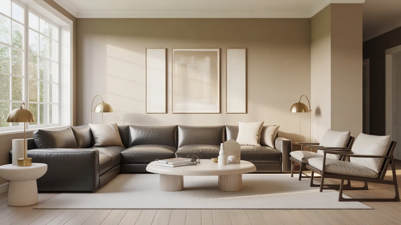
This soft, greige-inspired shade brings calm sophistication to any home style — from modern to farmhouse — adding just the right touch of depth and comfort. I’ve seen it instantly elevate curb appeal with its ability to feel both grounded and inviting.
In this post, I’ll walk you through how Mindful Gray behaves in different lighting, its best exterior pairings, ideal finishes, and real-world tips for making it work beautifully outdoors.
By the end, you’ll know exactly how to use Mindful Gray to highlight your home’s best features and create a look that feels timeless and balanced.
Getting to Know Sherwin-Williams Mindful Gray
Mindful Gray (SW 7016) by Sherwin-Williams is a balanced, versatile gray paint color that leans slightly warm. It’s often described as a sophisticated neutral that works beautifully in almost any space, offering a calm, grounded feel without looking too cool or too beige.
Basic Color Profile
HEX code: #BCB7AD
LRV (Light Reflectance Value): 48
Color family: Warm gray with subtle greige undertones
Mindful Gray sits comfortably between light and medium gray, making it ideal for rooms that need a soft contrast without feeling stark or cold. Its moderate LRV allows it to reflect just enough light to stay fresh while maintaining depth and warmth.
Undertones Explained
Mindful Gray has subtle green and beige undertones that shift depending on lighting conditions. These undertones are gentle, which is why the color feels calm and balanced rather than overly warm or cool.
-
In daylight, especially in rooms with plenty of natural light, the beige side of Mindful Gray becomes more noticeable, creating a soft, inviting warmth.
-
Under cooler or north-facing light, a faint green-gray undertone can emerge, giving the shade a more modern, grounded appearance.
Mindful Gray Paint: Exterior Applications
Mindful Gray works beautifully on home exteriors where you want subtle warmth and timeless balance. Let’s look at where it shines and how to make the most of it outdoors.
Siding

Using Mindful Gray as your main siding color creates a clean, grounded appearance.
It pairs especially well with white trim, stone accents, or natural wood tones. The soft warmth in this gray helps homes feel inviting without appearing too dark or flat.
Trim

As a trim color, Mindful Gray adds gentle contrast to lighter siding shades like white, cream, or greige.
It defines edges and architectural lines without feeling harsh, giving the exterior a cohesive, refined look.
Front Doors

A front door in Mindful Gray offers a welcoming, balanced touch.
It’s an excellent choice if you want something softer than black but more defined than beige. Try pairing it with brushed nickel or aged bronze hardware for a modern yet approachable entrance.
Garage Doors and Shutters

On garage doors and shutters, Mindful Gray adds harmony and balance to the overall palette.
It works equally well with brick, stone, or wood exteriors, creating a consistent and coordinated appearance.
Outdoor Furniture and Fencing

Mindful Gray can extend to outdoor furniture, planters, or fencing for a seamless exterior flow.
Its neutral tone complements greenery and warm materials like cedar or oak, helping your outdoor space feel calm, natural, and well-balanced.
Coordinating & Complementary Colors
Neutrals: Alabaster (SW 7008), Shoji White (SW 7042), and Eider White (SW 7014) lighten and soften Mindful Gray’s warmth. These tones create a relaxed, balanced exterior that feels bright but never stark.
Contrasts: Iron Ore (SW 7069) and Tricorn Black (SW 6258) offer bold definition for doors, shutters, or trim. These deep shades ground Mindful Gray beautifully, adding structure without overwhelming the palette.
Warm Accents: Copper fixtures, aged bronze hardware, and natural wood stains (like oak or cedar) highlight the inviting warmth within Mindful Gray. They help the exterior feel grounded and cohesive while keeping its earthy appeal intact.
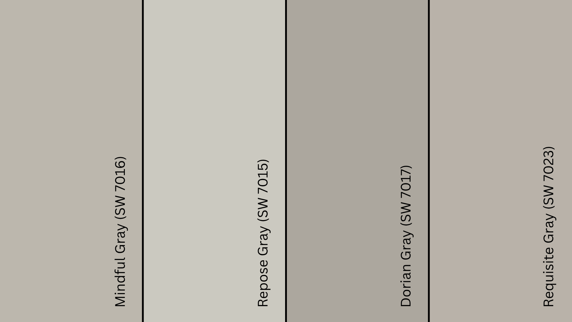
Cool Balance: Repose Gray (SW 7015), Dorian Gray (SW 7017), and Pewter Cast (SW 7673) add a subtle coolness that modernizes the scheme. They maintain the gray family’s depth while ensuring the look stays calm and well-balanced
Mindful Gray vs. Other Sherwin-Williams Grays
Comparing Mindful Gray to similar Sherwin-Williams colors helps highlight its balance and versatility. Each of these grays brings a slightly different tone and personality, so the right choice depends on the look you’re after.
Mindful Gray vs. Repose Gray
Repose Gray (SW 7015) is lighter and softer, leaning more toward a true light gray.
While both share greige undertones, Repose Gray reads cooler and brighter in natural light. Mindful Gray, on the other hand, has a touch more depth and warmth, giving exteriors a grounded, inviting presence.
Mindful Gray vs. Dorian Gray
Dorian Gray (SW 7017) is slightly darker and cooler than Mindful Gray. Dorian Gray leans more modern with a crisper tone, while Mindful Gray feels softer and more flexible. For exteriors, Mindful Gray offers a smoother transition between light and dark materials, making it easier to coordinate.
Mindful Gray vs. Requisite Gray
Requisite Gray (SW 7023) has a similar depth but reads warmer overall.
Requisite Gray leans slightly brown, which can make it appear earthier on large exteriors. Mindful Gray maintains a more neutral greige balance, helping it pair well with both warm and cool elements.
LRV Comparison Table
| Color Name | SW Code | Tone | LRV | Best For |
|---|---|---|---|---|
| Mindful Gray | SW 7016 | Warm balanced greige | 48 | Exteriors, trim contrast, modern neutrals |
| Repose Gray | SW 7015 | Light warm gray | 58 | Bright exteriors and open spaces |
| Dorian Gray | SW 7017 | Medium cool gray | 39 | Accent walls or shaded exteriors |
| Requisite Gray | SW 7023 | Medium warm gray | 45 | Classic or traditional home exteriors |
Expert Tips for Exterior Use
Recommended Finishes: Use a satin or low-sheen finish for siding and trim. It adds a subtle glow that highlights Mindful Gray’s depth without creating glare. Avoid flat finishes outdoors; they fade faster and can collect dust or grime.
How Sunlight Affects Tone: Mindful Gray shifts gently with the light. In bright sunlight, it appears warmer with beige undertones; in shade or overcast conditions, it leans cooler and more neutral. Always view large samples at different times of day before deciding.
Sample Testing Advice: Test Mindful Gray on various exterior areas: front, sides, and shaded sections. Observe how it looks in morning, afternoon, and evening light. This helps you choose confidently and ensures the tone feels balanced across your home.
Maintenance Tips and Durability: Mindful Gray performs well outdoors, holding color consistency over time. Regular rinsing keeps the finish clean and prevents dust buildup. In sunny or coastal climates, a light touch-up every few years helps maintain its smooth, even appearance.
Where to Buy Mindful Gray in the U.S.
If you’re in the U.S., getting Mindful Gray (SW 7016) is simple. Sherwin-Williams makes it widely available both online and in stores.
-
Sherwin-Williams Stores: You can purchase quarts, gallons, or sample sizes directly from your local Sherwin-Williams store. Use their online Store Locator to find one near you.
-
Online Ordering: Visit sherwin-williams.com to order Mindful Gray for pickup or home delivery.
-
Authorized Retailers: You can also find this shade available for color-matching at paint retailers like Lowe’s or through MyPerfectColor, which offers pre-mixed samples and touch-up options.
Tip: Always test a sample before buying full gallons. Lighting can shift how warm or cool Mindful Gray appears once it’s on your home exterior.
Paint Equivalents to Mindful Gray in Other Brands
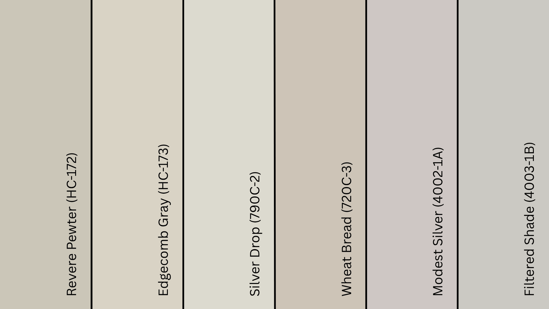
Benjamin Moore
- Revere Pewter (HC-172): Similar warm gray with a slight beige undertone, offering comparable versatility and lasting appeal.
- Edgecomb Gray (HC-173): Lighter, warmer option with greige undertones that provides similar adaptability to various lighting conditions.
Behr
- Silver Drop (790C-2): Soft, light greige offering warmth without excessive darkness, matching Mindful Gray’s balanced temperature.
- Wheat Bread (720C-3): A beige-gray blend with subtle warm undertones and a similar depth, suitable for comparable exterior applications.
Valspar
- Modest Silver (4002-1A): Cool, soft gray with slight beige undertones that adapts well to different architectural styles.
- Pale Oak Grove (5008-3A): Slightly lighter with warm undertones, providing similar versatility for both traditional and contemporary homes.
Wrapping Up
Choosing Mindful Gray (SW 7016) is about more than picking a paint color; it’s about creating an exterior that feels calm, refined, and enduring.
Its subtle greige undertones make it versatile for modern, farmhouse, or traditional designs while maintaining a balanced, natural warmth.
In my experience, Mindful Gray is a classic shade that doesn’t fade with trends. It adapts beautifully to changing light and materials, making it a dependable choice for exteriors that need both sophistication and comfort.
If you’re planning a repaint, start with a sample and see how it changes throughout the day.