Hale Navy Sherwin-Williams Match: Closest Dupes Guide
Are you looking for the perfect navy paint color, such as Hale Navy from Benjamin Moore? I want to tell you why Hale Navy is so popular with both designers and homeowners.
It features a deep navy tone with soft gray undertones, creating a calm and balanced feel. Hale Navy works well in many rooms and styles because it combines boldness with easy pairing.
Sometimes, finding the closest paint match is challenging, but knowing similar colors helps. I’ll share some great alternatives from Sherwin-Williams that closely match Hale Navy.
Let’s see these options so you can pick a navy blue you’ll love around your home for years to come.
What Makes Hale Navy So Popular?
Hale Navy (HC-154) has a deep navy tone with soft gray undertones, giving it a calm and balanced look. Many designers and homeowners love it because it strikes the perfect balance of boldness and versatility.
It’s strong enough to make a statement but easy to pair with a wide range of colors and styles. Hale Navy shines in common spaces, such as cabinetry, where it adds richness without overwhelming.
It also works beautifully on accent walls, bringing depth and interest to rooms. On the exterior, it creates curb appeal with a classic feel. Its flexibility and refined depth make Hale Navy a go-to favorite for various spaces.
Sherwin-Williams Alternatives to Hale Navy

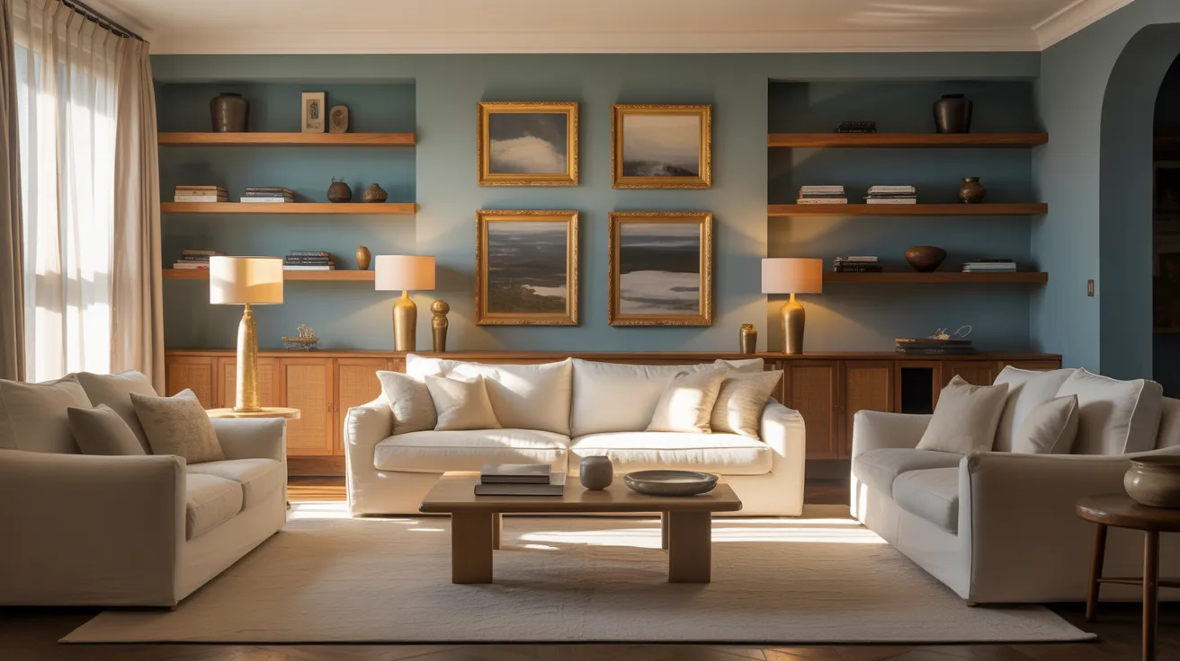
If you like Hale Navy, I think Sherwin-Williams has some great alternatives. Shades like Sea Serpent and Naval, when applied in real-world settings, demonstrate how different navy tones can create unique moods and intensities. Here are three Sherwin-Williams options you might consider:
1. Naval (SW 6244)
Naval is a bold, true navy with a graceful look. It has a deeper, richer tone than Hale Navy, offering stronger intensity. This dark blue hue shows up beautifully in rooms that need contrast and drama.
It’s perfect for walls, accent features, or cabinetry that wants to stand out. Naval carries a calm yet confident vibe with cool gray-green undertones, making it sleek and modern. Its depth makes rooms feel cozy and bold at once.
2. Sea Serpent (SW 7615)
The Sea Serpent by Sherwin-Williams is slightly muted, with a soft green-gray undertone, which lends it a calm, moody presence. Compared to Hale Navy, it feels softer and less bold.
This color is great for cozy, relaxed rooms needing quiet depth. It works beautifully in bedrooms, living rooms, or any space where you want calm but with a unique twist. Sea Serpent feels modern yet classy.
3. Indigo Batik (SW 7602)
Indigo Batik is a vibrant mid-tone navy that is lighter and easier to pair than Hale Navy. Its liveliness works well for cabinetry or furniture pieces that need a color pop without overwhelming.
This shade adds energy and classic style, bringing brightness to spaces where darker blues might feel too heavy. Indigo Batik mixes well with both bold and neutral surroundings, making it a versatile option.
How to Choose the Best Match for Your Project
When choosing between Hale Navy and Sherwin-Williams alternatives, think about your room’s lighting and size first.
Natural light can make colors appear differently, so test in both bright and dimly lit spaces. Consider your design style to see if you want bold or soft tones. Hale Navy offers a balanced, deep blue with gray undertones, good for classic looks.
Sherwin-Williams alternatives, such as Naval, are darker and bolder, while Sea Serpent gives a more muted and relaxed vibe.
Indigo Batik adds a lively, lighter touch. Testing samples side by side helps you find one that best fits your exact needs.
Real-World Applications of Hale Navy Dupes
Hale Navy dupes work wonderfully in kitchens, especially on cabinets, giving a fresh, stylish look that’s not too dark.
They also add appeal to doors, exteriors, and built-in shelves, making spaces feel warm and welcoming. Pairing these blues with crisp trim whites, warm neutrals, and natural wood tones creates a balanced, cozy design.
When considering the best blue paint for kitchen cabinets, these dupes offer colors that complement a variety of decor styles.
They brighten kitchens without feeling cold or overwhelming, making your space feel inviting and natural every day. These colors mix classic style with practical beauty effortlessly.
Final Thoughts
After learning about Hale Navy and its Sherwin-Williams matches, you can see how each shade brings something unique to your space.
Some have softer tones, while others offer bolder, deeper color. All share the balanced vibe that makes Hale Navy a favorite among them.
Finding your perfect navy depends on how you want your room to feel. I’d love to hear which color you choose or how you plan to use it at home.
Your experiences matter, so why not share them? Drop your story or questions in the comments below; it might help someone else!