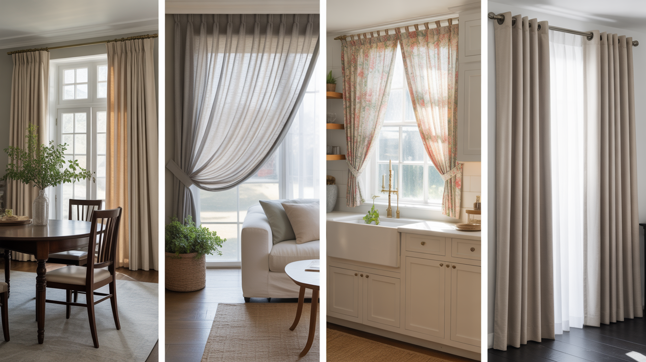
Sherwin-Williams (SW 7050) Useful Gray Undertones: Paint Guide
Picking the right paint color sounds easy until you’re standing in front of 50 shades of gray. I’ve been there, and it’s overwhelming.
If you’re after something calm, cozy, and not too cold, Useful Gray undertones might be exactly what you need. That’s why I’m breaking down everything you should know before you commit, from how the color shifts in different rooms to what it pairs best with.
You’ll get real-life tips, side-by-side comparisons, and a few mistakes to avoid. So if you’re wondering whether this soft greige is right for your space, let’s take a closer look together.
Useful Gray (SW 7050) by Sherwin-Williams

Useful Gray (SW 7050) by Sherwin-Williams is a soft gray with a gentle warmth that comes from its subtle mix of gray and beige tones. People often refer to it as “greige” because it mixes the best of both worlds.
Basic Color Profile
HEX code: #CFCABD
LRV (Light Reflectance Value): 59
Color family: Neutral
Useful Gray is a cozy blend of gray and beige, offering warmth without being too creamy or too stark.
Useful Gray: Undertones Explained
Now here’s where things get a little tricky. This color may appear slightly different in each room, depending on the lighting and surroundings. Here’s what you might notice:
- Beige: This is the leading undertone. It adds a soft, warm touch that keeps the gray from looking too cool or flat.
- Green: In certain lighting, you might notice a very faint greenish hue. It’s not strong, but it’s there if you’re paying close attention.
- Yellow or Red? Some people spot a whisper of yellow or even a taupe-like warmth that gives the color a little depth.
Useful Gray in Real Spaces
Living Room

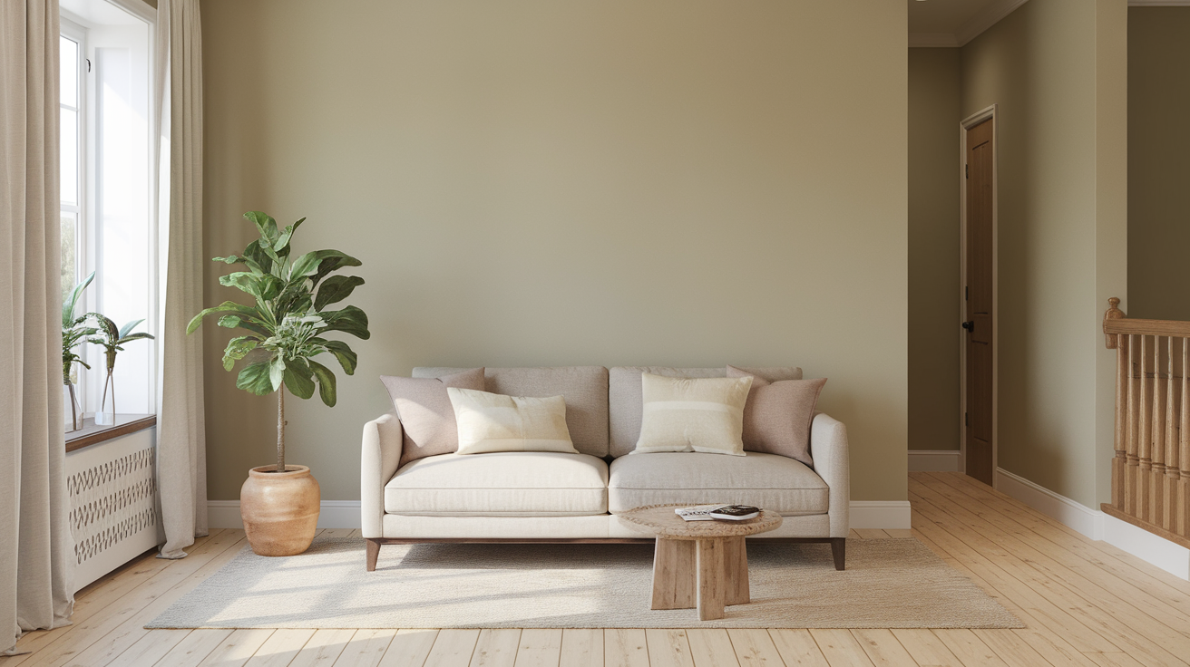
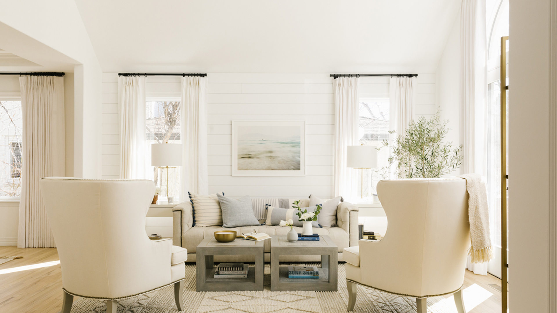
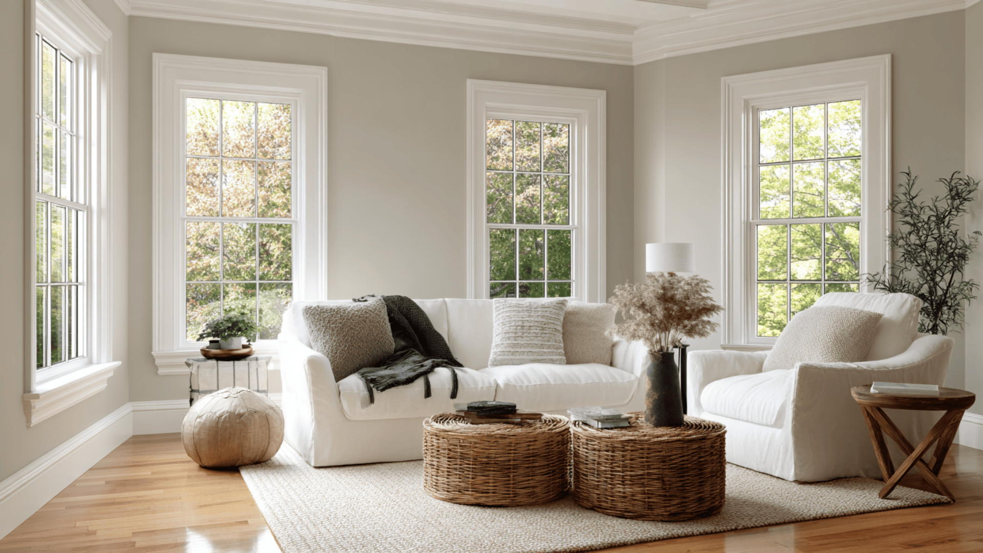
Useful Gray works beautifully in living rooms where you want a calm, warm base without going too dark. It can be the perfect backdrop for both minimalist and layered decor, allowing your furniture and accents to take center stage.
Bedrooms
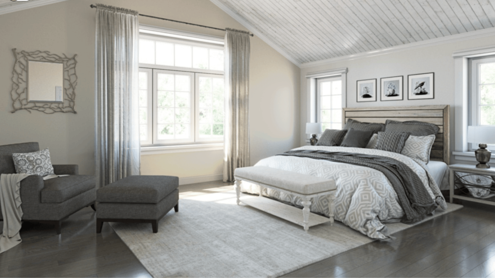
Useful Gray acts as a soothing cocoon. It works well with soft linens and warm lighting, making the room feel restful and serene.
Kitchens
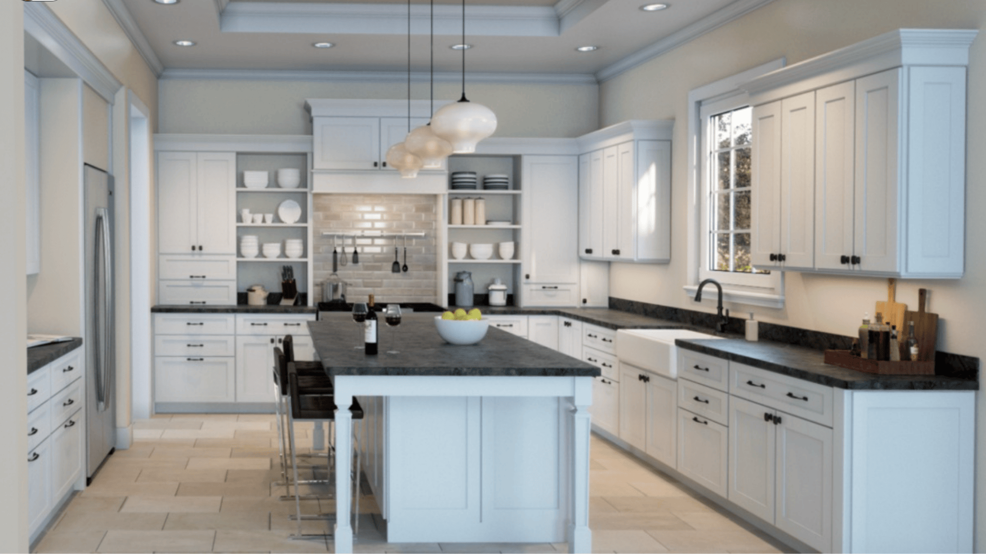
Kitchens benefit from its versatility. If you’re working with white shaker cabinets, stainless steel appliances, or butcher block countertops, Useful Gray will blend in smoothly.
Bathrooms
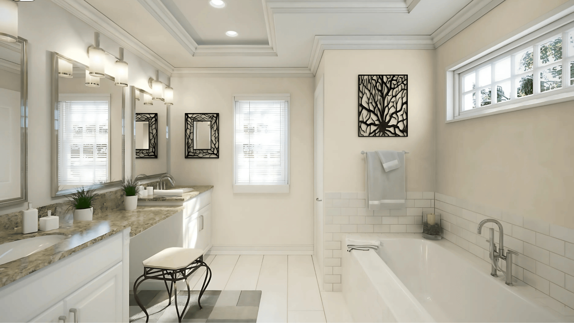
It brings a calm feel, especially when matched with crisp white tiles, matte black fixtures, or greenery. Its gentle tone keeps the room feeling clean and modern without being too harsh.
Exteriors

Useful Gray offers a simple but stylish option that feels both welcoming and inviting. Whether used on siding, shutters, or trim, it pairs well with brick, stone, and wood features. In changing outdoor light, it holds its own, never too washed out or too dark.
What Colors Go Well With Useful Gray?
Pairing it right helps the color pop. Here are combos I’ve found work:
- Trim & Ceiling: Use a bright white, such as Sherwin-Williams’ Extra White (SW 7006, #EEEFEA), for a clean edge that makes the gray feel crisper.
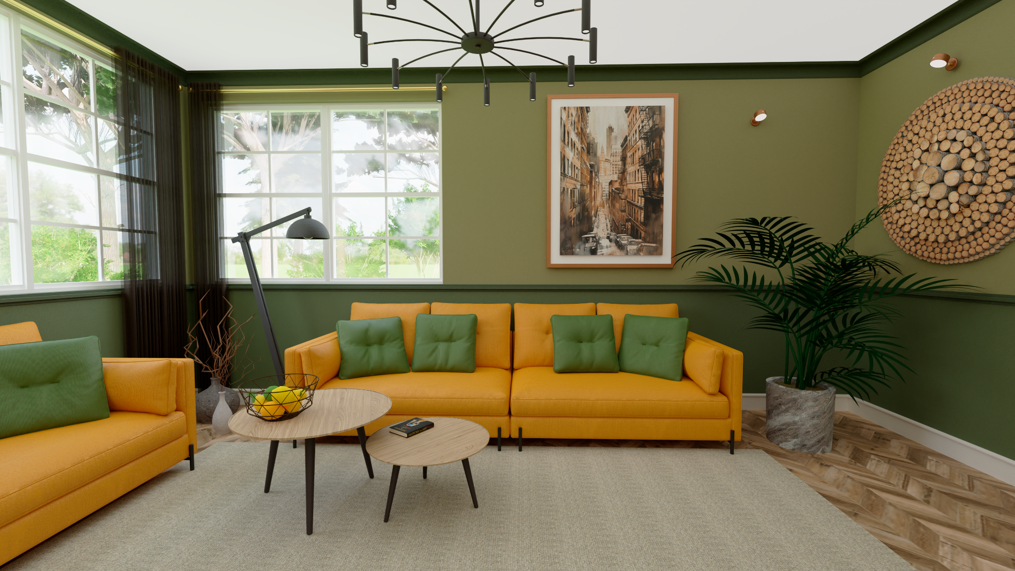
- Accent Walls: Try deep navy blue, rich charcoal, or even forest green to add contrast.
- Soft Partners: Colors like Greek Villa (SW 7551, #F0ECE2), Nuance (SW 7049, #E2E0D6), and Acacia Haze (SW 9132, #969C92) complement Useful gray.
- Natural Tones: Light oak, rattan, tan leather. These textures help bring out the warmth.
Pro Tip: Useful Gray works well with both modern and rustic styles. Add greenery, light woods, and simple fabrics for a fresh, natural look.
Useful Gray vs. Other Sherwin-Williams Grays
Useful Gray vs. Agreeable Gray
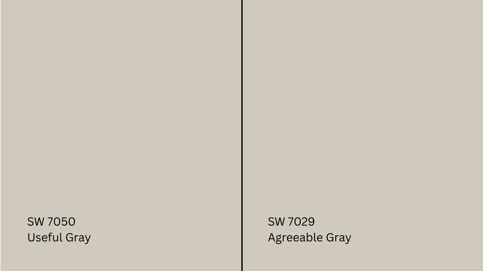
Agreeable Gray (SW 7029, #D1CBC1) is one of Sherwin-Williams’ most popular grays, and for good reason. It’s slightly lighter and has a more neutral base.
In homes with mixed lighting or cooler flooring, Agreeable Gray might feel more balanced. Useful Gray, on the other hand, leans a bit warmer and shows more depth in low light.
Useful Gray vs. Repose Gray
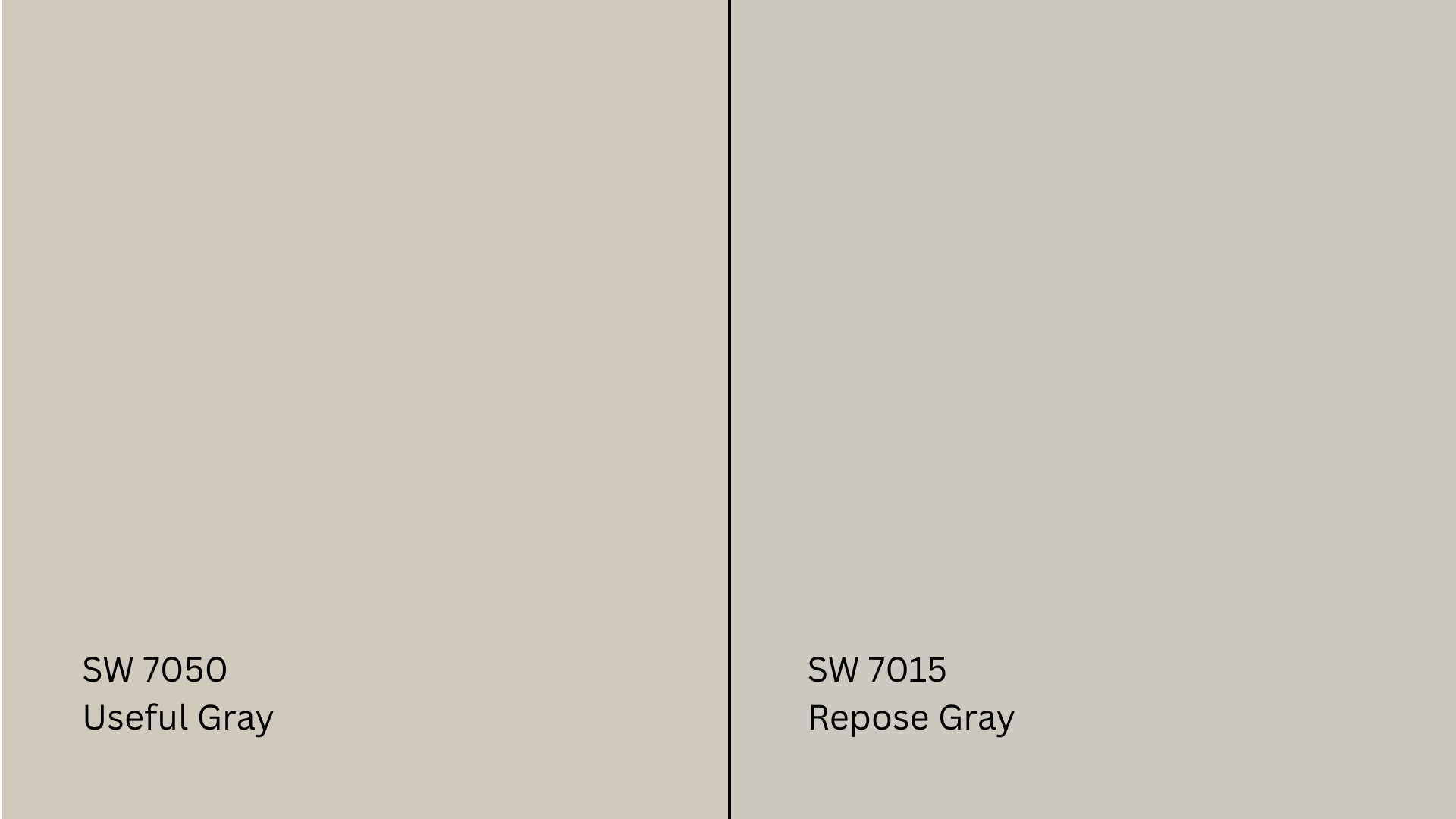
Repose Gray (SW 7015, #CCC9C0) tends to lean cooler and sometimes even picks up a blue or purple undertone in certain rooms.
It’s more modern and sharper in feel, while Useful Gray stays grounded with its beige influence. If you’re aiming for warmth and comfort, Useful Gray might feel more natural.
Useful Gray vs. Versatile Gray
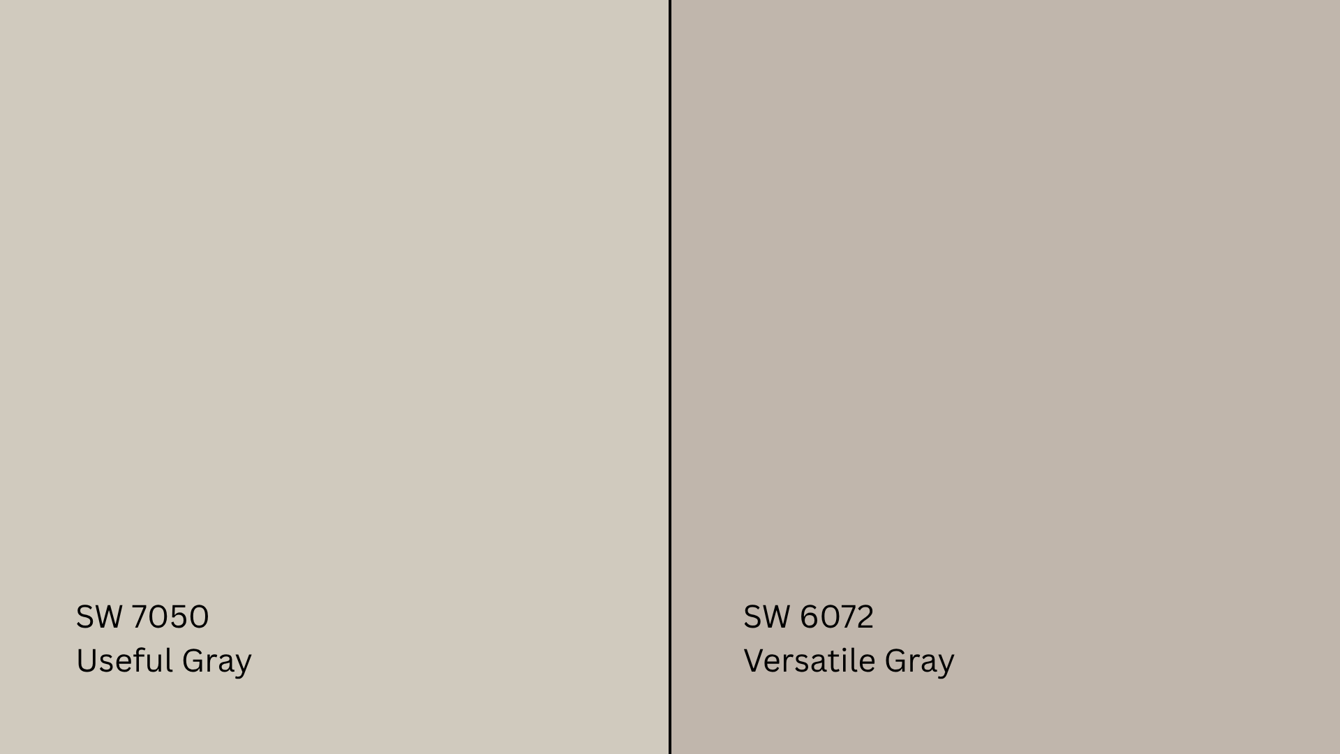
Versatile Gray (SW 6072, #C1B6AB)is a bit more flexible in spaces but also deeper. It’s more intense and can make a stronger statement, while Useful Gray is softer and more understated.
For a richer feel, opt for Versatile. If you prefer a light and airy look, stick with Useful Gray. In short, Useful Gray finds a balance where many others don’t.
How Lighting Affects It
The light in your room will change how this color looks. Here’s a breakdown:
- North-Facing Rooms: These get a cooler, bluish light most of the day. Useful Gray may lean more gray and muted, with slight green shadows appearing in less natural light.
- South-facing rooms: Sunlight pours in, especially during the midday hours. This boosts Useful Gray’s warm beige side, giving the room a soft, inviting glow that feels cozy without becoming yellow.
- East-Facing Rooms: Morning light is warm but fades by afternoon. Useful Gray may look brighter and more beige in the morning, then take on a flatter gray tone later.
- West-Facing Rooms: These rooms get richer light in the afternoon. Expect the color to appear warmer and deeper by evening, with beige undertones becoming more noticeable.
Where to Sample and Buy
Where to Get Peel-and-Stick Samples
- Samplize: Real Sherwin-Williams paint on removable adhesive sheets
- Sherwin-Williams stores: Sample cards and 8 oz. test jars available
- Hardware stores: Some carry color chips or can custom mix tester pots
Be sure to look at your sample in morning, afternoon, and evening light, and next to your trim, furniture, and flooring. That’s the best way to make a confident choice.
Where to Buy the Paint
- Sherwin-Williams.com: Order online for delivery or store pickup
- Sherwin-Williams stores: Full-size cans, finish advice, and expert help
- Authorized retailers: Some hardware stores can tint Useful Gray by formula
Many stores also offer curbside pickup and bulk discounts for larger projects.
Common Mistakes to Avoid
Although Useful Gray is a versatile color, there are a few common mistakes that can make it appear off in your space. Here are things to watch out for before committing:
- Skipping the sample test: You might think it’s a safe color, but it shifts with the light. Always test first.
- Wrong trim choice: A creamy white can clash. Stick to crisp whites.
- Underestimating lighting: This can make or break how this color appears.
- Using it in dark spaces without adding light: It can turn dull or flat without enough brightness.
Take your time with testing and planning. These small steps can save you from costly repaints and make sure Useful Gray looks its best in every room.
Conclusion
Useful Gray is one of those colors that surprises you, in a good way. It’s soft, warm, and works just about anywhere if you take the time to understand it.
The key is knowing how Useful Gray undertones shift in different lighting. The beige base adds warmth, but the slight hints of green or taupe can change how it feels in each room.
I’ve found that when you test it out first and pair it with the right whites and textures, it really shines. If you’re looking for a color that’s calm, welcoming, and easy to live with, Useful Gray is worth a closer look.
For more color tips and side-by-side comparisons, check out my other paint guides on the website.

