Benjamin Moore Van Courtland Blue (HC-145): Paint Review
Blue paints are tricky. They can be too bright, too babyish, or just way colder on your wall than they looked on the chip. I’ve been there, looking for something that feels classic but still brings personality to a room.
That’s why I put this guide together: to help you decide if Benjamin Moore Van Courtland Blue is the right shade for your space.
I’ll show you how it looks in real rooms, how it shifts in different lighting, how it compares to similar blues, and what finishes and pairings work best. You’ll also get sampling tips and brand equivalents if you’re still exploring options.
Getting to Know Benjamin Moore Van Courtland Blue

Van Courtland Blue (HC-145) is a historic color from Benjamin Moore’s Historical Collection. It’s a muted, mid-tone blue with a touch of gray, making it both elegant and livable.
Basic Color Profile
HEX code: #879A9D
LRV (Light Reflectance Value): 31.47
Color family: Muted blue with soft gray undertones
This shade offers a colonial-era richness without feeling outdated. It’s perfect for people who want something colorful without going bold or bright.
Undertones Explained
Van Courtland Blue has gray and green undertones, which give it a quiet, smoky look.
- In natural daylight, the blue comes forward with a slightly coastal vibe.
- In artificial or low light, it leans grayer and feels more muted.
It’s a shapeshifter in the best way. Never too stark or overwhelming, but always present.
Because of those shifting undertones, you’ll want to sample it in your own space before painting a full room.
Van Courtland Blue in Real Spaces
This color is more versatile than it first appears. It can act as a feature, a backdrop, or even a cabinet color. Here’s what to expect in different rooms:
How It Looks in Different Rooms
Kitchens

Van Courtland Blue looks stunning on lower cabinets, kitchen islands, or even full walls in traditional or cottage-style kitchens. It pairs beautifully with brass, soapstone, white marble, and warm woods.
Bathrooms

In bathrooms, this shade adds a soft, refreshing look. It plays well with white tile and brushed nickel, and it feels both clean and cozy. Small bathrooms benefit from the depth without the color feeling heavy.
Living Rooms

As a living room wall color, Van Courtland Blue creates a relaxed and grounded mood. It works well in rooms with natural light and looks especially nice with cream or greige upholstery.
Bedrooms

This shade is a favorite for bedrooms. It has a calming, timeless feel—almost like a well-worn denim or a misty sky. Pair it with white trim and neutral bedding for a balanced, peaceful space.
How Lighting Affects It
Van Courtland Blue has a relatively low LRV of 30.42, so it absorbs light more than it reflects. That means lighting will change its personality:
North-facing rooms: The gray-green undertones are stronger. It feels soft, cool, and smoky.
South-facing rooms: The blue brightens up and feels more cheerful without becoming loud.
East-facing rooms: Morning light gives it a fresh, powdery look.
West-facing rooms: The color deepens in evening light and may lean more slate-blue.
Always test a sample in both morning and evening light. This one shifts gently but noticeably.
Van Courtland Blue vs. Other Benjamin Moore Blues
Here’s how Van Courtland Blue compares to some of Benjamin Moore’s most popular blue-gray paint colors.
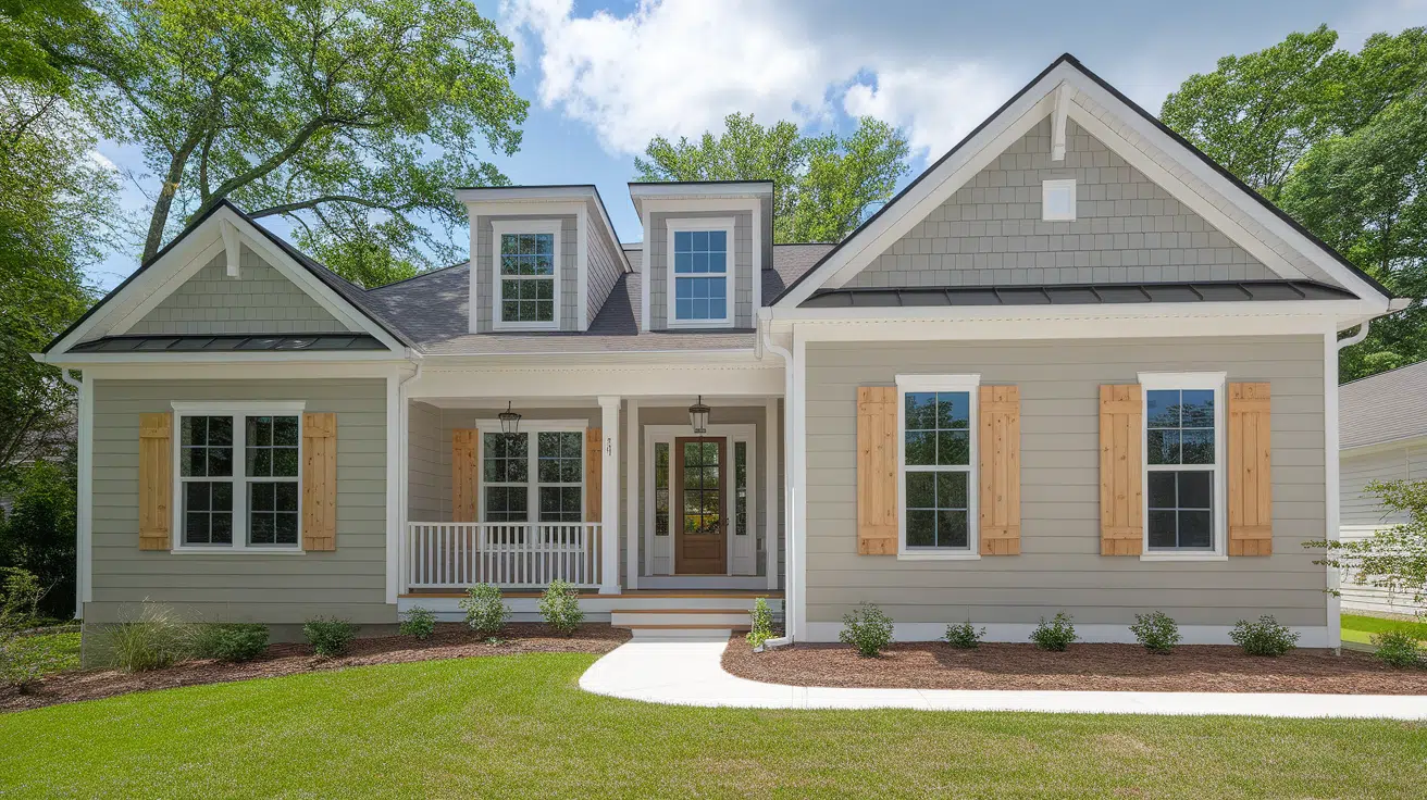
Van Courtland Blue vs. Smoke
Smoke (2122-40, #BBC8C8) is a light blue-gray with cool undertones.
- Smoke is brighter and more icy.
- Van Courtland Blue is deeper, dustier, and more grounded.
Choose Smoke for an airy, coastal vibe. Pick Van Courtland Blue for something with more historical character.
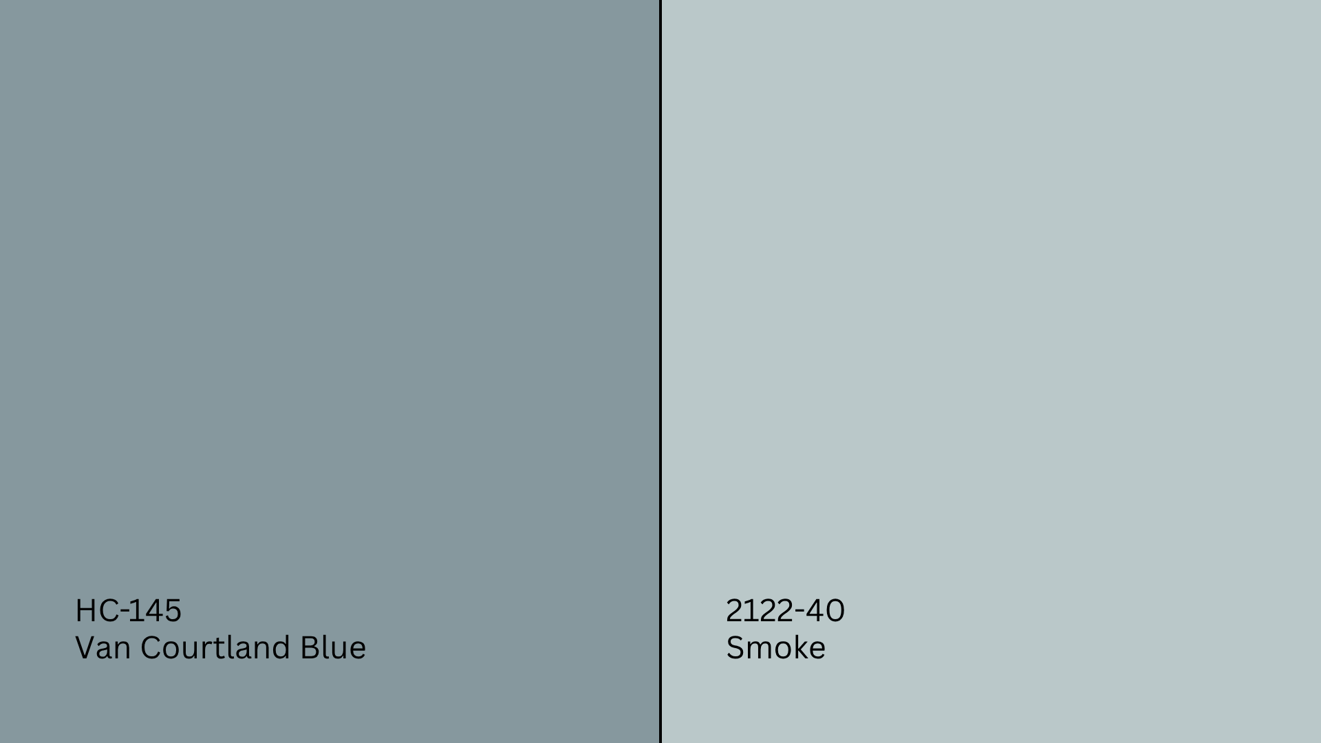
Van Courtland Blue vs. Boothbay Gray
Boothbay Gray (HC-165, #AAB2B0) is a classic blue-gray with a stronger gray presence.
- Boothbay Gray leans grayer and more neutral.
- Van Courtland Blue is more colorful and blue-forward.
Boothbay is perfect for minimalist or modern styles. Van Courtland Blue brings more color and softness.
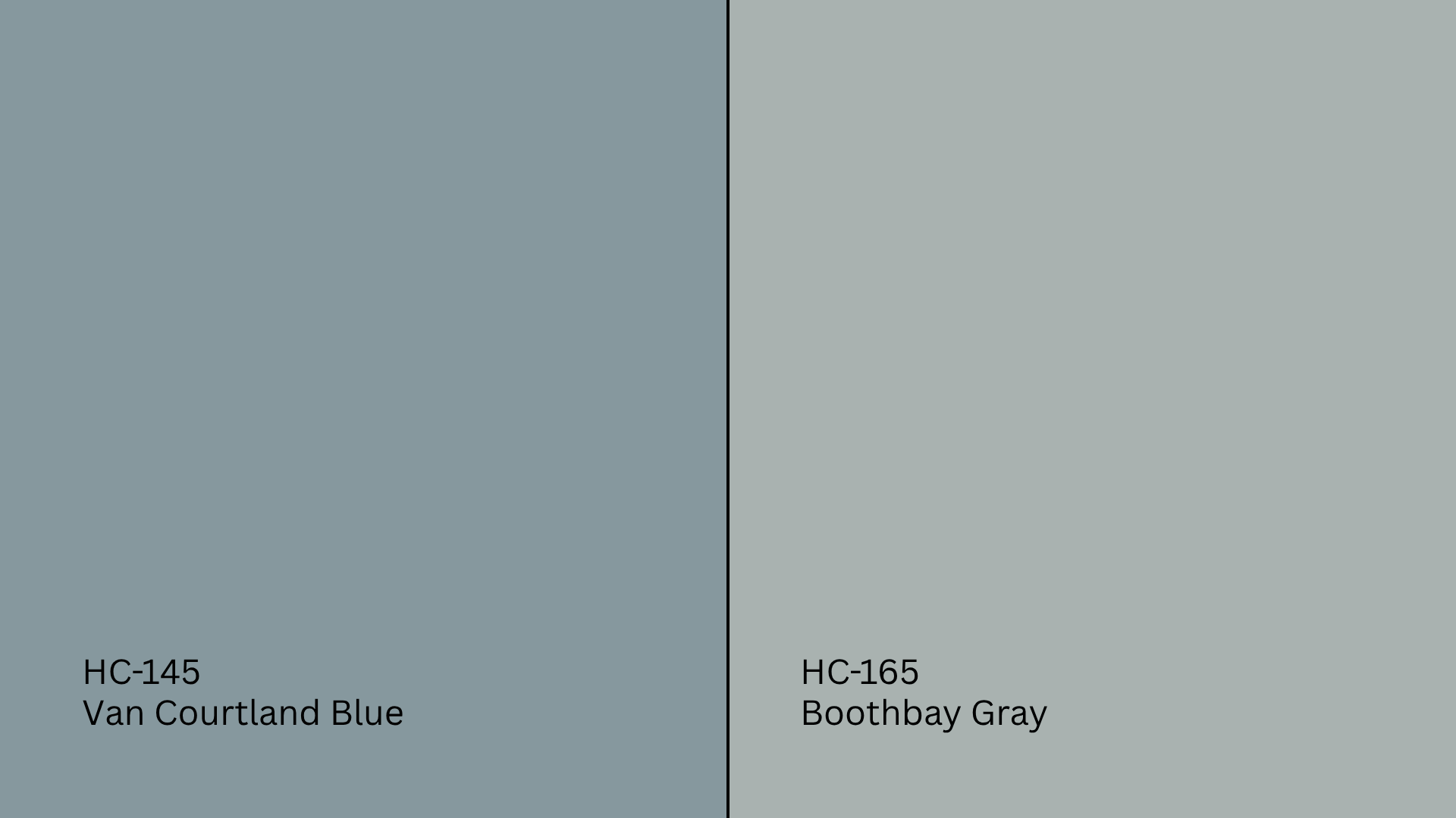
Van Courtland Blue vs. Santorini Blue
Santorini Blue (1634, #A2B5B8) is a lighter, brighter blue with cool undertones.
- Santorini Blue feels cheerful and fresh.
- Van Courtland Blue is more muted and subtle.
Use Santorini Blue in playful or beachy rooms. Use Van Courtland Blue where you want mood without drama.
Van Courtland Blue vs. Newburyport Blue

Newburyport Blue (HC-155, #425765) is a deep navy with steely undertones.
- Newburyport is significantly darker and bolder.
- Van Courtland Blue is soft, mid-tone, and easier to live with.
Newburyport Blue makes a statement. Van Courtland Blue supports the space.
Undertone and LRV Comparison Table
| Paint Color | Undertones | LRV | Warm or Cool |
|---|---|---|---|
| Van Courtland Blue | Gray, green-blue | 30.42 | Cool |
| Smoke | Blue-gray | 56.49 | Cool |
| Boothbay Gray | Gray with blue tint | 43.26 | Cool |
| Santorini Blue | Cool blue | 53.96 | Cool |
| Newburyport Blue | Navy, slate | 10.31 | Cool |
These blues serve very different styles. Use the table to match tone and depth to your room’s needs.
Best Color Pairings for Van Courtland Blue
Van Courtland Blue is subtle enough to pair with bold or neutral tones. Here’s how to bring it to life.
Trim and Ceiling Suggestions
- Chantilly Lace (OC-65, #F5F5EF): Crisp, bright white for sharp contrast.
- White Dove (OC-17, #F0EDE4): Softer white that balances the dusty blue.
- Simply White (OC-117, #F7F4EB): Slightly warm for a traditional feel.
Use flat on the ceiling, satin or semi-gloss on trim for a clean finish.
Accent Wall and Furniture Colors
For calm, layered pairings: Soft taupe, light greige, warm white, or dusty rose all work well.
For contrast and mood: Deep navy, charcoal, olive green, or warm golds pop against the muted blue.
Furniture in natural wood, beige, white slipcovers, or rich navy adds balance. Accent with brass, ceramic, or linen textures.
Hardware and Flooring Compatibility
Van Courtland Blue works well with brushed brass, which adds warmth and contrast. Chrome or nickel gives a clean look, especially in bathrooms and kitchens. Matte black creates a strong contrast in both modern and traditional spaces.
For flooring, light wood or white oak keeps the room open and bright. Medium-tone wood adds depth and warmth. Black-and-white tile or marble gives a classic, fresh look
Paint Finish Recommendations
Van Courtland Blue looks different depending on your finish:
Flat: No shine at all. Best for ceilings or low-traffic areas. Hides imperfections, but is hard to clean.
Matte: Slightly more durable than flat. Good for bedrooms, dining rooms, and spaces where you want a soft look.
Eggshell: Low sheen with better durability. Works well in living rooms, hallways, and other mid-traffic areas.
Satin: Smooth finish with gentle shine. Great for kitchens, bathrooms, and trim due to its moisture resistance.
Semi-Gloss: Noticeably shinier. Use on trim, doors, cabinets, or high-moisture areas that need frequent cleaning.
Gloss/High Gloss: Very shiny and durable. Best for furniture, cabinetry, or decorative trim. Highlights surface flaws, so prep matters
Sample finishes side-by-side to find your favorite balance of sheen and color.
Sampling and Buying Options
Where to Get Peel-and-Stick Samples
- Samplize: Offers real Benjamin Moore paint on mess-free adhesive swatches.
- Benjamin Moore retailers: Stock paint cards and tester jars.
- Hardware stores: May carry swatches or can order small pots.
Apply samples to multiple walls and check in different lighting conditions before choosing.
Where to Buy the Paint
- BenjaminMoore.com: Offers delivery or in-store pickup.
- Local paint stores: Carry the Historical Collection and all finishes.
- Big box stores: May carry comparable swatches or offer color matching.
Call ahead for stock. Some independent retailers carry different finish options.
Paint Equivalents in Other Brands
Looking for a similar color in other brands? These come close:
- Sherwin-Williams: Try Morning Fog (SW 6255, #A8AEB1) or North Star (SW 6246, #CAD0D2)
- Behr: Check out Blueprint (S470-5, #577C8A) or Watery (HDC-CT-26, #ADBCBC)
- Valspar: Try Voyage (4006-3A, #B5BABD) or Filtered Shade (4003-1A, #DBDBD5)
Test them side by side. Similar isn’t always close enough.
Conclusion
If you want a classic, soft blue that feels elegant and easy to live with, Benjamin Moore Van Courtland Blue could be the perfect choice.
Now you know how it behaves in different spaces, how it compares to other popular blues, and how to style it with trim, hardware, and furniture.
Before buying gallons, test it on your own wall; this one’s subtle shifts can really surprise you. Want to keep comparing? Check out more of my detailed paint guides to help you find your perfect match.