
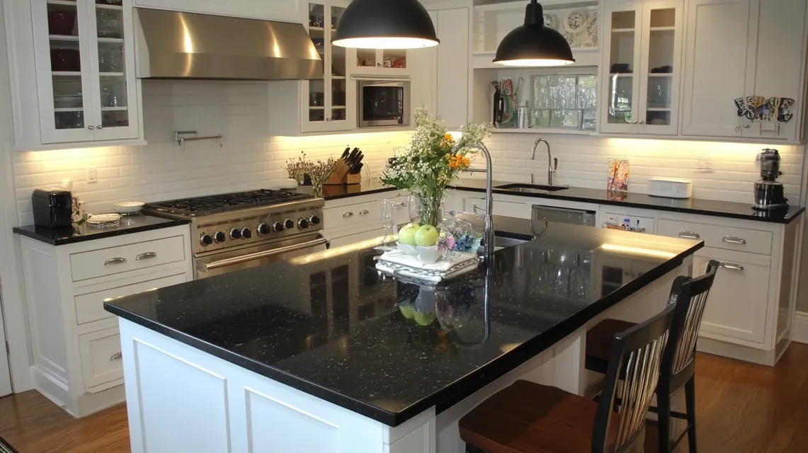
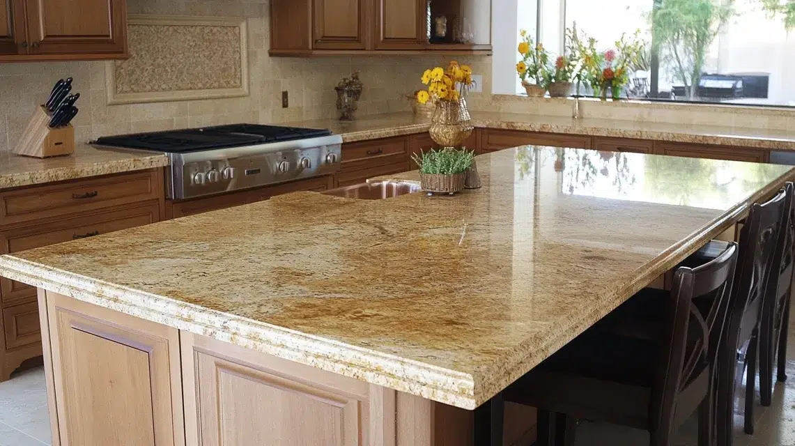
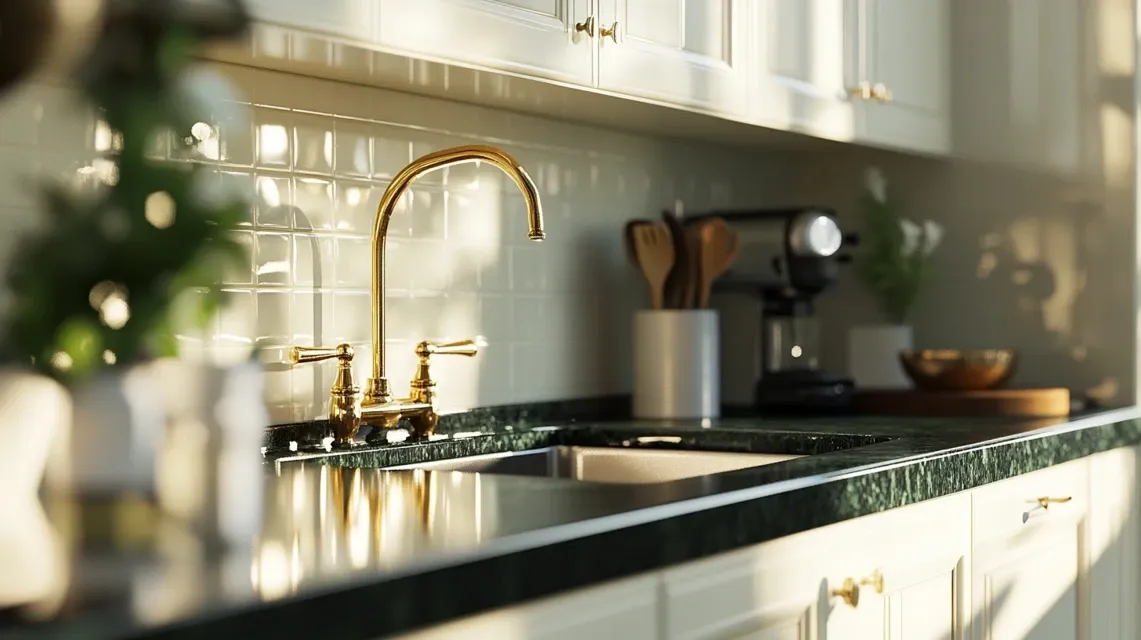
35 Amazing Backsplash Ideas for Busy Granite
Is your granite countertop loud, bold, or just plain busy?.
So many homeowners love granite’s natural patterns but struggle to find a backsplash that doesn’t match. The wrong tile can make your kitchen feel overwhelming.
This blog is here to help you with that. I’ll show you smart, stylish backsplash ideas for busy granite that bring balance, not chaos.
From calming color combos to tile styles that work, you’ll find everything you need to make your kitchen feel put-together and peaceful.
If you’ve been stuck on how to pair a backsplash for busy granite, keep reading. The perfect match might be simpler than you think
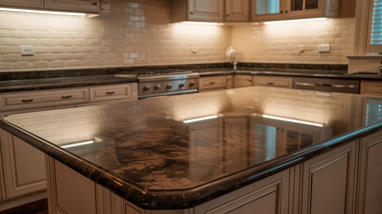
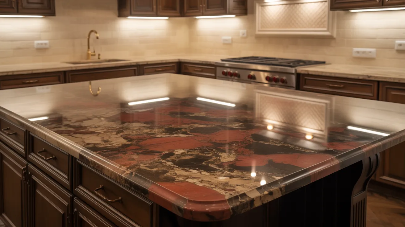
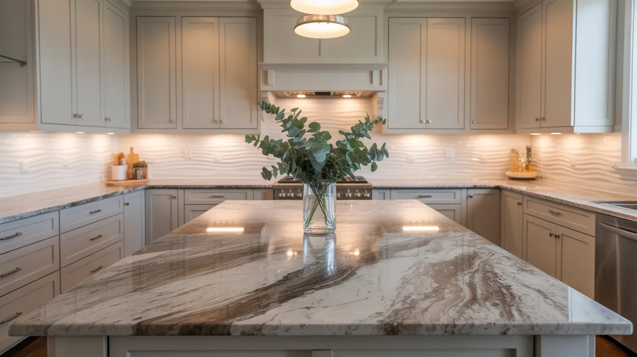
What Makes Granite Look “Busy”
Granite can grab your attention, and sometimes not in a good way. What makes it feel “busy” often comes down to three things:
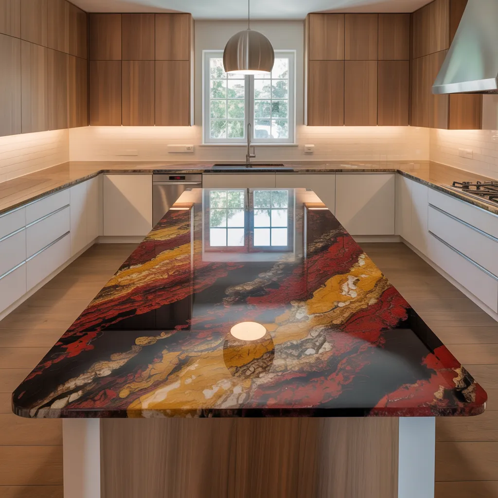
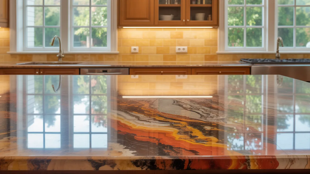
Movement: Some granite slabs have flowing patterns that twist and swirl. This dynamic movement adds drama but can also clash with other design elements if not balanced well.
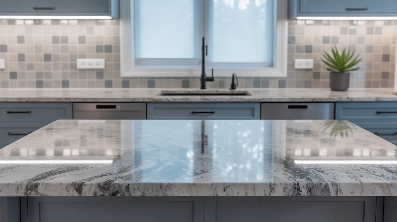
Speckling: Tiny flecks of different colors like gold, black, or white, scattered across the surface, create visual noise. The more colors in the mix, the harder it becomes to coordinate with tiles or cabinets.
Bold Veining: Thick, dark veins slicing through lighter granite can dominate the look of your kitchen. These bold streaks draw the eye and may compete with patterned backsplashes.
When Does This Become a Design Challenge
Granite feels “too much” when:
- It has more than three contrasting colors
- It’s paired with other strong patterns
- It lacks a calm backdrop (like neutral backsplash or soft cabinet tones)
Understanding these features helps you choose a backsplash that balances rather than competes
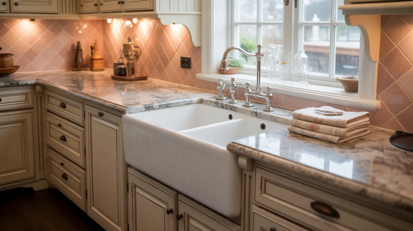
How to Choose a Backsplash That Calms Busy Granite
Granite is bold. It has lots of swirls, specks, and color changes. That’s part of its charm, but it can make a kitchen feel loud if you don’t pair it with the right backsplash.
Use Solid Colors That Pull from Granite Tones
To calm granite, pick a backsplash that matches one of its soft colors. Look closely for light beige, gray, or cream shades.
These smaller tones help connect the backsplash and granite. Avoid bold shades. Stick with soft finishes like matte or satin so the kitchen stays quiet, clean, and simple.
Stick with Simple Tile Styles
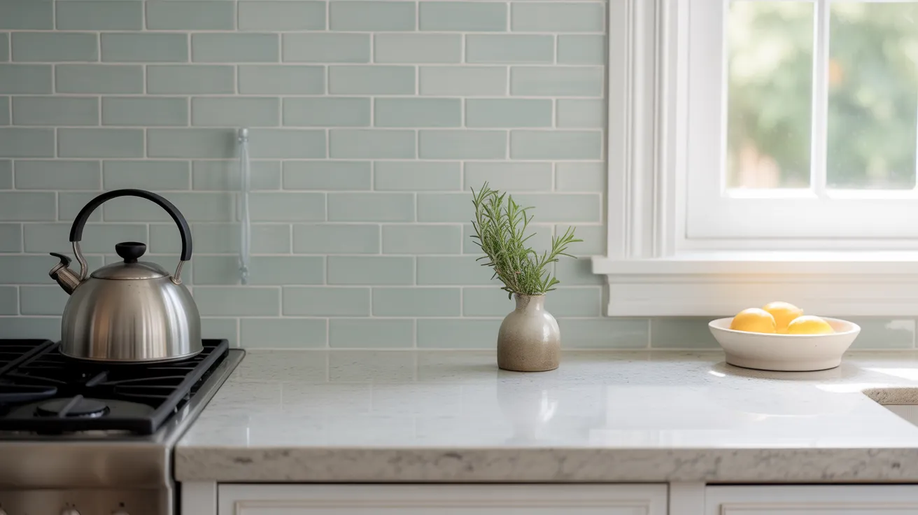
When granite looks busy, simple tiles work best. Use plain subway or glass tiles in calm colors. Avoid anything too shiny or with strong patterns.
Keep the design flat and smooth. This helps the granite stand out while the backsplash stays soft. No patterns, no prints, just a clean background.
Consider a Monochrome Look
Try matching your backsplash to the cabinet color. If your cabinets are white or gray, use the same shade for the backsplash.
This removes contrast and lowers visual noise. The granite becomes the focus. Everything else fades into the background. Simple color matches help make the kitchen feel calm.
Try Peel-and-Stick Options for Easy Fixes
Peel-and-stick backsplash tiles are easy and budget-friendly. They work well for renters or small fixes. Choose plain, light-colored tiles with a matte finish.
Stay away from shiny or fake textures. If you change your mind later, they come off easily. These tiles let you test your look without stress
Matching Bold Granite with Simple Backsplashes
These ideas match busy granite patterns with simple, calming backsplashes so your kitchen or bathroom feels balanced, not overwhelming.
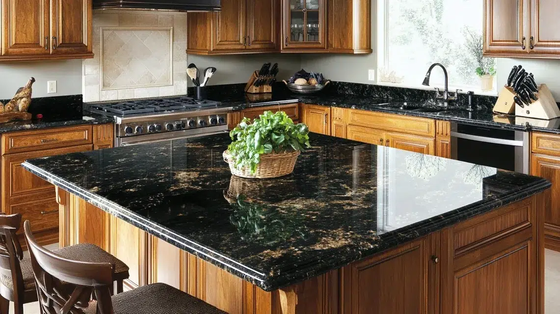
1. Black Galaxy Granite + White Subway Tile
Black Galaxy granite has golden flecks that shimmer. It’s bold and rich. A plain white subway tile softens the look. The smooth white background balances the granite’s shine.
This combo works great in small kitchens, too; it keeps things from feeling dark or closed-in. Use matte or satin tile finish for a cleaner, brighter effect without glare.
2. River White Granite + Light Gray Glass Tile
River White has soft swirls of gray and cranberry on a pale base. Pair it with soft gray glass tiles to echo the movement without making it feel too busy.
The glass tiles add a modern touch but stay light and simple. Great for open kitchens with natural light. Try longer glass tiles in a horizontal layout to make the wall feel wider.
3. Typhoon Bordeaux + Cream Tile With No Pattern

This granite is a showstopper with burgundy waves, beige backgrounds, and bold lines. A plain cream backsplash keeps the drama from being too much.
Stick to large tiles or a slab backsplash to avoid drawing attention away from the granite. It also helps keep the kitchen from looking old-fashioned. Warm LED lighting makes the colors blend nicely.
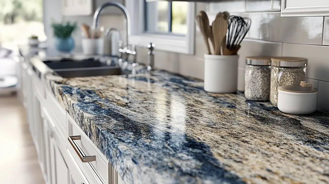
4. Blue Bahia + Matte White Brick Tile

Blue Bahia granite is eye-catching with deep blue and white patterns. A flat matte white brick tile calms everything down. It makes the granite look like art.
Stick to one grout color, white or light gray. This combo feels bold but not messy. Great in kitchens with white cabinets and silver fixtures.
5. Giallo Ornamental + Beige Ceramic Tile
Giallo Ornamental has speckling and movement, but its warm tones make it inviting. A simple beige ceramic tile blends right in, creating a soft, warm space.
It’s perfect for cozy kitchens with wood or cream cabinets. Choose slightly larger tiles for a more modern feel and fewer grout lines.
6. Lapidus Granite + Pale Almond Tile
Lapidus granite has copper, gold, and black flecks. It’s full of life. Pale almond tiles help calm it down without clashing.
This combo works well in kitchens with dark or espresso cabinets. Try pairing it with brushed bronze or dark metal fixtures to bring the look together.
7. Cosmic Black Granite + White Marble Tile

Cosmic Black granite has sweeping white and gold streaks. It’s dramatic. To tone it down, use white marble tile with light gray veining.
The soft contrast highlights the granite’s beauty. Keep the backsplash lines simple—don’t use mosaic patterns here. This setup works great in luxury kitchens with lots of natural light.
8. Verde Butterfly Granite + Soft Cream Tile
This granite is deep green with gray and white speckling. Use a soft cream backsplash to warm up the space and add balance.
The calm tile brings out the white flecks without adding clutter. This combo works beautifully in kitchens with wooden cabinets or gold-tone hardware.
9. White Spring Granite + Soft Blue Tile

White Spring granite has red and gray veins on a white base. A calm, soft blue tile adds a gentle color without clashing.
It brings out cooler tones in the stone. Use a smooth or slightly textured tile—nothing glossy. This combo adds calmness and color in one shot.
10. Golden Crystal Granite + Pale Taupe Tile
Golden Crystal has sandy tones with dark grains. It feels natural and bold. A pale taupe backsplash lets the granite take center stage.
This match works best in kitchens with light wood or white cabinets. You can also use grout that matches the tile to keep the wall smooth and simple.
11. Alaska White Granite + Light Gray Subway Tile
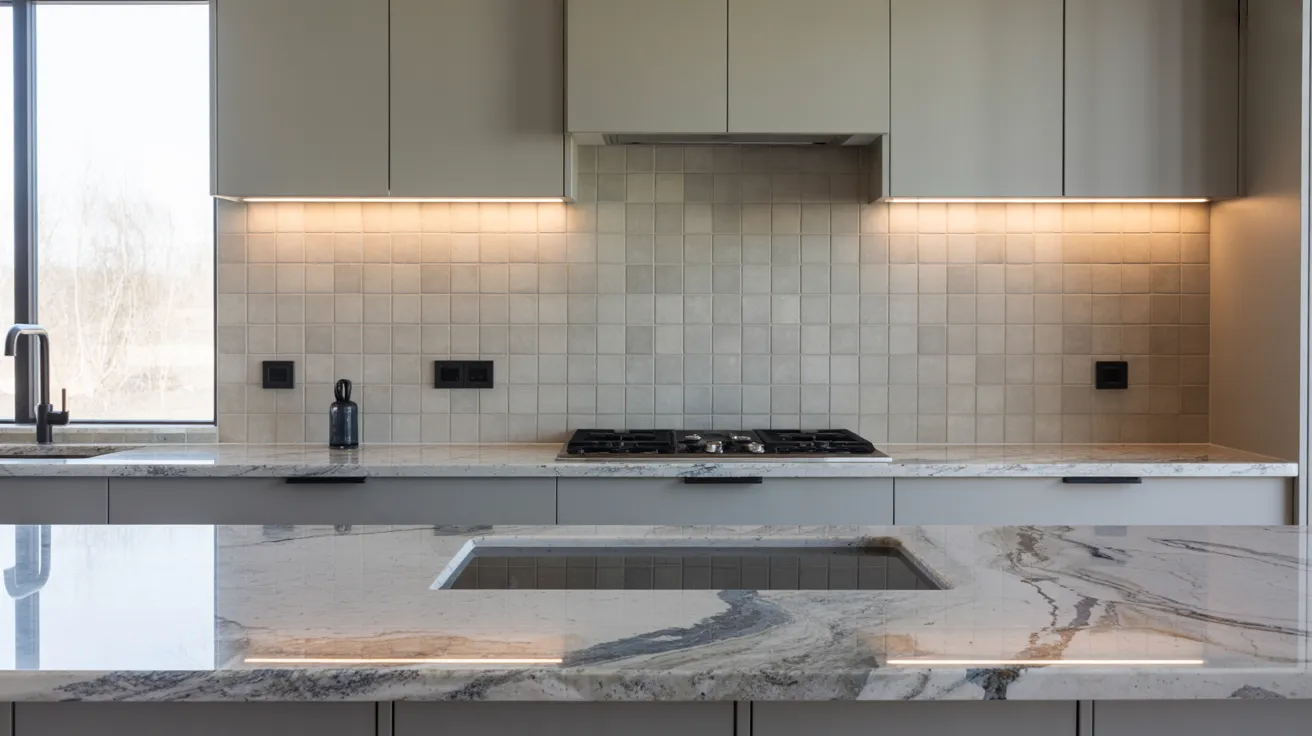
Alaska White has dark speckles and smoky swirls over a pale base. Light gray subway tiles echo the cool tones without adding noise.
This pairing feels clean and bright. It works well in both modern and traditional kitchens. Use a thin grout line for a smooth wall look that doesn’t fight with the granite’s patterns.
12. Brown Antique Granite + Ivory Tumbled Tile
This granite has warm browns and golds with heavy motion. Pair it with ivory tumbled stone tiles for a soft, natural vibe.
The texture adds warmth but keeps the wall calm. This is perfect for rustic kitchens or spaces with earthy tones. Avoid high-shine tiles here. They clash with the granite’s rough charm.
13. Titanium Granite + Cream Beveled Tile

Titanium granite is bold and full of contrast, with black, gold, and white streaks. Cream beveled tiles tone it down and bring a classic look.
The gentle 3D edge adds interest without chaos. This combo looks sharp with black or dark gray cabinets. Use warm lighting to make the gold streaks in the granite pop.
14. Persa Gold Granite + Matte Ivory Tile
Persa Gold mixes gold, gray, and cream swirls. It’s bold but warm. Matte ivory tiles match its base tone and give your eyes a break.
Great in farmhouse kitchens or ones with open shelves. Stick to simple layouts like straight stack or running bond to avoid extra patterns.
15. Azul Aran Granite + Soft Taupe Tile
Azul Aran blends cool gray with blue and taupe veins. A soft taupe backsplash balances it with warmth. This pairing creates a cozy but elegant space.
Use medium to large tiles so the wall feels smooth and quiet. Good for both traditional and updated kitchen styles.
16. Santa Cecilia Granite + Simple Bone Tile
Santa Cecilia is speckled with gold, black, and burgundy. A plain, bone-colored tile matches without shouting. This combo works well in family kitchens, warm and welcoming.
Keep the tile finish matte or satin. Too much shine can make the space feel overly busy when paired with all the granite flecks.
17. Blue Pearl Granite + White Shiplap Tile
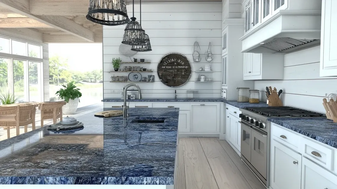
Blue Pearl sparkles with silvery blue tones. A white shiplap-look tile keeps things casual and clean. This pair looks great in coastal or cottage kitchens.
Shiplap tiles add texture without overwhelming the space. Add soft white or brushed nickel hardware for a fresh, relaxed vibe.
18. Colonial Gold Granite + Sand Tile
Colonial Gold granite has warm cream and gold veins. A soft sand backsplash makes it feel relaxed. Choose large ceramic or porcelain tiles for a modern touch.
This combo shines in kitchens with white or oak cabinets. Use warm-toned lights to bring out the golden flecks.
19. Magma Gold Granite + Flat White Tile
Magma Gold has deep reds, golds, and browns. It’s bold. A plain white flat tile lets it take the spotlight. Use oversized tiles or even a slab backsplash to keep it extra calm.
Great for kitchens with bold color in the granite and neutral cabinets elsewhere.
20. Lennon Granite + Pale Greige Tile
Lennon granite mixes grays, whites, and blue tones in swirling patterns. A pale beige tile tones it down without losing the cool, modern feel.
Try square tiles with thin grout for a neat look. This combo fits well in minimalist or industrial-style kitchens.
21. Golden Thunder Granite + Light Biscuit Tile

Golden Thunder brings lots of movement in gold, black, and brown tones. Light biscuit-colored tile softens it. Try a vertical tile pattern to keep it from feeling too heavy.
It adds just enough interest without creating conflict with the granite’s busy design.
22. Mascarello Granite + Soft Butter Tile
Mascarello is fiery, with rich oranges, reds, and golds. A soft butter-toned backsplash makes the room feel sunny but smooth.
Best in kitchens with lots of daylight. Choose wide tiles with soft edges. Don’t go glossy—it’ll compete too much with the granite’s shine.
23. Bianco Antico Granite + Frosted Gray Tile

This granite has cool tones of gray, white, and rose speckles. A frosted gray tile blends in and settles the space. Use glass or frosted ceramic for a light-catching look without the glare.
The combo works well with stainless steel appliances and simple cabinet styles.
24. Café Imperial Granite + Simple Linen Tile
Café Imperial has a dark chocolate tone with lighter veins. A linen-colored backsplash tile keeps it from feeling too heavy.
This combo brings warmth and calm. Go for a brick pattern if you want a slight texture but still want a neat wall. Works great in cozy kitchens or small spaces.
25. Bordeaux Dream Granite + Soft Rose Beige Tile
This granite mixes bold wine red with cream and gray tones. A soft rose beige tile supports the warmth but dials down the noise.
Choose smooth, medium tiles. Perfect in kitchens with brushed gold or antique bronze finishes. This pair feels warm and a little fancy without being over-the-top.
26. White Ice Granite + Matte Fog Tile
White Ice has icy grays, dark veins, and clear whites. Matte fog-gray tiles offer a cool, calming background. The combo is fresh and balanced.
It works great with dark cabinets for contrast or white cabinets for harmony. Use longer tiles laid straight for a clean, open look.
27. Costa Esmeralda Granite + Warm Sand Tile

Costa Esmeralda is green-toned with white and gray swirls. A warm sand backsplash softens the cool green without fighting it.
It works beautifully in kitchens with warm wood or cream-colored cabinets. Keep the tile shape basic—like rectangles or squares to avoid distracting the eye.
28. Sienna Bordeaux Granite + Beige Marble Tile
This granite is all drama red veins and gold patterns. A soft beige marble tile balances the heat. Choose a low-pattern tile to avoid conflict.
This combo is perfect in kitchens with bronze or antique hardware. Add warm white lights for a cozy glow.
29. Baltic Brown Granite + Light Tan Tile

Baltic Brown has heavy speckling in brown and black. A light tan tile keeps it grounded. Stick with larger tiles to avoid too many lines on the wall.
The neutral tones pair well with both traditional and country-style kitchens.
30. Peacock Green Granite + Buttermilk Tile
This granite shows green and gold when the light hits it. Buttermilk-colored tiles help soften the green while keeping things warm.
Perfect for classic-style kitchens. Use matte tiles to reduce shine and keep the room feeling smooth.
31. Ivory Fantasy Granite + Soft Blush Tile
Ivory Fantasy has sweeping gold and cream swirls. Soft blush backsplash adds a hint of warmth and style without taking over.
The look is gentle, fresh, and welcoming. Use large tiles with matching grout for a quiet, calming background.
32. White Ornamental Granite + Soft Pewter Tile
White Ornamental is light, with brown and gray flecks. Soft pewter tiles pull out the gray bits without adding more pattern. Great for transitional kitchens.
Use standard 3×6 subway tiles laid in a simple offset pattern to keep things classic and relaxed.
33. Red Dragon Granite + Bone Tile
Red Dragon granite is fiery and full of life. Bone-colored tile is a calming match that lets the red shine. Best for kitchens with neutral cabinets.
Choose matte or low-sheen finishes and avoid textured tiles, which can clash with the granite’s wild side.
34. Ice Brown Granite + Creamy Porcelain Tile

Ice Brown has smooth waves of brown and cream. Creamy porcelain tile keeps it looking smooth and modern. Great in newer kitchens with simple lines.
Use large, rectangular tiles laid in a horizontal stack for a wide, clean backsplash look.
35. Fantasy Brown Granite + White Textured Tile
Fantasy Brown is a mix of soft browns and grays with gentle veins. A white textured backsplash adds interest without adding pattern.
Choose tiles with a soft wave or ripple to echo the granite’s motion. This pair works in both modern and rustic homes.
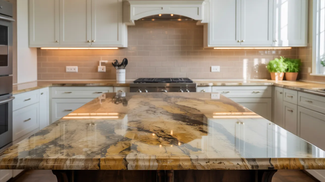
Backsplash Styles to Avoid with Busy Granite
Busy granite already has strong movement and color. Adding patterned tiles or shiny finishes can make the kitchen feel too loud.
Glossy surfaces reflect light and draw attention away from the granite. Tiles with bright or clashing colors break the flow of the space.
Also, avoid rough or uneven textures that add more visual weight. The goal is to calm the area, not compete with it.
Stick with smooth, soft finishes and neutral shades to keep the focus on the granite while making the space feel calm.
Tips for Balancing Granite Kitchens
- Balance contrast and calm: If your granite is bold, go with a calm backsplash. Too much contrast can overwhelm the space.
- Stick to one showstopper: Let either the granite or backsplash stand out—not both. This keeps the design clean.
- Match tones, not patterns: Pull one color from your granite to guide your backsplash and cabinet choices.
- Think size and space: In small kitchens, use lighter tiles to open up the space. For large kitchens, you can play with deeper tones.
- Keep finishes consistent: Matte with matte, gloss with gloss.
Conclusion
Choosing a backsplash that works with busy granite doesn’t have to feel hard. I hope the ideas in this guide gave you clear steps and helpful examples to make things easier.
If your granite already stands out, it helps to keep the backsplash simple. Soft tones and clean tiles can bring balance without taking attention away from the stone.
No matter if you’re making a small change or a full update, these ideas can guide you in the right direction. Save the styles you like, review a few samples, and begin shaping a kitchen that suits your space.
Take your time — each choice brings your kitchen closer to how you want it to feel.


