Reviewing Sherwin Williams Sea Serpent (SW 7615)
Finding the right paint color can feel overwhelming, especially when you want something bold but not too risky. Dark colors like Sea Serpent make many homeowners nervous about taking the plunge.
After months of testing Sea Serpent (SW 7615) in my own home, I can share exactly what this deep blue-green shade looks like in real life. I’ll give you the honest truth about this popular color choice.
In this review, I’ll show you how Sea Serpent behaves in different lighting throughout the day, what rooms it works best in, and the color combinations that make it shine. You’ll also get my honest thoughts on whether this popular shade lives up to the hype, plus practical tips for sampling and living with this bold color.
Color Description of Sherwin Williams Sea Serpent
Sherwin-Williams Sea Serpent (SW 7615), a color that made me pull over when I first saw it on a house. It’s a bold, dark navy with green undertones that creates a lively look, making any space feel more dramatic.
Let’s see the key features of this paint:
- A deep, rich neutral with serious depth
- A perfect mix of navy blue with green hints
- Dark and moody, never boring or flat
- A touch of mystery that feels both modern and timeless
When you look at this shade at different times of day, you’ll notice how the blue and green undertones shift and change. It’s complex, never one-dimensional, but adds just enough drama to make spaces feel special and put-together.
Undertones and LRV of Sea Serpent
Looking closely at the Sea Serpent, I see a beautiful mix of undertones that make it spellbinding. The main players here are:
- Strong navy blue base that anchors the color
- Green undertones that add depth and complexity
- Subtle gray hints that keep it grounded
Let me explain the LRV (Light Reflectance Value) in simple terms. Think of LRV as a number that tells you how much light a color bounces back into your room. Sea Serpent’s LRV of 7 means it absorbs most light, only about 7% bounces back.
This low LRV means:
- Rooms feel more intimate and cozy
- The color looks consistent in different lighting
- It creates a dramatic contrast with light colors
- Natural light brings out its true beauty
Warm or Cool?
I’d put Sea Serpent in the cool color family. The blue base gives it a calm, spirited feel. However, those green undertones add just enough warmth to keep it from feeling cold.
Here’s how this coolness affects different spaces:
- Living rooms feel more refined and pulled together
- Bedrooms become restful retreats
- Home offices stay professional while feeling interesting
- Dining rooms gain spirited
How to Incorporate Sherwin Williams Sea Serpent in Different Spaces?

After falling in love with Sea Serpent in my office, I started testing it in other rooms of my house.
What I learned about using this bold color in different spaces – including some surprises that changed my mind about dark colors in small rooms.
Using Sea Serpent in Living Rooms
My living room was my second Sea Serpent project, and what a difference it made. I painted just one wall as an accent, and it totally changed the room’s personality.
Tip: I found that Sea Serpent looks amazing during the day when natural light hits it, creating subtle color shifts that keep the space interesting.
The wall I painted faces north, and it creates this perfect backdrop for my light gray sofa and brass light fixtures.
I also noticed that my artwork really stands out against Sea Serpent – especially pieces with white, gold, or warm orange tones.
The color is deep enough to make the room feel put together but not so dark that it makes the space feel small. In fact, it actually made my living room feel bigger by adding depth to the walls.
Sea Serpent in Bedrooms
While many people think dark colors make a room feel smaller, I found the opposite to be true.
The deep tone actually made the walls recede, creating this cozy cocoon effect that my guests love.
I paired Sea Serpent with crisp white bedding and added some brushed nickel light fixtures. The combination feels both modern and comforting.
One thing I noticed – and wish someone had told me – is that this color looks different with various types of lighting.
Under my warm LED bulbs, it takes on a slightly warmer tone that’s perfect for evening relaxation.
I found that using multiple light sources (I have two bedside lamps and a small reading light) helps show off the color’s complexity.
Sea Serpent in Kitchens and Dining Rooms
I was nervous about using Sea Serpent in my dining room at first, but it turned out to be one of my best decisions.
I painted all four walls, and it created this incredible atmosphere for dinner parties.
The color feels sophisticated but not stuffy, making the perfect backdrop for both casual family meals and fancier gatherings.
Sea Serpent looks stunning with my white trim and crown molding – the contrast really makes the architectural details pop.
I kept my dining table and chairs light (they’re a natural oak color) to balance the deep walls.
One surprising bonus: the color hides the inevitable small marks and scuffs that happen in dining spaces much better than the light gray I had before.
For anyone thinking about using Sea Serpent in the kitchen, I started small by painting my kitchen island.
It looks beautiful against my white cabinets and creates a nice focal point.
The color holds up well to cleaning and doesn’t show water spots or cooking splatters as much as lighter colors do.
Pairing Sherwin Williams Sea Serpent with Complementary Colors
After living with Sea Serpent in several rooms, I’ve tried many different color combinations. Some worked better than others, and I’m excited to share what I learned through my own trial and error.
My experience with color pairing might save you some time and paint samples.
Best Accent Colors to Pair with Sea Serpent
Through experimenting in my own home, I found that Sea Serpent really comes alive with certain accent colors.
- Warm coral pillows create an amazing contrast in my Sea Serpent living room
- Bold oranges and soft peaches work surprisingly well for a perfect balance
- Muted golden tones work better than bright sunny yellows
- Mustard yellow throw pillows look fantastic against Sea Serpent walls
- Artwork with rust orange or deep red accents stands out and adds warmth
Using Neutrals and Metallics to Uplift Sea Serpent’s Depth
The biggest lesson I learned about decorating with Sea Serpent is how much metallics can transform the look.
- Brushed gold light fixtures make the walls look rich and expensive
- Silver photo frames pop against the deep color while staying modern
- Bronze hardware adds subtle warmth without being flashy
- Creamy whites work much better than stark whites with Sea Serpent
- Off-white curtains soften contrast while keeping rooms bright
- Lighter grays create more balanced looks than dark grays
Combining Sea Serpent with Natural Elements like Wood and Stone
My favorite learning was how beautifully the Sea Serpent works with natural materials.
- Light woods like oak and maple create a beautiful modern contrast
- Mid-tone woods like walnut complement Sea Serpent’s richness perfectly
- Marble coffee tables create a lovely contrast against Sea Serpent walls
- White marble veining pops more against the deep color
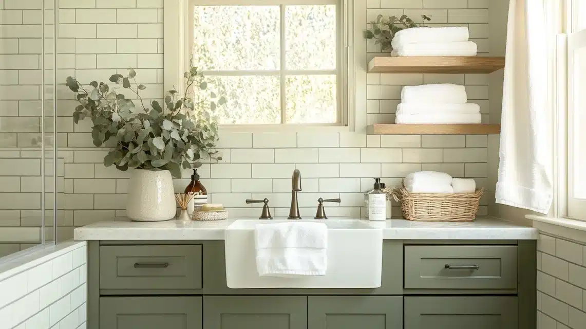
- Natural slate tiles add textural interest in bathrooms
- Seagrass rugs and rattan chairs add texture and warmth
- Woven natural materials keep rooms feeling cozy and lived-in
Benefits of Choosing Sherwin Williams Sea Serpent for Your Home

After living with the Sea Serpent for several months now, I can share some real benefits I’ve experienced. This isn’t just about how it looks, though that’s certainly part of it, but also about how it changes the feel of my spaces and makes my home more enjoyable to live in.
- Creates subtle sophistication without being too bold or overwhelming
- Makes simple white plates and everyday items look more special
- Changes beautifully throughout the day from soft morning tones to rich evening hues
- Works perfectly with different decorating styles from modern to traditional
- Makes crown molding and architectural details pop against the deep color
- Functions like a great pair of jeans go with everything, but still feel special
- Stays true to its blue-green color in bright rooms while feeling open
- Looks cooler in north-facing rooms, but never dark or gloomy
- Creates a calm, warm glow in west-facing rooms during evening light
- Makes small spaces feel bigger by creating visual depth that pushes walls back
Sherwin Williams Sea Serpent in Various Design Styles
I’ve tested this color in modern, coastal, and traditional settings, and each time it brings something unique to the space. Let me show you how this different shade modifies different decorating approaches
Modern and Contemporary Interiors with Sea Serpent

My home office became my testing ground for a modern look with Sea Serpent. I paired the walls with simple white furniture and clean lines, and the result was stunning.
The color’s depth creates this perfect background for my minimalist setup – my white desk and simple black office chair look like custom pieces against the rich walls.
What worked best in my modern spaces:
- Clean-lined white furniture pops beautifully against the deep walls
- My black and chrome accessories look extra sharp
- Simple art in white frames creates a strong visual impact
- The lack of fussy details lets the wall color be the star
I found that Sea Serpent actually makes modern spaces feel warmer and more welcoming. My geometric patterns and simple shapes look more interesting against the deep color.
Even my basic white shelving units look like custom built-ins now.
Sea Serpent in Coastal or Nautical-Themed Spaces

This might sound strange, but Sea Serpent worked perfectly when I updated my beach house guest room.
Instead of the typical light blues, I went bold with Sea Serpent and it transformed the space into something special.
The deep color reminds me of the ocean at dusk, adding real depth to my coastal decor.
My coastal room combinations:
- White linen curtains look fresh and breezy
- Natural rope accents stand out beautifully
- Weathered wood furniture adds the perfect beachy touch
- Shell collections and beach finds look like art pieces against the dark walls
I mixed in plenty of white and cream textures to keep the room feeling light and airy.
The result is a sophisticated take on beach style that doesn’t feel like a typical coastal room. My guests always ask about the wall color, it’s unexpected but feels just right.
Incorporating Sherwin Williams Sea Serpent in Traditional and Classic Settings

My dining room proved that Sea Serpent can look amazing in a traditional setting. I kept my antique mahogany table and classic chandelier but painted the walls Sea Serpent.
The color made everything look updated while respecting the room’s traditional bones.
How I made it work with traditional elements:
- My crystal chandelier sparkles even more against the deep walls
- White crown molding looks crisp and classic
- Oil paintings in gold frames feel fresh and current
- Traditional furniture patterns look updated but not out of place
One thing I learned: the key to making Sea Serpent work in traditional rooms is balance. I kept my great-grandmother’s china cabinet but paired it with modern table linens.
The mix of old and new feels interesting, and the wall color ties everything together.
Tip: in traditional spaces, Sea Serpent looks best when you mix in some modern touches.
My antique sideboard looks amazing against the Sea Serpent walls, but adding simple, modern table lamps kept the room from feeling too formal.
It’s all about finding that sweet spot between classic and current.
How Do You Sample and Test the Sherwin Williams Sea Serpent in Your Home?
Testing the Sea Serpent properly before committing to full gallons saved me from potential costly mistakes. I learned the hard way with previous paint projects that tiny color chips don’t tell the whole story.
Here’s my approach to sampling this bold color the right way.
Ordering Samples from Sherwin-Williams
After looking at tiny paint chips and getting nowhere, I finally figured out the right way to sample Sea Serpent. I started by getting three sample sizes from my local Sherwin-Williams store.
- Got samples in flat, satin, and eggshell finishes for different rooms
- Asked for fresh mixed samples rather than pre-mixed off the shelf
- Wrote down the formula number to ensure the final gallons matched perfectly
Viewing Sea Serpent in Different Lighting Conditions
This part was eye-opening for me. I spent three full days watching how the sample patches looked in different lights before making my final decision.
- Checked samples at sunrise, noon, sunset, and under room lighting
- The north-facing wall showed more blue tones
- Direct afternoon sun brought out green undertones
Using Test Swatches to Visualize the Color in Your Space
Where do I get smart after making mistakes with other colors? Instead of painting directly on my walls, I bought some large white poster boards and painted them with Sea Serpent.
- Painted three coats on 2×3-foot boards for accurate color coverage
- Moved boards around different walls and propped them behind furniture
- Painted the white trim piece to test contrast
- Kept sample boards for shopping trips to match accessories
How Do You Care for And Maintain Sherwin Williams Sea Serpent Paint?
Living with three kids and a dog, I’ve become an expert at keeping my Sea Serpent walls clean. After trying different finishes in different rooms, here’s what I learned through trial and error.
- Use a microfiber duster weekly for regular dusting – it’s gentle and doesn’t leave marks
- Clean fingerprints with a soft, slightly damp cloth works perfectly
- Sea Serpent hides small marks better than the lighter colors I used before
- Keep a small jar of touch-up paint labeled with room name and finish type
- Use a small artist’s brush for tiny marks, always dab, never brush when touching up
- Eggshell finish offers a perfect balance of subtle sheen and easy touch-ups
- Satin finish makes cleaning much easier, especially in kitchens and high-traffic areas
- Flat finish shows truest color but marks up more easily and needs gentler cleaning
- Higher sheens make the color look slightly darker and bounce more light around
- Store leftover paint in an airtight container at room temperature with the room name and date
Conclusion
This rich blue-green shade brings sophistication without being overwhelming, and it works beautifully in both small and large spaces.
The key to success with Sea Serpent is proper testing – spend time with samples in your actual lighting conditions. I’ve learned that this color pairs wonderfully with warm metals, natural wood, and coral accents.
If you’re ready to add drama to your space, Sea Serpent delivers. It’s forgiving to maintain, works across different design styles, and creates that perfect backdrop for both everyday living and special occasions.
Ready to make the leap? Start with proper samples, test thoroughly, and trust the process. Your walls will thank you for choosing this stunning, magical color.
Frequently Asked Questions
How Dark is Sea Serpent in a Small Room?
Based on my experience with Sea Serpent in my small home office (10×12 feet), it creates depth without making the space feel cramped. The key is good lighting – I added two wall sconces and a desk lamp. With proper lighting, Sea Serpent actually makes small rooms feel larger by creating visual depth that makes the walls recede.
What Colors Look Best with Sea Serpent?
From my year of living with this color, I’ve found that creamy whites, warm golds, and soft corals work wonderfully. Natural wood tones pair beautifully, too. My favorite combination is Sea Serpent with brushed brass fixtures and cream-colored textiles. The color also looks striking with crisp white trim and warm wood furniture.
Does Sea Serpent Show Marks and Scuffs?
In my busy household, I’ve found that Sea Serpent actually hides marks better than lighter colors. The deep tone masks small scuffs and fingerprints, especially in the eggshell finish. I’ve been pleasantly surprised by how well it’s held up in high-traffic areas like my hallway.
How Many Coats of Sea Serpent Do I Need?
In my rooms, I needed two coats for perfect coverage, using Sherwin-Williams Premium paint with primer. The key was using a good primer first – I used a gray-tinted primer, which helped achieve full coverage. Dark walls need careful prep for the best results.
Will the Sea Serpent Make My Room Feel Cold?
Not in my experience. Despite being a cool-toned color, Sea Serpent creates a cozy, intimate feeling in my spaces. I’ve found it feels particularly warm when paired with soft lighting and natural textures. My living room with Sea Serpent walls feels more welcoming than it did with lighter paint.