Exploring Victorian Color Schemes: Inspirations and More
Victorian color schemes can be tricky to master. Homes often have mismatched hues that fail to capture the era’s charm.
But don’t worry – creating a beautiful Victorian-inspired palette is easier than you might think.
We promise to guide you through the world of Victorian colors, helping you understand their historical context and how to apply them in modern settings.
Our tips make choosing the perfect shades a breeze, whether painting a whole house or adding a touch of Victorian flair to a room.
In this post, we’ll explore:
- Historical Context of Victorian Color Schemes
- Popular Victorian color combination ideas
- Discuss balancing bold and subtle tones
- Tips for incorporating these timeless palettes into your home
Get ready to bring some 19th-century elegance into your living space!
A Glimpse Into 19th-Century Color Schemes
The Victorian period, spanning from 1837 to 1901, saw big changes in design.
Named after Queen Victoria’s reign, this era saw a mix of old and new styles. People’s homes became a way to show off their taste and success.
During this time, house designs got more fancy. Rooms had lots of decorations, and furniture was often heavy and ornate. The Victorians liked to fill their spaces with many things, from patterned wallpaper to detailed rugs.
Colors played a big part in this look. At first, Victorians used darker, richer colors. But as time passed, they also started to like lighter, brighter shades.
This change in color choices tells us a lot about how society changed during Queen Victoria’s reign.
Technological Advancements
The Industrial Revolution transformed home color use. New paint-making methods brought more color options. Before, natural paints were dull and faded quickly.
New synthetic dyes, like the bright purple discovered in 1856, led to vivid, lasting colors. Cheaper paints made fashionable colors accessible to more people.
Cultural Influences
Art and global exploration shaped Victorian color choices. The Pre-Raphaelites inspired bold home colors. Britain’s worldwide ventures brought styles from Egypt, India, and Japan, creating unique color mixes.
The Arts and Crafts movement later promoted natural, earthy tones. These influences led to rich, varied Victorian color schemes.
The Colors of the Victorian Era: Rich Hues and Timeless Tones
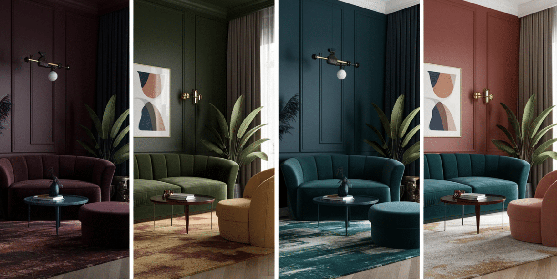
1. Deep, Rich Hues
Victorian homes often used dark, bold colors.
Rooms might have deep red walls, like burgundy or maroon. Green was also popular, with shades like forest or olive. Dark blue, especially navy, was common too. These strong colors gave rooms a warm, cozy feel.
2. Accents and Contrasts
Victorians used accent colors to add depth. Gold was a favorite for small touches, and purple, in various shades, added luxury.
Earth tones like brown and terracotta brought warmth. These accents created interesting contrasts against the main colors.
3. Use of Complimentary Colors
Victorians liked to pair colors from opposite sides of the color wheel. For example, they might combine red and green or blue and orange.
This created lively, eye-catching rooms. The mix of warm and cool colors made the spaces feel balanced.
4. Balancing with Neutrals
Light colors were important to prevent rooms from feeling too dark. Cream and ivory helped brighten spaces, and soft pastels like pale pink or light blue added gentleness.
These lighter shades balanced the deeper colors, making rooms feel more open.
Victorian Color Schemes Inspirations You’ll Love
1. Victorian Color Schemes Ideas for Living Room
Deep Burgundy and Gold
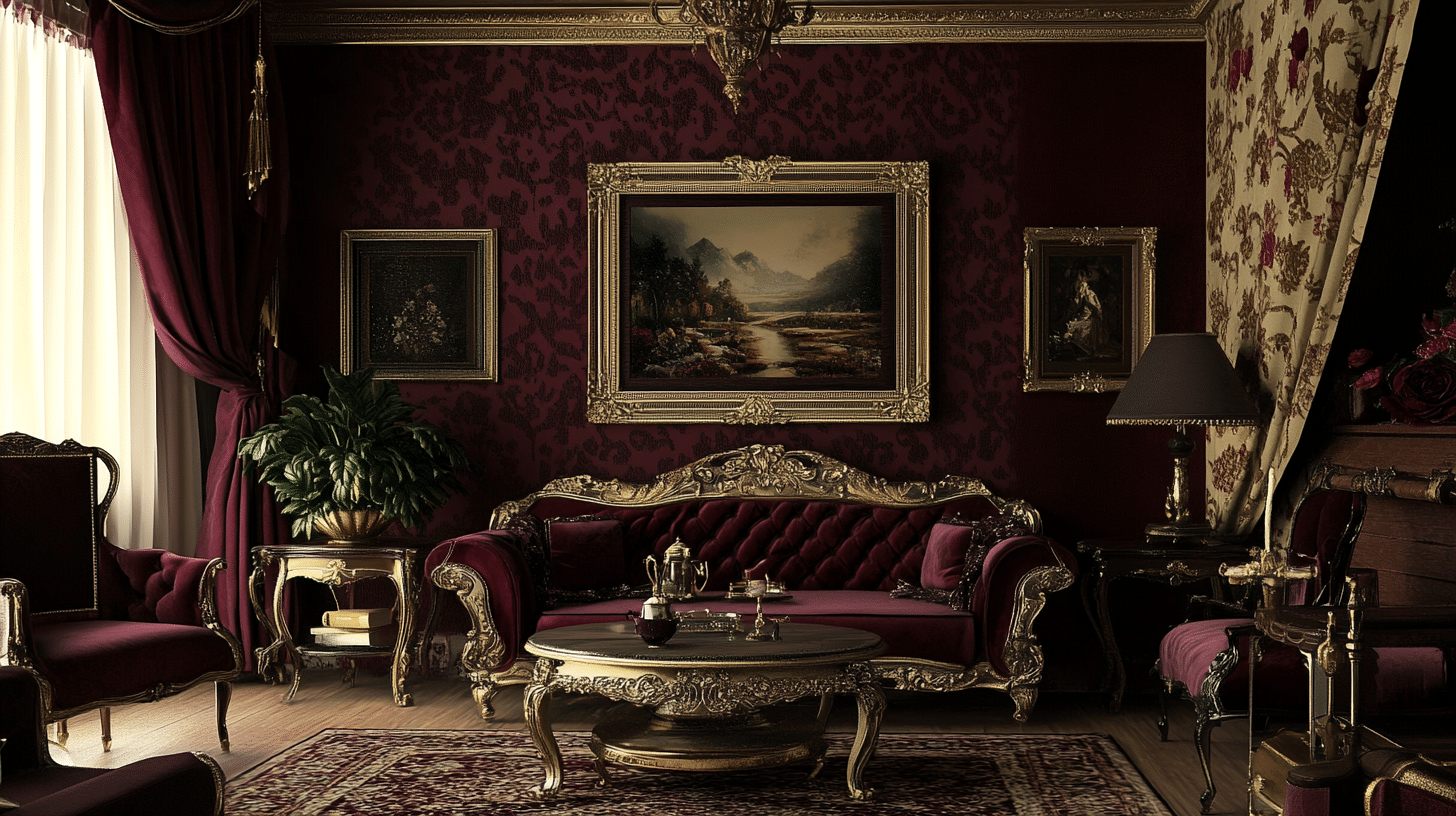
- Walls: Burgundy with gold stenciling
- Trim: Ivory
- Complementary Decor Elements: Gold picture frames, burgundy velvet drapes, and dark wood furniture with gold accents
Olive Green and Cream
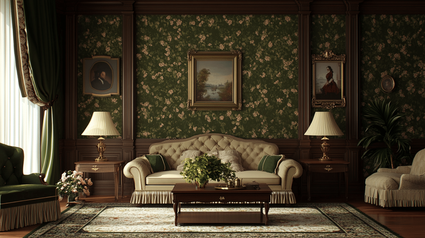
- Walls: Olive green wallpaper with a floral pattern
- Trim: Cream
- Complementary Decor Elements: Brass lamps, dark green drapery, and mahogany wood furniture with cream upholstery
Warm Taupe and Plum
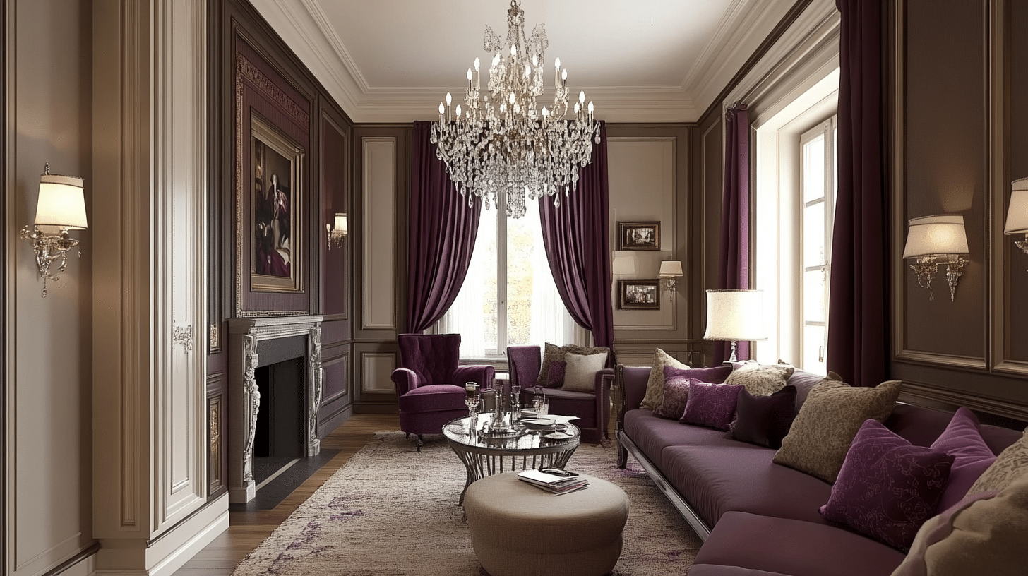
- Walls: Warm taupe with plum wainscoting
- Trim: Antique white
- Complementary Decor Elements: Crystal chandeliers, plum curtains, and dark-stained wood furniture with neutral upholstery
Forest Green and Rich Brown
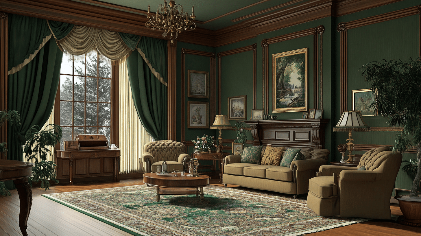
- Walls: Forest green with brown decorative molding
- Trim: Beige
- Complementary Decor Elements: Brass fixtures, rich brown drapery, and walnut furniture with forest green upholstery
2. Victorian Color Schemes Ideas for Bedroom
Lavender and Ivory
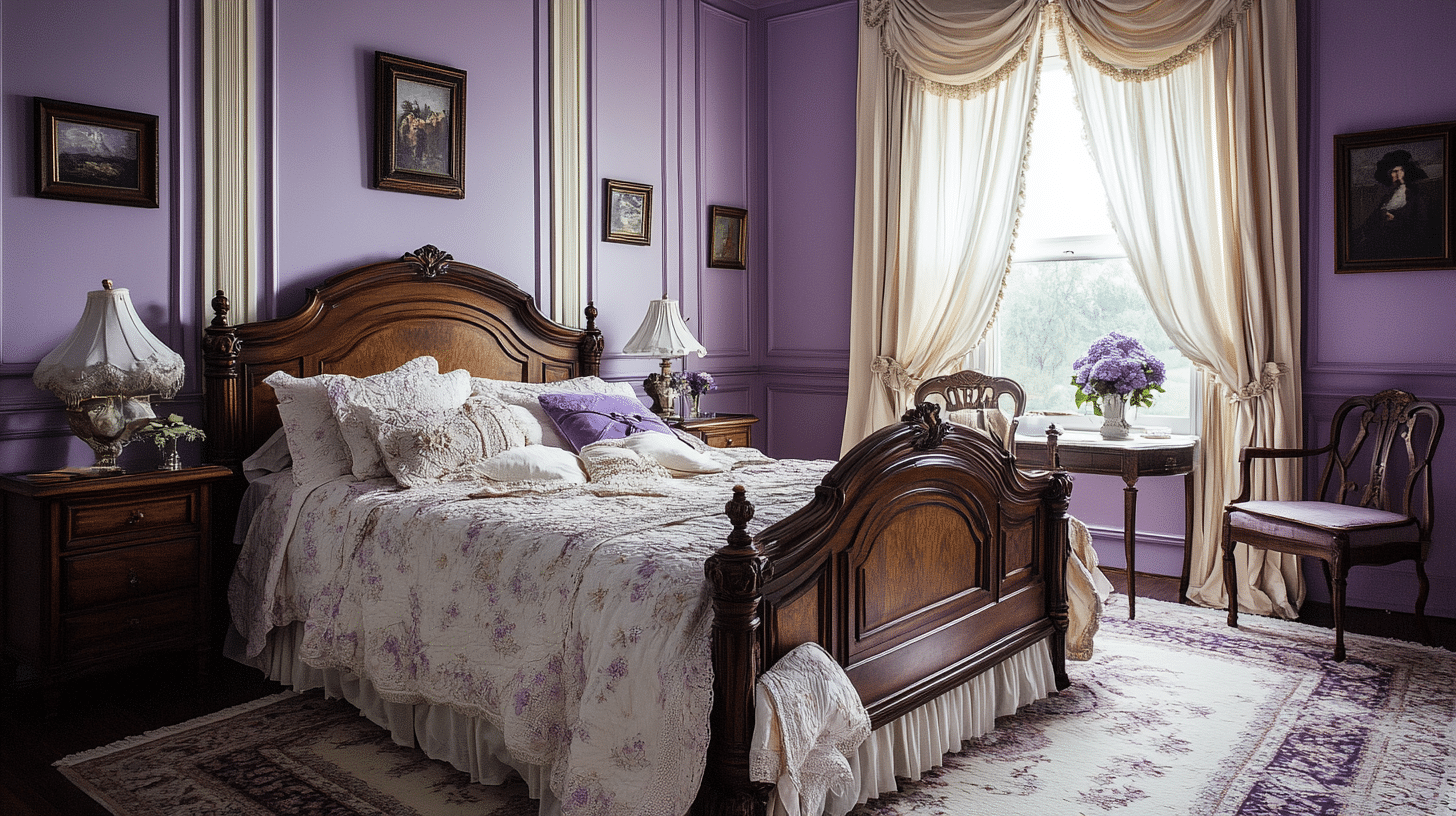
- Walls: Soft lavender with ivory trim
- Trim: Light beige or ivory
- Complementary Decor Elements: Lavender drapes, vintage ivory bed linens, and a dark wood bed frame with floral bedding
Dusty Rose and Gray
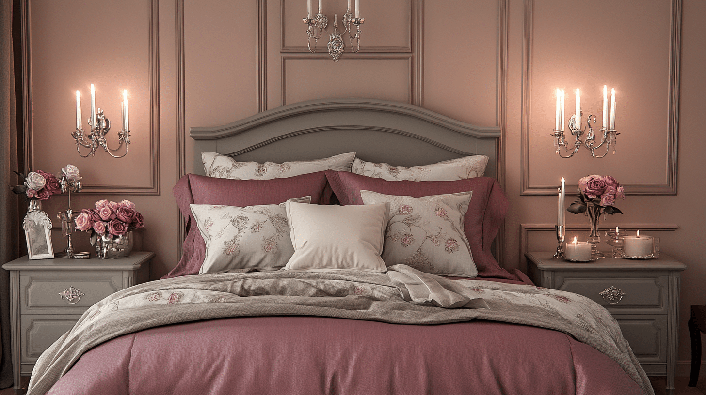
- Walls: Dusty rose with gray detailing
- Trim: Light gray
- Complementary Decor Elements: Silver candleholders, rose bedding, and painted gray furniture with rose accents
Pale Yellow and Olive
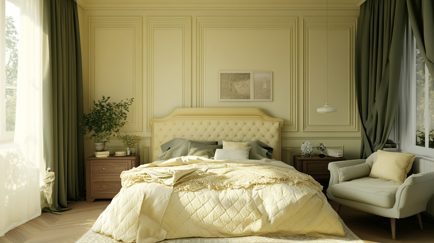
- Walls: Pale yellow with olive wainscoting
- Trim: Cream
- Complementary Decor Elements: Olive green drapes, bedding, and natural oak furniture with pale yellow upholstery
Soft Blue and Beige
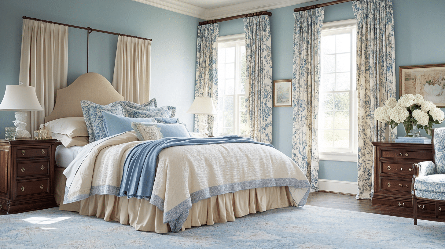
- Walls: Soft blue with beige accents
- Trim: White
- Complementary Decor Elements: Beige linens, blue floral drapes, and mahogany furniture with cream and blue bedding
3. Victorian Color Schemes Ideas for Kitchen
Moss Green and Charcoal Gray
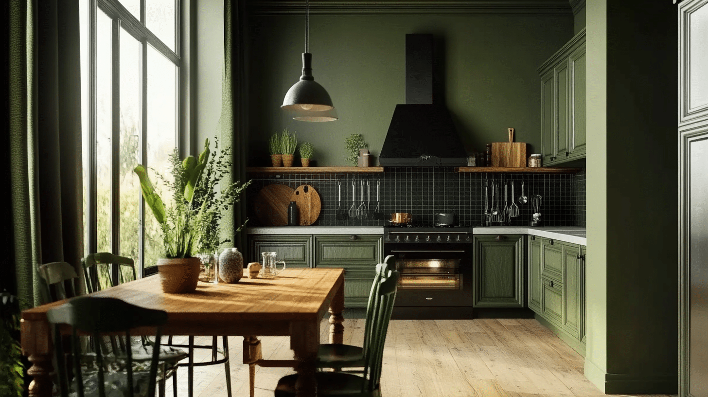
- Walls: Moss green with charcoal gray backsplash
- Trim: White
- Complementary Decor Elements: Black iron hardware, dark green curtains, and a wooden table with green chairs
Rust and Cream
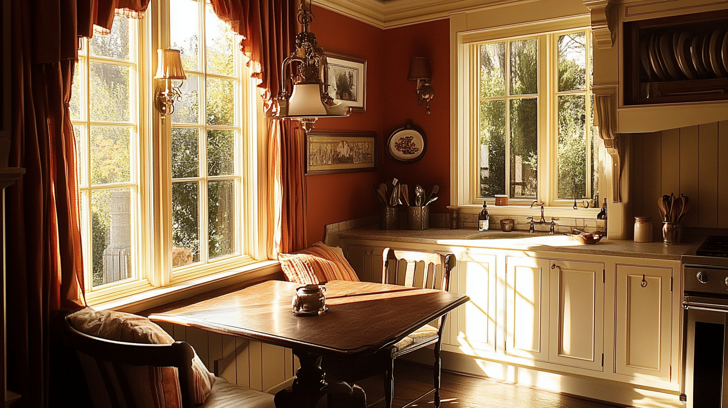
- Walls: Rust-colored walls with cream wainscoting
- Trim: Cream
- Complementary Decor Elements: Brass fixtures, rust-red curtains, and an oak table with cream cushions
Burnt Orange and Warm Brown
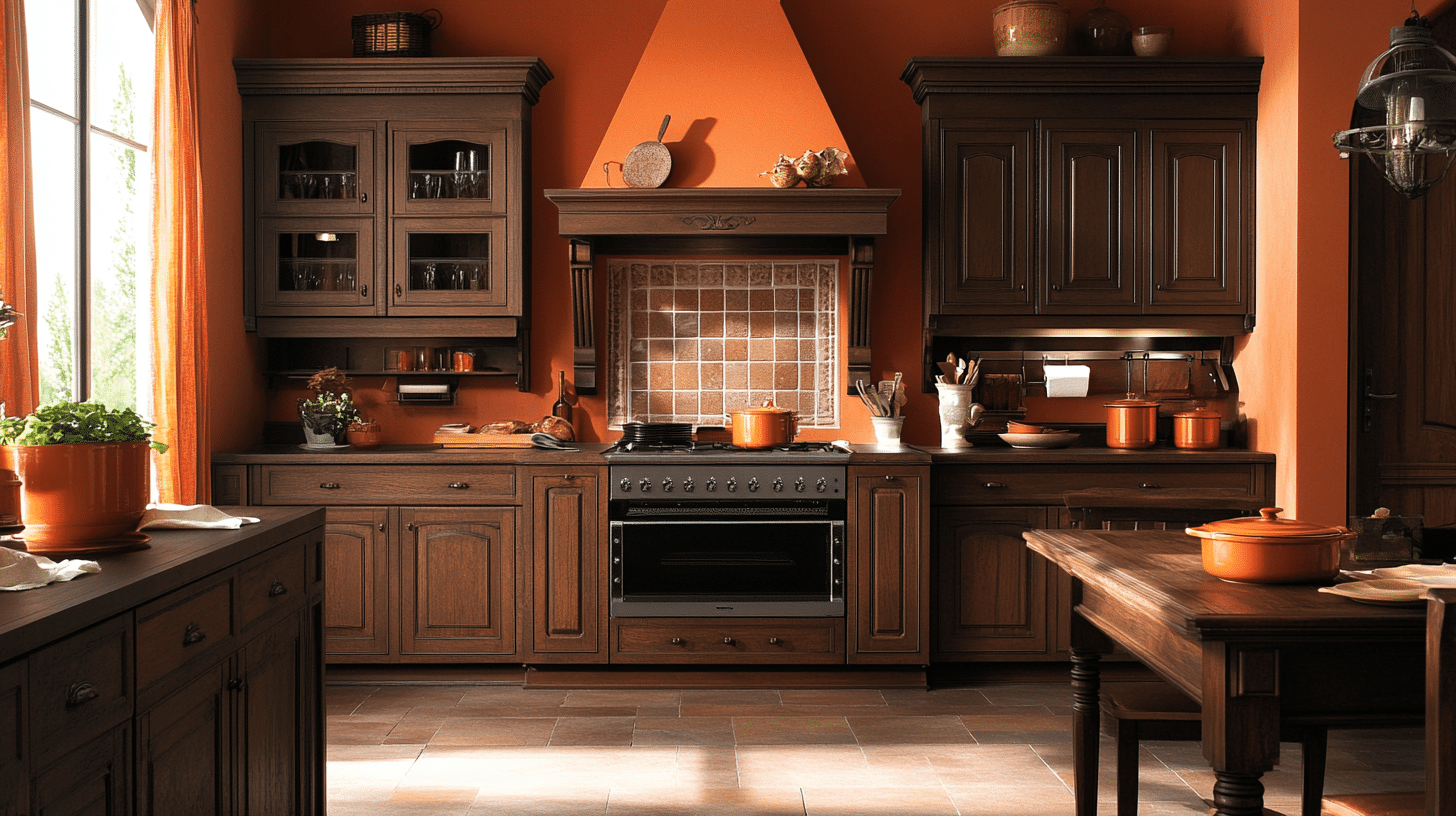
- Walls: Burnt orange with warm brown cabinets
- Trim: Dark wood
- Complementary Decor Elements: Copper pots, burnt orange curtains, and a dark wood table with terracotta tiles
Hunter Green and Cream
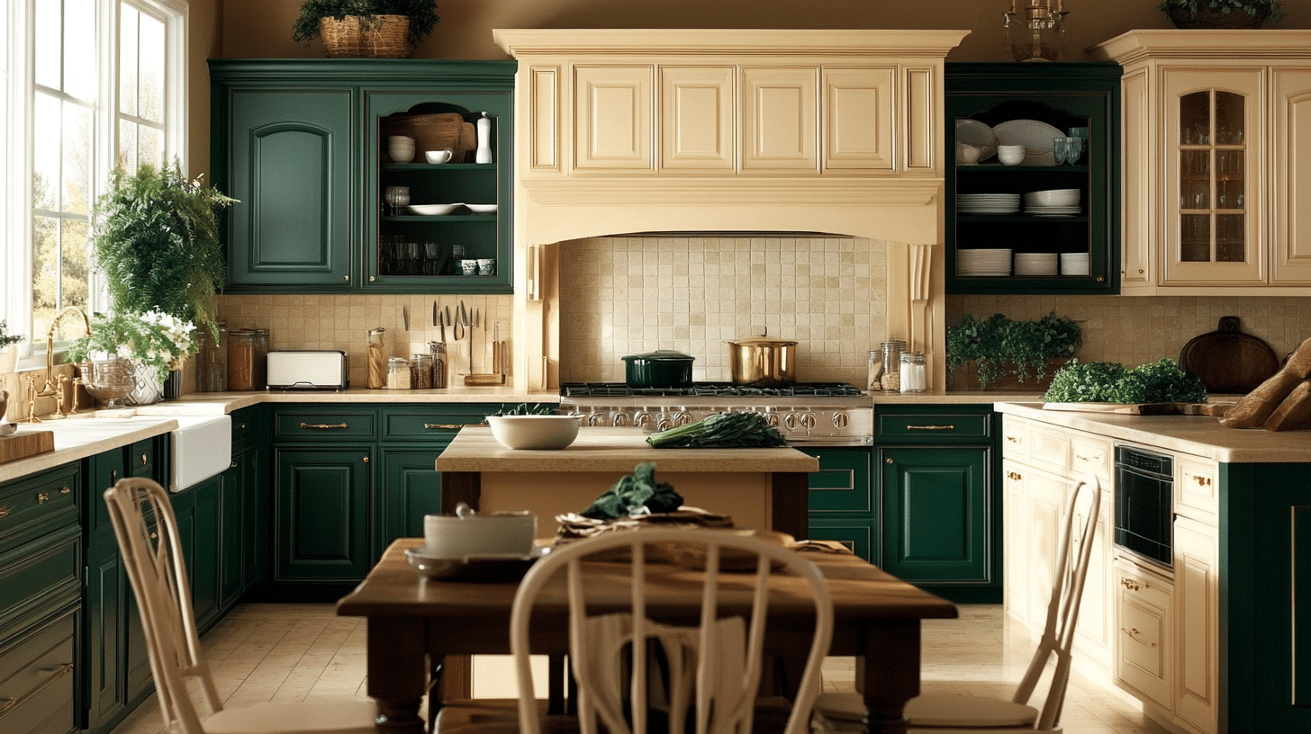
- Walls: Hunter green with cream tile backsplash
- Trim: Cream
- Complementary Decor Elements: Brass hardware, cream cabinetry, and a dark wood table with cream chairs
4. Victorian Color Schemes Ideas for Bathroom
Sapphire Blue and White
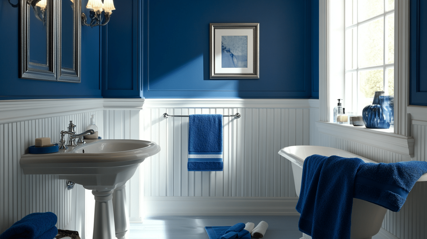
- Walls: Sapphire blue with white beadboard wainscoting
- Trim: White
- Complementary Decor Elements: Silver fixtures, blue towels, and a white sink with blue cabinetry
Rose Pink and Cream
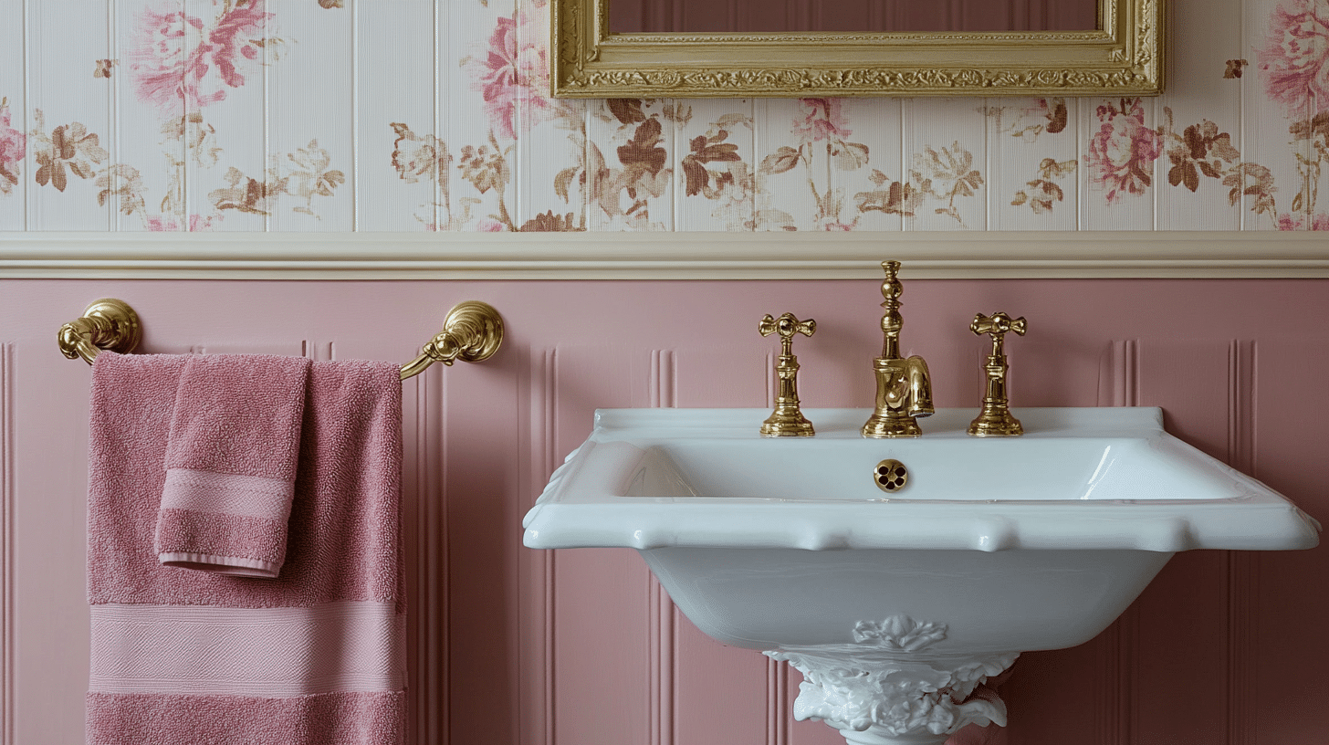
- Walls: Rose pink with cream trim
- Trim: Cream
- Complementary Decor Elements: Gold fixtures, pink floral towels, and a white porcelain sink with gold handles
Soft Beige and Emerald Green
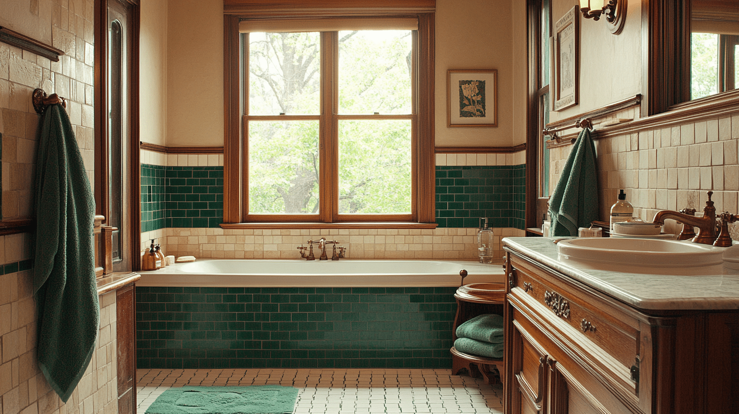
- Walls: Soft beige with emerald green tile borders
- Trim: White
- Complementary Decor Elements: Bronze fixtures, green towels, and a wood vanity with green accents
Ivory and Olive
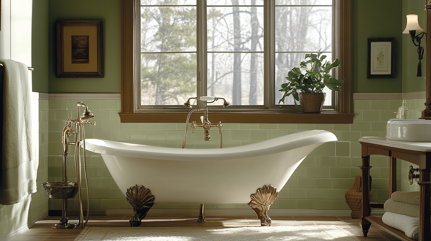
- Walls: Ivory with olive green tile accents
- Trim: Dark wood
- Complementary Decor Elements: Brass fixtures, olive towels, and a clawfoot tub in white with olive trim
Tips for Blending Victorian Hues with Modern Style
- Start small: Use Victorian colors in accent pieces like throw pillows or artwork.
- Choose one bold color: Pick a single Victorian shade as a focal point, like a deep green accent wall.
- Pair with neutrals: Balance rich hues with light grays, whites, or beiges.
- Use modern patterns: Apply Victorian colors to contemporary geometric designs.
- Light it right: Bright, natural lighting helps soften the intensity of darker Victorian shades.
- Introduce texture: Mix in textured fabrics to add depth without relying solely on color.
- Go for the 60-30-10 rule: Use 60% neutral, 30% secondary, and 10% Victorian accent color.
- Modernize with metallics: Incorporate brushed nickel or chrome instead of traditional brass.
- Color block: Create visual interest by blocking Victorian colors with more modern hues.
- Keep it simple: Avoid clutter and opt for clean lines to offset the richness of Victorian colors.
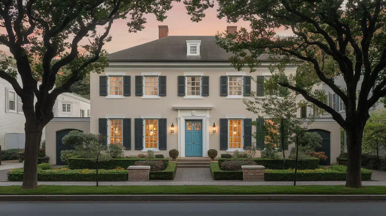
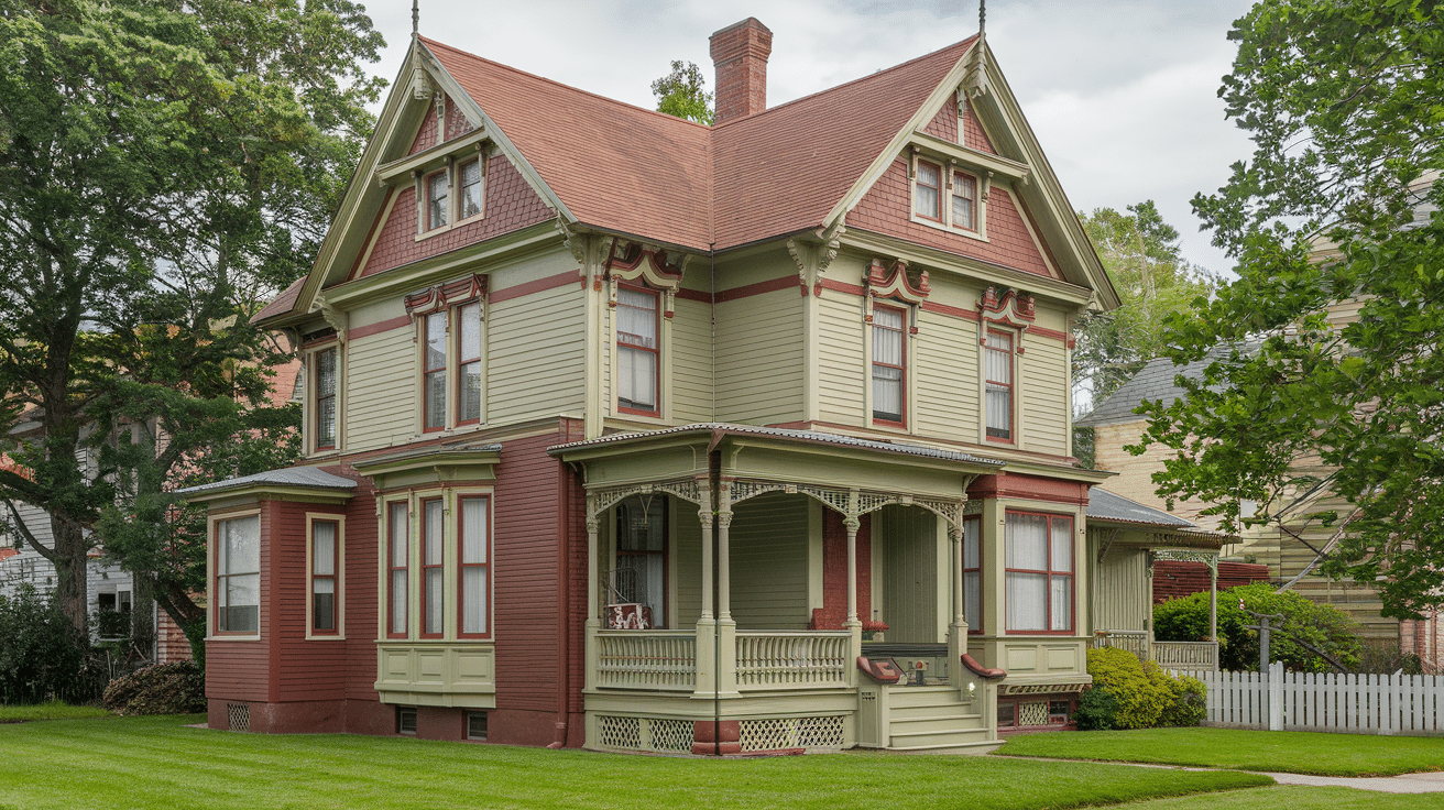
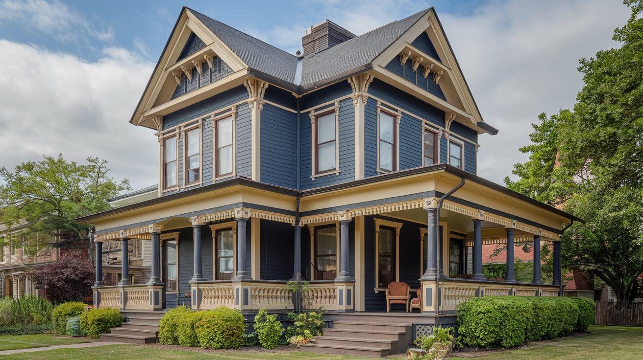
Victorian Color Schemes for Exterior Design: 5 Unique Combinations
Victorian homes come in diverse styles, each affecting color choices.
Queen Anne homes, popular in the late 1800s, have uneven facades, fancy spindles, and often a tower. Wrap-around porches offer chances for contrasting colors.
Italianate styles show low roofs, wide eaves with brackets, tall windows, and fancy cornices, allowing creative coloring.
1. Deep Olive, Cream, and Burgundy
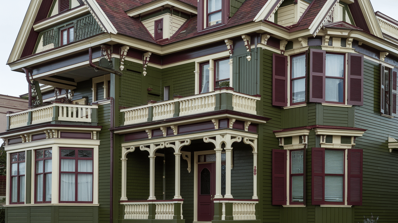
- Main Color: Deep Olive – Sherwin-Williams, “Garden Sage” (SW 7736)
- Trim: Cream – Benjamin Moore, “Simply White” (OC-117)
- Accents: Burgundy – Behr, “Cinnabark” (PPU2-02)
2. Slate Blue, White, and Charcoal
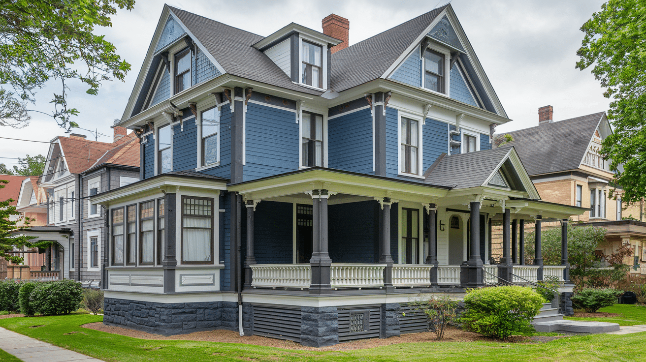
- Main Color: Slate Blue – Benjamin Moore, “Van Deusen Blue” (HC-156)
- Trim: White – Sherwin-Williams, “Extra White” (SW 7006)
- Accents: Charcoal – Behr, “Black Pearl” (PPU24-05)
3. Muted Mustard, Sage Green, and Brick Red
- Main Color: Muted Mustard – Benjamin Moore, “Hawthorne Yellow” (HC-4)
- Trim: Sage Green – Sherwin-Williams, “Clary Sage” (SW 6178)
- Accents: Brick Red – Behr, “Burnt Red” (S-H-180)
4. Navy Blue, Cream, and Warm Taupe
- Main Color: Navy Blue – Sherwin-Williams, “Naval” (SW 6244)
- Trim: Cream – Behr, “Creamy Mushroom” (PPU5-13)
- Accents: Warm Taupe – Benjamin Moore, “Taos Taupe” (2111-40)
5. Hunter Green, Soft Gold, and Antique White
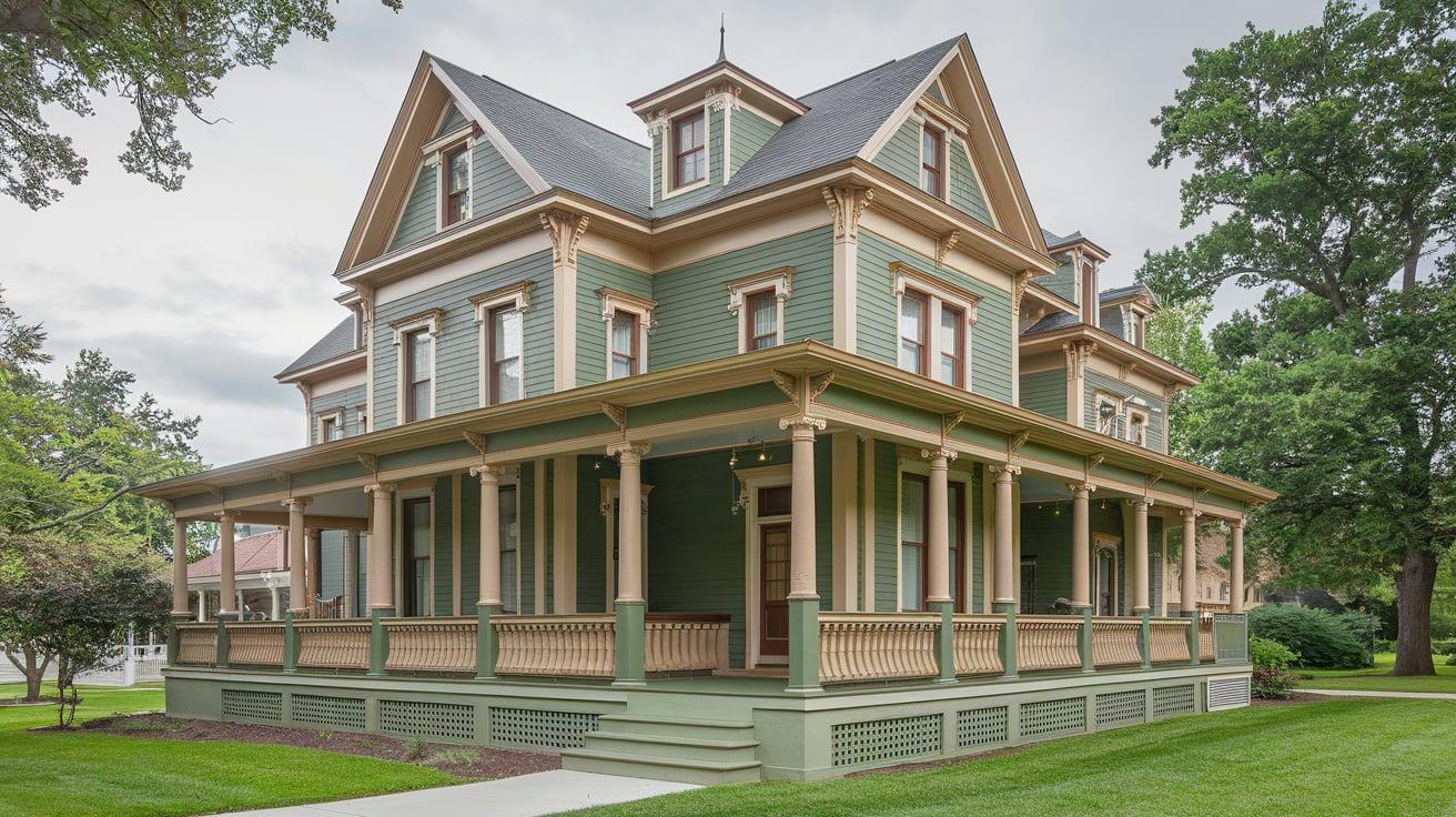
- Main Color: Hunter Green – Benjamin Moore, “Hunter Green” (2041-10)
- Trim: Soft Gold – Sherwin-Williams, “Humble Gold” (SW 6380)
- Accents: Antique White – Behr, “Cottage White” (13A)
Conclusion
As we wrap up our journey through Victorian color schemes, it’s clear these palettes offer more than just a glimpse into the past.
They provide a rich source of inspiration for modern homes, allowing us to blend historical charm with contemporary style.
Remember, incorporating Victorian colors doesn’t mean recreating a museum piece. It’s about finding balance – using deep, rich hues alongside lighter tones and pairing bold choices with neutral backdrops.
Whether painting your home’s exterior or adding a touch of 19th-century elegance to your living room, the key is to make these colors work for you.
We hope this guide has sparked your creativity and given you the confidence to experiment with Victorian-inspired palettes.
Why not start small? Try a burgundy accent wall or some olive green throw pillows. Your home’s next color adventure awaits!
Frequently Asked Questions
What Were Popular Victorian Color Schemes?
Popular Victorian color schemes included deep reds, greens, and blues with gold accents. Earth tones and rich purples were also common. These colors reflected wealth and matched the era’s ornate decor.
How Can I Incorporate Victorian Colors Into My Modern Home?
To add Victorian colors to a modern home, use them in accent pieces like throw pillows or artwork. Paint one wall a bold Victorian shade. Mix in contemporary patterns and keep the overall look uncluttered.
Are There Specific Paint Brands that Offer Victorian Colors?
Several paint brands offer Victorian-inspired colors:
- Sherwin-Williams: “Victorian” collection
- Benjamin Moore: “Historical Collection”
- Farrow & Ball: many traditional shades
- Valspar: “National Trust” range.