What Makes SW Passive (SW 7064) a Popular Choice?
Are you tired of staring at paint swatches, wondering which shade of gray will look perfect in your home? Sherwin Williams Passive might be your answer.
In this guide, I’ll explain why this versatile gray paint has become a go-to choice for homeowners and designers.
After helping hundreds of clients pick their perfect paint color, I’ve seen firsthand how Passive creates the modern, clean look so many people want.
You’ll learn exactly what makes this shade special – from its undertones and light reflection to the best rooms to use it in. I’ll also share real home examples and give you practical tips to avoid common painting mistakes.
Whether you’re painting one room or your entire house, by the end of this article, you’ll know if Passive is the right gray for your space.
What Color Is Sherwin Williams Passive (SW 7064)?

Sherwin Williams Passive is a mid-tone gray that sits right in the sweet spot – not too light or dark. I’d describe it as the color of morning fog just as the sun starts to break through.
Here’s what makes this gray special: subtle blue-green undertones keep it from feeling flat or boring. But don’t worry – these undertones are so gentle that most people won’t notice them.
Want to know a cool trick? The color changes throughout the day. In bright sunlight, it looks like a soft dove gray. When clouds roll in, it takes on a deeper, moodier feel.
You might be wondering about its Light Reflectance Value (LRV). At 60, Passive reflects a good amount of light while still giving your walls some depth. Think of it as the perfect middle ground between stark white and charcoal gray.
Here’s a simple way to think about it: if classic gray paint colors were porridge, Passive would be the one that’s just right.
Understanding Sherwin Williams Passive Undertones
Let’s talk about what’s happening beneath this popular gray’s surface. As a color consultant, I’ve seen how undertones can make or break a paint choice.
Passive has blue-green undertones, but they’re wonderfully subtle. Think of them as whispers rather than shouts. In north-facing rooms, you might catch hints of blue. Turn the corner into a south-facing space, and those gentle green notes might peek through.
Here’s what makes these undertones work so well: they’re balanced. Unlike some grays that suddenly look purple or green, Passive stays true to its nature. This balance is exactly why it plays nicely with both warm and cool color schemes.
But here’s something important to know: your lighting can bring out different undertones. Natural daylight tends to reveal Passive’s true color, while artificial lighting might emphasize either its cooler or warmer side. That’s why I always recommend testing it in your specific space before committing.
The best part? These undertones are so well-behaved that they won’t clash with your existing decor. Whether you have warm wood tones or cool metal finishes, Passive knows how to blend in while still holding its own.
How Sherwin Williams Passive Looks in Different Lighting
I’ve seen Passive transform spaces in fascinating ways depending on the light. Let me break down how this chameleon-like gray behaves in different lighting conditions.
1. Natural Light
In north-facing rooms, Passive takes on a cooler, more sophisticated feel. The blue undertones become slightly more noticeable, creating a serene atmosphere. But don’t worry – it never feels cold or unwelcoming.
South-facing spaces bring out Passive’s warmer side. The strong natural light softens those blue-green undertones, making the color appear lighter and more airy. This is where you’ll see why so many people fall in love with this shade.
2. Artificial Light
Here’s something interesting I’ve noticed: LED bulbs can make Passive look crisper and more modern. Under warm bulbs (2700K-3000K), it feels cozier and more relaxed. Cool bulbs (4000K+) emphasize its modern edge.
Evening light brings another dimension to the Passive. As the sun sets, the color deepens slightly, creating a calm, peaceful vibe that’s perfect for winding down.
Want to really understand how it’ll look in your space? Paint a sample board and move it around throughout the day. Watch how the color shifts from morning to night – it’s like getting a preview of how Passive will perform in your home.
Best Coordinating Colors with Sherwin Williams Passive
Let me share what I’ve discovered works beautifully with Passive after seeing it in hundreds of homes. This gray is like a friendly neighbor – it gets along with almost everyone, but some combinations really shine.
1. Perfect White Pairings
Pure White (SW 7005) is my top pick for trim and ceilings with Passive. It’s clean without being stark. If you prefer something warmer, Extra White (SW 7006) creates a subtle, sophisticated contrast that never feels harsh.
2. Accent Colors That Pop
Navy Blue is Passive’s best friend. Try Naval (SW 6244) for a dramatic touch that feels both classic and current. For a softer look, Sea Salt (SW 6204) brings in those coastal vibes without overwhelming the space.
3. Bold Partners
Here’s a designer secret: Passive looks stunning with black accents. Iron Ore (SW 7069) can add dramatic touches through:
- Door frames
- Window trim
- Light fixtures
- Cabinet hardware
Want something unexpected? Deep green like Evergreen Fog (SW 9130) pairs surprisingly well, especially in spaces where you want to bring in some natural elements.
Remember this rule of thumb: if you’re unsure, stick to colors that share Passive’s subtle undertones. They’ll work together naturally, creating a cohesive look that feels intentional but not forced.
Real-Life Spaces Featuring Sherwin Williams Passive
Let me share some real spaces where I’ve seen Passive work its magic. These aren’t just pretty pictures – they’re actual homes where this color shines.
1. Modern Living Rooms
I recently helped a client paint their open-concept living room in Passive. With 12-foot ceilings and lots of natural light, the color created this incredible sense of calm. Their charcoal sectional and white built-ins pop perfectly against these walls.
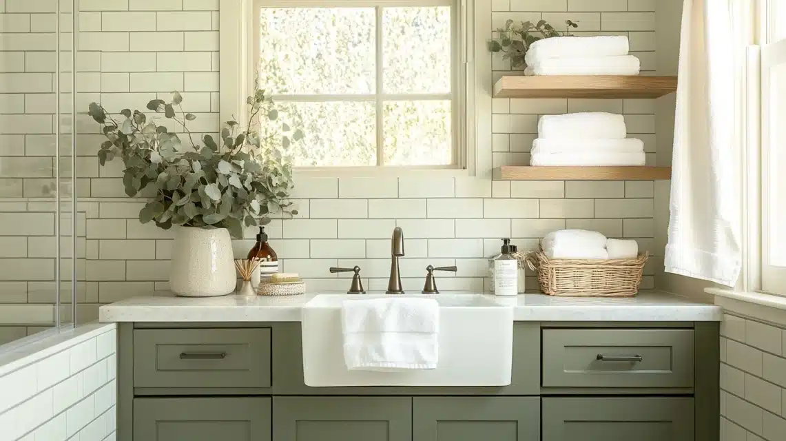
2. Kitchen Success Story
One of my favorite transformations was a kitchen where we used Passive on the walls and white cabinets. The homeowner worried it might feel too cold,
but here’s what happened: the gray balanced the warm wood floors beautifully while making the stainless appliances look like they were meant to be there all along.
3. Bedrooms Done Right
A master bedroom I worked on proves how versatile Passive can be. The space feels cozy and sophisticated with cream linens, a navy accent wall, and natural wood furniture. The morning light makes the walls glow, while evening light turns them subtly moodier.
4. Office Spaces
Here’s a surprise: Passive works wonders in home offices. In one recent project, we painted all four walls Passive. Against white trim and with plenty of natural light, it created the perfect background for video calls while keeping the space feeling professional and calm.
Is Sherwin Williams Passive Right for Your Space?
After seeing Passive in hundreds of homes, I’ve learned it’s not just about loving the color – it’s about making sure it’s right for your specific space. Let me help you decide.
Passive Might Be Perfect If: You have a modern or transitional style home. I’ve seen this color shine in spaces with clean lines and simple decor. It creates this amazing backdrop that lets your furniture and art take center stage.
Natural light matters, too. This color absolutely glows in rooms with good windows. But here’s the thing – it can still work in darker spaces if you balance it with proper lighting.
Think Twice If: Your home leans heavily traditional with lots of beige or tan furnishings. While Passive can work here, you might find it feels a bit disconnected from your existing decor.
Here’s my honest advice: grab a sample and live with it for a few days. Paint a large poster board and move it around your space. Watch how it looks:
- In morning light
- During midday
- At sunset
- Under your artificial lighting
Remember this: the perfect paint color isn’t about trends – it’s about what works in your space and makes you feel at home. If Passive checks both boxes, you’ve found your match.
Tips for Using Sherwin Williams Passive Effectively
Let me share some practical tips I’ve learned from countless Passive paint jobs. These insights will help you get the most out of this versatile gray.
1. Test Before You Commit
Here’s the biggest tip I give my clients: paint two coats on a large piece of white poster board. Don’t skip this step. Tiny paint chips lie – they never show the true color. Move your sample around different walls and watch it throughout the day.
2. Proper Prep Work
I’ve seen beautiful paint jobs go wrong because of poor prep. Passive shows wall imperfections more than darker colors. Take time to:
- Fill holes properly
- Sand rough spots
- Clean walls thoroughly
- Use a good primer
3. Lighting Matters
Do you have dark corners? Install additional lighting before painting. I’ve transformed gloomy hallways into welcoming spaces by adding simple can lights.
Remember, Passive looks best with layered lighting – think overhead lights, table lamps, and wall sconces.
4. The Right Finish
Here’s a pro secret: stick with eggshell finish for living spaces. It hides minor wall flaws while still being easy to clean. Save flat finish for ceilings and satin for high-moisture areas like bathrooms.
5. Paint Order
Start with your darkest wall (usually the one with the most windows) and work toward the lightest. This helps you maintain consistent coverage. And always paint two full coats – Passive needs both to show its true color.
In Closing, Is Passive Worth the Hype?
After working with hundreds of paint colors, I can confidently say that Sherwin Williams Passive deserves its popularity. It’s not just another gray – it’s a versatile neutral that can transform your space.
While no paint color is perfect for every situation, Passive comes pretty close with its balanced undertones and adaptable nature.
Remember, the key to success with Passive lies in understanding your space, testing the color thoroughly, and taking time with proper preparation.
Don’t rush the process. Whether you’re painting a single room or your entire home, this color has proven itself time and again as a reliable choice that can grow with your style.
If you’re drawn to Passive’s subtle sophistication and versatile nature, chances are it will serve your space well. Trust your instincts, follow the tips we’ve discussed, and enjoy watching how this remarkable gray brings your walls to life. After all, the best paint color is one that makes you feel at home every time you walk through the door.
Frequently Asked Questions
Is Sherwin Williams Passive warm or cool?
Passive is a balanced gray that leans slightly cool with subtle blue-green undertones. However, it’s neutral enough that it can work in both warm and cool color schemes, depending on your lighting and decor.
What are the best trim colors to pair with Passive?
Pure White (SW 7005) is my top recommendation for trim with Passive. Extra White (SW 7006) and High Reflective White (SW 7757) also work beautifully. The key is choosing a clean white that creates a crisp contrast without fighting the gray.
Does Passive work in north-facing rooms?
Yes, Passive can work well in north-facing rooms, but be prepared for it to show its cooler side. In these spaces, balance the coolness with warm lighting and decor elements. I often recommend testing the color carefully in north-facing rooms before committing.
How does Passive compare to Agreeable Gray?
While both are popular grays, Passive is cooler with blue-green undertones, while Agreeable Gray has warmer, beige undertones. Passive reads as a more modern gray, while Agreeable Gray tends to feel more traditional and warm.
Will Passive look too dark in a small room?
With an LRV of 60, Passive usually won’t overwhelm small spaces. However, I recommend balancing it with proper lighting and lighter furnishings. In very tiny rooms with limited natural light, you might want to consider a lighter shade or use Passive as an accent wall.