What Makes BM Stonington Gray (HC-170) a Popular Choice?
Looking to paint your room but torn about Stonington Gray? I get it. After testing dozens of Benjamin Moore grays, I can tell you that choosing the perfect shade isn’t easy.
In this guide, I’ll walk you through everything you need to know about Stonington Gray (HC-170). We’ll look at how it changes in different lighting, what undertones to watch for, and which rooms it works best in.
My goal? This is to help you decide if this popular gray is right for your space. As a home designer who’s used this color in countless projects, I’ll share real examples of what worked (and what didn’t).
Whether you’re painting a bedroom, living room, or kitchen, you’ll learn exactly how Stonington Gray performs in real homes. No more second-guessing your paint choice or worrying about expensive mistakes.
What is Benjamin Moore Stonington Gray (HC-170)?

1. The Basics
Stonington Gray (HC-170) is a medium-depth gray paint that I’ve found to be one of Benjamin Moore’s most versatile colors. Think of it as the middle ground between light and dark grays – not too bold, not too shy.
2. The Undertones
Here’s what makes it special: This gray has subtle green-blue undertones that show up differently as your lighting changes throughout the day. In morning light, you might catch hints of blue. By afternoon, it can lean slightly green.
3. The Quality
I love that it’s not a “flat” gray. When you put it on your walls, it has the depth that cheaper grays often lack.
4. The Light Factor
The color sits at a Light Reflectance Value (LRV) of 59, which means it reflects a good amount of light back into your room. In simple terms? Your space won’t feel dark or cave-like.
The Feel
Pro tip: While many grays can feel cold and uninviting, Stonington Gray manages to stay warm enough to feel welcoming in most spaces.
Stonington Gray’s Undertones, A Closer Look
1. The Base Undertones
Let me share what I’ve discovered about Stonington Gray’s undertones after using it in dozens of homes. At its core, it has a mix of blue and green undertones, but they’re subtle – not in-your-face like some other grays.
2. Morning Light
Early morning sun brings out the coolest tones. In east-facing rooms, you’ll notice more blue peeking through. This makes mornings feel crisp and refreshing, especially in bedrooms and bathrooms.
3. Afternoon Changes
By midday, something interesting happens. The green undertones start to emerge, giving the color more warmth. In west-facing rooms, this shift can make your space feel cozier as the day progresses.
4. Artificial Light Impact
Here’s what you need to know about bulbs: Warm white bulbs will bring out the warmer side of Stonington Gray, while cool white LEDs can make those blue undertones more noticeable. This matters most in spaces you use after dark.
5. The Gray Balance
What I appreciate most about this color is its balance. Unlike some grays that suddenly look purple or brown, Stonington Gray stays true to its nature. Sure, it shifts with light, but it never ventures into unexpected territory.
How to Use Stonington Gray in Your Home
1. Living Rooms
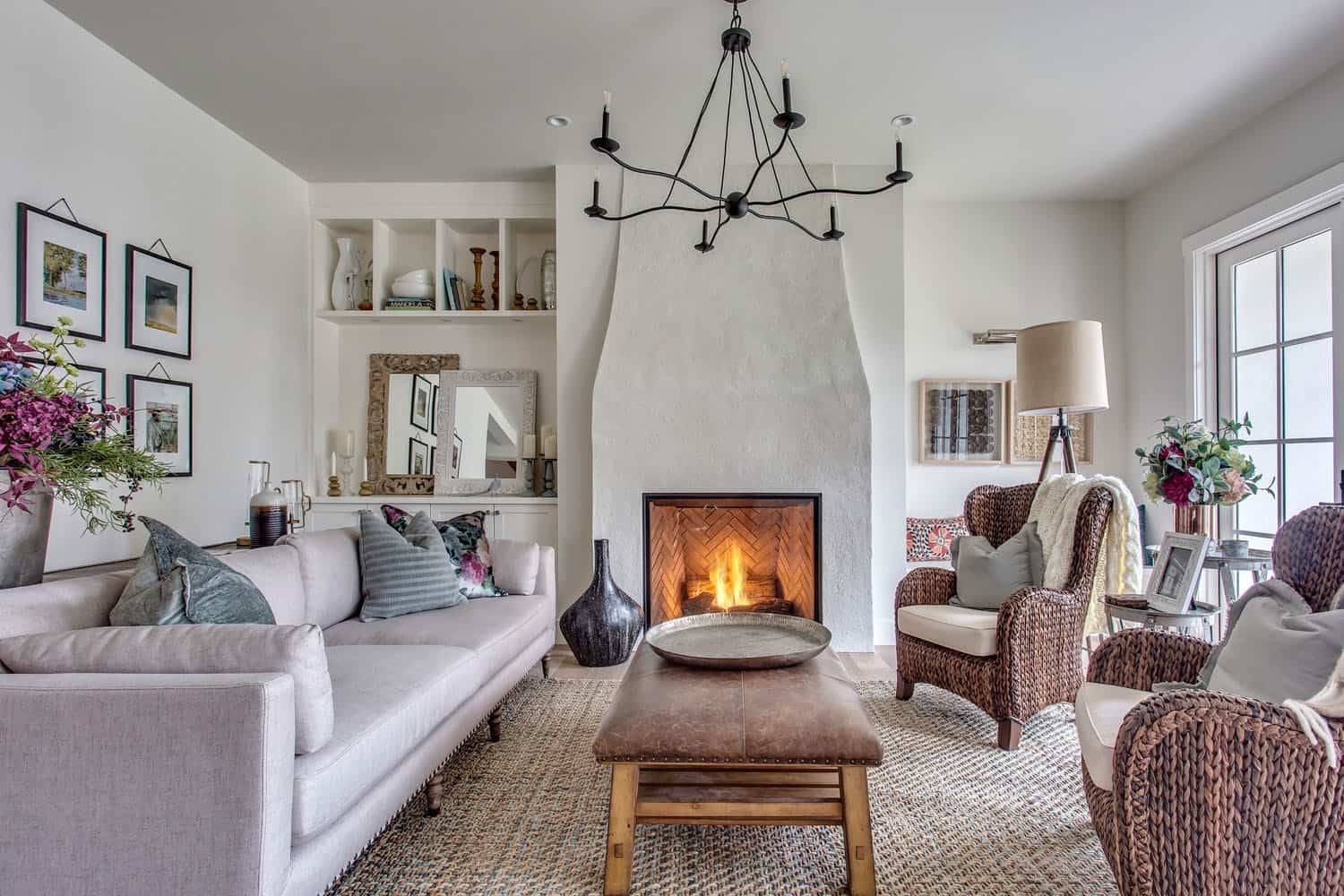
I’ve found Stonington Gray shines in living rooms, especially ones with lots of natural light. It creates a perfect backdrop for both modern and traditional furniture.
Pro tip: Pair it with white trim to make the color pop and define your space.
2. Kitchens
Kitchen magic happens when you use this color right. It works beautifully on cabinets or walls, playing nicely with both stainless steel and brass hardware. In my experience, it looks especially sharp against white countertops.
3. Bedrooms
Want a calming bedroom? Stonington Gray delivers. Its subtle undertones create a peaceful vibe that’s not too cold or too warm.
Here’s a secret: Add soft textures through bedding and curtains to make the space extra cozy.
4. Bathrooms
In bathrooms, this color really proves its worth. It complements chrome fixtures, marble tiles, and white porcelain without stealing the show. Plus, it makes small bathrooms feel bigger thanks to its light-reflecting properties.
5. Home Office
I love using Stonington Gray in home offices. It’s professional enough for video calls but warm enough to keep you comfortable during long work sessions.
Bonus: It won’t compete with your computer screen like darker colors might.
6. Exteriors
While less common, don’t overlook Stonington Gray for exteriors. It pairs beautifully with white trim and dark shutters, creating classic curb appeal that stands the test of time.
Why Choose Stonington Gray?
1. It’s Time-Tested
I’ve watched paint trends come and go, but Stonington Gray has stayed popular for good reason. Unlike trendy grays that feel dated after a few years, this shade has proven its staying power in countless homes.
2. The Neutral Sweet Spot
Here’s what makes it special: It’s not too warm, not too cool. Not too light, not too dark. Think of it as the Goldilocks of grays – just right for most spaces. This balance means it works with nearly any style, from modern farmhouse to urban contemporary.
3. Color Coordination
One thing I love about Stonington Gray is how well it plays with others. It pairs beautifully with:
- Crisp whites in trim and ceilings
- Deep navy blues in furniture
- Natural wood tones in flooring
- Black accents in hardware and fixtures
4. Real Estate Value
If you’re thinking about selling someday, this color is a smart choice. It’s neutral enough to appeal to buyers but has enough character to stand out from basic builder whites.
5. The Forgiveness Factor
Here’s a practical benefit: Unlike darker grays or pure whites, Stonington Gray is forgiving. It hides minor wall imperfections and doesn’t show every fingerprint or scuff. For busy households, this matters.
6. Light Adaptability
Whether your room faces north or south, gets lots of sun or very little, Stonington Gray adapts beautifully. This flexibility is rare – most grays either wash out or go muddy as lighting changes.
Comparing Stonington Gray to Other Popular Grays
1. Stonington Gray vs. Gray Owl
While both are popular Benjamin Moore grays, there’s a clear difference. Stonington Gray is slightly deeper, with more presence on your walls.
Gray Owl appears softer and has stronger blue undertones. In my experience, Stonington Gray holds up better in bright rooms where Gray Owl might wash out.
2. Stonington Gray vs. Revere Pewter
Revere Pewter is warmer and has noticeable beige undertones. If you put them side by side, you’ll see that Stonington Gray stays true to its gray roots.
A key difference: Revere Pewter can look muddy in north-facing rooms, while Stonington Gray maintains its crispness.
3. Stonington Gray vs. Coventry Gray
Think of Coventry Gray as Stonington’s bolder cousin. It’s notably darker and makes more of a statement.
Here’s what matters: While Coventry Gray can overwhelm smaller spaces, Stonington Gray keeps rooms feeling open and airy.
4. Stonington Gray vs. Metropolitan
Metropolitan is the newer, trendier option. It has a more modern feel with subtle violet undertones.
But here’s the thing: Stonington Gray offers more versatility and tends to be more forgiving in different lighting conditions.
5. Stonington Gray vs. Light Pewter
Light Pewter lives up to its name – it’s definitely lighter. While both colors work well in most homes, Stonington Gray gives you more depth and dimension.
Think of it this way: Light Pewter is like a whisper, while Stonington Gray is a clear, confident voice.
Stonington Gray: Best Complementary Colors
1. White Pairings
I’ve found that Stonington Gray looks stunning with clean whites. Chantilly White works beautifully for trim and ceilings, while White Dove adds a softer touch that won’t compete with your gray.
These combinations create a crisp, fresh look that never feels stark.
2. Accent Colors
For drama and depth, try these pairings I’ve tested:
- Navy Blues: Hale Navy adds sophisticated contrast
- Deep Greens: Gloucester Sage creates a natural harmony
- Soft Black: Iron Mountain provides elegant definition
- Rich Browns: Alexandria Beige brings warmth
3. Neutral Partners
When you want a layered, designer look, I recommend:
- Chelsea Gray for deeper accent walls
- Grant Beige for a warm transition
- Edgecomb Gray for subtle contrast
- Classic Gray for gentle variation
4. Bold Companions
Here’s something unexpected: Stonington Gray plays nicely with bold colors too. In my projects, it’s worked beautifully with:
- Aegean Teal for a coastal vibe
- Van Deusen Blue for rich contrast
- Caliente for a dramatic pop
- October Mist for natural harmony
5. Metal Finishes
Don’t forget about hardware: Stonington Gray enhances both warm and cool metals. Brushed nickel keeps things modern, while brass adds warmth. Matte black fixtures create a striking contrast.
Cost & Availability
1. Paint Cost Breakdown
Stonington Gray comes in several Benjamin Moore paint lines. Here’s what you can expect to pay (prices as of early 2024):
- Ben: $49.99 per gallon – Good quality, budget-friendly
- Regal Select: $64.99 per gallon – Premium, most popular choice
- Aura: $89.99 per gallon – Top-tier, best coverage
- ben WATERBORNE: $45.99 per gallon – Basic option
2. Coverage Details
I always tell my clients to plan ahead. One gallon typically covers:
- 400 square feet with Ben
- 400-450 square feet with Regal Select
- 350-400 square feet with Aura
Pro tip: Buy an extra quart for touch-ups. It’s cheaper than getting a new gallon later.
3. Where to Buy
You’ll find Stonington Gray at:
- Benjamin Moore authorized retailers
- Local paint specialty stores
- Select hardware stores
- Note: It’s not available at big box stores like Home Depot or Lowe’s.
4. Sample Options
Start with samples – they’re worth the investment:
- Pint-size samples: $10.99
- Paint sheets: $2.99 each
- Color swatches: Free at most retailers
Cost-Saving Tips
Want to save money without sacrificing quality? Here’s what I tell my clients:
- Watch for seasonal sales (usually spring and fall)
- Buy 5-gallon buckets if painting large areas
- Join store loyalty programs for discounts
- Consider Ben line for large projects where budget matters
Conclusion
Stonington Gray (HC-170) stands out as one of Benjamin Moore’s most reliable and versatile paint colors. After using it in countless homes, I can confidently say it’s a choice you won’t regret.
This medium-toned gray brings the perfect balance of warmth and coolness, making it adaptable to almost any space or style.
Its subtle blue-green undertones add depth without being overwhelming, while its excellent light reflectance helps keep rooms feeling bright and open.
What I appreciate most about Stonington Gray is its forgiveness – it performs well in different lighting conditions, hides minor wall imperfections, and coordinates beautifully with a wide range of colors and finishes.
Whether you’re painting a cozy bedroom, a busy kitchen, or an entire home’s exterior, this shade offers a rare combination of timeless appeal and modern sophistication.
Plus, with multiple paint line options, you can find a price point that works for your budget without compromising on quality.
If you’re on the fence about Stonington Gray, I’d encourage you to grab a sample and test it in your space. In my experience, it’s one of those colors that often exceeds expectations once it’s on the walls.
It’s not just another gray – it’s a tried-and-true choice that continues to prove its worth in modern homes.
Frequently Asked Questions
Is Stonington Gray too dark for a small room?
Not at all. An LRV of 59 reflects enough light to keep small spaces feeling open and airy. I’ve used it in powder rooms and small offices with great success.
Just remember: Good lighting helps bring out its best qualities.
Does Stonington Gray look blue on the walls?
While it has subtle blue undertones, it stays firmly in the gray family.
Here’s what to expect: You might catch hints of blue in morning light or north-facing rooms, but it never reads as a “blue” paint color. The undertones add depth without dominating.
How does Stonington Gray perform in rooms with little natural light?
Based on my experience, it holds up well in low-light spaces. Unlike some grays that can look muddy or flat in dim lighting, Stonington Gray maintains its character.
Pro tip: Using warm white LED bulbs helps keep the color looking fresh and vibrant.
Will Stonington Gray work with warm wood tones?
Absolutely! That’s one of its strengths. I’ve paired it with everything from rich mahogany to light oak. The secret? Its balanced undertones complement both warm and cool wood tones without clashing. It’s especially beautiful with medium-toned hardwood floors.
How many coats of Stonington Gray will I need?
Using Benjamin Moore’s Regal Select line, most walls need two coats for perfect coverage. Dark or bright colors underneath might need a primer first.
Time-saving tip: Don’t skip the second coat – it ensures even coverage and brings out the true color.