What Makes BM Palladian Blue (HC-144) So Popular?
Staring at paint swatches can make your head spin. But there’s a reason why Benjamin Moore’s Palladian Blue keeps popping up in designer portfolios and Pinterest boards across the globe.
As an interior designer who’s used this shade in countless homes, I’m here to break down exactly why this blue-green-gray chameleon has become a go-to choice for both professionals and DIY enthusiasts.
In this guide, you’ll discover what makes Palladian Blue special, where it works best in your home, and how to pair it with other colors. No more second-guessing if this paint color is right for your space.
Whether you’re planning to refresh your bathroom or transform your living room, I’ll help you understand if Palladian Blue is the perfect choice for your next painting project.
What Makes Palladian Blue (HC-144) Unique?

1. A Color That Changes Its Mind
Palladian Blue isn’t your typical paint color. I’ve watched countless clients fall in love with it because it seems to have a mind of its own.
2. The Light Dance
Here’s what makes it stand out: this color shifts with the light. In your north-facing room, it might look like a soft gray. Turn the corner into your sunny kitchen, and suddenly, it’s showing off its blue-green side.
But that’s not all.
3. The Perfect Party Guest
Unlike many paint colors that scream for attention, Palladian Blue whispers. It’s what we designers call a “chameleon color” – it plays well with others without trying to steal the show.
4. Plays Well with Others
Think of it as that friend who gets along with everyone at the party. When you pair it with warm whites, it feels crisp and clean. Put it next to natural wood tones, and it brings out their richness.
5. Beginner-Friendly
The best part? You don’t need to be a color expert to make it work. This shade is surprisingly forgiving, which means even if you’re new to choosing paint colors, you’re in safe hands.
Ideal Spaces for Palladian Blue
1. The Perfect Bathroom Match
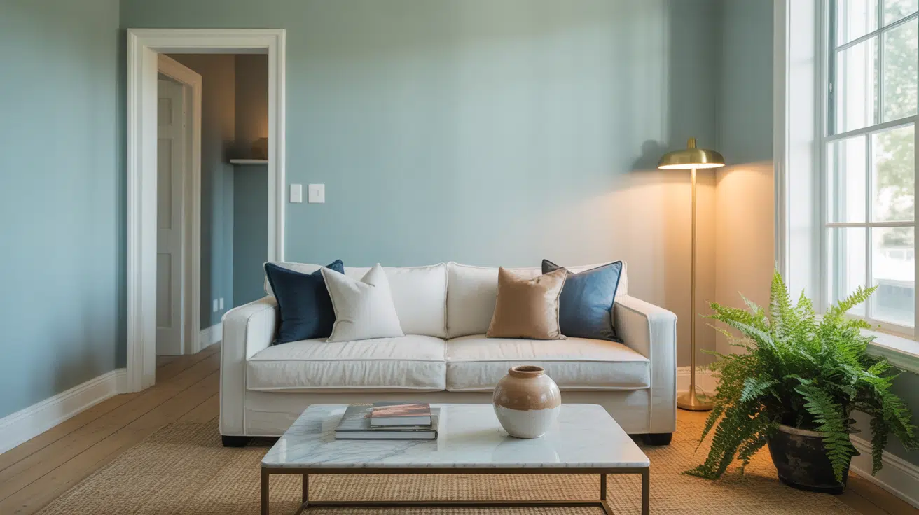
If you’re looking to create a spa-like bathroom, Palladian Blue shines here. I’ve used it in countless bathroom makeovers because it brings a sense of calm without feeling cold. The color reminds my clients of sea glass and gentle ocean waves.
2. Living Room Magic
Picture your living room bathed in soft, natural light. Palladian Blue walls create the perfect backdrop for both modern and traditional furniture.
It’s subtle enough not to compete with your decor but interesting enough to make your space feel intentional.
3. A Peaceful Bedroom Retreat
Looking for better sleep? This shade works wonders in bedrooms. Unlike stark whites or deep blues, Palladian Blue creates a gentle cocoon that’s neither too stimulating nor too dull. It’s especially beautiful during golden hour when it takes on a warm, ethereal glow.
4. Home Office Harmony
In your home office, this color helps you focus without feeling boxed in. I’ve noticed my clients report feeling more productive in their Palladian Blue offices.
It provides a professional backdrop for video calls while keeping your space feeling fresh all day long.
5. Kitchen Possibilities
While bold kitchen colors come and go, Palladian Blue has staying power. It pairs beautifully with white cabinets, stainless steel appliances, and marble countertops.
Plus, it makes your kitchen feel bigger and brighter without going all-white.
Best Pairings with Palladian Blue
1. Crisp White Magic
Pure white trim is Palladian Blue’s best friend. I’ve found Benjamin Moore’s Chantilly Lace creates the perfect crisp contrast without fighting for attention. Your eye will thank you for this clean, classic combination.
2. Natural Wood Tones
Want to warm things up? Raw wood furniture and hardwood floors make Palladian Blue sing. The color brings out the richness of oak, walnut, and even bamboo. This pairing feels both modern and timeless.
3. Metallic Accents
Here’s a designer secret: Palladian Blue loves to flirt with metals. Brushed nickel hardware, brass light fixtures, or chrome faucets – they all work beautifully. The color makes these metallic elements pop without overwhelming them.
4. Soft Gray Companions
Looking for a whole-house color scheme? Palladian Blue plays nicely with light grays. Think of it as creating a gentle flow from room to room. I often use Gray Owl in connecting spaces to create a seamless transition.
5. Fabric Friends
When it comes to fabrics, you’ve got options. Navy blue velvet, cream linen, or even floral patterns in coral tones – they all work. The key is letting Palladian Blue be your neutral foundation while these accents add personality.
6. Stone and Tile
Planning a bathroom or kitchen? Palladian Blue looks stunning with marble, quartz, or even simple subway tile. The color enhances natural stone patterns while keeping the space feeling fresh and clean.
Quality and Durability of Benjamin Moore Palladian Blue
1. The Paint Base Matters
I’ve found that Benjamin Moore’s paint base is what sets Palladian Blue apart. The color stays true even after years of sun exposure. While cheaper brands might fade or turn chalky, this formula holds its ground.
2. Coverage That Counts
Let’s talk about what you’re really getting for your money. This paint covers walls like a dream – usually in two coats. I’ve seen it hide previous colors that I thought would need a primer.
The paint flows smoothly and doesn’t leave those annoying roller marks.
3. Cleaning Made Simple
Here’s something practical: Palladian Blue in Benjamin Moore’s Regal Select line stands up to cleaning. Coffee splashes? Kid’s crayon marks? A damp cloth usually does the trick without damaging the finish. This matters when you’re living with the color day after day.
4. Long-Term Value
The price tag might make you pause, but here’s the truth: you won’t need to repaint as often. I’ve had clients whose Palladian Blue walls look fresh even after five years.
The color depth and richness stay consistent, saving you money in the long run.
5. Environmental Notes
For those who care about indoor air quality (and who doesn’t?), this paint has low VOC levels. You can paint a room today and sleep in it tonight without that strong paint smell lingering for days.
How to Use Palladian Blue in Your Home
1. Start Small
Are you not ready to paint your whole house? Try Palladian Blue in a powder room first. Small spaces are perfect for testing how this color works with your lighting. Plus, you’ll get to live with it before making a bigger commitment.
2. Consider Your Light Sources
Here’s a pro tip: Look at your paint sample at different times of day. I always tell my clients to tape their samples to the wall and watch how it changes from morning to night.
North-facing rooms will bring out the gray undertones, while southern light makes the blue-green shine.
3. Layer Your Lighting
Don’t rely on natural light alone. The right mix of lighting can make Palladian Blue feel magical. Think about:
- Warm LED bulbs for overall room lighting
- Task lighting for workspaces
- Accent lights to highlight artwork
4. Think About Flow
Planning to use it in multiple rooms? Consider how the color will transition between spaces. I like to use it in rooms that can “see” each other, creating a subtle connection throughout your home.
5. Sample Smart
Before you buy gallons, get a real sample pot. Paint a 2×2 foot square on each wall you plan to cover. This isn’t just about seeing the color – it’s about understanding how it lives in your space.
6. The One-Wall Option
Not sure about painting the whole room? Try a Palladian Blue accent wall. I’ve found it works especially well on the wall behind your bed or as a focal point in your living room.
Remember: There’s no rush. Living with your sample for a few days will help you make the right choice for your home.
Making the Right Choice with Palladian Blue
After working with hundreds of paint colors over the years, I can tell you that Palladian Blue’s popularity isn’t just hype.
Its unique ability to adapt to different lighting conditions, its calming presence, and its versatile nature make it a standout choice for any home.
Whether you’re refreshing a small powder room or transforming your entire living space, this color brings a timeless elegance that’s hard to match.
Remember that the key to success lies in testing the color in your specific space and considering how it plays with your existing decor and lighting.
While no paint color is truly perfect for everyone, Palladian Blue comes pretty close with its blend of sophistication and livability.
Trust your instincts, take your time with samples, and you might just find that this is the color you’ve been searching for all along.
Frequently Asked Questions About Palladian Blue
Is Palladian Blue More Blue or Green?
Palladian Blue is a chameleon color that sits right between blue and green, with gray undertones. In north-facing rooms, it leans more gray-blue.
In spaces with lots of natural light, you’ll see more of its blue-green personality come through. The time of day and your lighting choices will influence which undertone becomes more prominent.
Will Palladian Blue Make My Room Look Dark?
No, Palladian Blue has a surprisingly light reflective value (LRV) that helps keep spaces feeling bright. In fact, it often makes rooms feel larger because it reflects light so well.
I’ve used it in small spaces, and it actually helps open them up rather than closing them in.
How Different Is Palladian Blue From Other Blue-Green Colors?
Unlike brighter blue greens like Benjamin Moore’s Wythe Blue or Sherwin Williams’ Rainwashed, Palladian Blue has more gray in its mix.
This makes it more sophisticated and easier to live in the long term. It’s less beachy and more refined than typical coastal colors.
Do I Need to Use Benjamin Moore Primer With Palladian Blue?
While you can use other quality primers, I recommend sticking with Benjamin Moore’s Fresh Start primer. The paint and primer are formulated to work together, giving you the truest color and best coverage.
If you’re painting over a dark color, primer is definitely a must.
How Many Gallons Do I Need for an Average Room?
For a standard 12×12 foot room with 8-foot ceilings, you’ll typically need 2 gallons of paint for two coats. Always buy your paint at once to ensure color consistency.
Remember to factor in doors, windows, and any architectural features that might affect your coverage needs.