31 Two Toned Kitchen Cabinets for Every Style
Have you ever looked at your kitchen and felt like it’s missing something, but you’re not ready for a complete remodel? You’re not alone.
A lot of homeowners want to make their kitchens feel fresh and updated without tearing everything out. That’s where two-toned kitchen cabinets come in.
They’re one of the simplest ways to bring contrast, balance, and personality into your space without overcomplicating things.
In this post, I’ll walk you through layout ideas, color combos, and planning tips that work in real homes like yours. If your kitchen is big or small, you’ll find something that fits. Let’s get started and see the look that best suits your space.
What Makes Two-Toned Cabinets a Practical Choice?
Two-tone cabinets offer more flexibility than single-color setups. By mixing shades, you can add contrast without overwhelming the space.
This works well in both large and small kitchens; lighter upper tones help open up tight areas, while deeper base tones anchor the design.
It also allows you to highlight specific zones, such as islands or pantries, without requiring a full remodel. The layered look adds structure and depth, making it a functional and versatile choice across styles.
Two-Toned Kitchen Cabinets to Inspire Your Layout
Popular High-Contrast Combinations
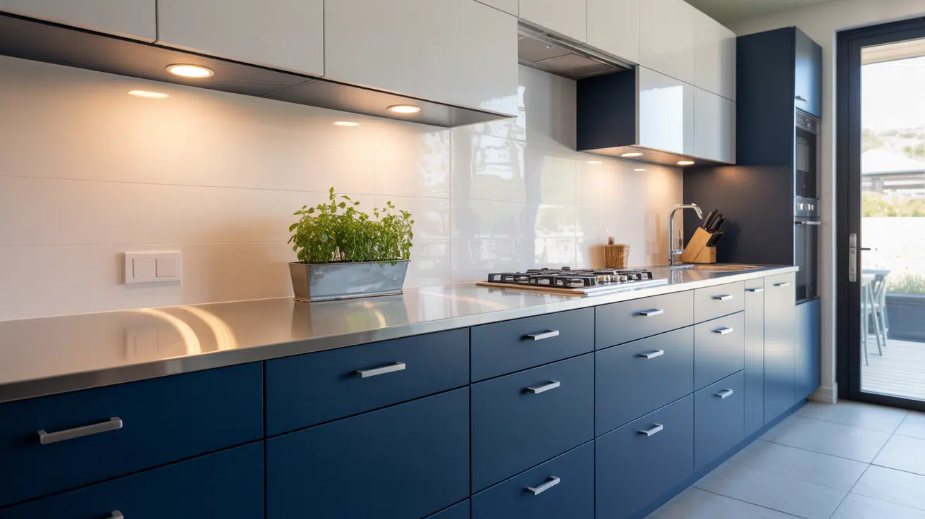
1. White and Navy Cabinets

This pairing keeps things bright on top while grounding the space below. Navy base cabinets add structure without overpowering.
The clean white uppers open up the room, making it feel more spacious, especially helpful in smaller kitchens. Navy also pairs well with wood floors or brass accents, giving you flexibility in fixtures and decor.
Tip: Ideal for kitchens with limited natural light or narrow layouts that require visual depth without the use of dark walls.
2. Black and Woodgrain Cabinets

Combining black lowers with natural wood grain uppers creates a warm yet bold mix. The contrast helps divide the space visually and gives a modern-meets-organic feel.
Black cabinets hide wear better than lighter tones, and woodgrain adds warmth that prevents the look from feeling too stark.
Tip: Works best in open-plan kitchens or those with large windows to balance the darker tones.
3. White and Charcoal Gray Cabinets

Charcoal base cabinets add weight and depth, while white uppers lift the eye and keep the space bright.
This look stays clean without feeling flat and works exceptionally well with cool-toned countertops or floors. The gray tones offer a more forgiving surface for everyday use, hiding minor scuffs or stains.
Tip: Suitable for homes that lean modern or transitional in style.
4. Dark Blue Base, Cream Upper Cabinets

The rich blue brings color and strength to the base cabinetry while cream uppers soften the overall effect. This combination provides a classic feel with enough character to stand out. It’s a good alternative to black if you want contrast without going too bold.
Tip: Looks great with brushed nickel or matte gold hardware and suits mid-sized or open kitchens.
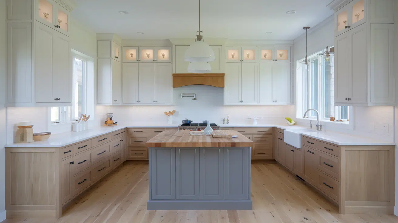
5. Graphite and Light Oak Cabinets

This pairing creates a balance between sleek and natural elements. Graphite cabinets add depth and shadow, while light oak gives warmth and texture.
The variation in finish also makes it easier to coordinate with mixed-material countertops. It’s a wise choice if you’re combining modern appliances with natural wood features.
Tip: Best used in kitchens with soft white or neutral wall colors for contrast.
Soft Pairings for Subtle Style
6. Warm Gray and White

This duo brings just enough contrast to keep the kitchen from feeling washed out. Warm gray lowers pair smoothly with white uppers for a neutral base that’s not boring.
The warmth in the gray makes it easy to coordinate with beige walls or brass fixtures.
Tip: Ideal for households that want something classic and low-maintenance, especially in medium-sized kitchens with a balanced lighting setup.
7. Pale Blue and Ivory

This combination feels calm and understated. Pale blue on lower cabinets adds a touch of color without overwhelming the space, while ivory uppers soften the visual tone.
It’s a low-risk pairing for people who want color but are hesitant about strong contrasts.
Tip: Works especially well in coastal, country, or farmhouse kitchens with plenty of natural light.
8. Beige and Greige

Beige base cabinets combined with beige uppers offer a layered neutral palette. The subtle variation keeps the space from feeling too flat while remaining easy to match with other finishes.
It’s warm, relaxed, and practical, perfect for anyone avoiding pure white but still wanting a clean base.
Tip: A great fit for kitchens with warm wood flooring or natural stone countertops.
9. Sage Green and Bone White

Sage lowers bring a soft, natural touch while bone white uppers help reflect light. This combo is easy on the eyes and pairs well with mixed materials like butcher block or quartz.
Sage gives just enough contrast without being bold.
Tip: Great in kitchens that need a bit of color without feeling cold or too trendy.
10. Light Taupe and Natural Birch

The taupe base offers a warm, earthy tone, while the natural birch above adds brightness and a subtle woodgrain finish.
This pairing makes the space feel grounded and organized without feeling heavy. Birch keeps it airy and neutral, making the entire layout easier to update later with accessories.
Tip: Ideal in homes with warm lighting and transitional cabinetry styles.
Natural Wood + Painted Cabinets
11. Walnut and Off-White

Dark walnut base cabinets give the space richness and weight, while off-white uppers keep it bright and balanced.
The two finishes create a well-rounded design that feels stable but open. Walnut hides daily wear well, and off-white works with a range of hardware finishes.
Tip: Best for larger kitchens or open-concept homes that need clear zoning between prep and wall areas.
12. White Oak and Soft Green

White oak brings texture and depth, while soft green provides subtle color.
Together, they offer a fresh take without being distracting. The oak tones warm up cooler green hues and blend with white or stone countertops easily.
Tip: Use this in kitchens where you want a calm color base with natural materials showing through.
13. Maple and Slate Gray

Maple’s light tone softens the boldness of slate gray cabinets, which adds depth.
This pairing gives you flexibility to go modern or traditional, depending on hardware and layout. It’s also easy to clean and resists fading.
Tip: Best used in homes with mixed metal accents and matte finishes on walls or backsplashes.
14. Driftwood Base with Arctic White Uppers

The soft grain of driftwood adds texture, while arctic white brings clarity to the upper sections.
The overall look is balanced and works well in open kitchens where you don’t want the lower cabinets to overpower the space.
Tip: Perfect for minimalist kitchens or open-plan spaces with lots of natural light.
15. Rustic Cherry and Almond

Rustic cherry base cabinets carry natural red tones, while almond uppers soften the visual impact.
The blend works well in transitional or craftsman kitchens. This pairing hides wear and doesn’t demand frequent cleaning.
Tip: Ideal in kitchens with warm or golden lighting where deeper tones need softening above eye level.
Two-Tone Kitchen Islands and Accents
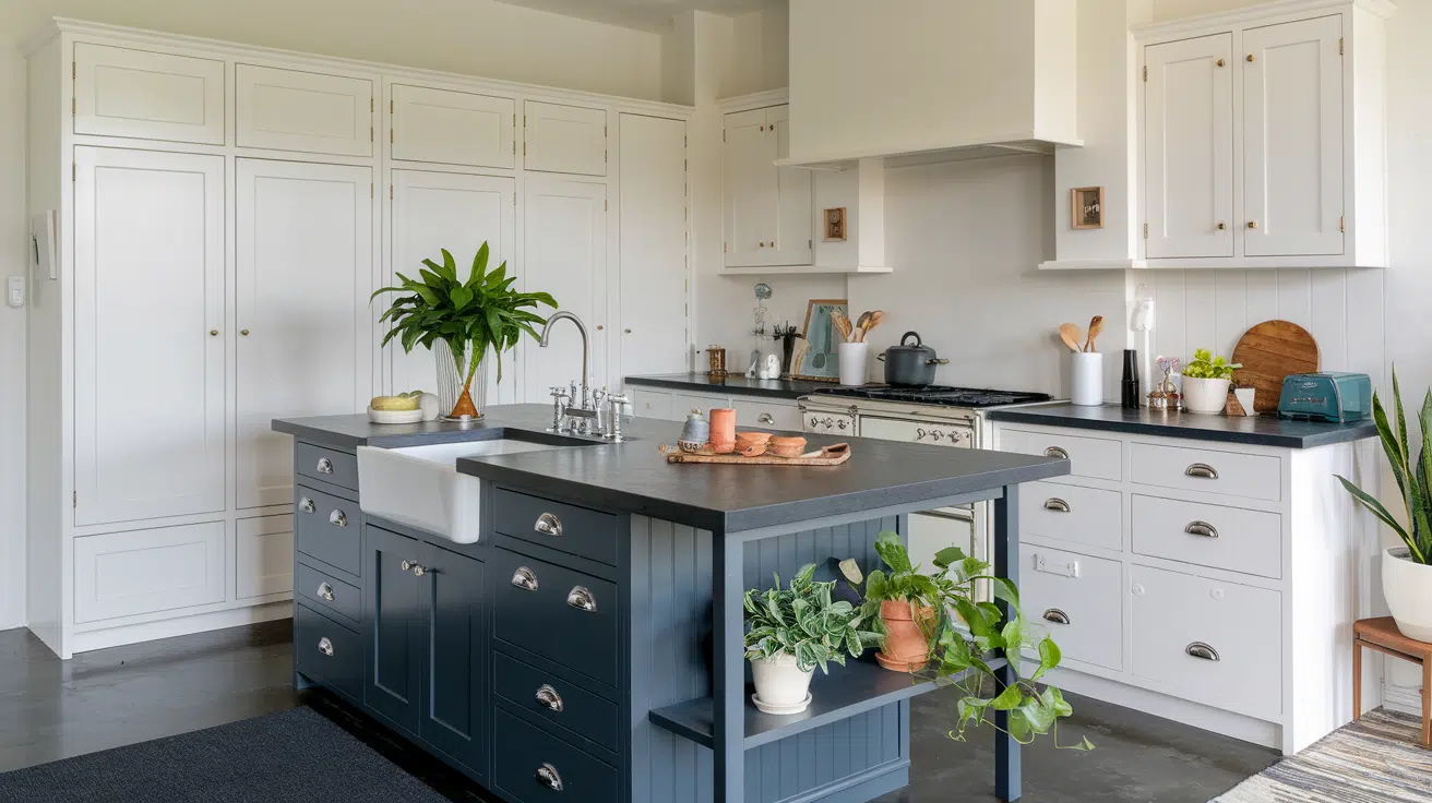
16. Dark Island with White Perimeter

A dark-toned island anchors the space and naturally separates the prep zone from the rest of the kitchen. Surrounding white cabinets keep the room feeling light and organized.
This pairing makes the island a visual anchor while still allowing freedom with backsplashes and flooring.
Tip: Use this layout in open kitchens or shared cooking/dining areas to subtly divide zones without changing floor plans.
17. Green Island in a White Kitchen

A soft or deep green island provides contrast and interest without taking over.
The white cabinets around it keep the space clean and straightforward, making the island feel like a purposeful centerpiece. This is a low-commitment way to bring in color.
Tip: Try this setup in kitchens with gold or bronze hardware for extra warmth.
18. Black Cabinetry With Lighter Cabinets Full-height
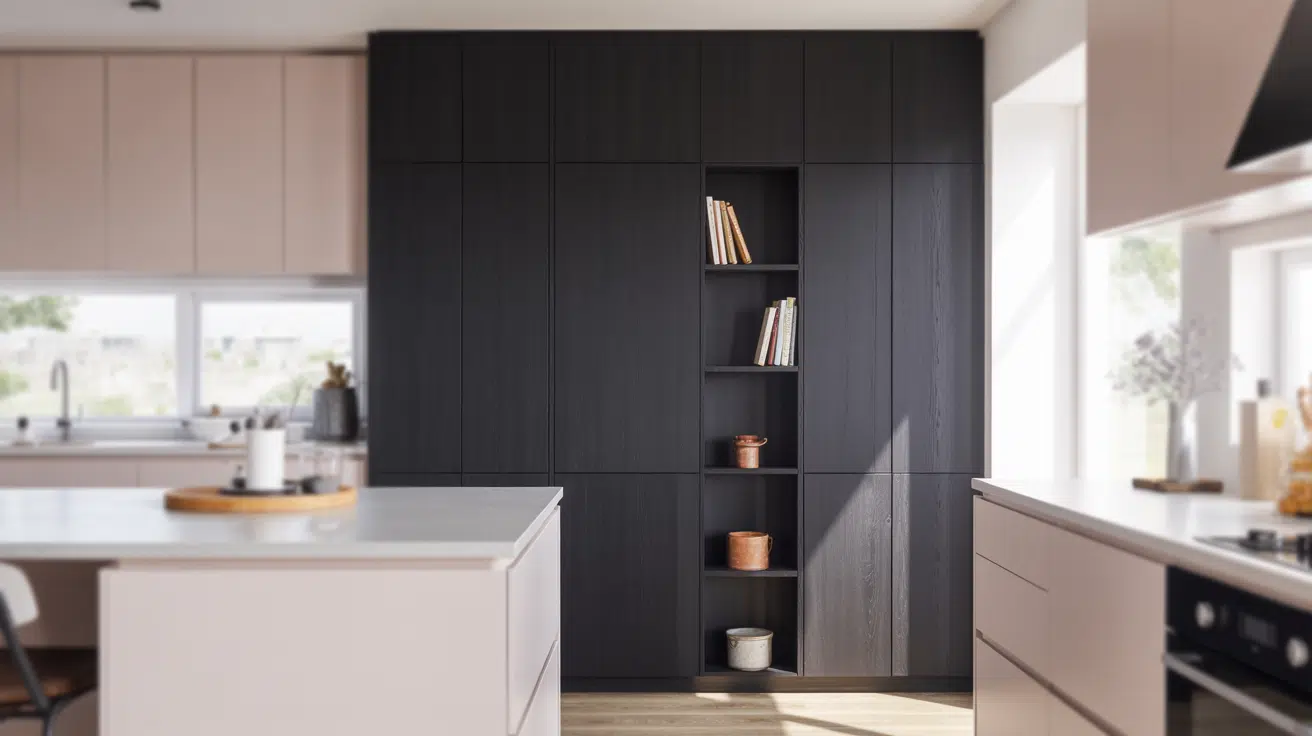
Black cabinetry along a full-height pantry wall gives depth and presence, especially when balanced by lighter base and upper cabinets elsewhere. It serves as a backdrop for open shelving or a display zone.
Tip: Works best in wider kitchens where vertical visual weight won’t overwhelm the layout.
19. Gray Built-In Hutch in a White Layout

Adding a gray built-in hutch adds dimension without overpowering. It breaks up the repetition of all-white cabinets and works well for displaying dishware or storing dry goods.
The color shift is enough to create a break, but still blends with a light scheme.
Tip: Ideal for traditional layouts or kitchens that open into dining rooms.
20. Wood Island with Painted Cabinets

Natural wood brings in warmth and grain contrast, while painted perimeter cabinets offer a clean foundation. The mix keeps the space from feeling sterile and adds balance. Use a sealed wood finish to reduce wear.
Tip: This is a good choice if you want a low-gloss, tactile element in the kitchen’s center.
Unique or Bold Combos
21. Olive and Charcoal Cabinets

Olive base cabinets give off an earthy tone, while charcoal adds a grounding effect. The combination feels solid without being harsh. It’s great for layering with natural materials like wood or stone.
Tip: Use in kitchens with ample light, so the darker charcoal doesn’t overpower the room.
22. Blush and Cream Cabinets

Blush lower cabinets offer softness and color, while cream uppers keep things balanced. The result is warm and controlled, not overly feminine. This look pairs well with brushed nickel fixtures.
Tip: Try this in small kitchens or apartments where you want a warm palette without going bold.
23. Teal and Buttermilk Cabinets

Teal brings energy and depth, while buttermilk tones it down and ties into warm neutrals. This setup works well with wood or tile floors and can handle a bit more visual noise.
Tip: Fits vintage-inspired kitchens or those mixing older and newer finishes.
24. Deep Red and Light Gray Cabinets

The rich red base provides focus, while light gray keeps it from feeling too heavy. Together, they create a layout that has definition but stays neutral enough for resale.
Tip: Use this when pairing with dark countertops or exposed brick accents.
25. Black and Tan Cabinets

Black cabinets bring structure, while tan provides warmth and relief from darkness. This layout makes the kitchen feel tailored and organized without introducing a sharp contrast.
Tip: A practical choice in homes with pets or heavy use, as both colors hide smudges well.
Small Kitchen Combos That Work
26. White on Top, Warm Gray Below

White upper cabinets brighten the room, helping walls visually disappear, while warm gray lowers create structure.
The balance gives the space clarity without making it feel closed in. It’s one of the safest yet effective ways to create contrast without shrinking a small kitchen.
Tip: Use this when your kitchen has limited window light or if you’re working with galley or U-shaped floor plans.
27. Cream with Soft Blue Base

Cream uppers offer a clean and neutral frame, while soft blue lowers bring in color without being loud. This combination adds calm energy and breaks visual monotony in small areas.
The soft blue works particularly well with white or beige flooring.
Tip: Great for kitchens in older homes where light tones help soften narrow walls and tight corners.
28. Light Wood on Lowers, White on Uppers

The white cabinets at eye level brighten the room, while light wood below adds warmth and texture. This setup gives the illusion of taller ceilings by drawing the eye upward. The natural tones also help blend with various flooring choices.
Tip: Ideal for low-ceiling kitchens or apartments with limited vertical space.
29. Pale Green Base with Open Shelves

Pale green lower cabinets add color in a subtle way, while open shelving above removes visual bulk. This keeps small kitchens feeling wider and more breathable. It’s a smart way to avoid crowding your top wall space.
Tip: Works well in kitchens with only one whole wall or when upper cabinets would block light.
30. Navy Base with Floating White Cabinets
Navy provides depth at the base, while floating white uppers lighten the visual load and increase openness. The separation gives a strong contrast without closing in the space. Navy is durable for high-use areas.
Tip: Ideal for studio or loft kitchens where wall space is limited and multifunctional layouts are needed.
31. Dark Gray Island in a Compact Layout
A dark gray island adds visual structure to an open-plan kitchen, even in tight layouts. It doesn’t take over, but clearly defines prep and storage zones. Paired with neutral surrounding cabinets, it blends smoothly.
Tip: Use when your kitchen doubles as a dining or work area, but you can’t afford to feel cramped.
How to Pick a Color Combo That Works in Your Home
Choosing the right two-tone cabinet colors depends on layout, materials, and lighting. Keep it simple, balanced, and practical for long-term use.
1. Match Your Cabinets to Countertops and Flooring
Cabinet colors should align with existing surfaces to avoid visual clutter. Look for undertones in flooring and countertops, and choose cabinet colors that either blend or clearly contrast.
Avoid combining warm and cool tones without intention, as it can feel disjointed. If you’re planning a full remodel, choose one surface first and build your color decisions around it.
2. Use Lighting to Help With Contrast
Natural and artificial lighting can shift how colors appear. In low-light kitchens, avoid pairing two dark tones, which can make the room feel tight.
Brighter spaces can handle deeper contrasts more comfortably. Test paint samples under both daytime and evening lighting to make sure they still work. Undercabinet lighting can also help highlight tone shifts.
3. Start With a Neutral and Add One Deeper Shade
To keep things balanced, begin with a neutral like white, cream, or light gray. Then introduce a darker or richer shade on base cabinets, the island, or accents.
This layered approach keeps the room grounded while giving it definition. Using two bold tones rarely works unless the rest of the space is minimal and consistent.
Planning Tips for a Two-Tone Kitchen Layout
To get the most out of a two-tone setup, stick to clean layouts, avoid visual clutter, and keep tones coordinated.
- Wall uppers with base cabinet contrast: Use lighter uppers to brighten the room and darker lowers to anchor the layout. It’s the most balanced, space-friendly option.
- Island as the second tone: A different tone of the isle adds separation without overwhelming. This works well in open-concept kitchens or larger layouts.
- Accent sections only (coffee bar, pantry): Use a second color in a small area, such as a pantry or built-in hutch, to break the repetition without overdoing it.
- Avoid using more than two tones: Adding more than two colors or finishes can make the space look cluttered and unfocused, especially in smaller kitchens.
- Avoid clashing undertones (warm vs. cool): Stick to similar undertones to keep the palette cohesive. Mixing warm and cool tones often feels mismatched or unplanned.
- Avoid combining glossy and matte finishes without balance: Mixing sheens can work, but only if done with intention. Unbalanced combinations create inconsistent reflections and distract from the layout.
Conclusion
If you’ve been considering two-toned kitchen cabinets, I hope this gave you ideas that feel clear and doable.
You don’t need to commit to bold colors or complicated layouts; just the right mix of tones can give your space structure and style.
Think about how your lighting, flooring, and layout work together, and start with one small section if you’re unsure.
The best part? This is a versatile trend that works well across various kitchen types. Keep experimenting, and trust that you’ll find something that suits your home.
For more layout ideas and clever kitchen tips, check out my other blogs. There’s plenty more where this came from.


