Tan vs Beige: A Color Comparison Guide
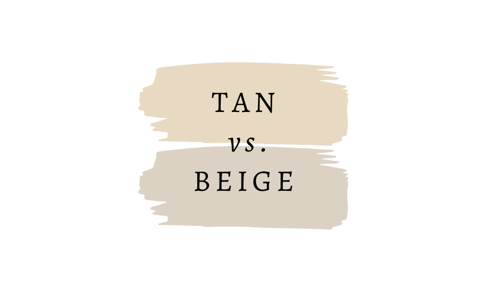
In interior design and paint colors, tan and beige are often confused or used interchangeably. But is there really a difference between these two popular neutral shades?
The answer is both yes and no – and that’s exactly what makes these colors so intriguing.
While both colors belong to the warm neutral family, each brings unique characteristics to a space. Whether you’re planning to paint your walls, choose new furniture, or coordinate your wardrobe, understanding the subtle differences between tan and beige can help you make more informed design decisions.
Let’s explore the distinct qualities of these versatile neutrals, from their undertones to their practical applications, and help you choose the perfect shade for your next project.
Definitions and Descriptions
Understanding Tan
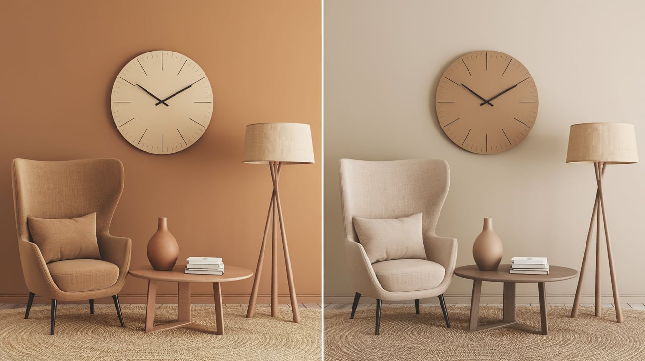
Think of walking along a sandy beach on a warm summer day – that’s tan in its most natural form. This warm, inviting color draws its inspiration directly from nature, appearing as a soft brown with distinct yellow-orange undertones that give it a sun-kissed quality.
Unlike its cousin, beige, tan tends to show its warmth more confidently, creating naturally cozy and welcoming spaces.
Tan reveals its dynamic nature in different lighting conditions. It often appears brighter and more energetic during daylight hours, emphasizing its yellow undertones.
As the sun sets and artificial lighting takes over, tan tends to deepen, creating a rich, comfortable atmosphere that makes spaces feel more intimate and grounded.
Understanding Beige
Beige stands as perhaps the most misunderstood neutral in the color spectrum. While often dismissed as plain or boring, this sophisticated hue offers remarkable depth and versatility.
At its core, beige is a soft, pale brown color with subtle gray undertones, giving it a more refined and muted appearance than tan.
The beauty of beige lies in its chameleon-like ability to adapt to its surroundings. In modern interiors, it can act as a sophisticated neutral backdrop that allows other design elements to shine.
When paired with different colors and textures, beige takes on new personalities. It appears warm and cozy when combined with rich woods and textiles or crisp and contemporary when set against stark whites and metals.
Beige’s gray undertones help it maintain its composure in various lighting situations, making it particularly versatile for interior spaces.
Unlike tan, which can sometimes appear too warm, beige maintains a steady, balanced presence throughout the day, providing a consistent foundation for your color scheme.
Detailed Comparison
Primary Color Comparison Table
| Aspect | Tan | Beige |
|---|---|---|
| Primary Undertone | Yellow-orange | Gray-brown |
| Color Temperature | Warm | Neutral to cool |
| Depth | Medium to deep | Light to medium |
| Visual Weight | Stronger presence | Softer presence |
| Natural Light Response | More dynamic | More stable |
Undertone Variations Table
| Base Undertone | Tan Variations | Beige Variations |
|---|---|---|
| Yellow | Yellow-green tan | Yellow-gray beige |
| Orange | Orange-yellow tan | Orange-pink beige |
| Brown | Caramel tan | Taupe beige |
| Green | Sage tan | Greige |
| Pink | Peachy tan | Rose beige |
Room Impact Analysis
| Design Element | Tan Effect | Beige Effect |
|---|---|---|
| Small Spaces | It can make rooms feel cozier | Creates the illusion of more space |
| High Ceilings | Brings warmth down | Maintains airiness |
| Dark Rooms | Adds warmth but may darken | Brightens while staying neutral |
| Bright Spaces | Can become intense | Maintains balance |
| North-Facing Rooms | Counteracts coolness | May appear grayer |
| South-Facing Rooms | It may appear too warm | Balances natural light |
Color Pairing Guide
| Pairing Color | With Tan | With Beige |
|---|---|---|
| White | Creates crisp contrast | A soft, seamless blend |
| Black | Modern dramatic look | Classic, sophisticated look |
| Navy Blue | Rich, traditional feel | Preppy, clean aesthetic |
| Green | Natural, organic vibe | Subtle, refined combination |
| Red | Warm, energetic mix | A muted, elegant pairing |
| Purple | Exotic combination | Sophisticated blend |
Lighting Impact
| Light Source | Tan Appearance | Beige Appearance |
|---|---|---|
| Natural Daylight | Warmth intensifies | Remains stable |
| LED Cool White | Can appear dull | Maintains neutrality |
| Warm LED | Enhances warmth | Warms slightly |
| Fluorescent | May appear yellowish | Gray undertones emerge |
| Incandescent | Deepens color | Softens appearance |
These comparison tables comprehensively overview how tan and beige differ in various contexts and applications. Understanding these nuances is key to making informed decisions for your specific space or design needs.
Popular Shades and Their Uses
Notable Tan Paint Colors
1. Manchester Tan from Benjamin Moore is a sophisticated choice. It features warm undertones that adapt beautifully to changing light.
This versatile shade works exceptionally well in living rooms with abundant natural light and makes an elegant statement in formal dining spaces. Its subtle depth also makes it perfect for exterior trim work.
2. Sherwin Williams’ Natural Tan brings a sunlit warmth to any space, working particularly well in family rooms and kitchens. The color’s natural radiance helps create an inviting atmosphere in social spaces while maintaining a professional appearance in home offices.
3. Canvas Tan, another Benjamin Moore favorite, offers a lighter approach with its subtle warmth. This shade excels in bedrooms, where it creates a serene atmosphere, and in sunrooms, where it complements natural light without overwhelming the space.
Standout Beige Paint Colors
1. Accessible Beige by Sherwin Williams has earned its reputation as a modern classic. Its gray undertones provide sophistication that works beautifully in contemporary spaces, especially in open-concept homes where color flow matters. This shade particularly shines in living areas and hallways, creating a cohesive look throughout the home.
2. Grant Beige from Benjamin Moore offers a warmer take on traditional beige. Its depth makes it ideal for formal spaces like dining rooms and studies, creating an atmosphere of refined comfort. This shade pairs exceptionally well with rich wood tones and traditional furnishings.
3, Bleeker Beige, also from Benjamin Moore, brings a deeper sophistication to spaces. Its complex undertones make it especially suitable for libraries and formal living rooms, where it provides a rich backdrop for artwork and elegant furnishings. This shade works particularly well in spaces with architectural details, highlighting moldings and millwork.
Integration in Modern Homes
These colors shine differently depending on their application. Lighter tans work beautifully in spaces needing warmth without heaviness, while deeper beiges create sophisticated backdrops for contemporary furnishings.
When selecting these shades, the key lies in considering your space’s lighting and existing elements.
Conclusion
Tan and beige, each with distinctive characteristics, are foundational colors in modern design.
Their versatility extends beyond wall colors—they create atmospheres, influence moods, and transform spaces. Understanding their undertones and applications helps create more intentional, sophisticated environments.
When selecting between these two neutrals, remember that both offer timeless appeal while serving different purposes. Tan brings warmth and earthiness, making spaces feel grounded and inviting.
Beige offers subtle sophistication with its adaptable nature, working harmoniously with various design elements.
Whether you prefer the sandy warmth of tan or the refined neutrality of beige, your choice should reflect your space’s unique characteristics and personal style preferences.
These enduring neutrals continue to prove their worth in creating beautiful, lasting interiors.

