Is Finnie Gray Benjamin Moore’s Best Neutral Shade?
I know how frustrating it can be to stare at paint swatches for hours, trying to find that perfect neutral shade that won’t feel cold or boring.
After testing countless grays, I’ve found something special – Benjamin Moore’s Finnie Gray.
Want to know what makes this color different? Finnie Gray has hidden depths unlike typical grays that can feel stark and uninviting.
With its warm mushroom undertones, it adds character to any room without overwhelming the space.
I’ve seen this shade work magic in both modern apartments and traditional homes. It’s like having the perfect “little black dress” for your walls – it goes with everything and never fails to impress.
Finnie Gray by Benjamin Moore: Color Profile
I’ve spent countless hours studying this shade, and I can tell you that Finnie Gray isn’t your typical gray paint.
When I first looked at it, I noticed how it straddles the line between gray and beige—what many people call “greige.”
I find it sits perfectly in the middle range with an LRV (Light Reflectance Value) of 41.96. This means it reflects enough light to keep spaces bright while absorbing enough to create noticeable depth on your walls.
What makes this color truly special is its warm mushroom undertones.
I’ve seen it change throughout the day – in morning light, it leans more gray, but as the sun sets, those cozy brown notes become more visible.
In my experience, these characteristics make it an excellent choice for:
- Living rooms where you want to feel relaxed
- Home offices that need to feel professional yet welcoming
- Bedrooms seeking that perfect balance of warmth and sophistication
Lighting Effects on Finnie Gray
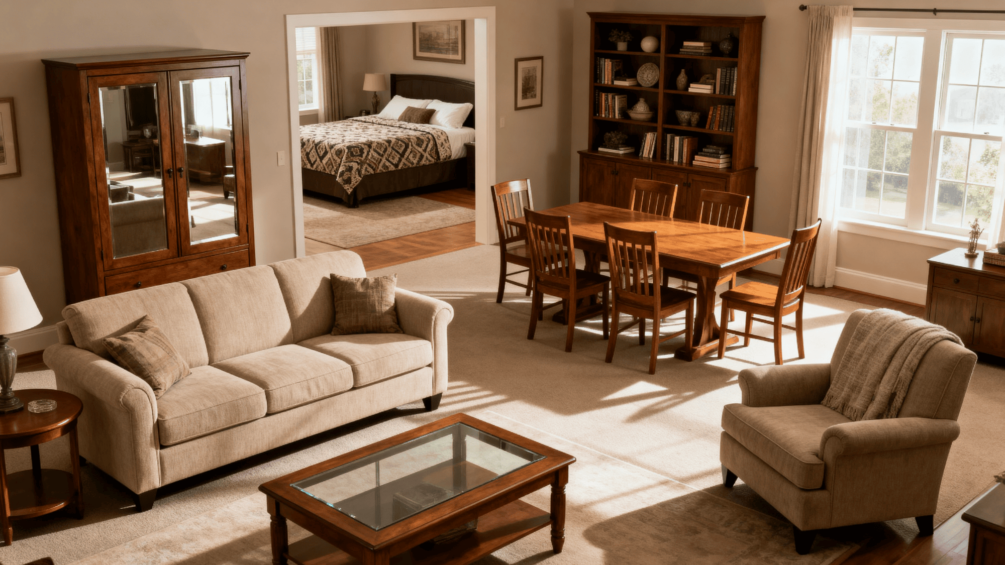
I’ve watched Finnie Gray change its personality throughout the day, and it’s fascinating how different types of light affect this color.
Let me share what I’ve learned about how this paint responds to various lighting conditions.
Natural Light:
In north-facing rooms, I notice Finnie Gray shows its cooler side, bringing out the gray notes.
But don’t worry—those warm undertones still keep the space feeling comfortable. In south-facing spaces, the strong sunlight brings out the mushroom tones, making the walls feel extra cozy.
Morning vs. Evening Light:
During the early hours, the color appears more muted and soft. As sunset approaches, it warms up significantly, taking on richer brown notes that make spaces feel inviting.
Artificial Lighting:
- Cool white LED bulbs make the gray tones more visible
- Warm white bulbs highlight the brown undertones
- Halogen lighting brings out a balanced mix of both qualities
Can Finnie Gray Work in Both Modern and Traditional Spaces?
I always get this question, and the short answer is yes! Let me explain why I’m so confident about this color’s flexibility.
In Modern Spaces: I’ve seen Finnie Gray shine in modern settings where it acts as a sophisticated backdrop.
It pairs beautifully with:
- Clean-lined furniture
- Minimalist decor
- Glass and metal accents
- Black and white artwork
The color’s subtle depth helps soften modern spaces without compromising their fresh feel. I especially love how it makes stainless steel appliances and chrome fixtures stand out.
In Traditional Settings: This shade feels right at home in traditional rooms too.
I often recommend it to people who want to update their traditional space without losing its classic appeal.
It works wonderfully with:
- Wood trim and moldings
- Antique furniture pieces
- Oil-rubbed bronze fixtures
- Rich textiles and patterns
My Real-World Experience: I recently used Finnie Gray in a modern city loft and a colonial-style home.
It created a smooth, current look in the loft and highlighted the architectural details while making the colonial home feel current.
Visual Gallery Featuring Finnie Gray
1. Bedroom
When I painted my client’s bedroom in Finnie Gray, I was struck by how it created such a peaceful atmosphere.
The color feels like a gentle hug in morning light, and as evening comes, it transforms into the perfect sleeping environment. I’ve found that this shade helps my clients feel at ease the moment they walk into their bedrooms.
Mood Board Tips:
- White bedding with soft brown accents
- Natural wood or upholstered headboard
- Light ivory curtains for softness
- Brushed nickel or bronze light fixtures
- Textured throw pillows in cream and taupe
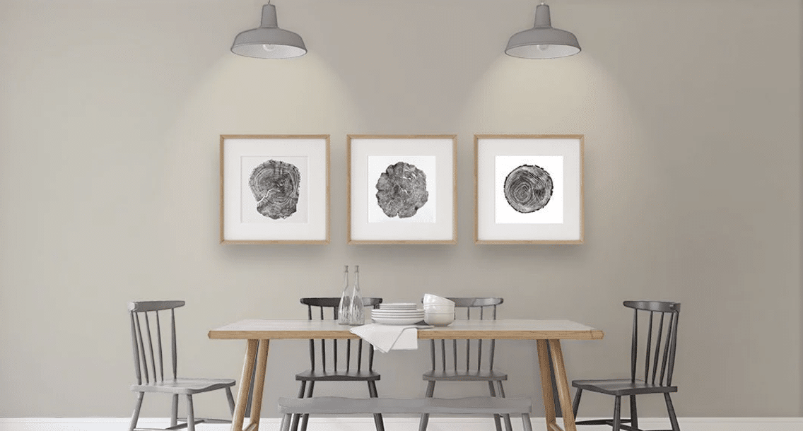
2. Dining Room (the most stunning transformation)
I painted my own dining room in Finnie Gray, and I love how it changes from daytime casual to evening formal. The walls seem to glow during dinner parties, making everyone look their best.
It creates the perfect backdrop for both family meals and special occasions.
Mood Board Tips:
- Dark wood dining table for contrast
- Cream-colored upholstered chairs
- Mixed metal candleholders
- Textured neutral table linens
- Clear glass light fixture
3. Living Room
In my experience, Finnie Gray makes living rooms feel both put-together and lived-in.
Mood Board Tips:
- Ivory or beige sofa
- Natural fiber rug in light tones
- Mix of light and dark wood tables
- White trim for definition
- Brass or bronze lamps
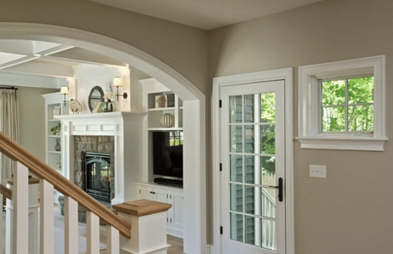
4. Home Entry
I’ve seen this color make smaller entries feel open and larger ones feel welcoming. When I use Finnie Gray in entryways, it sets the perfect tone for the rest of the home.
It always makes a good first impression without trying too hard.
Mood Board Tips:
- Natural fiber runner or rug
- Simple white console table
- Mixed metal mirror frame
- Woven basket for storage
- Warm white lighting
5. Bathroom
The first time I used Finnie Gray in a bathroom, I was amazed by how well it worked with both natural and artificial light.
It creates a spa-like feel while keeping the space warm and inviting. I find it particularly good at making smaller bathrooms feel bigger.
Mood Board Tips:
- White porcelain fixtures
- Natural stone or white tile
- Light wood vanity
- Cream or white towels
- Bronze or nickel hardware
Finnie Gray VS Other Benjamin Moore Grays
Before I share the table, let me tell you why this comparison matters. I’ve tested these colors in many homes, and each has its special qualities.
Let’s look at how Finnie Gray stands up against its closest relatives.
| Paint Color | LRV | Main Undertones | Best Uses | What Makes It Different |
|---|---|---|---|---|
| Finnie Gray | 41.96 | Warm mushroom, brown | All-purpose, versatile spaces | Balanced warmth, middle-range depth |
| Classic Gray | 74.78 | Soft white, slight purple | Bright, open spaces | Much lighter, cooler feel |
| Stonington Gray | 59.0 | Cool blue, slight green | Modern, clean spaces | Cooler, true gray appearance |
| Revere Pewter | 55.51 | Beige, green | Traditional spaces | Greener undertones, lighter |
| Chelsea Gray | 22.16 | Brown, black | Bold accent walls | Much darker, dramatic look |
What This Means For You:
- Pick Finnie Gray when you want a middle-tone neutral that stays cozy
- Choose Classic Gray for spaces that need more light
- Select Stonington Gray for a cooler, more modern look
- Use Revere Pewter when you want a lighter greige option
- Try Chelsea Gray when you need more depth and drama
Paint Your Front Door with Finnie Gray
I painted my front door with Finnie Gray last spring, and I’m still pleased with how it turned out.
Unlike bright colors that might feel too bold, or pure neutrals that fade into the background, this shade gives my entrance its own personality while staying tasteful.
Quick Tips for Best Results:
- Clean door thoroughly with soap and water
- Sand any rough spots
- Use exterior primer made for doors
- Apply 2-3 thin coats
- Let each coat dry fully
I found Finnie Gray pairs wonderfully with:
- White trim
- Brick exteriors
- Stone facades
- Black hardware
- Glass panels
The color looks different as the sun moves across your door throughout the day, but it never loses its warmth.
This makes it a reliable choice for your home’s first impression.
Professional Take on Finnie Gray
As an interior designer, I’ve worked with countless paint colors, but let me share what makes Finnie Gray stand out in professional settings.
I’ve gathered insights from my colleagues and combined them with my own experience.
What Design Experts Say
Sara Matthews, Interior Designer: “I reach for Finnie Gray when clients want a color that feels fresh but not cold. My clients often tell me their rooms feel more complete with this shade.”
Michael Chen, Color Expert: “The balance in this color is what makes it special. It’s not too warm, not too cool – just right for most spaces.”
Professional Tips I Share with Clients:
- Test the paint in different lighting conditions
- Use flat finish for low-traffic areas
- Choose eggshell or pearl for high-traffic spaces
- Paint a large test patch on each wall
- Consider the color of your flooring first
Summing It Up
I started this guide because I know how hard it can be to pick the right neutral paint color.
After walking you through Finnie Gray’s unique qualities, I hope you can see why it’s become one of my most trusted choices.
Remember, what makes this color special isn’t just its warm mushroom undertones or its versatility between styles – it’s how it makes a space feel lived-in and loved. Whether you’re painting a front door or an entire room, Finnie Gray offers that perfect middle ground between classic and current.
Ready to try Finnie Gray in your home? Start with a test patch and watch how it changes throughout the day.
And if you’ve already used this color, I’d love to hear about your experience – drop a comment below!

