Front Entryway Ideas: Doors, Planters, and Address Signs
Walk up to any house and your eye goes to the same three things almost every time: the door, the plants near it, and the house number. If those feel thrown together, the rest of the exterior usually does too. If they look considered, the whole place suddenly feels more pulled together, even if nothing else on the facade has changed in years.
You don’t need a full remodel to get there. A few smart changes to the front door, the planters that frame it, and the way you show your address can completely change how your entry feels when you pull into the driveway.
Why your front entry matters more than you think
The front entry is a small slice of the house, but it does a lot of heavy lifting. Guests look for it first. Delivery drivers rely on it to find you. Buyers, if you’re selling, decide how well the home has been cared for before they ever step inside.
Real estate data backs that up. In one piece of Zillow research on front door colors, certain darker door colors were linked with higher sale prices, which tells you how closely people pay attention to this one surface. That doesn’t mean everyone should rush out and paint their door black. It does mean the front entry is worth as much thought as a kitchen backsplash or a living room rug.
The good news is that most entry upgrades are reversible and relatively inexpensive. Paint can be changed. Planters can move. Signs and numbers can be swapped out if you change your mind. So you can experiment without committing to a full exterior makeover.
Getting the front door right

If you’re not sure where to begin, start with the door. It’s the single biggest block of color at the entry and it usually sets the tone for everything around it.
When you’re thinking about a new door color, don’t start with the paint deck. Start by standing on the sidewalk and really looking at your house. Notice the undertone of the siding or brick, how dark the roof is, and whether there’s stone, tile, or metal that already has a strong color of its own. The door is basically the “headline” sitting in the middle of all that, so it has to make sense with the background, not fight it.
Some houses just ask for softer colors. If you stand back and look at a small cottage with light siding, it often feels more finished when the door doesn’t shout at you—something like a dusty blue, a softened green, or a creamy off-white usually sits nicely. A squarer, more modern facade or a low mid-century ranch can handle more weight on the door, so deep navy, charcoal, or a dark green tends to look intentional rather than overwhelming.
If you’re thinking beyond color—maybe you want to add glass or change the panel layout—the ideas in ahouseinthehills’ guide to innovative vestibule door ideas to transform your entryway are a helpful reference point. Even if you’re not copying any one design, seeing a range of door styles makes it easier to notice what you’re drawn to.
Once the color and style feel settled, pay attention to hardware. A new handle set in a simple, substantial shape can immediately make an older door feel more current. Try to keep the metal finish consistent with nearby fixtures so the entry reads as one composition rather than a mix of shiny bits.
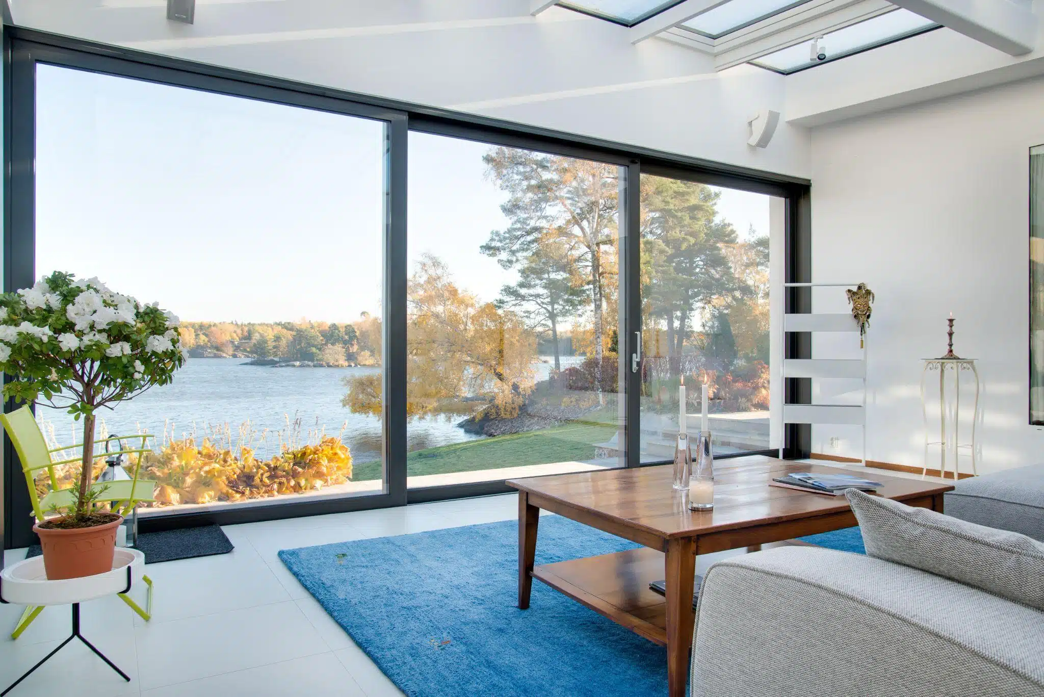
Front entryway ideas with planters and greenery
After the door, plants are usually the next thing people notice. They soften hard edges, add life, and help the entry feel like a gentle transition rather than a hard stop.
You don’t need complicated landscaping to get a good result. Often, one or two planters are enough. Taller houses or wider steps can handle a pair of generous containers flanking the door. Small stoops or narrow walkways may look better with a single planter off to one side so people aren’t forced to squeeze past foliage.
Before you start grabbing whatever looks pretty on a garden rack, think about what will actually survive on your porch. A plant that’s happy in a mild coastal yard might fry on a hot driveway in Arizona or freeze out in the Midwest. The USDA Plant Hardiness Zone Map breaks the country into zones based on winter lows, so it gives you a quick gut check on what has a chance of living in your pots. Once you know your zone, you can pick a couple of tough “backbone” plants—small evergreens, dwarf shrubs, or sturdy grasses—and then use seasonal flowers as the fun extras you swap in when you feel like a change.
If you like a bit of seasonal drama, mums in fall, branches in winter, and annuals in summer all work well in the same basic container. The porch ideas in ahouseinthehills’ article on creative ways to use mums on your front porch this year are a good reminder that you can repeat a simple idea a few different ways and it will still feel intentional, not fussy.
One practical note: be honest about how much plant care you’ll actually do. If you travel a lot or don’t enjoy watering, skip the thirsty annuals and go for hardy evergreens, grasses, or even a well-made faux option. A clean, empty planter is fine. A planter full of dead plants makes the whole entry feel neglected.
Lighting, hardware, and address signs that actually work
Once the big moves are in place, the details start to matter. Lighting, hardware, and address signs do two jobs at once: they make the entry look finished and they help people find the house.
With lighting, size is where most people go wrong. Fixtures that look huge in the store can disappear on a tall facade. A common rule of thumb from lighting pros is to choose wall lights roughly one-quarter to one-third the height of the door and hang them so the center of the bulb sits near eye level at the entry. That proportion tends to look balanced on most standard-height porches. Matching the metal finish to your door hardware makes it feel like a deliberate set.
Most people treat house numbers as an afterthought, but they matter more than you’d think. Picture a friend driving over for the first time, or a delivery driver at night in the rain. If they have to slow to a crawl and lean over the wheel to guess which house is yours, the numbers aren’t doing their job.
Go bigger than you think you need, and don’t be shy about contrast. Dark numbers on light siding, or the reverse, are much easier to spot from the street. On boxy, mid-century or more modern homes, plain block numbers often look right and are easy to read. If your place is older or more traditional, you can get away with a bit of curve or script, but if you have to stare at it to figure out whether that’s a 3 or an 8, it’s the wrong style.
If you’re thinking about a plaque or a full address panel, it’s worth scrolling through examples of modern exterior signage first instead of guessing. Notice which materials you’re drawn to, how far the numbers sit off the wall, and how they’re fixed in place; that little bit of depth throws a shadow that makes the numbers easier to read and quietly makes the entry feel more custom.
After everything is installed, walk across the street or down the block and look back. Check daytime visibility and then again after dark when the lights are on. If a tree, railing, or parked car hides the numbers from view, consider adding a secondary set of smaller numbers closer to the street, on a fence or post, to back up the main sign.
Rugs, decor, and the moment you step inside

The last layer is the one people physically interact with: the rug underfoot and any decor that lives on or around the door.
A mat that fits properly under the door width—rather than a tiny one floating in the middle—helps anchor the entry and catches dirt before it gets inside. Some people like to layer a flat-woven outdoor rug under a smaller doormat for pattern and color. That can look great as long as the scale is right and you’re willing to keep both pieces clean.
It’s tempting to load up this area with wreaths, multiple wall signs, and a lot of small accessories. Usually, less reads as more high-end. One wreath or door hanger, one doormat, and one or two planters is enough for most houses. If you want a big statement, focus on scale over quantity: a single oversized pot, a large wreath, or a substantial lantern will do more than a handful of small items.
If you’re thinking about changes beyond the immediate doorway—new trim colors, updated railings, or a different treatment for the front steps—the ideas in ahouseinthehills’ roundup of amazing house facade ideas to try are useful for zooming out. Seeing the whole front as one composition makes it easier to decide which entry details to keep simple and which ones can afford a bit of personality.
Pulling your front entryway ideas together
When you look at front entries that really feel “done,” it’s usually not because there’s a ton of stuff on the porch. It’s the basics that are right. The door color makes sense with the rest of the house, the plants don’t fight the climate or overwhelm the steps, the lights are the right size for the space, and the house numbers are easy to spot from the street. Once those pieces are working together, everything else—wreaths, seasonal decor, the exact pot shape—starts to feel more like fun styling than a way to cover up problems.
And you don’t have to fix all of it at once. Go stand out by the curb and pay attention to what bugs you first. Is it the faded door? The empty concrete by the steps? The numbers you have to squint to read? Choose that one thing and deal with it before you worry about the rest.Give the door a new color, add one good planter, or swap the numbers for something bigger and clearer. Then let it sit. See how it feels when you come home a few days in a row.
If you keep making small changes like that, the entry will slowly shift. The front of the house starts to feel more settled, guests stop texting you for directions, and even delivery drivers find you without looping the block. It’s not a dramatic HGTV reveal, but one day you’ll walk up the path and think, “Okay, this finally looks like my place.”