Repose Gray vs Agreeable Gray: Best Pick for Walls
I know how tough it can be to settle on a paint color when two shades look almost the same. That’s exactly the case with Repose Gray vs. Agreeable Gray.
Both are popular, both are versatile, and both can significantly alter the feel of your home, depending on the light and finishes.
Beyond just color, it also helps to understand the different Sherwin-Williams paint grades, since quality levels can affect how well a project holds up.
In this post, I’ll share what I’ve learned about how these colors differ, where each works best, and what to watch for.
My goal is to help you decide which one makes the most sense for your space so you don’t waste time second-guessing
Understanding Repose Gray and Agreeable Gray
These two shades may seem close at first glance, but they behave differently once you consider lighting, finishes, and room layout.
Here’s a detailed breakdown of each color:
Repose Gray (SW 7015) by Sherwin-Williams
Repose Gray sits slightly deeper on the scale, offering a crisp gray appearance with faint taupe and green undertones. Compared to Agreeable Gray, it leans cooler, giving it a cleaner and more modern feel.
This shade works particularly well in contemporary spaces, kitchens, and bathrooms where a subtle yet refined backdrop is desired.
Basic Color Profile
- HEX code: #CCC8C1
- LRV (Light Reflectance Value): 58
- Color Family: Neutral gray with slight taupe and green undertones
Its appeal comes from its fresh, polished look. But in low-light rooms, the depth can make it feel a bit darker, so it’s best tested before committing.
Agreeable Gray (SW 7029) by Sherwin-Williams
Agreeable Gray is a light taupe-gray that feels warm and steady across most lighting conditions. It has become one of Sherwin-Williams’ most used neutrals because of its ability to adapt to nearly any style or setting.
It brings a soft and balanced tone, making it a popular pick for open layouts, bedrooms, and full-home applications.
Basic Color Profile
- HEX code: #D1CBC1
- LRV (Light Reflectance Value): 60
- Color Family: Warm taupe-gray with subtle beige undertones
Its strength lies in consistency; it rarely shifts dramatically under different light sources. However, in dim or north-facing rooms, it can sometimes appear a little flat without contrasting accents.
Quick Comparison at a Glance

Choosing between these two shades comes down to subtle undertones, brightness, and the atmosphere you want your space to reflect.
| Feature | Agreeable Gray (SW 7029) | Repose Gray (SW 7015) |
|---|---|---|
| LRV | 60 – slightly brighter | 58 – a touch deeper |
| Undertones | Warm taupe with beige | Neutral gray with faint green/taupe |
| Mood | Soft, inviting, adaptable | Crisp, calm, refined |
| Best Style Fit | Farmhouse, transitional, full-home use | Modern, contemporary, minimalist settings |
Takeaway: Agreeable Gray offers warmth and consistency, while Repose Gray gives a cleaner, cooler backdrop with subtle depth.
How Lighting Affects Them
Lighting has a major impact on how these shades appear. In bright daylight, Agreeable Gray stays light and balanced, while Repose Gray may lean slightly cool with a faint green or taupe cast.
Under warm evening light, Agreeable Gray feels cozier and more inviting, whereas Repose Gray sharpens into a crisp backdrop. In low light, Agreeable Gray holds its tone better, while Repose Gray can appear darker.
Style-wise, Agreeable works well in warm, family-focused spaces, while Repose brings a modern edge. For pairing, Agreeable loves warm trim, brass, and wood, while Repose matches crisp whites, navy, or cool-toned accents.
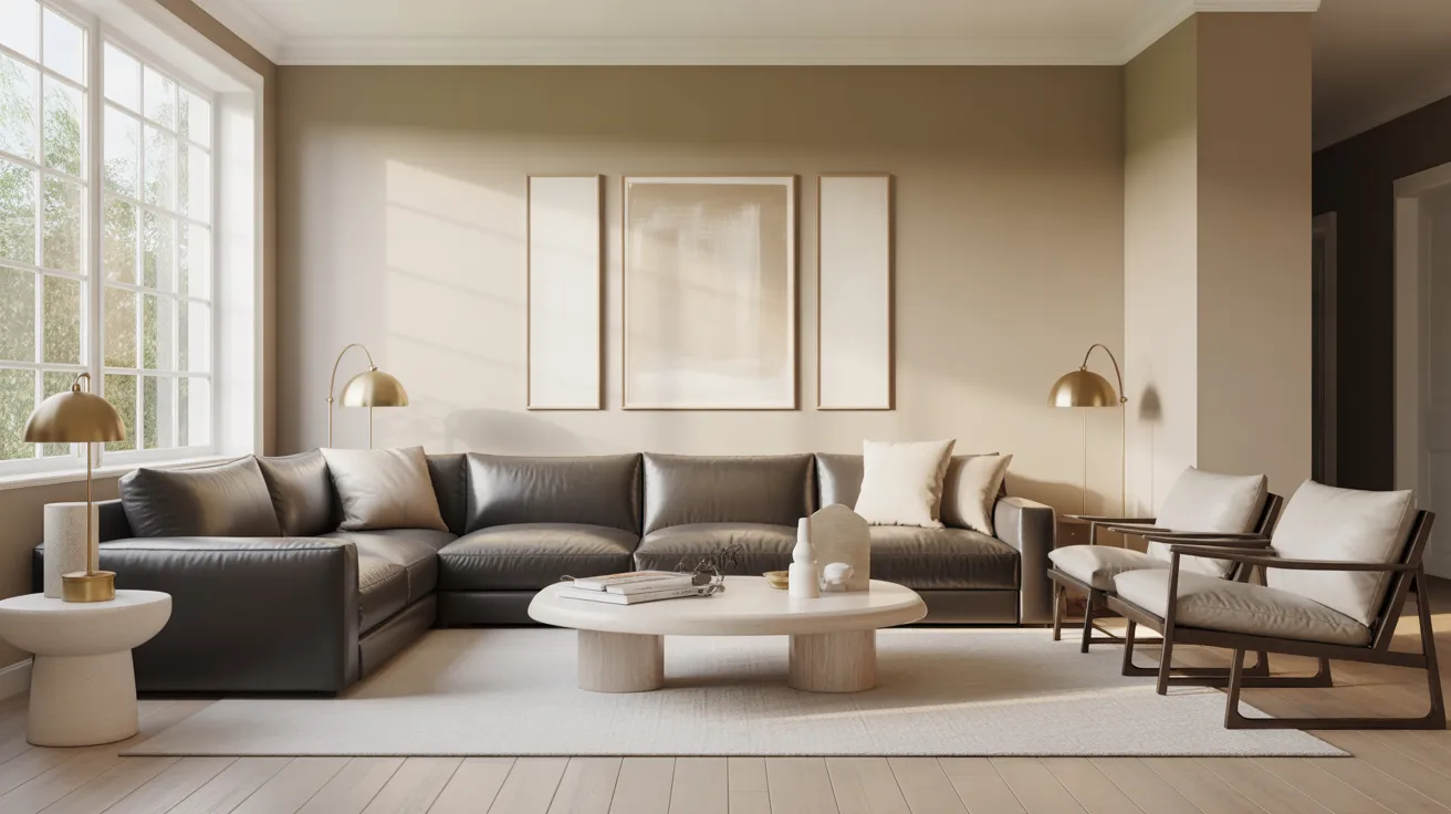
Rooms Where Each Color Works Best
These two neutrals adapt differently across spaces, making room size, natural light, and décor style important factors in the final choice.
Living Areas

Agreeable Gray makes living rooms feel open and inviting, especially in shared spaces with varied lighting conditions. Repose Gray works better for sleek layouts, art displays, or contemporary furniture.
Both shades provide versatility, but Agreeable leans warm while Repose gives a more modern finish.
Bedrooms

Agreeable Gray offers a soft, restful tone that blends with light bedding and layered textures. Repose Gray feels calmer and sharper, great for minimalistic bedrooms or paired with white furniture.
If you prefer warmth, go with Agreeable; for crisp refinement, Repose shines.
Kitchens

Agreeable Gray keeps kitchens bright, especially with white cabinets and light countertops, giving balance without overwhelming. Repose Gray creates contrast against cool fixtures and works beautifully with stainless steel.
For cozy farmhouse kitchens, choose Agreeable; for clean, modern kitchens, Repose is the better match.
Bathrooms

Agreeable Gray delivers comfort in bathrooms, balancing well with warm fixtures and creams. Repose Gray creates a spa-like atmosphere when paired with crisp whites and chrome.
If your bathroom is smaller or dim, Agreeable lifts the space; Repose fits best with larger, brighter bathrooms.
Exteriors

Repose Gray performs beautifully on exteriors, holding depth against strong sunlight and pairing with stone or brick.
Agreeable Gray can appear lighter outdoors but works well in shaded areas, on trim, or porches. Choose Repose for a classic, grounded look, and Agreeable for softer outdoor applications.
When Not to Use Each Shade
Agreeable Gray may not perform well in north-facing or dimly lit rooms, where it can appear flat without contrasting accents. It also feels too warm in very modern spaces that rely on crisp lines and cooler finishes.
Repose Gray, on the other hand, can appear too dark in small rooms or areas with little natural light.
For households with kids or pets, Agreeable’s softer tone hides everyday marks more effectively, while Repose requires more upkeep to maintain its fresh look.
Repose Gray and Agreeable Gray Alternatives to Consider

If Repose Gray or Agreeable Gray aren’t quite right, several alternatives provide similar versatility and neutral appeal for modern spaces.
| Brand | Color Name | Code | LRV | Undertone | Description |
|---|---|---|---|---|---|
| Sherwin-Williams | Agreeable Gray | SW 7029 | 60 | Warm greige, subtle taupe | Best-selling greige, balanced warmth |
| Sherwin-Williams | Repose Gray | SW 7015 | 58 | Cool gray, soft beige | Calm modern gray, subtle cool touch |
| Sherwin-Williams | Accessible Beige | SW 7036 | 58 | Beige, yellow-green | Cozy and warm, slightly traditional |
| Benjamin Moore | Classic Gray | OC-23 | 74 | Soft warm gray | Airy, barely-there warmth |
| Behr | Silver Drop | 790C-2 | 69 | Light cool gray | Crisp, light, and flexible |
These alternatives provide slightly different undertones and light reflectance, allowing tailored choices for any home’s lighting and décor.
Conclusion
After comparing Repose Gray vs. Agreeable Gray, I’ve realized it’s not about one being better, but about what feels right in your home.
Agreeable Gray leans warmer and forgiving, while Repose Gray adds a cleaner, cooler edge. I’d suggest trying both on your walls, even in small swatches, to see how they behave in your light.
I’ve used this same approach in my own projects, and it always makes the choice easier.
If you’re still curious about other shades, I’ve covered plenty of color comparisons that might help you find the exact match you’re looking for.