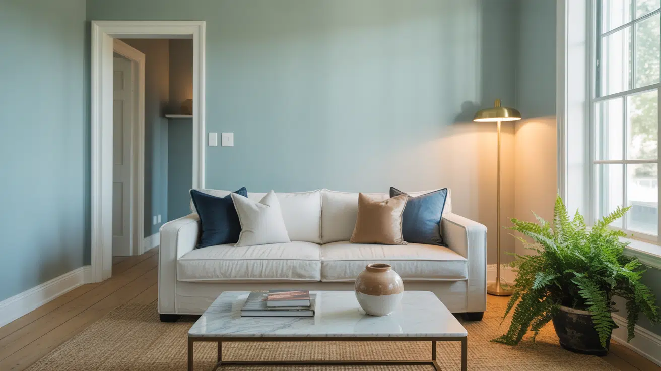
Reviewing Benjamin Moore Boothbay Gray (HC-165)
Looking for the perfect gray paint that works in any room? Boothbay Gray by Benjamin Moore might be your answer. In this guide, I’ll walk you through everything you need to know about this versatile shade.
After testing dozens of grays in my work as a home decorator, I’ve found that Boothbay Gray is uniquely adaptable. It shifts beautifully with different lighting and complements almost any decor style.
Whether you’re painting a cozy bedroom or a bright kitchen, I’ll show you exactly how this color can work in your space.
You’ll learn the best lighting conditions for this shade, ideal color pairings, and real examples from homes I’ve worked on.
Plus, I’ll share honest tips about when this color might not be your best choice. No marketing fluff – just practical advice from years of hands-on experience with this remarkable paint color.
What Makes Boothbay Gray (HC-165) Unique?

1. A Color That Changes With Light
Let me tell you what sets Boothbay Gray apart from other grays I’ve worked with. This isn’t just another gray paint – it has some special traits that make it stand out.
2. The Chameleon Effect
First, it’s a chameleon color. In the morning light, it appears soft and warm. By afternoon, it takes on cooler, bluer tones. I love how it shifts throughout the day while staying subtle and balanced.
3. Not Your Typical Gray
Here’s what makes it different from typical grays:
Unlike most grays that lean heavily warm or cool, Boothbay Gray sits right in the middle. It has just enough blue to feel fresh but enough warmth to keep rooms cozy.
Think of it as the “Goldilocks” of grays – not too warm, not too cool, but just right.
4. The Natural Connection
You might notice a hint of green in certain lights. Don’t worry – this actually helps it blend beautifully with both indoor plants and outdoor views. In my experience, this subtle green undertone makes rooms feel more connected to nature.
5. Versatility at Its Best
The best part? You won’t have to repaint when you change your decor. I’ve seen this color work equally well with modern furniture, traditional pieces, and everything in between. It’s like having a neutral that’s anything but boring.
Ideal Spaces for Boothbay Gray
1. Living Rooms & Family Spaces
I’ve found Boothbay Gray shines in large gathering spaces. It creates a welcoming backdrop that doesn’t compete with your furniture or artwork. The color feels especially cozy when paired with natural wood tones and soft textures.
2. Home Offices
Want a focused workspace without feeling closed in? This shade provides just enough color to keep your office interesting while maintaining the professional vibe you need. I love how it looks with white built-ins and dark wood desks.
3. Bedrooms
In bedrooms, Boothbay Gray creates a serene retreat. The color’s subtle shifts throughout the day help maintain a peaceful atmosphere from dawn to dusk. It works particularly well with crisp white bedding and brass accents.
4. Open-Concept Areas
Here’s where this color really proves its worth. If you’re painting connected spaces, Boothbay Gray helps rooms flow together naturally. I’ve used it to unite kitchens, dining areas, and living rooms without making the space feel monotonous.
5. Sun Rooms
The green undertones in Boothbay Gray make it perfect for rooms that connect with the outdoors. It picks up natural light beautifully and helps bring the outside in – especially when surrounded by windows.
6. Kitchen & Dining Areas
In kitchens, this color provides a sophisticated backdrop for both white and dark cabinets. It’s also forgiving of food splatters and daily wear, which makes it practical for busy cooking spaces.
How to Use Boothbay Gray with Other Benjamin Moore Shades
1. Light Pairings
I’ve discovered that Boothbay Gray plays beautifully with White Dove and Cloud White. These soft whites enhance its depth without creating harsh contrast. For trim work, I often reach for Simply White – it brings out the color’s warmth while keeping things fresh.
2. Deeper Companions
Want to add some drama? Hale Navy is my go-to dark accent with Boothbay Gray. They share similar undertones, creating a natural flow. For built-ins or kitchen islands, try Iron Mountain – it adds weight without overwhelming the space.
3. Coordinating Colors
Here’s a combination I often recommend to my clients: Use Boothbay Gray on main walls, Gray Owl in connecting spaces, and Sea Salt for subtle accents. These colors share similar undertones but each brings its own personality to your space.
4. Statement Combinations
When clients want more impact, I pair Boothbay Gray with Revere Pewter and Kendall Charcoal. This creates a sophisticated color story that moves from light to dark while maintaining harmony.
5. Coastal Connections
For a beachy vibe that’s not cliché, try combining Boothbay Gray with Beach Glass and White Sand. These colors mirror natural coastal elements without going overboard on the theme.
Why Choose Benjamin Moore Boothbay Gray?
1. A True Problem-Solver
You know that frustrating search for a gray that doesn’t look too blue, too brown, or too purple? I’ve been there. After testing countless grays in different homes, I can tell you that Boothbay Gray solves this common paint dilemma.
2. Quality That Shows
Not all paint formulas are created equal. The Benjamin Moore Aura and Regal Select lines give Boothbay Gray exceptional coverage and durability. I’ve seen it hold up beautifully in high-traffic areas where other paints would show wear.
3. Lighting Flexibility
Most grays can look great in the perfect light, but Boothbay Gray stays true across different lighting situations. Whether you have north-facing windows or lots of artificial light, this color maintains its integrity. This adaptability means fewer surprises after painting.
4. Designer-Approved
As someone who works with color daily, I appreciate how this shade balances undertones. It’s become a go-to recommendation for clients because it rarely disappoints.
The color has enough personality to be interesting but remains neutral enough for long-term satisfaction.
5. Real-Life Performance
Here’s what matters in actual use: Boothbay Gray hides wall imperfections well, touches up easily, and doesn’t show roller marks like some other grays. These practical benefits make it a smart choice for busy households.
6. Worth the Investment
While Benjamin Moore paints aren’t the cheapest option, Boothbay Gray’s versatility means you won’t need to repaint if you change your decor. In my experience, it’s a color choice you won’t regret.
How to Incorporate Boothbay Gray into Your Home
1. Start Small
If you’re unsure about going all-in, I recommend starting with a single room. Maybe paint your guest bathroom or home office first.
This lets you live with the color and see how it performs in your space before making a bigger commitment.
2. Test Properly
Here’s my tried-and-true testing method:
Paint large sample squares (at least 2×2 feet) on different walls in your room. Watch how the color changes throughout the day. Take photos in different lighting conditions. This extra effort prevents expensive mistakes.
3. Consider Flow
Think about sightlines between rooms. I often suggest using Boothbay Gray in spaces that connect visually. It creates a cohesive feel without having to paint your entire home the same color.
4. Layer Your Lighting
The beauty of this color really comes through with proper lighting. Mix your light sources – natural light, overhead fixtures, and table lamps.
I’ve found this layered approach helps Boothbay Gray show its full range of subtle variations.
5. Add Depth with Textures
Boothbay Gray looks even better when you pair it with varied textures. Try:
- Natural woven baskets
- Plush velvet pillows
- Nubby wool throws
- Smooth ceramic lamps
- Textured wall art
6. Balance with Wood Tones
Don’t forget about your wood elements. Boothbay Gray works with most wood tones, but I especially love it with medium oak or walnut finishes. These warm woods help ground the space and add natural warmth.
Wrapping Up: Is Boothbay Gray Right for You?
Throughout my years working with paint colors, I’ve learned that finding the perfect gray is deeply personal – yet Boothbay Gray has proven itself time and again as a remarkably versatile choice.
Its ability to adapt to different lighting conditions, complement various decor styles, and create a welcoming atmosphere makes it stand out in Benjamin Moore’s impressive lineup of grays.
Whether you’re updating a single room or planning a whole-house color scheme, Boothbay Gray offers that rare combination of sophistication and livability.
It’s a color that works hard but doesn’t demand attention, creating spaces that feel both fresh and timeless. From my experience, this is more than just another gray – it’s a color that can grow with you and your home’s evolving style.
Remember, though, that the best way to know if Boothbay Gray is right for your space is to test it properly. Take time with samples, observe the color in different lights, and trust your instincts. After all, a color that makes you feel at home is always the right choice.
Frequently Asked Questions
Is Boothbay Gray too dark for a small room?
Not in my experience. While it’s a medium-toned gray, it has enough lightness to work in compact spaces. The key is adequate lighting.
I’ve used it successfully in small home offices and powder rooms. Just make sure your room has good natural or artificial light to let the color breathe.
How does Boothbay Gray compare to Gray Owl?
Though both are popular Benjamin Moore grays, they have distinct personalities. Boothbay Gray is slightly deeper and has more blue-green undertones, while Gray Owl is lighter with cooler undertones.
I find Boothbay Gray more versatile with varying light conditions, whereas Gray Owl can sometimes appear more silvery.
Do I need special lighting for Boothbay Gray?
No, that’s one of its strengths. While all paint colors look different under various lighting conditions, Boothbay Gray maintains its character under most lighting situations.
However, I recommend using LED bulbs in the 2700K-3000K range for the most flattering results.
Will Boothbay Gray work with my existing beige furniture?
Yes! This is one of my favorite things about this color. Despite its gray base, Boothbay Gray plays well with beige tones because of its warm undertones.
I’ve paired it successfully with everything from cream sofas to tan leather chairs.
How many coats of Boothbay Gray will I need?
Using Benjamin Moore’s premium lines (Aura or Regal Select), you’ll typically need two coats for perfect coverage. If you’re painting over a dark color or using a lower-grade paint, you might need three coats.
Always use a quality primer first – it makes a huge difference in the final result.