How Does Manchester Tan (HC-81) Compare to Other Neutrals?
So you’re staring at paint swatches, wondering if Manchester Tan is the right neutral for your space.
Trust me, I’ve been there – and I’ve spent countless hours comparing it with other popular neutrals like Revere Pewter, Edgecomb Gray, and Swiss Coffee.
In this guide, I’ll show you exactly how Manchester Tan stacks up against other neutral paint colors. You’ll learn:
- What makes Manchester Tan unique
- How it change in different lighting
- Which rooms it works best in
- Real-life examples from actual homes
As someone who’s used Manchester Tan in three different rooms (and made plenty of paint mistakes along the way), I’ll help you avoid the confusion of picking the wrong neutral.
No more second-guessing or wasting money on sample pots that aren’t quite right.
Let’s find out if Manchester Tan is your perfect neutral.
What is Manchester Tan (HC-81)?

1. Basic Details
Manchester Tan (HC-81) is a warm, neutral paint color from Benjamin Moore’s Historic Collection. I’d describe it as a light beige with subtle green undertones that peek through in certain lights.
2. What Makes It Different
Here’s what makes it special: Unlike stark whites or heavy beiges, Manchester Tan sits right in the sweet spot. It’s light enough to brighten a room but has enough depth to create warmth.
3. Real-World Description
The color reminds me of creamy coffee with a splash of milk. But don’t let that fool you – it’s more sophisticated than your average beige.
4. Technical Specs
Let’s break down its characteristics:
- Light Reflectance Value (LRV): 64.41
- Undertones: Soft green and yellow
- Intensity: Light to medium
- Temperature: Warm, but not too warm
5. Everyday Use
Think of it as the “goldilocks” of neutrals. It’s not too warm, not too cool, and not too anything – which is exactly why it works in so many spaces.
You’ll often spot it in living rooms, hallways, and even kitchens, where it plays nicely with both natural and artificial light.
Where Does Manchester Tan Work Best?
1. Living Spaces
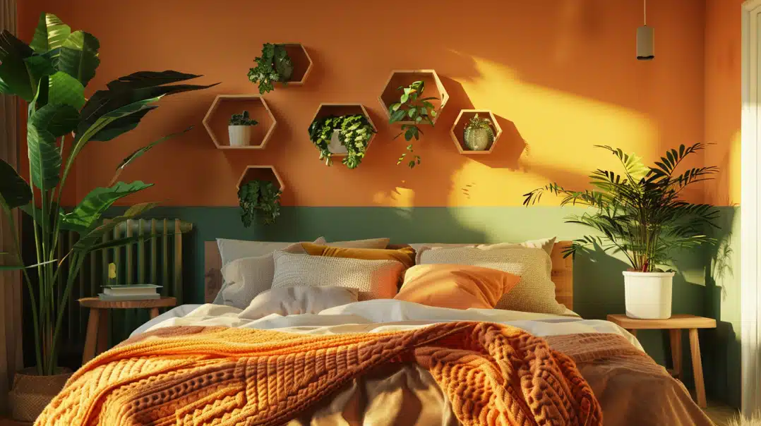
I’ve found Manchester Tan shines brightest in living rooms and family rooms. Its warm undertones create a cozy vibe without making the space feel cramped. You’ll love how it softens harsh afternoon light but still keeps the room bright.
2. Connecting Areas
Here’s a secret: Manchester Tan is a champion in hallways and open floor plans. It flows seamlessly from room to room, creating a sense of continuity. I used it in my own hallway, and it made the space feel wider and more welcoming.
3. Kitchen Magic
Don’t overlook your kitchen! Manchester Tan plays nicely with:
- White cabinets
- Wood tones
- Stainless steel appliances
- Marble or granite countertops
4. North-Facing Rooms
Got a room that feels cold and unwelcoming? This color can help. The warm undertones balance out the cooler northern light, making the space feel more inviting.
5. Home Offices
In home offices, it creates a focused environment without feeling sterile. The neutral backdrop helps reduce eye strain during long workdays, and it won’t compete with your video call background.
6. Where to Skip It
Be careful in south-facing rooms that get tons of direct sunlight – it can wash out and look a bit too yellow. Also, if you’re after a crisp, modern look, you might want to consider a cooler neutral instead.
What Colors Go Well With Manchester Tan?
1. Best White Pairings
White Dove and Simply White are my top picks for pairing with Manchester Tan. They create clean trim and molding contrasts without looking harsh. I’ve seen this combo in countless homes, and it never fails to look polished.
2. Natural Wood Tones
I’ve learned that Manchester Tan is incredibly friendly with wood finishes. It works with:
- Rich walnut
- Warm oak
- Light maple
- Dark mahogany
- Weathered driftwood
3. Accent Colors
Want to add some personality? These colors play especially well:
- Navy blue for classic sophistication
- Sage green for a natural flow
- Deep burgundy for warmth
- Charcoal gray for modern contrast
- Soft blue for a coastal vibe
4. Metallic Finishes
The neutral base of Manchester Tan makes it a perfect backdrop for hardware and fixtures. It pairs beautifully with:
- Brushed nickel
- Aged brass
- Oil-rubbed bronze
- Polished chrome
- Matte black
5. Colors to Avoid
Skip bright, tropical colors as accents – they’ll fight with Manchester Tan’s subtle warmth. Also, stay away from pure bright white trim, as it can make the tan look muddy in comparison.
6. Foolproof Combinations
My favorite no-fail combo is Manchester Tan walls, White Dove trim, and navy blue accents. This trio creates a timeless look that works in any room of your house.
How to Incorporate Manchester Tan in Your Home
1. Start Small
I always tell people to test Manchester Tan in one room first. Try it in a guest bedroom or home office – spaces where you can really get a feel for how it behaves in different lights. Paint a large sample board and move it around the room throughout the day.
2. Layer Your Neutrals
Here’s a designer trick:
Build depth by using Manchester Tan as part of a neutral palette. Try,
- Lighter tans for ceilings
- Darker beiges for accent walls
- Creamy whites for trim
- Gray-beige for furniture
3. Textural Elements
The color really comes alive when you add texture. I’ve seen it work beautifully with:
- Natural fiber rugs
- Linen curtains
- Woven baskets
- Textured throw pillows
- Chunky knit blankets
4. Lighting Considerations
Your lighting choices can make or break this color. Use both:
- Natural light through clean windows
- Warm LED bulbs (2700-3000K) for fixtures
5. Room-by-Room Tips
In the living room, use Manchester Tan as your base and add layers through artwork and accessories. For bedrooms, pair it with soft textiles for a calming retreat. In kitchens, let it complement your countertops and backsplash without competing.
Customer Reviews and Real-Life Examples
1. From a First-Time Painter
“I was nervous about choosing a neutral that wasn’t white. After trying Manchester Tan in my living room, I wish I’d found it sooner. It’s warm without being yellow and makes my space feel so welcoming. Even my husband, who didn’t care about paint colors, noticed the difference.” – Sarah M.
2. The Open Floor Plan Test
I spoke with Lisa, an interior designer who used Manchester Tan in a complete home makeover: “My client wanted one color to flow through their entire first floor. Manchester Tan was perfect – it looked elegant in the dining room, cozy in the family room, and brightened up the dark hallway. It’s been three years, and they still love it.”
3. Real Estate Agents Take
Worth noting: “When preparing homes for sale, I often recommend Manchester Tan. It appeals to most buyers and photographs beautifully. Plus, it helps buyers envision their furniture in the space.” – Mark R., Realtor
4. A Practical Review
Here’s a helpful perspective from a homeowner with kids and pets: “We needed something that could handle real life. Manchester Tan hides minor scuffs well, and when we do need to touch up, it blends seamlessly. It’s been on our walls for two years and still looks fresh.”
5. Before and After Results
Jamie documented her kitchen transformation:
- Before: Dark beige walls made her kitchen feel dated
- After: Manchester Tan brightened the space and made her cabinets pop
- Bonus: Her white appliances blend in better now
6. The Bottom Line
The most common feedback I hear? “It’s the perfect neutral that doesn’t feel boring.” That’s exactly what makes Manchester Tan a reliable choice for any home style.
Final Thoughts
After diving deep into Manchester Tan’s characteristics, best pairings, and real-world applications, it’s clear why this Benjamin Moore classic has stood the test of time.
From brightening dark hallways to creating cozy living spaces, its versatility makes it a reliable choice for any home. While it may not be the perfect fit for every space (particularly those sun-drenched south-facing rooms), its warm undertones and adaptable nature make it a standout among neutral paint colors.
What I appreciate most about Manchester Tan is its ability to provide warmth without overwhelming a space – it’s like having the perfect supporting actor who makes everyone else look better.
Whether you’re updating a single room or planning a whole-house color scheme, Manchester Tan offers that elusive balance of warmth and sophistication that so many homeowners seek.
Remember to always test your paint samples in your specific space, as lighting can significantly impact how this color is present in your home.
Frequently Asked Questions
Is Manchester Tan too yellow?
No, Manchester Tan isn’t too yellow – it’s actually a balanced beige with subtle green undertones. While it can show a hint of warmth in strong southern light, it generally stays true to its neutral nature.
If you’re concerned, I recommend testing it on multiple walls, as its appearance can shift throughout the day.
How does Manchester Tan compare to Revere Pewter?
Manchester Tan is lighter and warmer than Revere Pewter. While both are versatile neutrals, Revere Pewter has stronger gray undertones and a lower LRV (55.1 compared to Manchester Tan’s 64.41). I often suggest Manchester Tan for spaces where you want a brighter, warmer feel.
Can I use Manchester Tan in a bathroom?
Absolutely! Manchester Tan works well in bathrooms because it maintains its warmth even under artificial lighting. It pairs beautifully with white tiles and fixtures,
and its light reflectance value helps brighten smaller bathroom spaces. Just ensure you use the proper bathroom paint finish for moisture resistance.
Will Manchester Tan make my room look dated?
Here’s the truth: While Manchester Tan has been around for years, it’s remained popular because it’s timeless rather than trendy.
Its neutral profile works with both traditional and contemporary decor. The key is pairing it with current accessories and furnishings to keep the overall look fresh.
Does Manchester Tan work with gray furniture?
Yes, Manchester Tan plays surprisingly well with gray furniture, especially warmer grays or greiges. The color’s subtle warmth can actually help soften stark grays and create a more cohesive look.
I’ve seen it work particularly well with charcoal and taupe-gray pieces.