Benjamin Moore Gentle Gray: A Designer’s Favorite
I’ll show you everything you need to know about Benjamin Moore’s Gentle Gray – a pale blue shade with a soft gray touch that creates calming spaces in any home.
I’ve tested this paint color in various lighting conditions and room styles, and its Light Reflectance Value of 57.2 makes it incredibly flexible. It’s become one of my top recommendations for clients who want a neutral that isn’t boring.
Let’s look at what makes this color so special and how you can use it in your home.
Benjamin Moore’s Gentle Gray: Color Profile
Let me tell you about Benjamin Moore’s Gentle Gray – it’s quite different from what its name suggests.
When I first saw this color, I noticed it’s actually a pale blue with a subtle gray influence, rather than a true gray.
The blue shows itself most clearly in natural daylight, giving rooms a fresh, clean feeling.
I’ve noticed the gray elements help soften the blue, making it less obvious and more subtle.
This mix creates a color that changes throughout the day – sometimes appearing more blue, other times showing its gray side.
The Light Reflectance Value (LRV) of 57.2 tells an important story.
This number means the color sits right in the middle range – not too light, not too dark. I’ve found this makes it bright enough to open up smaller spaces while still providing enough color to stand out in larger rooms.
In my experience with this shade, here’s what affects how it looks:
- Morning light brings out the blue notes
- Evening light emphasizes the gray aspects
- Artificial lighting can make it appear slightly warmer
The color works nicely with pure whites, creating clean transitions between walls and trim.
I often suggest this combination to my clients who want something subtle but still interesting.
Benjamin Moore Gentle Gray in Bedroom (my top suggestion)
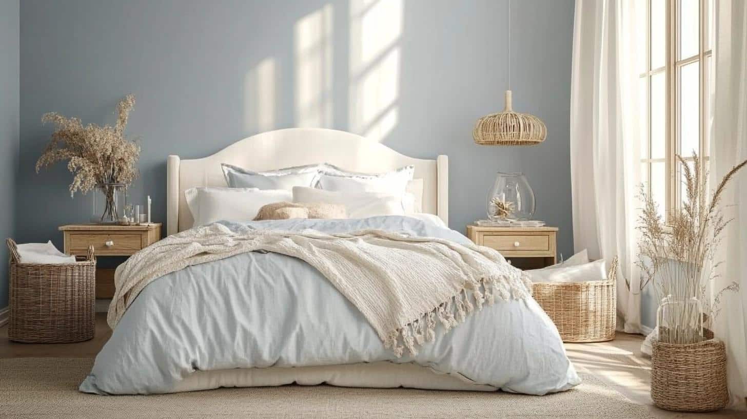
When I first painted my guest bedroom with Gentle Gray, I watched the color change like a chameleon throughout the day.
- In the morning sunlight, it shows its blue side – soft and fresh like early dawn.
- By midday, it balances perfectly between blue and gray, creating a calm backdrop for rest.
- The evening brings out its gray notes, which I find perfect for winding down.
I placed my bed against the Gentle Gray wall, and the color makes both dark and light bedding stand out beautifully.
Mood Board Tips for Bedroom:
Bedding Layers:
- White cotton sheets as base
- Light gray duvet cover
- Cream throw blankets
- Mix of white and blue pillowcases
Furniture Pairings:
- Light oak bedside tables
- White-painted dresser
- Natural wood bench at bed’s foot
- White upholstered headboard
Window Treatments:
- White linen curtains
- Light wood blinds
- Simple white curtain rods
Accessories:
- White ceramic table lamps
- Clear glass water carafe
- White picture frames
- Natural fiber baskets
House Entry Featuring Benjamin Moore Gentle Gray
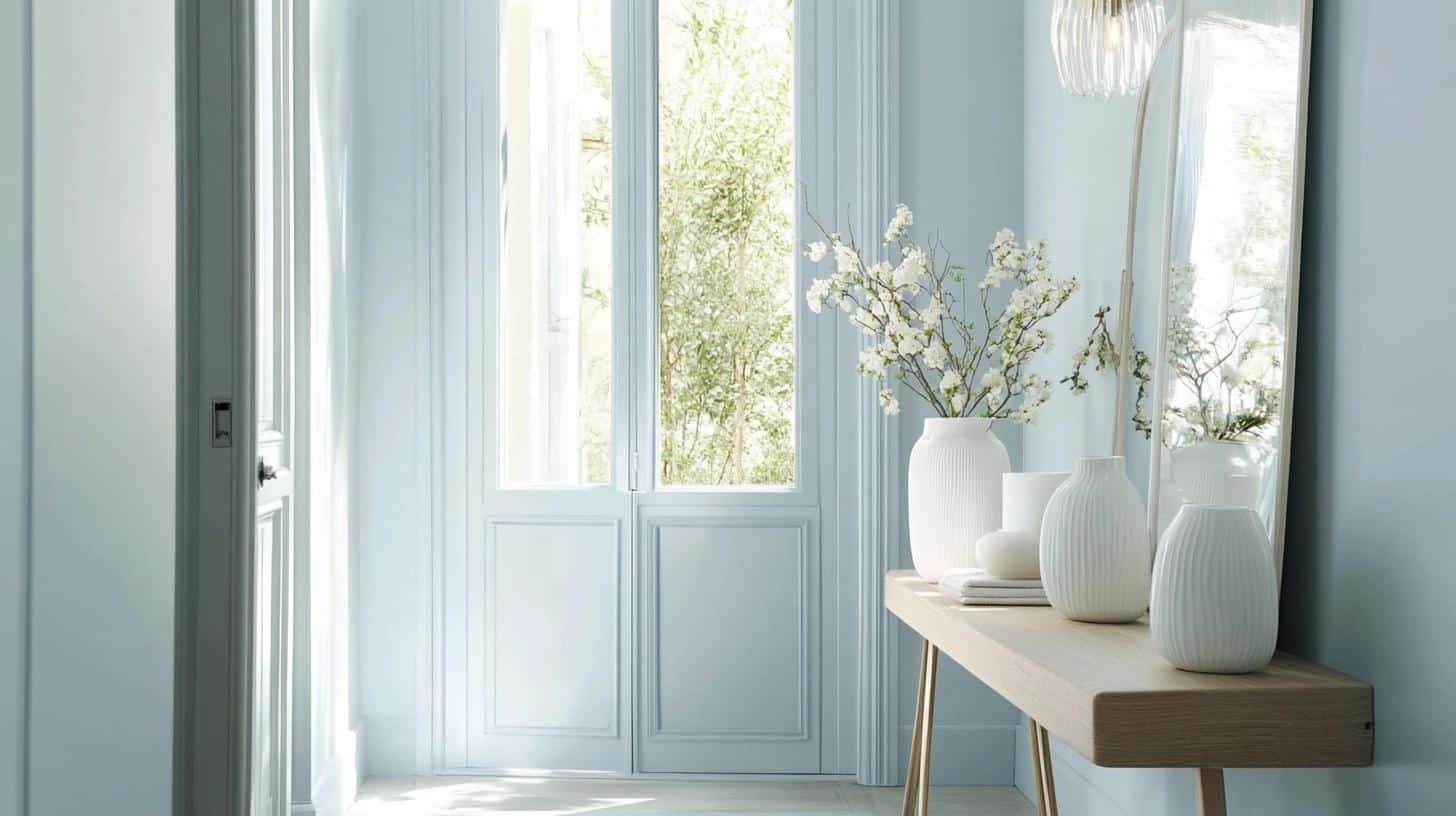
The entry hallway in my sister’s home wears this color beautifully.
It’s light enough to make the narrow space feel open, yet has enough color to create interest. The natural light from her glass door makes the blue undertones glow softly throughout the day.
Mood Board Tips for Entry:
- Install a large white-framed mirror
- Add a light wood console table
- Include silver coat hooks
- Place a natural fiber runner
- Mix in white ceramic vases
- Use clear glass lighting fixtures
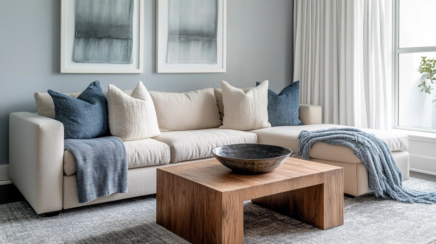
Benjamin Moore Gentle Gray in Living Room
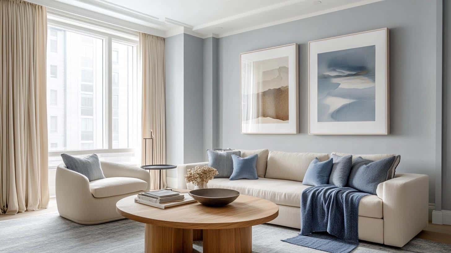
My living room makeover with Gentle Gray turned out better than I expected.
The color stays true from morning to night, creating a clean backdrop that makes furniture and art stand out.
The gray notes help keep the space feeling grounded and cozy.
Mood Board Tips for Living Room:
- Choose cream-colored sofas
- Add white cotton curtains
- Mix in blue throw blankets
- Include natural wood coffee tables
- Layer with gray area rugs
- Use white picture frames
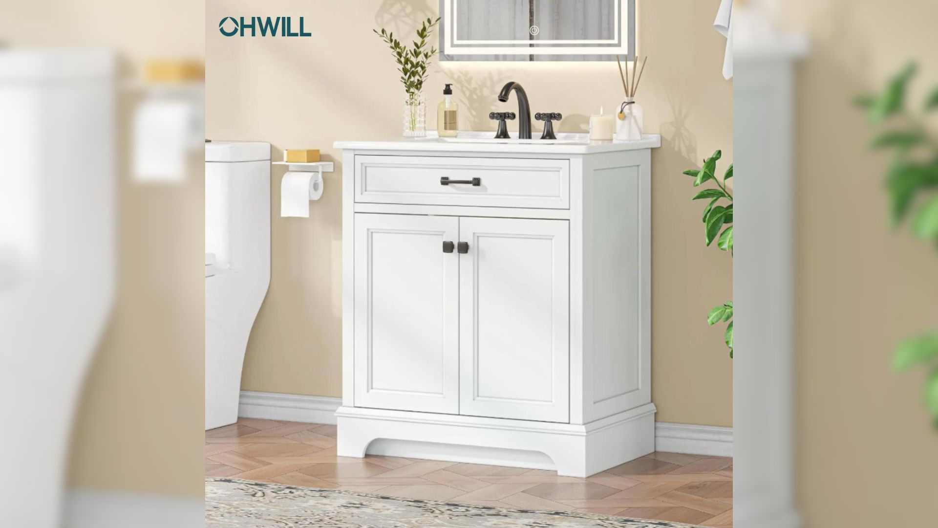
Benjamin Moore’s Gentle Gray in Bathroom
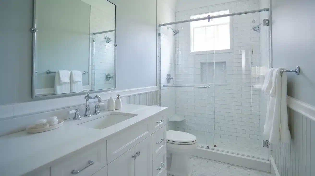
My small bathroom got a big lift with this color.
The LRV of 57.2 helps the space feel larger, and the color looks stunning with white tiles. Morning light makes it feel spa-like, while evening brings a softer, more relaxed mood.
Mood Board Tips for Bathroom:
- Install white subway tiles
- Choose chrome fixtures
- Add white fluffy towels
- Include a clear glass shower door
- Use white porcelain accessories
- Mix in light gray floor tiles
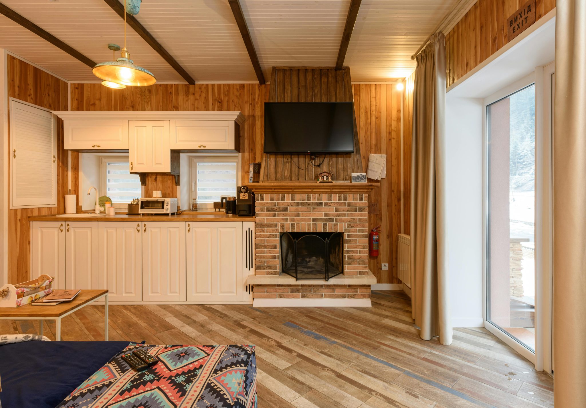
Benjamin Moore’s Gentle Gray in Kitchen
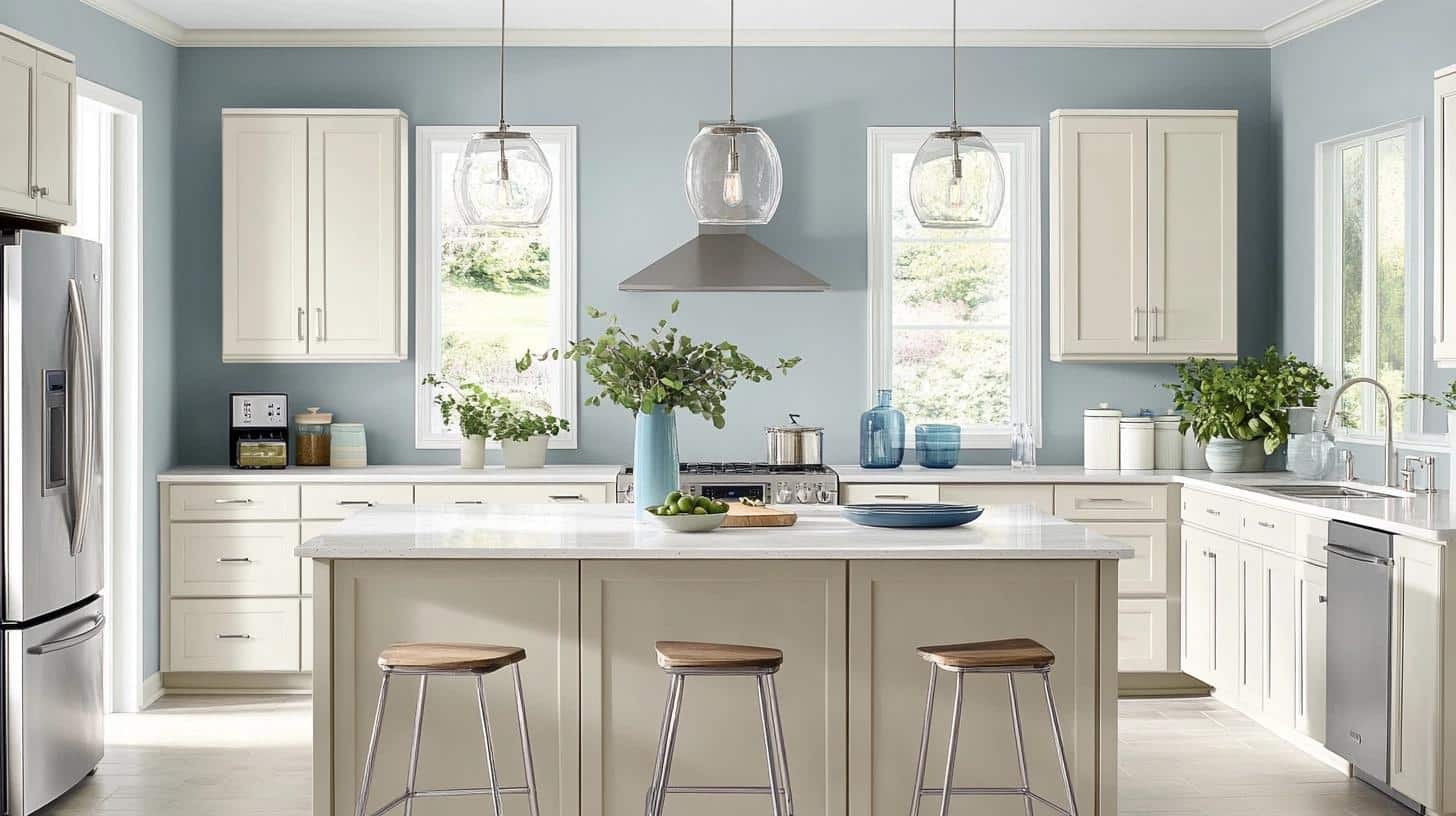
My kitchen transformation with Gentle Gray taught me so much about this color.
It changes personality based on my kitchen lighting – under my sunny window, it’s clearly blue, while the shadowed corners show more gray.
The morning sun makes the walls look fresh and clean, perfect for starting the day.
What I love most is how it handles kitchen activities – it stays looking clean even when I’m cooking up a storm, and any marks clean off easily.
Mood Board Tips for Kitchen:
- Select white cabinet faces
- Use silver cabinet pulls
- Add white stone countertops
- Include glass pendant lights
- Mix in blue glass vases
- Choose light wood bar stools
Gentle Gray VS Other Gray Paints
| Features | Gentle Gray | Classic Gray | Gray Owl | Smoke |
|---|---|---|---|---|
| Base Tone | Pale blue-gray | Warm gray | Cool gray | Medium gray |
| LRV | 57.2 | 74.78 | 65.77 | 56.49 |
| Best For | Bedrooms, bathrooms, kitchens | Large open spaces, hallways | Living rooms, offices | Accent walls, dining rooms |
| Natural Light | Shows blue tints | Stays neutral | Shows green hints | Deepens in tone |
| Artificial Light | Becomes softer | Warms up | Stays true | Can look darker |
| White Trim Pairing | Works well | High contrast | Moderate contrast | Strong contrast |
Let me share my experience with each pairing:
Gentle Gray vs. Classic Gray:
I’ve used both colors, and here’s what stands out: Classic Gray feels much lighter and more neutral.
In my projects, Gentle Gray adds more character to a room, while Classic Gray works better when you want walls to step back completely.
Gentle Gray vs. Gray Owl:
Between these two, I find Gentle Gray reads more blue, while Gray Owl can show green undertones. In my living room tests, Gray Owl felt more businesslike, while Gentle Gray created a softer mood.
Gentle Gray vs. Smoke:
The biggest difference I’ve noticed is depth.
Smoke creates more drama and feels moodier. I often pick Gentle Gray when I want a lighter touch, saving Smoke for spaces that need more presence.
Top Interior Designer Insights on Gentle Gray
Let me share what I’ve learned from talking with professional designers about Benjamin Moore’s Gentle Gray.
Their real-world experience offers valuable tips for anyone considering this color.
Sarah Miller’s Take: “I pick Gentle Gray for my clients who want a color that’s not plain white but still feels light. It’s become my top choice for home offices. The blue hints keep people alert without being too strong.”
Tom Chen’s Experience: “The true value of this color shows up in natural light. I used it in a beach house project last summer. The walls shifted colors with the ocean view – exactly what my client wanted.”
Lisa Rodriguez’s Tip: “I always tell my clients to test this color on all four walls. It’s not a tricky color, but knowing how it acts helps you use it well.”
Summing It Up
Picking the right gray isn’t always easy, but I hope my guide to Benjamin Moore’s Gentle Gray has helped you understand this unique shade.
The color’s mix of pale blue and soft gray creates spaces that feel both fresh and grounded.
From testing it in bedrooms to busy kitchens, I’ve seen how this color adapts beautifully to different spaces and lighting conditions.
Its middle-range LRV of 57.2 strikes a perfect balance – bright enough for small rooms yet rich enough for larger areas.
Ready to try Gentle Gray in your home? Start with a test patch and watch it through different times of day.
Want more paint color guides? Check out my other blog posts about Benjamin Moore’s most loved colors.

