A Guide to Accessible Beige Complementary Colors
I know how tricky it can be to match colors with accessible beige. As an interior design enthusiast, I’ve spent years working with this versatile neutral shade in my own home.
Many homeowners feel stuck when trying to pair accessible beige with other colors. But here’s the good news – this warm neutral plays well with many color options. You just need to know the right combinations.
In this guide, I’ll show you:
- The best color matches for accessible beige
- Simple ways to create balance in your space
- Tips for mixing and matching shades
- Real examples from my own design work
Let’s find the perfect color partners for your accessible beige walls!
Understanding Accessible Beige

1. Color Profile
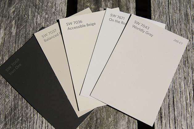
I’ve worked with Accessible Beige (SW 7036) in many rooms, and I can tell you it’s a special kind of beige. This color sits right between warm and cool tones.
When I look at it, I see a soft beige with hints of gray mixed in. It’s not too dark or light—it sits perfectly in the middle.
2. Undertones & Lighting
I’ve noticed this color changes throughout the day in my own home. In the morning light, it looks warmer and more beige. By afternoon, the gray notes come forward more.
Here’s what I’ve learned about how light affects it:
- The morning sun brings out warm, cozy tints
- Cloudy days make the gray show up more
- Evening light creates soft, muted walls
- LED bulbs can make it look cooler
- Natural light shows its true color best
In my family room with north-facing windows, it looks different from my south-facing kitchen. The color shifts but stays pleasant in both spaces. That’s why I tell my friends it’s like having several colors in one.
Want my tip? Test this color on different walls in your room. Watch how it changes as the sun moves. This will help you see exactly how it will look in your space.
Choosing Complementary Colors
1. Color Theory Basics
Let me share what I know about pairing colors from my design work. Colors that sit across from each other on the color wheel work well together. Think of blue with orange, or purple with yellow. But with a neutral like Accessible Beige, we get more options.
When I work with this shade, I look at the color wheel differently. Instead of strict rules, I think about balance. Accessible Beige is gentle, so it works with both bold and soft colors.
2. Impact of Undertones
Here’s what I’ve learned about Accessible Beige’s undertones:
- The gray hints help it pair with cool colors
- Its warm base makes it friendly with earth tones
- These mixed undertones let it adapt to many colors
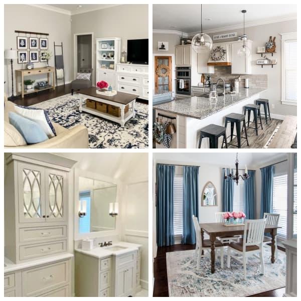
In my projects, I’ve seen how these undertones matter. When I put blue next to it, the gray notes come out. With warm woods, the beige gets stronger. It’s like the color takes cues from its neighbors.
I always tell my clients to put paint samples next to their furniture. This shows how the undertones will play with their existing pieces. It’s a simple step that makes a big difference.
Top Complementary Colors for Accessible Beige
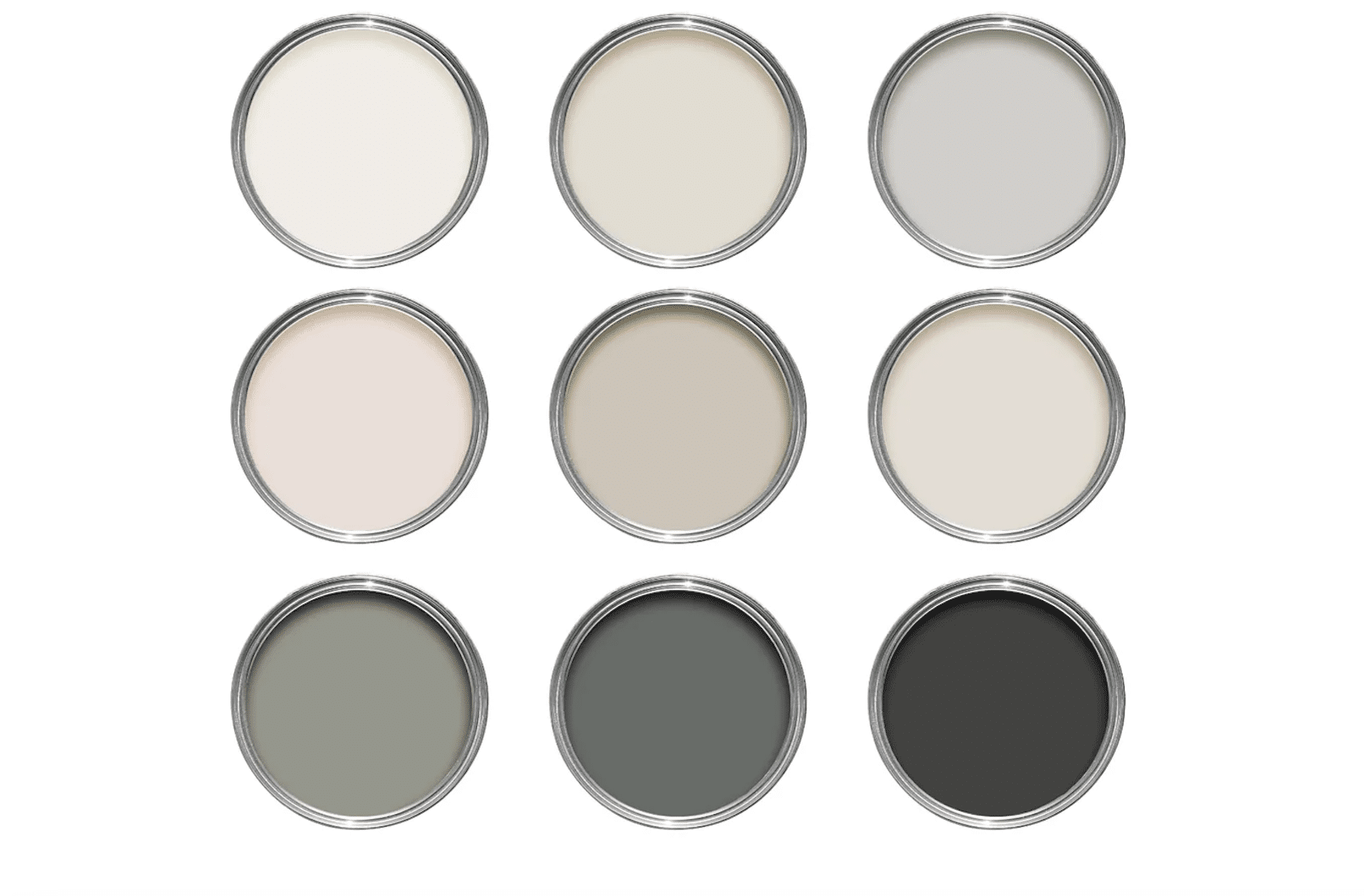
1. Crisp Whites

Examples I’ve used:
- SW Alabaster: Gives a soft, warm white look
- SW Pure White: Creates clean, clear contrast
Usage Tips:
I paint all my trim work in Pure White. It makes the beige walls stand out beautifully. For ceilings, I prefer Alabaster. The warmth helps the room feel connected.
Try white in these spots:
- Door frames
- Window sills
- Crown molding
- Baseboards
2. Soft Grays
Examples I recommend:
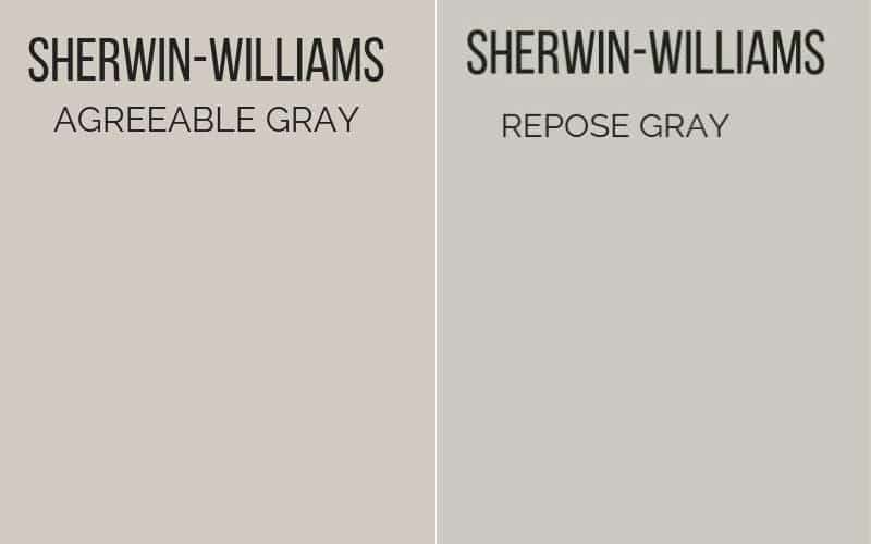
- SW Repose Gray: Adds subtle depth
- SW Agreeable Gray: Brings gentle contrast
Usage Tips:
When I want a modern feel, I use these grays:
- As an accent wall
- In attached rooms
- On built-in cabinets
- For furniture pieces
3. Earthy Greens

Examples from my work:
- SW Sea Salt: Makes spaces feel light
- SW Rainwashed: Brings in natural tones
Usage Tips:
I use these green tones to make rooms feel peaceful:
- In bathrooms
- For kitchen cabinets
- On interior doors
- As accent pieces
4. Warm Browns
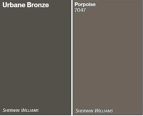
Examples I trust:
- SW Porpoise: Adds cozy depth
- SW Urban Bronze: Creates rich accents
Usage Tips:
I use these brown tones to add warmth:
- On kitchen islands
- For accent beams
- In wooden furniture
- Through textiles and rugs
5. Muted Blues
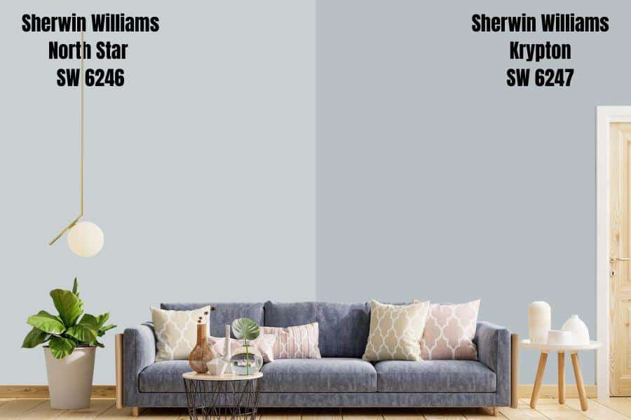
Examples I work with:
- SW North Star: Brings subtle coolness
- SW Krypton: Adds gentle depth
Usage Tips:
These blues help me create calm spaces:
- In bedrooms
- For bathroom vanities
- On accent pillows
- Through wall art
6. Soft Creams
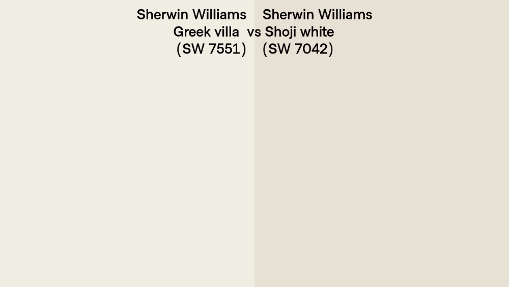
Examples I prefer:
- SW Shoji White: Makes smooth transitions
- SW Greek Villa: Adds gentle warmth
Usage Tips:
I blend these creams in:
- Connected living spaces
- Kitchen cabinets
- Dining room walls
- Through curtains
7. Rich Blacks
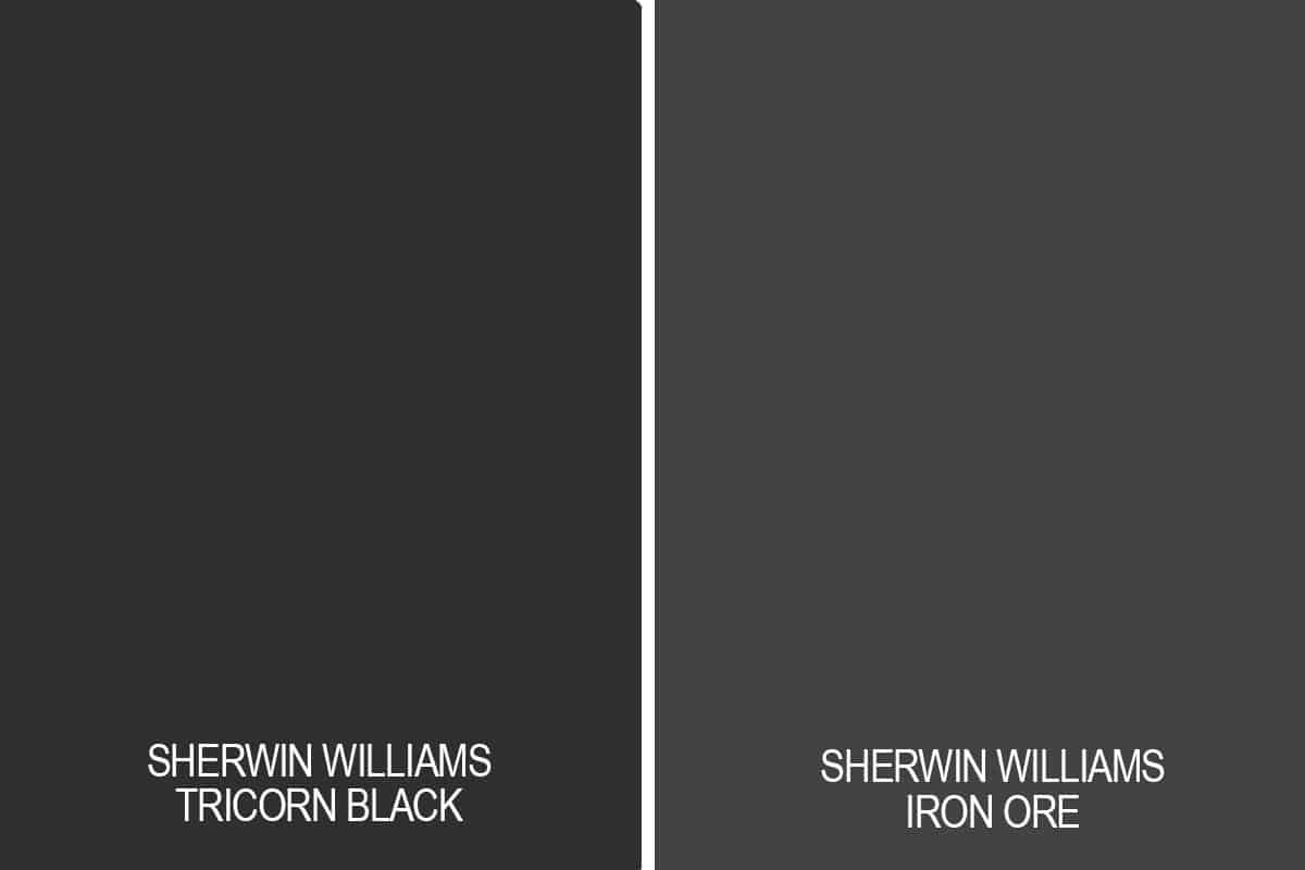
Examples I rely on:
- SW Iron Ore: Offers subtle black
- SW Tricorn Black: Makes clear statements
Usage Tips:
I use these blacks carefully:
- For window frames
- On light fixtures
- Through hardware
- In small decor pieces
All these colors pair well with Accessible Beige. I’ve seen them work in both small and large spaces. The key is balance – use stronger colors in smaller doses.
Price Range of Every Complementary Colors You Should Know
| Complementary Color | Paint Option | Cost per Gallon | Notes |
|---|---|---|---|
| Crisp Whites | SW Alabaster | $35-$70 | Prices vary based on finish (flat, eggshell, semi-gloss) |
| SW Pure White | $35-$70 | Prices vary based on finish (flat, eggshell, semi-gloss) | |
| Soft Grays | SW Repose Gray | $35-$70 | Higher-traffic areas need better finishes, affecting the cost |
| SW Agreeable Gray | $35-$70 | Higher-traffic areas need better finishes, affecting the cost | |
| Earthy Greens | SW Sea Salt | $35-$70 | Bathroom and kitchen paints may cost more |
| SW Rainwashed | $35-$70 | Bathroom and kitchen paints may cost more | |
| Warm Browns | SW Trusty Tan | $35-$70 | Darker colors often need more coats |
| SW Urban Bronze | $40-$75 | Darker colors often need more coats | |
| Muted Blues | SW North Star | $35-$70 | Deeper blues may need a primer |
| SW Distance | $40-$75 | Deeper blues may need a primer | |
| Soft Creams | SW Creamy | $35-$70 | Light colors often need fewer coats |
| SW Greek Villa | $35-$70 | Light colors often need fewer coats | |
| Rich Blacks | SW Iron Ore | $40-$75 | Dark colors need good prep work |
| SW Tricorn Black | $40-$75 | Dark colors need good prep work |
Money-Saving Tips:
-
Buy during paint sales
-
Get samples first ($5-$10 each)
-
Check for contractor discounts
-
Look for holiday deals
-
Join the SW Paint rewards program
NOTE: The prices listed are from my recent projects. They may change based on your location and time of purchase.
Strategies to Create Cohesive Color Palettes
| Strategy Name | Key Steps |
|---|---|
| 1. The Main Color Strategy | – Make Accessible Beige the main wall color |
| – Put it in all key spaces | |
| – Keep it on most walls | |
| – Use it as the starting point | |
| 2. The Connection Method | – Paint hallway walls in Accessible Beige |
| – Keep all doors one color | |
| – Use the same trim shade everywhere | |
| – Match window frames | |
| 3. The Color Flow Plan | – Start at the front door |
| – Look at room openings | |
| – Note what’s seen together | |
| – Plan colors that match | |
| 4. The Balance Technique | – Use big items in calm tones |
| – Choose medium pieces in mid-tones | |
| – Add small things in brighter shades | |
| – Mix a maximum of three shades | |
| 5. The Testing Steps | – Paint large squares to test |
| – Look at the colors morning and night | |
| – Check with room lights on | |
| – See how it looks near furniture | |
| 6. The Repeat Method | – Use the same white trim throughout |
| – Pick one metal finish | |
| – Matchwood tones | |
| – Repeat accent colors |
NOTE: These strategies work in real homes. They help create spaces that look planned and feel right.
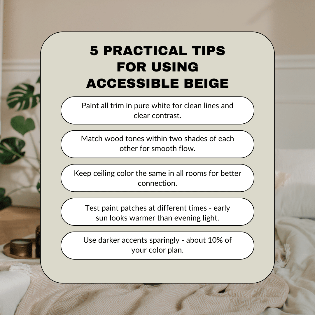
Some Practical Tips for Using Accessible Beige
Conclusion
I know finding the right color matches can feel tricky. But after working with Accessible Beige in many homes, I can tell you it’s a color that plays well with others.
Remember my key points:
- Test colors in your own light
- Start with whites and grays
- Add depth with earth tones
- Keep trim colors the same
- Use darker shades in small doses
Ready to get started? Pick up some paint samples and test them on your walls. Watch how they change throughout the day.
And if you need more help, comment below with your questions. I’d love to hear how your color project turns out!

