
Top 30 Colors that Perfectly Complement Yellow
Yellow is a bright, cheerful color that can light up any space.
But finding the right colors to pair with it can be tricky.
Many of us struggle to create color schemes that make yellow shine without overwhelming the eye.
Don’t worry – I’m here to help you unlock Yellow’s full potential.
In this post, I’ll share 30 colors that work beautifully with yellow, from subtle neutrals to bold contrasts.
You’ll discover a range of color combinations to suit any style or mood.
Whether decorating a room, planning an outfit, or designing graphics, you’ll find options to make yellow look its best.
Let’s explore the perfect partners for this sunny hue.
List of Colors that Go with Yellow
1. White
White and yellow create a fresh, clean, cheerful, and sophisticated look.
This combination brings brightness to any space, making it feel open and airy.
It’s perfect for modern interiors or summer outfits.
The contrast allows yellow to stand out, while white provides a crisp backdrop, resulting in a lively yet balanced aesthetic.
Shades
- Pure White
- Ivory
- Off-White
2. Black
Black and yellow form a striking duo that commands attention.
This high-contrast pairing is bold and dramatic, often associated with caution signs or nature’s warning colors.
It creates a modern, edgy, sophisticated, and eye-catching design.
The darkness of black makes yellow appear even brighter and more vibrant.
Shades
- Jet Black
- Charcoal
- Ebony
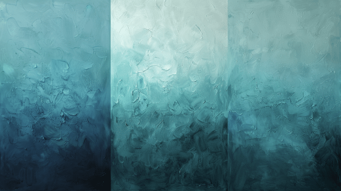
3. Navy Blue
Navy blue with yellow offers a classic, sophisticated combination.
This pairing evokes a nautical feel, perfect for fashion and home decor.
The Navy’s depth allows yellow to shine without overpowering, creating a balanced and visually appealing duo.
It’s a versatile combination that can suit both formal and casual settings.
Shades
- Midnight Blue
- Indigo
- Dark Denim
4. Gray
Gray serves as a neutral base that softens yellow’s brightness.
This combination creates a modern, balanced, stylish, versatile look.
The coolness of gray tempers yellow’s warmth, resulting in a harmonious palette.
It’s an excellent choice for contemporary interiors or professional attire.
Shades
- Charcoal Gray
- Silver Gray
- Dove Gray
5. Brown
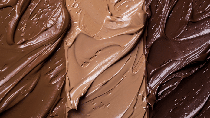
Brown adds warmth and earthiness when paired with yellow.
This combination evokes natural, autumnal vibes and creates a cozy, welcoming atmosphere.
The richness of the brown ground and the yellow’s brightness result in a balanced and comforting palette.
It’s ideal for rustic or traditional design schemes.
Shades
- Chocolate Brown
- Walnut
- Caramel
6. Beige
Beige creates a soft, harmonious combination with yellow.
This pairing offers a warm, neutral backdrop that allows yellow to shine without overwhelming.
It’s perfect for creating a calm, inviting atmosphere in living spaces or a subtle, elegant look in fashion.
The result is a gentle, soothing palette.
Shades
- Sand
- Ecru
- Taupe
7. Coral
Coral paired with yellow adds a lively, tropical feel.
This vibrant combination evokes thoughts of summer sunsets and exotic flowers.
It’s energetic and cheerful, perfect for creating a fun, upbeat atmosphere.
The warmth of both colors creates a harmonious, inviting, and refreshing blend.
Shades
- Salmon Coral
- Peach Coral
- Deep Coral
8. Teal
Teal and yellow create a vibrant, energetic look.
This combination is bold and playful, reminiscent of tropical waters and sunny skies.
The cool undertones of teal balance yellow’s warmth, resulting in a dynamic and refreshing palette.
It’s perfect for adding color to any design or outfit.
Shades
- Peacock Teal
- Ocean Teal
- Emerald Teal
9. Turquoise
Turquoise adds a bright, refreshing contrast to yellow.
This pairing is reminiscent of sunny beaches and clear waters, evoking a sense of relaxation and joy.
The combination is lively and refreshing, perfect for creating a cheerful, uplifting atmosphere in fashion and interior design.
Shades
- Aqua Turquoise
- Sky Turquoise
- Deep Turquoise
10. Orange
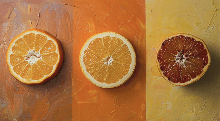
Orange complements yellow for a warm, sunny palette.
This combination creates a vibrant, energetic look full of life and enthusiasm.
It evokes thoughts of citrus fruits and summer days.
While bold, this pairing can be balanced and harmonious, perfect for creating a cheerful, welcoming atmosphere.
Shades
- Tangerine
- Burnt Orange
- Apricot
11. Green
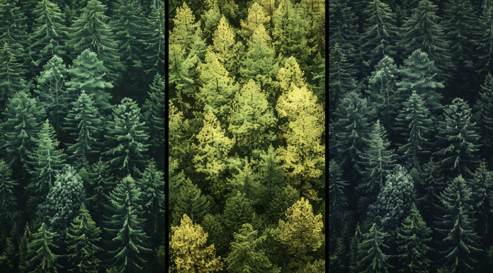
Green and yellow create a natural, lively combination.
This pairing evokes the freshness of spring and the vitality of nature.
It’s a harmonious blend that can be both energizing and soothing, depending on the shades used.
The mix works well in various settings, from cheerful interiors to outdoor-inspired fashion choices.
Shades
- Lime Green
- Forest Green
- Sage Green
12. Olive
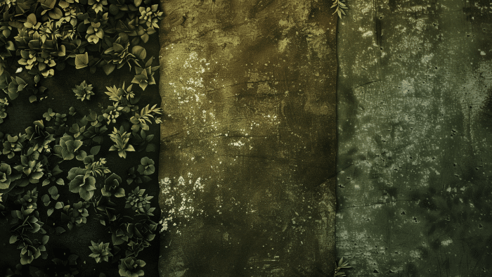
Olive adds a muted, sophisticated touch to yellow.
This earthy combination creates a warm, subdued palette that’s elegant and natural.
The richness of olive tones down yellow’s brightness, resulting in a balanced, mature look.
It’s perfect for creating a cozy, inviting home decor or fashion atmosphere.
Shades
- Army Green
- Moss Green
- Khaki
13. Mint Green
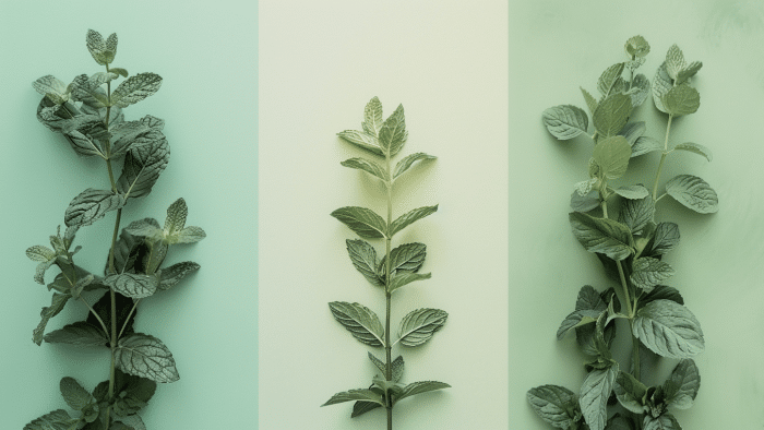
Mint green creates a fresh, cool contrast with yellow.
This combination is light and airy, evoking thoughts of spring and new beginnings.
It’s a playful yet soothing palette that works well in modern designs.
The coolness of mint balances yellow’s warmth, creating a refreshing and invigorating look.
Shades
- Seafoam Green
- Pastel Mint
- Spearmint
14. Purple
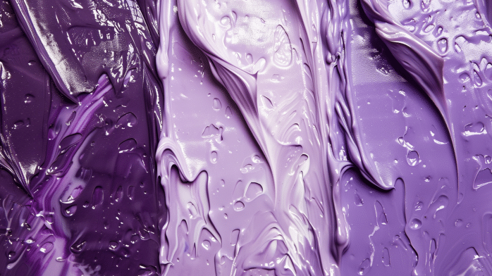
Purple offers a bold, vibrant combination with yellow.
This pairing is often seen in nature, like in pansies or irises.
It’s a regal and eye-catching duo that can create dramatic, luxurious looks.
The contrast between cool purple and warm yellow creates a dynamic, energetic palette.
Shades
- Royal Purple
- Plum
- Lavender
15. Lavender
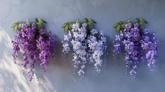
Lavender adds a soft, calming effect to yellow.
This gentle combination creates a soothing, romantic atmosphere.
It’s less intense than stronger purples, offering a more subtle and elegant pairing.
This palette works well in bedrooms and nurseries or for creating serene, dreamy looks in fashion.
Shades
- Light Lilac
- Wisteria
- Periwinkle
16. Pink
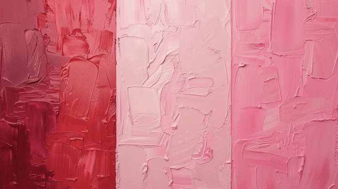
When paired with yellow, pink creates a playful, cheerful look.
This combination is youthful and energetic, perfect for creating fun, upbeat designs.
Pink can range from soft and sweet to bold and vibrant, depending on the shades used.
This pairing works well in children’s rooms, spring fashion, or festive decorations.
Shades
- Blush Pink
- Hot Pink
- Salmon Pink
17. Magenta
Magenta adds a bold, dynamic touch to yellow.
This vibrant pairing is attention-grabbing and full of energy.
It’s a modern, trendy combination that works well in graphic design or fashion-forward outfits.
The contrast between cool magenta and warm yellow creates an exciting, lively palette.
Shades
- Fuchsia
- Berry
- Deep Pink
18. Red
Red provides a striking, energetic combination with yellow.
This pairing is bold and attention-grabbing, often used in warning signs due to its high visibility.
In design and fashion, it creates a warm, passionate look.
The intensity of both colors results in a dynamic, powerful palette.
Shades
- Cherry Red
- Crimson
- Scarlet
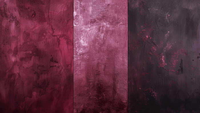
19. Burgundy
Burgundy adds depth and richness to yellow, creating a sophisticated pairing with a warm, luxurious look.
The deep tones of burgundy balance the yellow’s brightness, resulting in a mature, elegant palette.
It’s perfect for creating cozy, inviting spaces or adding a touch of refinement to outfits.
Shades
- Maroon
- Wine Red
- Oxblood
20. Sky Blue

Sky blue creates a serene, calming palette when combined with yellow.
This pairing evokes sunny days and clear skies, bringing a sense of cheerfulness and tranquility.
It’s a fresh, airy combination that works well in interior design and fashion, especially for spring and summer themes.
Shades
- Baby Blue
- Powder Blue
- Azure
21. Aqua
Aqua adds a bright, refreshing contrast to yellow.
This combination evokes tropical waters and sunny beaches, creating a lively and stimulating palette.
It’s perfect for summer-themed designs or to add a splash of cheerfulness to any space.
The cool tones of aqua balance the yellow’s warmth, resulting in a vibrant yet harmonious look.
Shades
- Turquoise Aqua
- Sea Green
- Cyan
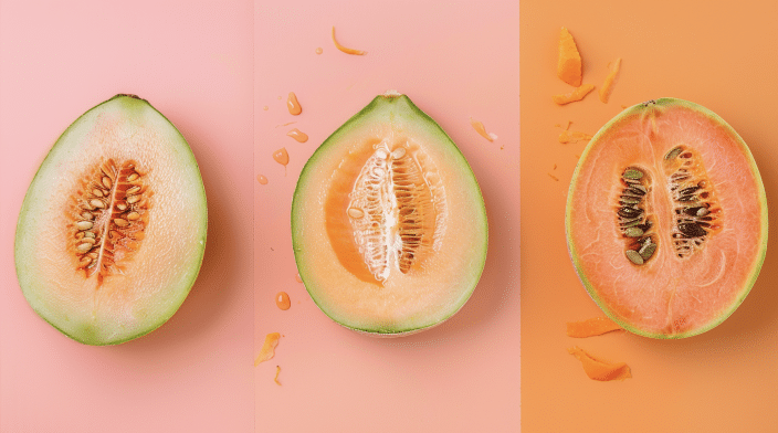
22. Peach
Peach and yellow offer a soft, warm combination.
This pairing creates a gentle, inviting atmosphere reminiscent of summer sunsets.
It’s a subtle, elegant palette that works well in fashion and interior design.
The softness of peach complements yellow’s brightness, resulting in a soothing yet cheerful look.
Shades
- Apricot
- Cantaloupe
- Coral Peach
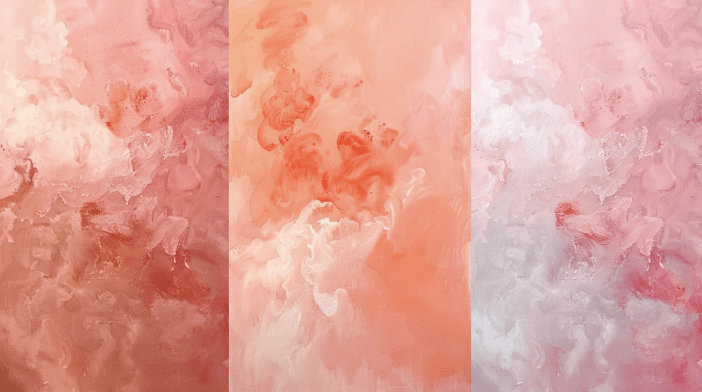
23. Salmon
Salmon adds a soft, pastel contrast to yellow.
This combination is delicate and sophisticated, perfect for creating a calm, elegant atmosphere.
It’s often seen in nature, like in certain flowers or sunsets.
The warmth of both colors creates an inviting and refined harmonious blend.
Shades
- Light Salmon
- Coral Salmon
- Dusty Rose
24. Maroon
Maroon provides a rich, sophisticated pairing with yellow.
This deep, warm color adds depth and intensity to yellow’s brightness.
The combination is bold yet elegant, perfect for creating a luxurious, mature look.
It works well in traditional and modern design schemes, adding a touch of refinement.
Shades
- Burgundy
- Wine
- Deep Red
25. Chocolate
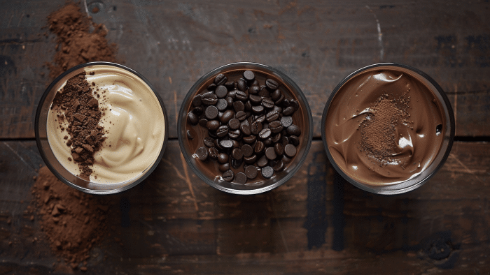
Chocolate adds depth and warmth to yellow.
This earthy combination creates a cozy, inviting atmosphere reminiscent of autumn.
The richness of chocolate grounds yellow’s brightness, resulting in a balanced and comforting palette.
It’s ideal for creating warm, welcoming spaces or adding a touch of sophistication to designs.
Shades
- Dark Chocolate
- Milk Chocolate
- Mocha
26. Cyan
Cyan creates a vibrant, energetic look when paired with yellow.
This combination is bold and playful, reminiscent of tropical waters and sunny skies.
The cool tones of cyan contrast beautifully with yellow’s warmth, resulting in a dynamic and refreshing palette.
It’s perfect for adding a pop of color to any design.
Shades
- Electric Blue
- Bright Turquoise
- Teal Blue
27. Royal Blue
Royal blue offers a bold, regal contrast to yellow.
This pairing is striking and sophisticated, often associated with luxury and elegance.
The depth of royal blue allows yellow to shine without overpowering, creating a balanced and visually appealing duo.
It’s versatile enough for both formal and casual settings.
Shades
- Sapphire Blue
- Cobalt
- Lapis Lazuli
28. Fuchsia
Fuchsia adds a bright, playful touch to yellow.
This vibrant combination is energetic and eye-catching, perfect for creating bold, modern designs.
The cool tones of fuchsia balance yellow’s warmth, resulting in a lively and dynamic palette.
It’s ideal for fashion-forward looks or adding excitement to any space.
Shades
- Hot Pink
- Magenta
- Deep Pink
29. Ivory
Ivory provides a soft, elegant contrast to yellow.
This subtle combination creates a warm, sophisticated, inviting and refined look.
The creaminess of ivory softens yellow’s brightness, resulting in a gentle, harmonious palette.
It’s perfect for creating a classic, timeless atmosphere in fashion and interiors.
Shades
- Cream
- Off-White
- Eggshell
30. Gold
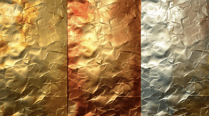
Gold adds a luxurious, harmonious touch to yellow.
This pairing creates a rich, opulent look that exudes warmth and elegance.
The metallic sheen of gold complements yellow’s brightness, resulting in a sophisticated and glamorous palette.
It’s ideal for adding a touch of luxury to any design or outfit.
Shades
- Antique Gold
- Champagne Gold
- Bronze Gold
Conclusion
Yellow is a cheerful and adaptable color that pairs well with many hues.
We’ve explored 30 colors that complement yellow, from crisp whites to deep burgundies and everything in between.
The key to using yellow effectively is balance.
Consider the mood you want to create, whether a bold contrast or a subtle harmony.
Don’t hesitate to experiment with different shades to find what works best for your project or space.
While these suggestions can guide you, trust your taste.
The perfect combination might represent your unique style and the atmosphere you want to create.
I hope this guide has inspired you to try new color combinations with yellow.
Whether you’re redecorating, planning an outfit, or working on a design project, you now have a palette of options to make yellow shine its brightest.


